Gathering data is one thing. Helping your community understand it is another.
Most nonprofits collect useful information about their work—outcomes, reach, funding, growth. But when that data is shared without context or structure, it often shows up as a wall of numbers people aren’t sure how to read.
Simplifying your nonprofit’s data helps people understand what really happened, what shifted on the ground, and how your work connects back to the people you serve.
When Data Gets in the Way
Complex programs, layered initiatives, and detailed metrics can quietly create distance between your organization and your community.
For your team, data reflects progress, decisions, and accountability.
For everyone else, it’s often just numbers on a page.
Without explanation, numbers don’t do much on their own. Readers may see the totals, but still miss who benefited, how access changed, or what those outcomes mean in real life—whether that’s families finding stable housing, students getting the support they need, or neighbors accessing basic services.
When nonprofit data isn’t simplified, supporters are left filling in the gaps:
- What does this number represent?
- Why is this important?
- How did my support play a role?
Clear, simplified data makes it easier to connect the dots. It helps people feel confident in what they’re reading and stay engaged over time, especially when they’re deciding where to give their time or money.
How to Simplify Your Nonprofit’s Data
Two things make data easier to understand: storytelling and visuals.
1. Use Storytelling to Add Context
Storytelling helps your data make sense.
Instead of sharing numbers on their own, it helps you show:
- What changed this year
- Who felt that change
- How it happened
- Why it matters now
Annual reports are a natural place to do this well. They give you room to connect programs, outcomes, and community voices into a story that flows from start to finish.
Good storytelling means arranging what you already have so people don’t have to work to understand it.
2. Use Visuals to Make Data Easier to Read
Visuals help people process information faster.
Simple charts, diagrams, and infographics let readers spot patterns and takeaways without rereading or decoding long blocks of text.
Visuals can:
- Support stories in an annual report
- Work on their own as infographics
- Be reused in emails, social posts, or presentations
The goal isn’t to decorate the data, but to make it easier to take in.
.avif)
Get The Annual Report Checkpoint

Donor Thank You Postcards Templates
Enter your info and we’ll send the postcards straight to your inbox:

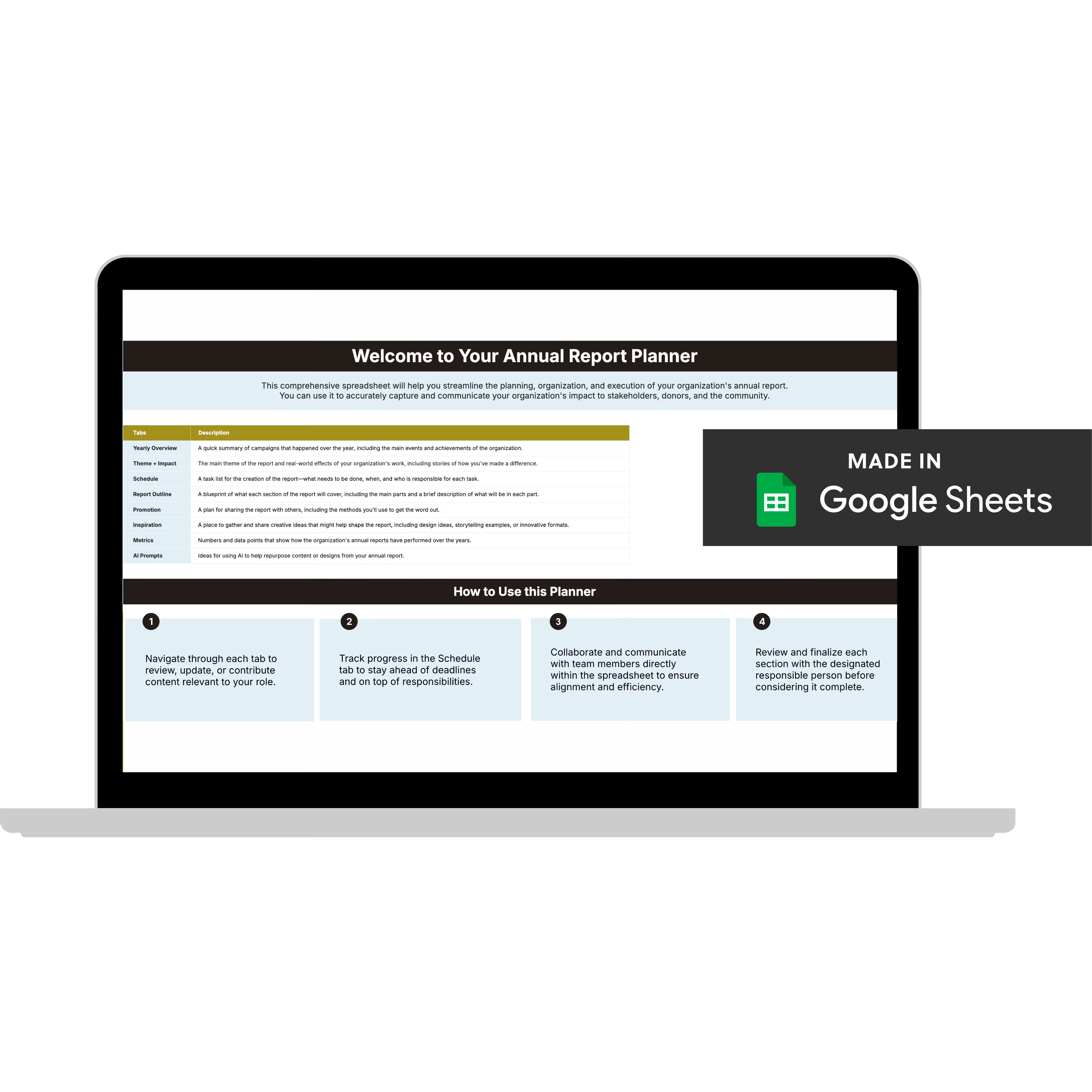
Annual Report Planner
Get a clear content roadmap so your annual report builds belief, earns trust, and actually gets used after launch—plus the same planning approach we use with our 1:1 clients, built in.
Sharing Data Beyond the Annual Report
Your data shows up in more places than one report.
You can (and should) use simplified data across:
- Your website (impact and financial pages)
- Program or advocacy content
- Blog posts
- Email updates
- Donor communications
Wherever it lives, the same basics apply:
- Add context
- Focus on what changed
- Use visuals with intention
Don't stop at sharing information. Make sure your data is easy to understand without added explanation.
Getting More Value From Your Impact Data
Most nonprofits struggle here especially when programs are complex or a lot happened in one year. Storytelling and visuals help, but they take time. And for small teams, that's often the biggest challenge.
The real work starts before design: deciding what to highlight, what to group, and what doesn't need to be shown at all.
The Annual Report Checkpoint helps you make those calls with clarity before you invest time, budget, or energy into building anything.


