annual report design for nonprofits
Annual reports that earn the next gift and the next partner
Are you ready to make your annual report the hardest-working piece in your fundraising stack?


.avif)
.webp)

Are you ready to make your annual report the hardest-working piece in your fundraising stack?


.avif)
.webp)
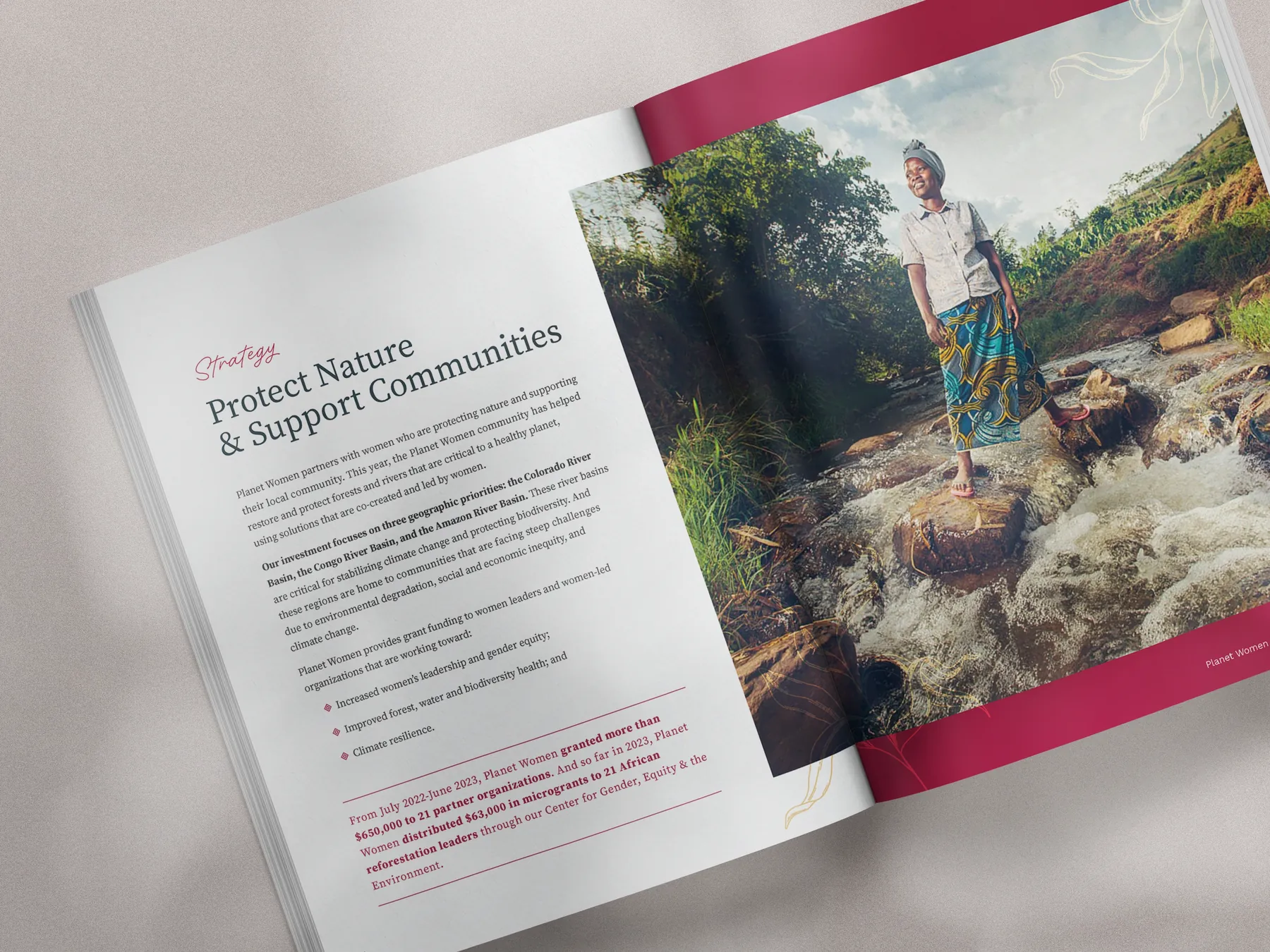
Helping nonprofit teams turn one annual report into a full year of donor-ready, stewardship materials that lead with narrative, not numbers alone.
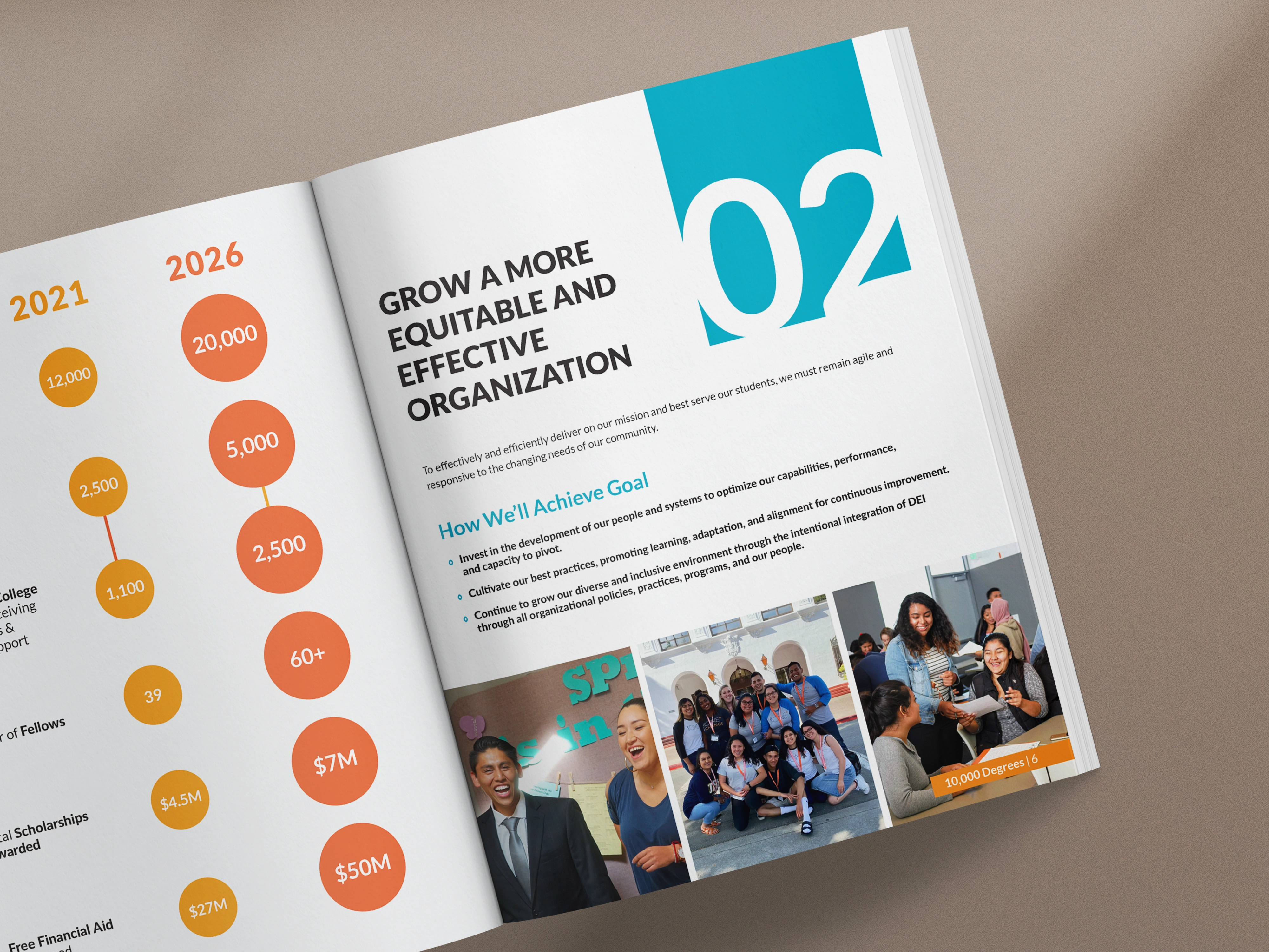
Our narrative-first, supporter-centered approach to design has produced results like…

"I used the report as a major hook for four pieces of health-protective legislation in Congress."

"Acton Circle's work has earned us high praise and accolades for our materials."

"The end product was finished on time and received rave reviews from our team and Board leadership."


You're tired of sending things out and hoping for the best (been there). You know that organizations doing important work shouldn't be the hardest to trust. Good news? This is fixable.
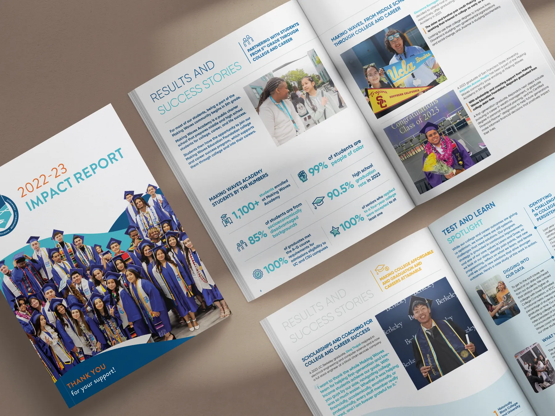
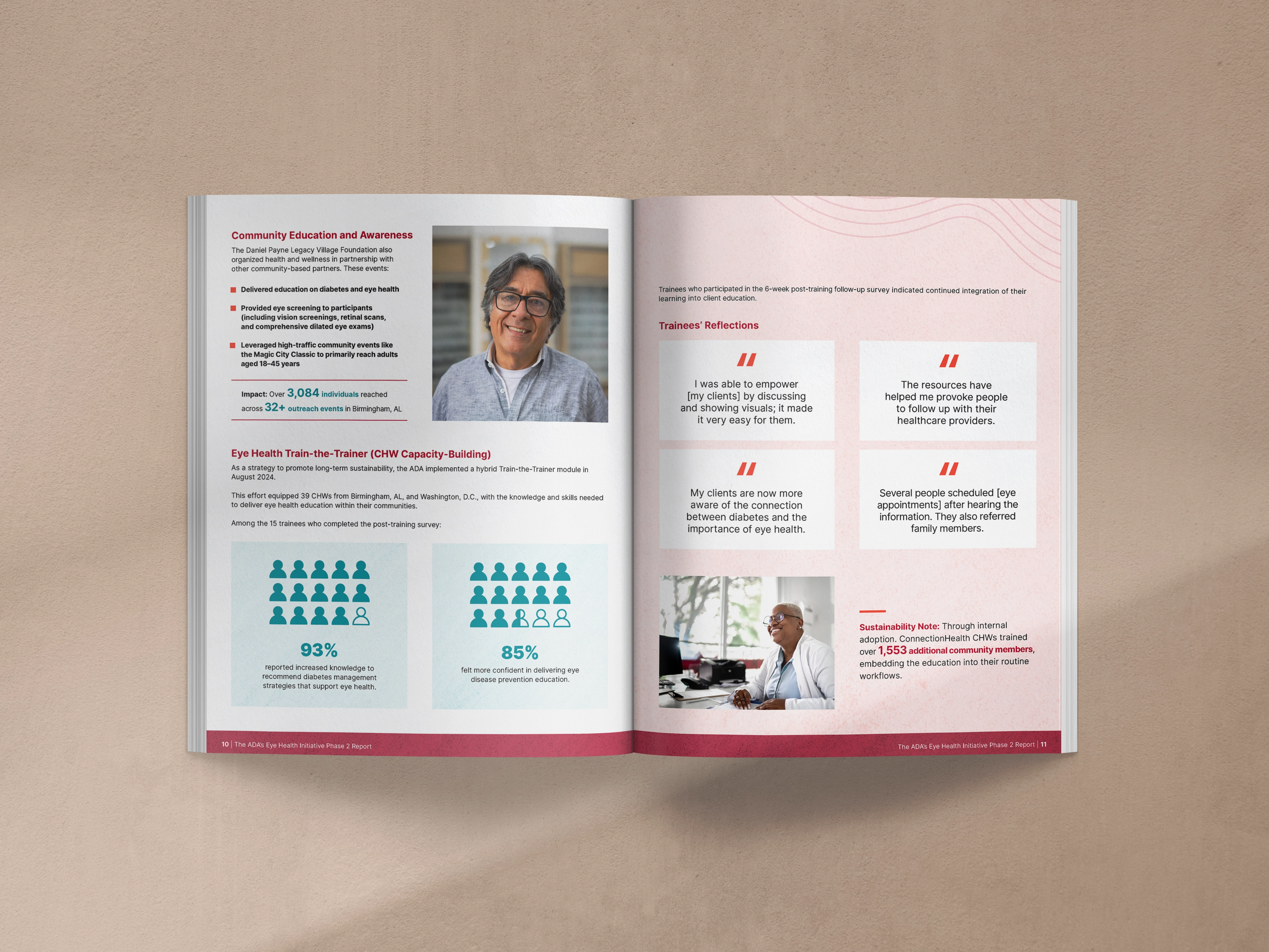
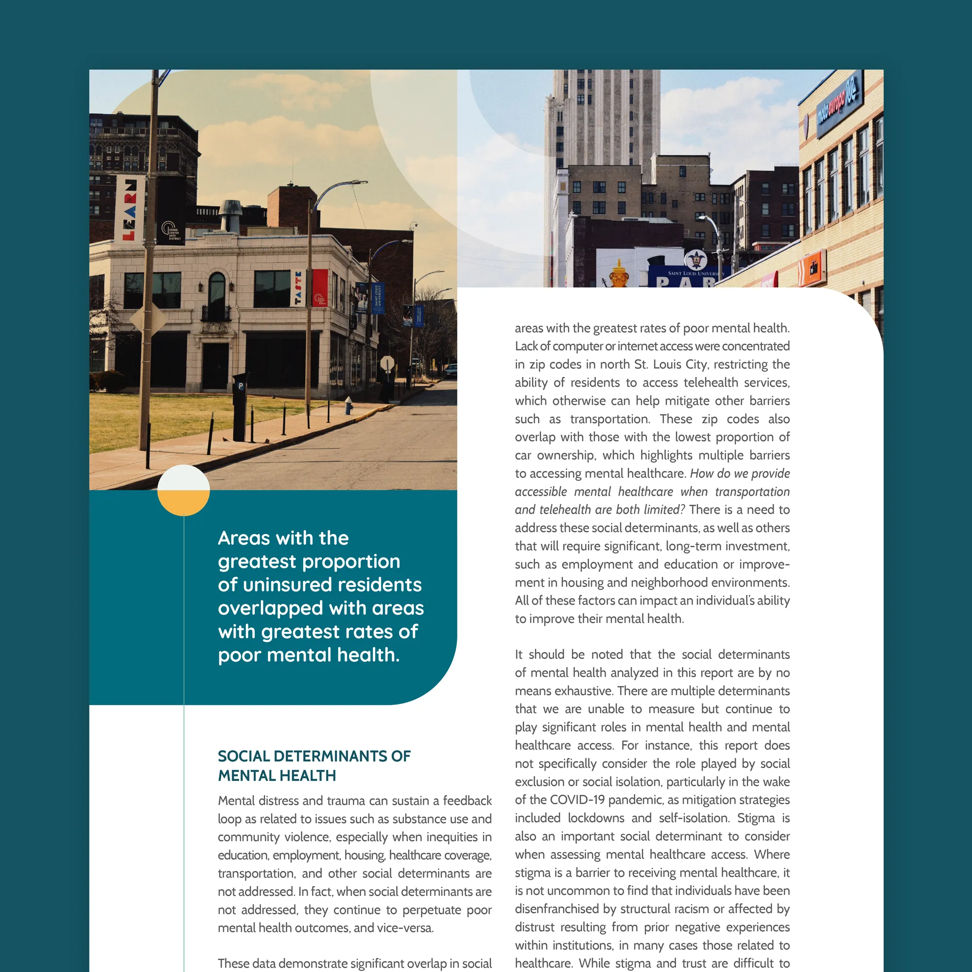
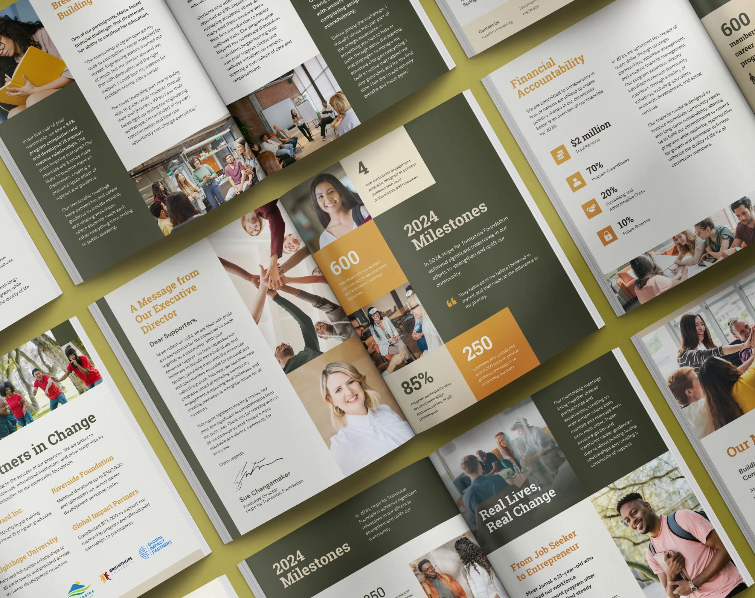
Plenty of agencies and freelancers can hand you a polished PDF (love that for them). We hand you a report that does the work.
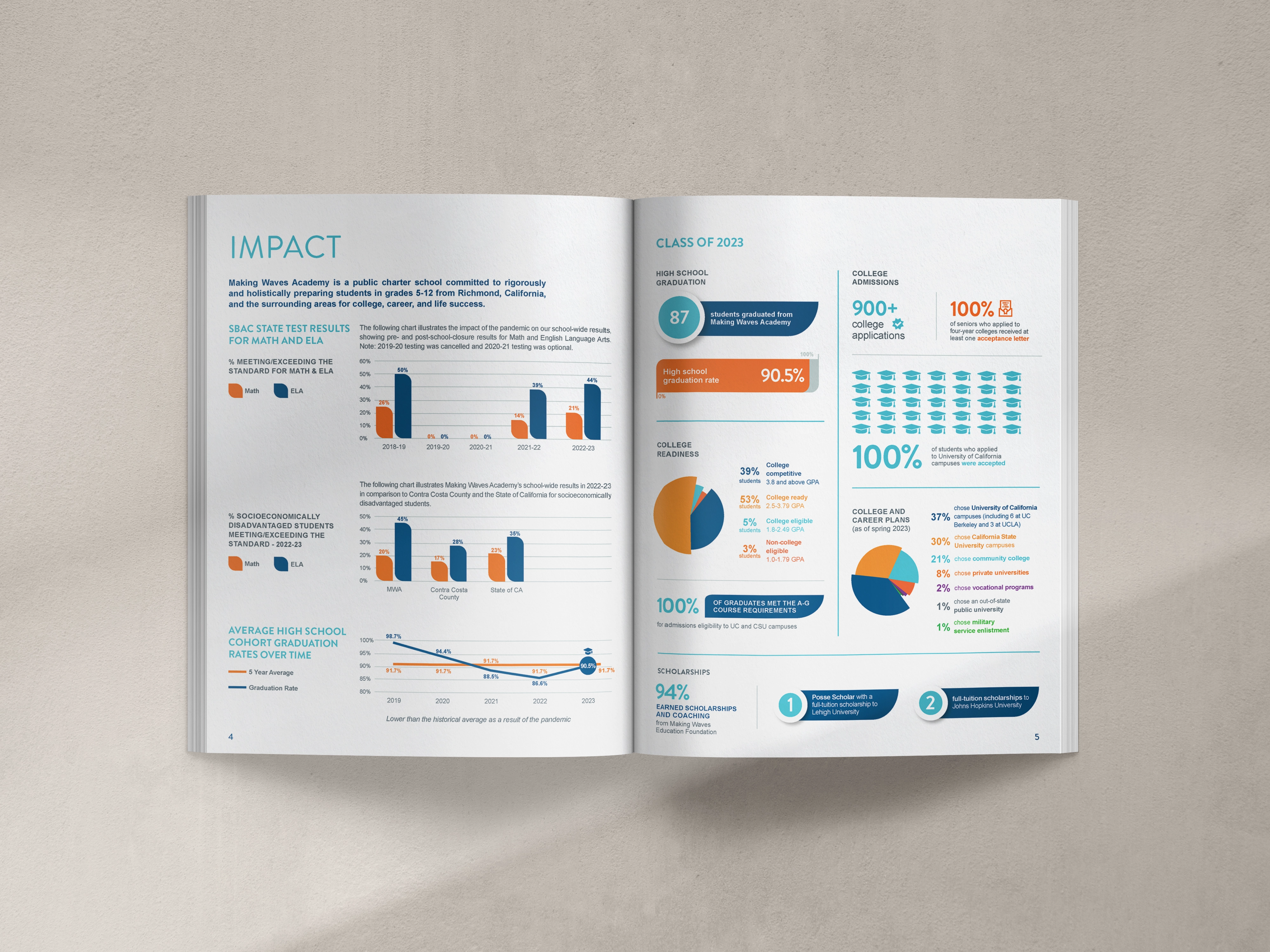
We design for how people actually read annual reports: fast, distracted, halfway through their inbox. So every page is built to make sense on its own. The headlines are clear. The data is easy to follow. The captions close the loop.
And we're with you the whole way (no ghosting). Clear communication from kickoff. Real time spent understanding your mission. Feedback that gets engaged with and applied, not glossed over and showing up in the next round. High-quality work you can count on.
I'm Olivia, and I started Acton Circle because too many nonprofits were doing great work and getting missed. Their materials weren't telling the real story. I built Acton Circle to fix that. For good.
The name comes from my grandparents. They lived on Acton Circle in Berkeley, CA. The font comes from my grandfather's handwriting.
They were the kind of people who loved big and served others faithfully. For decades. Without making a thing of it.
So no, this was never just about design. It’s about honoring a legacy and supporting the missions that are making a real difference.


We speak nonprofit and design. We get the board, the stakeholders, the pressure to build trust. We get the four different audiences you're trying to reach with one document (yes, four—we've had that exact conversation more than once).

Clear timelines. Proactive updates. Built-in reviews. You always know what's coming, why it matters, and how it ties to your goals.
We know you're covering for two people and running point on three other things. You shouldn't have to chase us too.

We're not here to make things just look clean and professional. We're here so supporters really feel your mission. Every font, image, and layout means something. Yes, it's that deep.
The content that's 90% there... we know how to find the missing 10% and make the whole thing click.

No hourly rates. No surprise invoices. Fixed pricing, clear deliverables, zero scope creep. You know what you're investing and what you're getting. Period.
It's the first thing most people want to know. So we just tell you upfront.

We start with the heart of your work. Our approach prioritizes storytelling that helps donors feel the change you’re creating before they ever reach the numbers.

Your annual report becomes a system for campaigns, stewardship, board updates, and outreach. This keeps your mission top-of-mind long after release.

Every choice, from hierarchy to imagery to typography, reflects your mission and audience. We create storytelling and fundraising materials that are credible and closely match your work.

We aim to set a new standard with our work. Our design builds donor and supporter confidence and matches the excellence already within your organization.