A nonprofit one-pager is supposed to be your simplest, most grab-and-go communication tool. One page, a clear message, and an obvious next step.
But if you've ever tried to squeeze your organization's ENTIRE story onto a single page (bless your heart), you know how fast it turns into a wall of text with everything and the kitchen sink, something readers simply don't have the bandwidth to process.
When I review nonprofit materials as part of our design work, one-pagers are consistently the piece with the biggest gap between what the team intended and what the reader experiences. The intent is clarity, but the result is straight overwhelm. 😵💫
A nonprofit one-pager is less about saying it all and more about saying the right things well.
Donors and partners don't need every single program detail. They need your main message, why it should matter to them, and a clear next step.
Here are a few simple edits to make your one-pager way easier to read, and a whole lot more effective.
So… How Long Should a One-Pager Be?
One page. Full stop. Not one and a half with margins shrunk to almost nothing. Not a three-panel brochure in disguise.
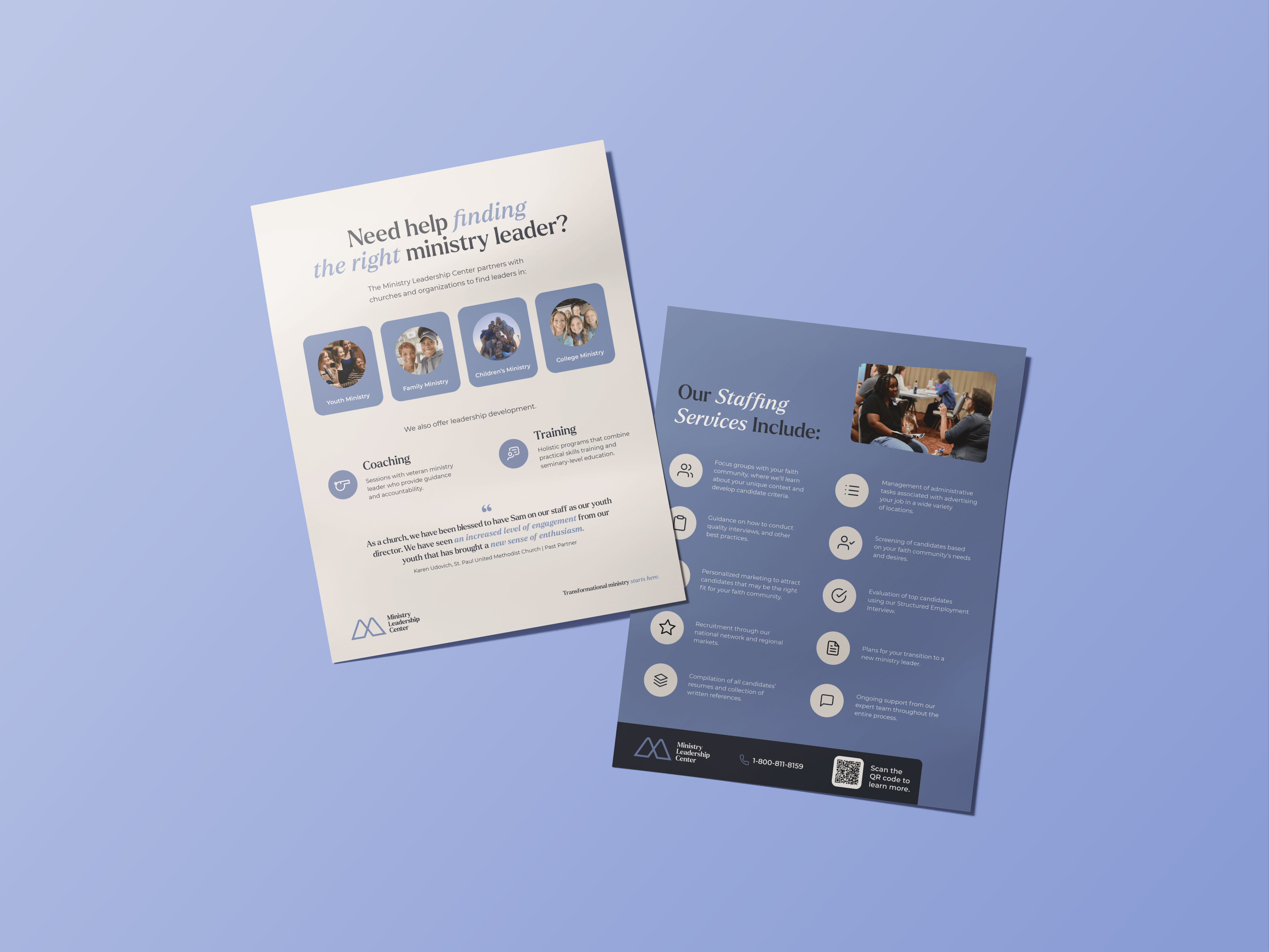
A strong nonprofit one-pager usually includes:
- A clear headline + mission statement
- 2–3 focus areas or programs
- 1–2 quick stats or impact highlights
- A clear next step (your call to action)
Think of it as the door-opener, not the full tour. Its job is to make someone want to know more, not to replace every other piece of communication you have.
Pro tip: Sometimes a two-pager works even better. If your programs are more complex or you need space for both a story and stats, stretching to two pages is totally fine. Just keep the same rules: concise, clear, and scannable.
Making It Donor-Ready
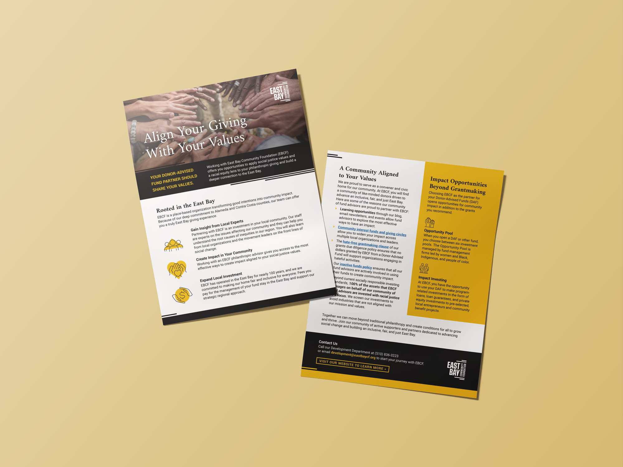
If you're sending that one-pager directly to a donor, the bar is higher. Donors want a reason to believe and a clear way to get involved.
One of the most consistent patterns I see in nonprofit materials: organizations lead with programs when they should be leading with people. Donors connect to outcomes and stories first, programs second.
A donor-ready nonprofit one-pager should:
- Lead with impact. Open with one strong stat or story that proves change is happening.
- Show a human connection. A photo, quote, or testimonial makes your mission real.
- Build trust quickly. Highlight recognizable partners, results, or community reach.
- Make the ask obvious. End with one clear, super visible action: donate, partner, or learn more (in button form if possible).
Your donor should walk away knowing EXACTLY how they can step into the story.

.avif)
Get The Annual Report Checkpoint

Donor Thank You Postcards Templates
Enter your info and we’ll send the postcards straight to your inbox:
5 Edits That Make Your One-Pager Work
Even seasoned communicators fall into these traps. The good news is each one has a simple fix. Run through this checklist and your one-pager will instantly feel easier to read and more compelling.
1. Cut the clutter
Most one-pagers are jammed with every program, stat, and tagline ever written for the organization. Narrow it down to your top 2–3 points.
Ask yourself: if someone remembers only ONE thing, what should it be? Start there and build out only what directly supports it.
2. Upgrade your headers
"About Us" doesn't exactly draw people in. Swap generic labels for headlines that tell a story such as: "How We Help Families Thrive" or "Where Your Support Goes."
Headers are prime real estate. Use them to move the reader forward, not just label sections.
3. Make the action super obvious
If the reader doesn't know what to do next, they'll do nothing. And no, a tiny website link in the footer doesn't count.
End with a clear, visible next step with a sentence of context: donate, volunteer, partner, or learn more. One action. Not five.
And if you want to have more fun with it, infuse your brand voice: join in on the fun, be the big sister they needed, give people a nourishing meal, the list goes on!
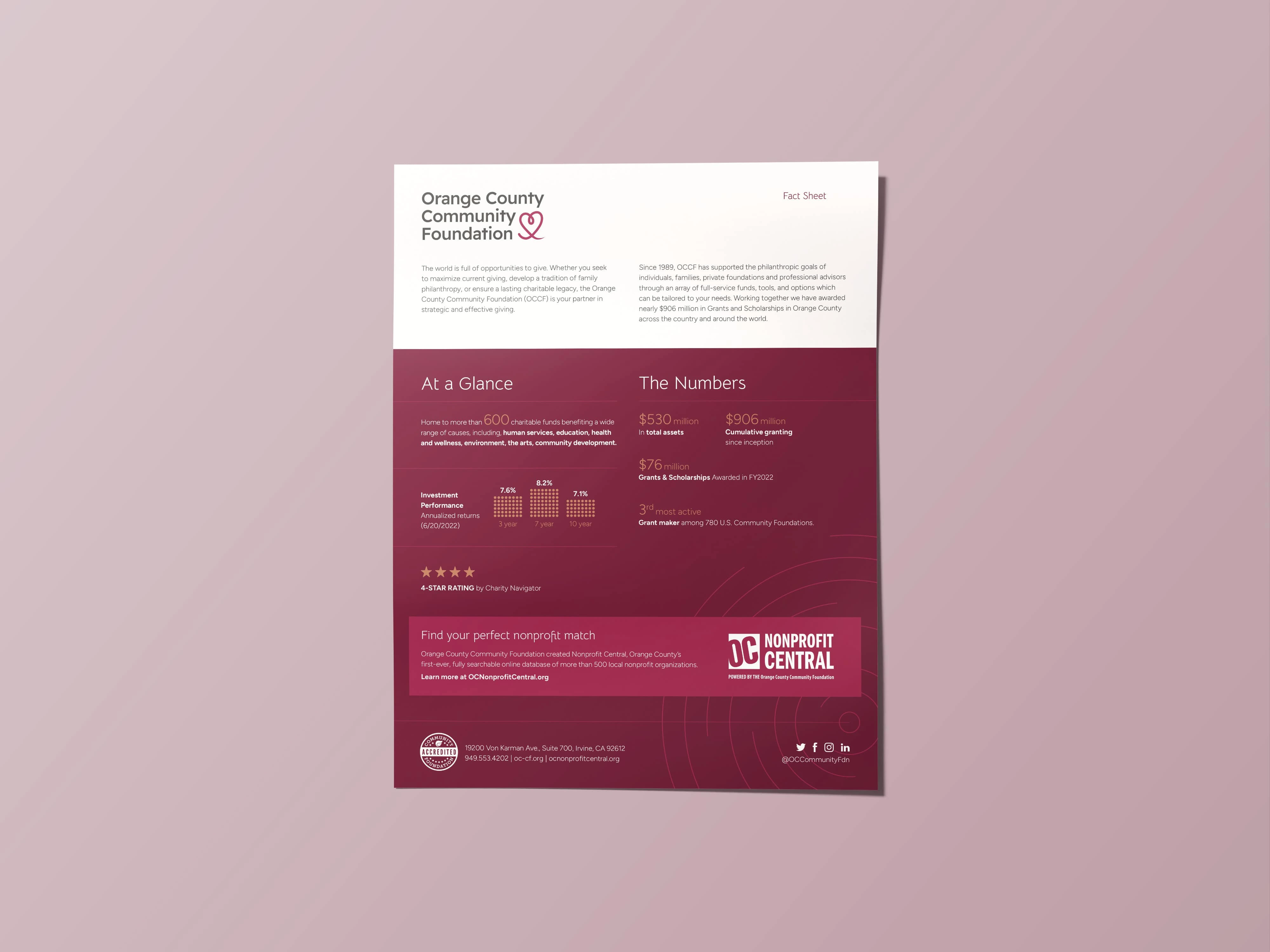
4. Lead with numbers or stories
A quick stat ("2,300 meals served last year") or a short quote connects faster than a paragraph ever will.
Don't bury your best proof of impact halfway down the page. It's your strongest asset so treat it like one.
5. Simplify the design
Fonts, colors, and photos should guide the eye, not compete for attention. Stick with two fonts max. One for headlines, one for body copy. One to two brand colors, with one used as an accent. And leave room to breathe. If everything looks important, nothing is.
If you want a starting point that already has the hierarchy built in, our Annual Report Template Kits include pages designed to work as standalone one-pagers, so you're not starting from nothing.
Nonprofit One-Pager Template: FAQs
Can a one-pager replace a full annual report?
Not really. A one-pager is great for snapshots like opening doors, starting conversations, giving someone a leave-behind. But funders and boards often need the depth that only a full annual report can provide.
Use both: one for quick engagement, one for detailed storytelling. Link the one-pager to the longer version so interested readers know where to go next.
Should I include photos or graphics?
Yes, if they're high quality and add clarity. A strong image or icons can break up lots text and guide the reader's eye.
When in doubt, one great photo beats four mediocre ones every time.
What if our programs are too complex for one page?
Then you need multiple one-pagers, one per audience or program. Each should be focused and relevant to that specific reader, not crammed with everything at once. Complexity is not a reason to abandon the format. It's a reason to use it more strategically.
Do one-pagers work for fundraising?
Yes, when they're clear, concise, and donor-focused. A well-designed nonprofit one-pager is often easier for a donor to read quickly and move to the next step than a longer document. The key word is designed, not just written.
Ready to go beyond your one-pagers?
If reading this made you side-eye your current one-pagers, you're my people.
One-pagers are powerful snapshots. They open doors and start conversations. But they work best when they're part of a larger content system, one where your annual report, your donor materials, and your one-pagers are all telling the same story in different formats.
You don't need to figure out layout, hierarchy, and visual flow from scratch. Our template kits give you a professional design foundation that's already doing the work, you just bring your content and make it yours.