If you're about to design your org's first annual report, first: take a breath.
I've worked with a LOT of first-timers, and I promise it doesn't have to be as overwhelming as it feels right now.
Whether you're a team of one or you've got a handful of people to pull it together, your first report can be something you're genuinely proud of without it consuming your entire quarter.
Here's what I wish every nonprofit team knew before diving in.
1. Content First, But Design Isn’t an Afterthought
It's tempting to jump into Canva or send a design request before you're fully ready. But without content, design is just dressing a moving target. Get your message settled first, it makes everything else easier.
Start by gathering:
- Your top 3–5 impact stories
- Key data points from the year (think: people served, funds raised, programs launched)
- A message from leadership
- High-quality photos that reflect your work
Then write with this framework in mind: shorter sections, clear headings, quotes worth pulling out, stats that could be visualized. The more intentional you are at this stage, the smoother the design process will be later.
But here's what gets skipped constantly: design should never be an afterthought. When we see first annual reports that fall flat, it's almost always because design got tabled until the last two weeks and the result looks and feels disconnected from the story the org was trying to tell.
Bring your designer or design-minded team member in early. Not to start designing immediately, but to think through flow, layout, and the kinds of visuals that will help your content land stronger.
2. Understanding Beats Cleverness Every Time
Your readers (donors, funders, partners, board members, community supporters) don't need 20 pages of jargon or filler. They need to understand what you did, why it mattered, and what's next.
This is one of the most consistent things we see when organizations come to us after attempting their first annual report on their own: the instinct to sound comprehensive works against clarity. More content doesn't mean more credibility. A focused report that answers three questions well is more powerful than a sprawling one that answers twelve halfway.
A few ways to keep it clear:
- Focus each page or section on one main story
- Use consistent, easy-to-read headings and subheadings
- Call out key quotes, milestones, and quick wins visually
When readers walk away with a clear picture of your outcomes, they're far more likely to stay engaged and keep giving.
A small environmental nonprofit came to us for their annual report knowing exactly what they wanted to say, they just needed help making it connect better with their community. They didn't have a big team or a big budget. They had a clear mission and a story worth telling.
"We really loved the annual report that Acton Circle created for our small environmental nonprofit. They followed our direction really well and made a beautiful and fun report that highlighted our programs perfectly."
3. Make It Easy to Read (Even for a Quick Scroll)
Not everyone will read every word. And that's okay. Your job is to make the most important stuff impossible to miss.
Design talks first. Every time. Before a supporter reads a single sentence, they've already formed an impression based on how the page looks and how the information is organized. A report that's visually overwhelming signals that the org itself might be hard to understand.
Simple ways to make your story shine:
- Use short paragraphs and bullet points (like this!)
- Highlight key stats and quotes with bold or callout text
- Add negative space (don’t cram everything in)
A well-designed first annual report respects your reader's time. When you design with skimmers in mind, more people absorb your message.
Get The Annual Report Checkpoint
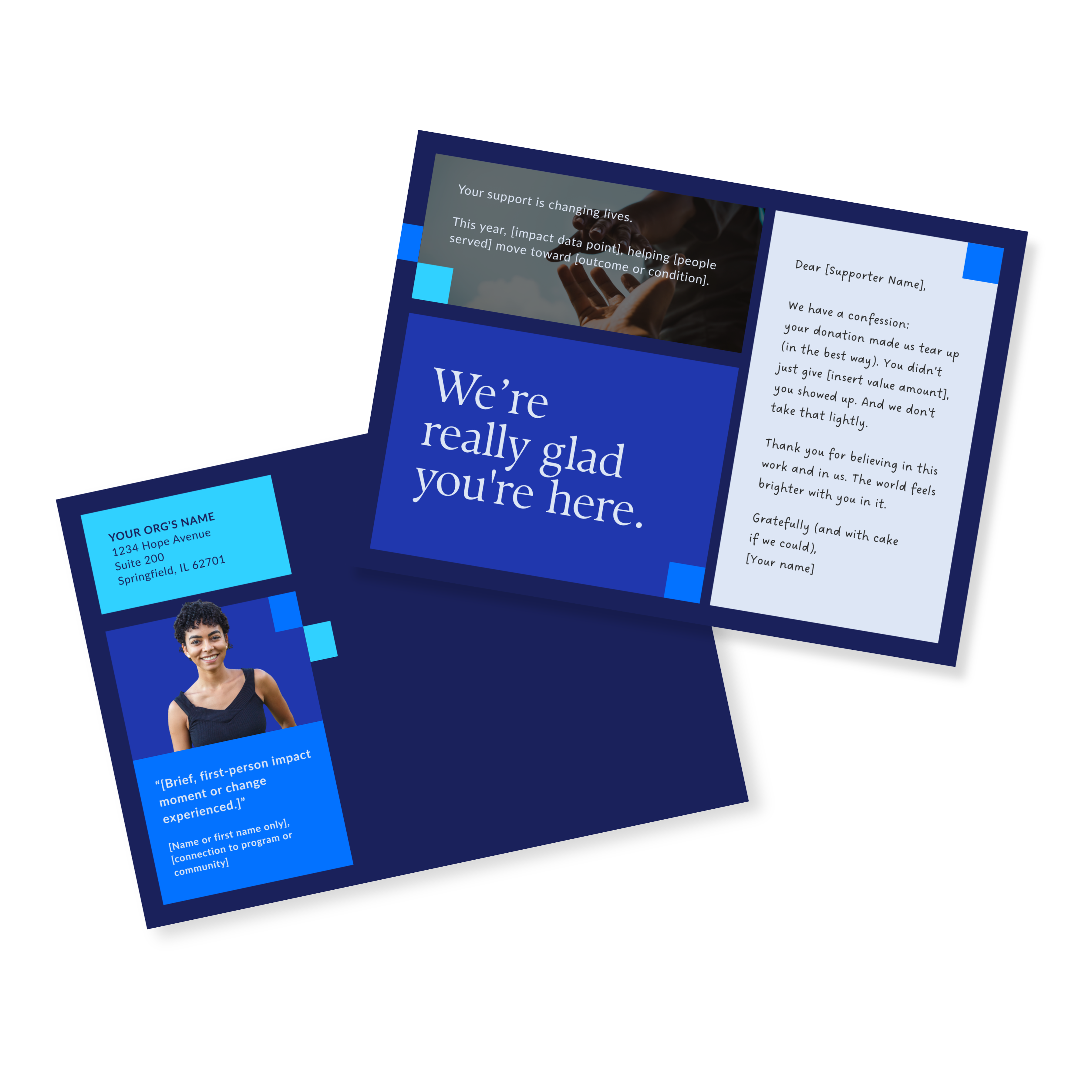
Donor Thank You Postcards Templates
Enter your info and we’ll send the postcards straight to your inbox:
4. It'll Take More Time Than You Think (And That's Okay)
I'm going to be real with you... your first annual report will almost certainly take longer than you expect. You're coordinating across departments, waiting on stats and stories, looping in leadership, and managing rounds of feedback from people who all care deeply but don't always agree. That's just the reality of it.
If you can, plan for at least 4–6 weeks of lead time.
One of the things I hear most from teams who've been through the process is that having the right system in place is what made the difference between stressful and manageable.
"I had a lot of pressure on my end from many colleagues to get a great product in a certain time frame. Working with Olivia eliminated my stress and created a great plan and product."
For a full overview of what you're building toward, the complete annual report guide is worth bookmarking before you start.
The earlier you start gathering content and feedback, the more space you have to make thoughtful decisions instead of rushing through the final week. The teams that finish their first report feeling good about it almost always started earlier than they thought they needed to.
A note on feedback rounds: get alignment on who has final approval before design starts. Nothing derails a first annual report faster than a new stakeholder appearing in round three with a completely different vision.
5. Not Every Organization Can (or Should) Hire a Designer
The difference between a stressful first annual report and a manageable one often comes down to where you start.
A good template gives you structure before things get messy. It's built for real nonprofit content like stories, stats, donor lists, and leadership notes, so you're not forcing your content to fit a generic layout.
Instead of fighting the design or guessing where sections should go, you can focus on what you're good at: telling the story of the year you just lived.
Our Annual Report Template Kits are built specifically for nonprofit teams doing this work in-house. Every layout is designed to work for annual report content, not just look pretty—so your first report feels intentional, not thrown together.
Turn a Year of Work Into a Report Worth Sharing
Your first annual report doesn't have to be perfect. It has to be true to your work and clear enough that supporters feel the impact of what you've built. That's the whole job.
If you're building in-house, the Annual Report Template Kits give you a proven framework to work within. Layouts built for nonprofit content, designed to save you time and cut down on the back-and-forth that usually buries first-timers.