Spoiler: an effective annual report is not all numbers and bullet points. It’s more than a document you have to check off your list—it’s a strategic storytelling tool.
When done right, your annual report should build trust, deepen relationships, and help your community and stakeholders understand not just what you did this year, but why it matters.
And yes, design is part of that story. We know it’s easy to write it off and treat it as an afterthought (especially when you’ve got an overflow of data and anecdotes to present). But good design should be baked into your report from the very beginning. Clear visuals, intentional layout, and strategic storytelling don’t just look good—they keep people reading and leave a lasting impression.
So, to answer the big question: How can effective annual report design improve stakeholder engagement and understanding of your business?
Three words: Clarity. Trust. Connection. Let’s break it down.
1. Help Stakeholders See Themselves in Your Story
Your annual report is your organization's chance to pull back the curtain: share real wins (and real lessons!) and say, “Here’s who we are. Here’s what we’re working toward. And here’s how you’re part of it.”
Whether it’s donors, board members, partners, or internal staff, stakeholders don’t want fluff or filler. They want transparency. An impact. An intention. A reason to care.
Great design turns your content into a compelling experience. It guides the reader through the report and spotlights what matters most. Instead of going through a wall of text or a dry PDF, they get a digestible, dynamic view of your year—and a deeper connection to your mission.
2. Design With Audience Vision in Mind
A good annual report design starts with a question: “Who is this for?”
Not all stakeholders look for the same things. Your board might want to review KPIs and strategic direction. Donors want to see how their contributions made a difference. Staff want to feel valued for the work they’ve done. And potential supporters? They want confidence in your mission and capacity.
If you want to speak to your entire community, it’s important to understand these differences in your audience’s needs and create a design that accommodates their expectations.
- Start strong with a visual highlight on your most significant outcomes. Potential supporters may not yet be invested enough to read the entire report, so you have to give them a reason to stay.
- Back up your “pitch” with strong anecdotes and impact stories. Show your community how much their help mattered. Inspire them to continue supporting your world-changing mission.
- Use compelling graphs and layouts to make metrics and complex data digestible. Sure, your stakeholders have to review those…but you can always make it easier for them to show them you care about their interests.
This is when design stops being just decoration and starts helping people understand your work and stay on the same page.
3. Use Design Principles That Actually Engage
Here’s the truth: stakeholders do judge your report by its design. But not in the way you think.
They’re not asking, “Is this trendy?” They ask, “Can I find what I need quickly?” and “Does this feel trustworthy?”
Good design answers with:
- Clean, intentional layout: Signals professionalism and earns trust.
- Consistent colors + typography: Strengthens brand recognition and credibility.
- White space: Gives readers room to think, process, and stay engaged.
- Visual hierarchy: Helps them focus on the right info at the right time.
- Charts, icons, infographics: Turn complex data into clear insights—fast.
Our annual report template kits were built to include these elements, allowing you to amplify your impact even on limited time or resources. Designs like these don’t just make your report prettier. They make it more readable, more memorable, and more likely to be shared.

4. Tell a Story (Not Just a Summary)
Your stakeholders don’t want a yearbook. They want a story with an intro, a plot, and a “what’s next.”
Start with your mission and the big “why” to set up your impact stories—this will allow you to highlight progress with clarity and humility. And, as much as you want to focus on the positives, remember to include honest challenges (it builds trust!).
Then, use testimonials, quotes, and character features to humanize the work. You want your readers to feel as if they’re truly on the journey with you, and let them know where that path is headed.
Remember: Keep the tone human. Speak with your reader, not at them. A conversational, mission-first voice helps them connect emotionally, so they stick around, donate again, and advocate on your behalf.
5. Make It Interactive
A well-designed report doesn’t have to be static (in fact, it shouldn’t be!). Digital-first reports open up a world of possibility.
Clickable navigation makes content easy to explore—your stakeholders won’t have to scroll from the table of contents all the way to your financial summaries on page 18.
Embedded videos and QR codes also add a touch more life to your programs. You can use them to highlight certain anecdotes or offer digital deep-dives into specific initiatives.
Lastly, feedback forms create a two-way dialogue and let your community know that you value their insights.
The goal is to make your annual report feel less like a PDF and more like a mini experience—something that engages and informs without the friction. That’s what our Microsite Design service offers: an immersive digital experience that cuts through the noise to amplify your impact.
6. Distribute Smarter for Better Reach
You put time, energy, and resources into creating this report, so don’t let it collect dust on a shelf (or in an inbox):
- Email it to partners and funders directly.
- Host a live webinar or walk-through session for your board.
- Post bite-sized highlights on social (yes, even on Instagram).
- Print and deliver key excerpts for major donors or community leaders.
In other words, make the most out of this one asset. Remember: smart distribution = better engagement.
7. Learn, Iterate, Improve
Your annual report should evolve just like your organization does.
Always start by asking: What resonated with stakeholders this year? What went unread, unnoticed, or underwhelming? What content got the most clicks, comments, or shares?
Gather feedback. Look at metrics. Then, use those insights to refine your next report—whether it’s layout, tone, or even the content structure.
The most effective reports aren’t just well-designed. They’re well-informed.
Final Thoughts
A thoughtfully designed annual report isn’t just a “nice-to-have.” It’s about giving your stakeholders a clear, authentic, and inspiring view of your mission and making them feel like part of it.
So if you’re tired of creating reports that don’t get read, or you’re ready to make your next one your best yet, let's chat.
%20(1).png)
Get The Belief-Building Annual Report Playbook
The Belief-Building Annual Report Playbook
Enter your info and we’ll send the postcards straight to your inbox:
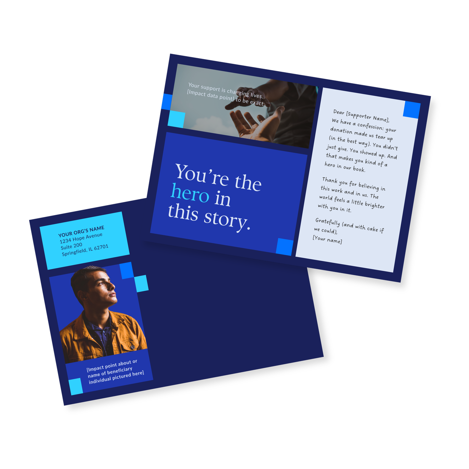
Donor Thank You Postcards Templates
Enter your info and we’ll send the postcards straight to your inbox:

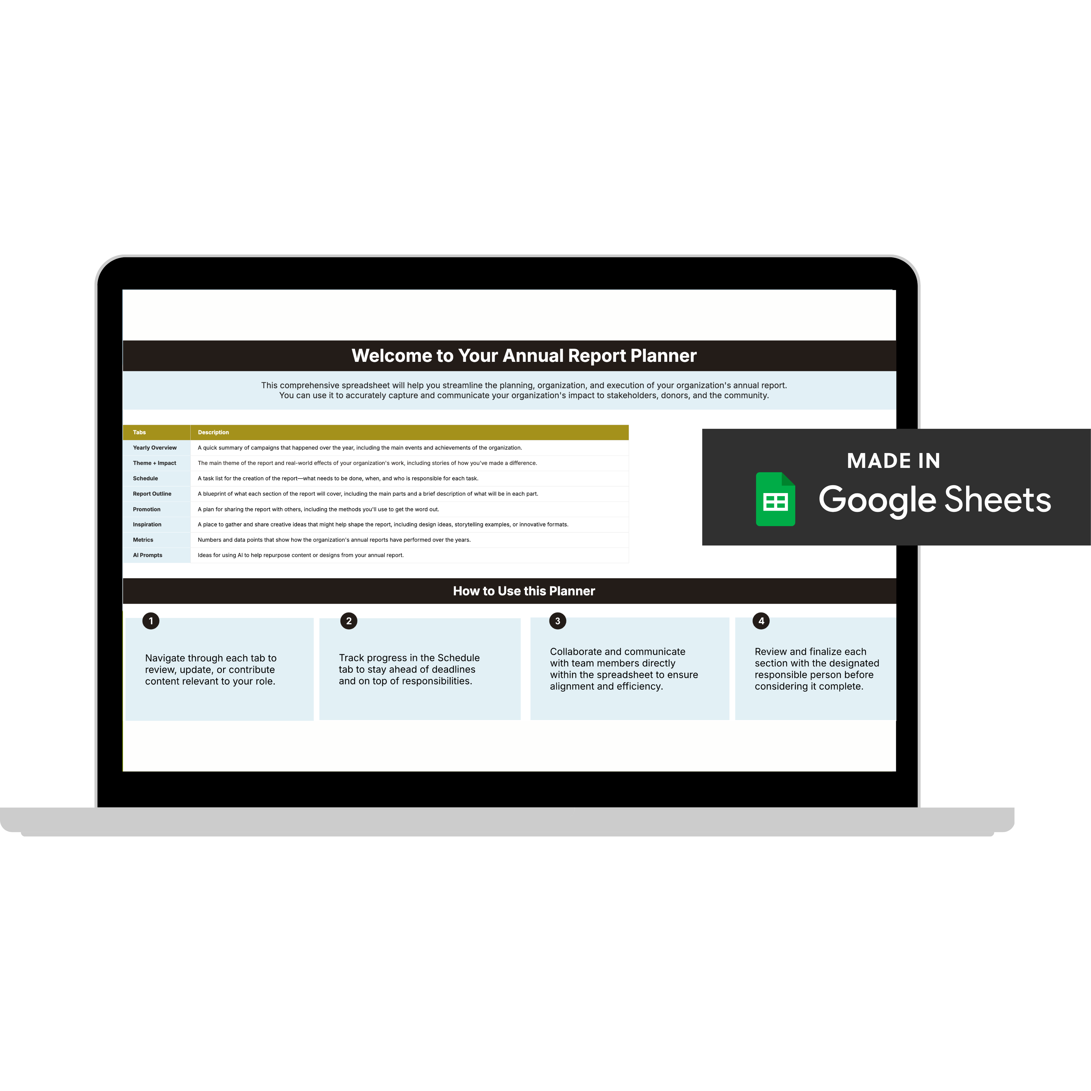
Annual Report Planner
Get a clear content roadmap so your annual report builds belief, earns trust, and actually gets used after launch—plus the same planning approach we use with our 1:1 clients, built in.