You’ve said it. In a meeting, to your ED, or just muttered under your breath.
“We really need to redo the website.”
But then something more urgent showed up. Grant deadline, board meeting, annual report season, pick your fire. The website project got pushed to Q3, then after the rebrand, then next fiscal year. You know the drill.
You know the website needs work. You can see the distance between who you are now and what your site still says. And that distance is costing you… big time.
This article is for development or marketing directors who understand the importance of design but keep putting the website on the back burner.
We're going to look at exactly where that gap hurts you most, including a connection to your annual report that most people in your seat don't see coming, and what you can do about it before the next report goes out, without starting over.
When Good Donor Communications Hit a Bad Website
If you're in comms or fundraising, design isn't a foreign concept. You've watched a strong annual report change the mood in a room. You know the difference between a donor who's moved and one who's just waiting for it to be over.
So no, this isn’t about convincing you that your nonprofit website design should be good. You already know that.
This is about a specific point in time that happens every year, and most people miss it.
Your annual report goes out. It’s pretty good. The photos are real, the numbers tell a story, and someone on your board even gets choked up reading it. Donors share it, people forward it, you post it on LinkedIn, and the engagement is poppin’ off.
And then those people Google you or follow your QR code.
They hit your website that hasn’t been touched since before your best program even existed. The brand and messaging doesn’t match (yikes). And neither does the energy (double, yikes).
All the momentum your annual report created... gone.
That’s the part of annual report season that’s easy to gloss over. All that care you put into your donor communications has to fall somewhere. If your nonprofit’s web presence doesn’t match what donors just felt, you lose them right at the finish line.
What an Outdated Nonprofit Website Costs You Every Month
Here’s what’s happening every month your website isn’t updated to reflect your work and org:
→ Donors who found your annual report can’t find the version of you they just believed in
→ Foundation program officers are pulling up your site before calls, forming opinions before you say a word
→ Potential volunteers are trying to figure out if you’re the kind of place where they belong
→ Major donor prospects are deciding whether you look like what they want to be associated with
You’re not in any of those moments, but your website is.
No one calls to say, “I almost donated, but your site felt outdated.” They just don’t give.
(Worth noting: 63% of donors prefer to give online. That’s who you’re making this impression on, every single day.)
Your Nonprofit Website Is Dated
If you’re still reading, your site probably needs more than a quick update. Something about it doesn’t reflect where your organization is TODAY. The urgency is gone, the story feels old, and a new visitor wouldn’t know why they should care.
All the right pieces, none of them super compelling. A visitor can find your programs, read your mission, and still leave without feeling anything.
That’s a bigger issue than a broken link or an old photo. A site that works but doesn’t inspire trust or taking the next step hurts your organization every day.
It’s easy to think, “it works, it’s fine,” while donors see something very different.
A quick way to tell: pull up your homepage right now and ask yourself:
→ Does the headline reflect your current programs, or the ones you were running two or three years ago?
→ If you put your most recent annual report and your website side by side, do they feel like the same org?
→ Can a first-time visitor find your best impact story in under 30 seconds?
→ Does your donation page feel confident enough to share with a major donor?
If you answered no to any of those, you already know where the issue(s) lie. And that may be exactly where donors are falling through the cracks.
You can also spot this happening by watching your team. They start making excuses like, “Sorry, the website is a little out of date,” during donor calls, before sharing a link, or in conversations where they should feel confident. That hesitation is a warning sign and costs you opportunities.
.avif)
Get The Annual Report Checkpoint

Donor Thank You Postcards Templates
Enter your info and we’ll send the postcards straight to your inbox:
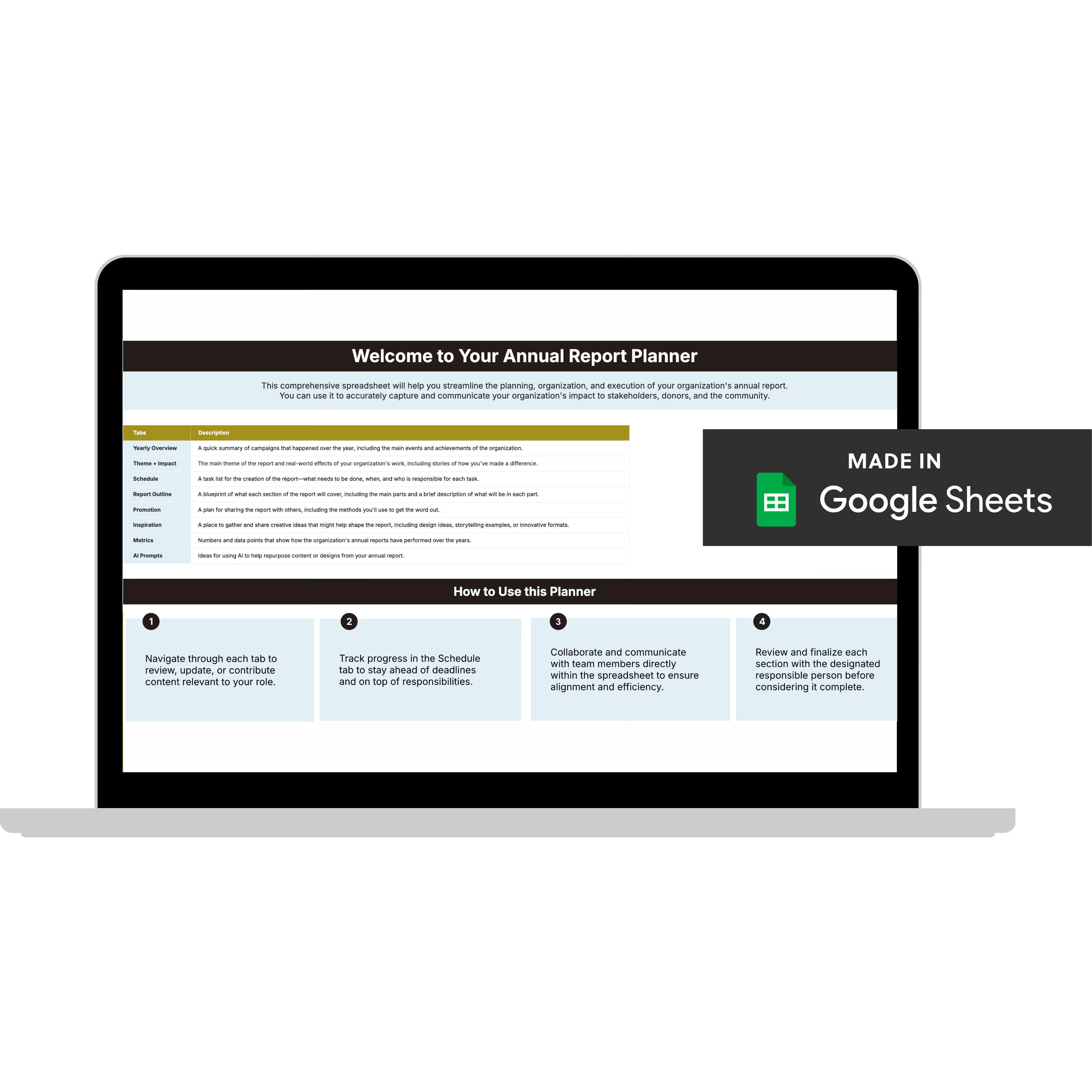
Annual Report Planner
Get a clear content roadmap so your annual report builds belief, earns trust, and actually gets used after launch—plus the same planning approach we use with our 1:1 clients, built in.
What Happens When Your Nonprofit Website Is Up to Date
After years of working alongside 60+ nonprofit teams, here’s what I’ve watched happen when the site finally matches the org:
→ The annual report traffic spike converts; visitors stay, explore, give
→ Donation rates go up because trust is already built before anyone reaches the giving page
→ New partners reach out because you look like you walk the talk
→ Your team stops apologizing for the website in donor conversations
How to Improve Your Nonprofit Website Before Annual Report Season
Listen, making the outside match the inside (soul of your org) doesn’t always mean starting over. There are real, targeted moves you can make, especially before annual report season, that shift things meaningfully.
Update your homepage messaging
Your homepage is usually the first thing people see after clicking through from your annual report. Even if nothing else changes, make sure the headline, imagery, and introduction reflect who you are now, your current programs, this year’s impact, and your authentic voice.
Old copy and images that don’t match your work create confusion. Fresh, accurate copy makes everything else easier to follow.
Make your annual report easy to find
Don’t hide it in the footer or bury it in financial pages. Place it in your main navigation or in a visible section on your homepage.
Donors who want to check your credibility before giving shouldn’t have to search for it. If your impact story is hard to find, they’ll wonder why.
Do a quick brand consistency check
Open your latest annual report and your homepage side by side. Do they have the same visual energy, color palette, and quality of photography? They don’t have to be identical, but they should feel like the same org. If not, it’s time for a deeper design discussion.
Review your donation page as if you’re a first-time donor
Is it fast, clear, and trustworthy? Every extra step between wanting to give and actually giving is a chance for donors to change their minds. A simple, confident giving experience is often the quickest improvement you can make on an outdated site.
You don’t have to fix everything at once. Choosing just one of these steps and doing it before your next annual report goes out is how you start securing more donations and support.
FAQs: Why Nonprofits Should Invest in Their Website
Is a nonprofit website an investment or an expense?
Just like you invest in your fundraising or program delivery, your nonprofit website is the foundation for everything else. When it’s strong, your annual report, campaigns, and donor stewardship all work better. When it’s weak, it undermines everything.
How does a nonprofit website help with fundraising?
Your website is the only fundraising tool that works for you 24/7. Someone can find you at 2 am, read your story, and decide if your mission is worth supporting, all without you being there. A strong website design means more people choose to give. Outdated design means missed opportunities.
How should a nonprofit website connect with its annual report?
They should feel like the same org, with similar visual language, mission clarity, and tone. Every year, annual reports bring a spike in website traffic as donors share them, board members forward them, and people click through to learn more.
If your website doesn’t match the quality of your report, that traffic won’t convert. Your annual report and website should work together to build donor belief in your mission and ultimately trust.
What makes a nonprofit website build donor trust and credibility?
Donors notice the difference between a site built for them and one made just to check a box. Use real photos, clear, impactful language, an easy giving experience, and, most importantly, messaging that shows who you are now, not who you were when the site was first built.
Annual Report Season Is Your Best Window for Nonprofit Website Investment
You already know that your website needs work. None of this is news.
Annual report season is one of the best times to make improvements. You’ve just created your strongest donor communication. The story is fresh, the brand is current, and the emotional momentum is strong.
Don’t send donors from that report to a website that doesn’t match what they just felt.
Most nonprofit teams have a donate button, but fewer have a page designed for someone who just finished reading your best story and is ready to give. That's where giving decisions are lost.
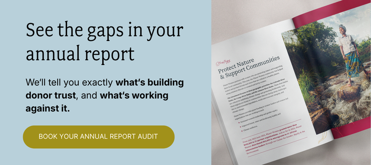
This handoff is part of what we look at in the Annual Report Audit. Bring your current report to a 45-minute call, and I'll score it against our BELIEF by Design™ framework, including where it's sending donors and whether the ask survives the jump.
You'll walk away with:
✅ Every gap in your report, named
✅ What each one is costing you in donor response
✅ Where donors drop off between your report and your giving page
✅ Your #1 fix, prioritized and ready to act on
✅ The scores, yours to keep (with us or without us)
If your next annual report is already in the works, this is the right time to have this convo.