Educational equity nonprofits carry a specific kind of reporting pressure. You're not just showing what you did, you're making the case that access and opportunity are worth investing in, year after year, for students whose outcomes depend on it.
I've designed annual reports for organizations doing exactly this work, and the ones that move donors aren't the ones with the most data.
They're the ones where the story and the design are working together. Here are five examples from our portfolio, and what you can take from each one.
What Makes an Educational Equity Annual Report Connect
Before the examples: a quick framework for what "connecting" means here.
Educational equity is a complicated story to tell. You're not selling a product. You're making the case that systemic barriers exist, that your programs address them, and that donors' investment is part of the solution. That's a lot to ask of a PDF.
In my experience, the reports that connect the best aren't the most beautifully designed. They're the ones where the design and the story are working toward the same thing: making the reader feel the weight + urgency of the problem AND the possibility of the solution in the same breath.
That's the standard I hold these examples to. Not "does it look good?", but does it build belief?
1. 10,000 Degrees: Turning Data Into Something You Can Feel
Format: Microsite + Print/Digital Report + Donor Booklet
Focus: Student outcomes and donor impact
10,000 Degrees helps students from low-income backgrounds get to AND through college which is a distinction a lot of organizations miss. Getting there is one thing. Staying there is another. Their annual report makes that distinction visible.
What they did well: complex impact data presented across three formats (microsite, report, donor booklet) without losing coherence. Each piece serves a different reader at a different moment in their donor journey, but they all feel unmistakably connected.
What I'd borrow:
- The microsite makes scrollable charts feel natural, not clinical. Data should move with the reader, not sit there waiting to be analyzed.
- Every number is paired with a human story. This is non-negotiable in my book. Data without a heartbeat is just noise.
- The design consistency across formats is doing serious credibility work. When your print booklet and your microsite feel like they belong to the same story, donors trust you more. Full stop.
The takeaway: Make your impact page the visual centerpiece. If someone only reads one section, that's the one that should capture results AND emotion in a single scroll.
A communications leader at 10K Degrees described the response simply: some said it was the best-designed materials they'd had to date. That kind of reaction doesn't come from a report that just looks polished, it comes from one where the design is doing real organizational work.

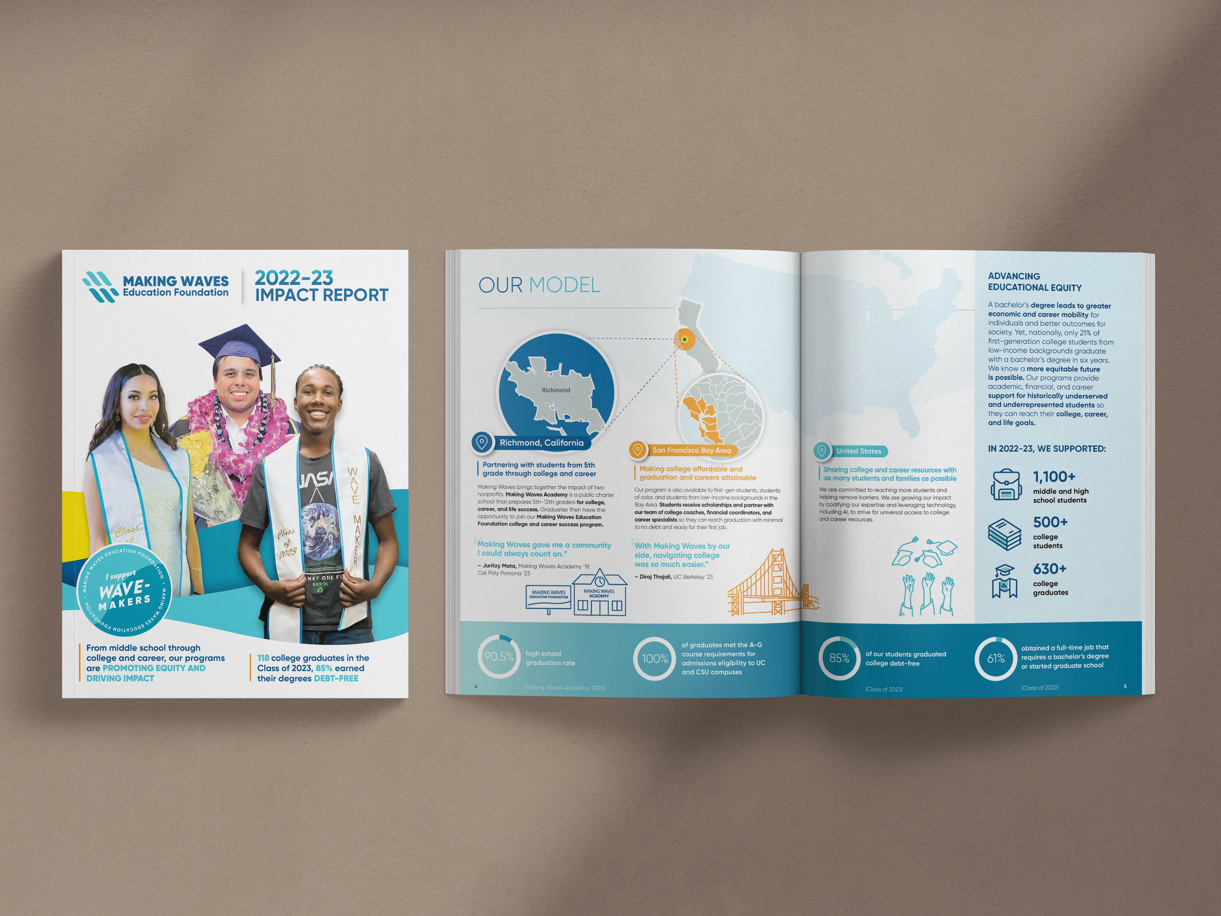
2. Making Waves Education Foundation: Data and Story in Actual Harmony
Format: Digital + Print Hybrid
Focus: Long-term student success
Making Waves has been doing this work since fifth grade through college and career, which means their story isn't about a single intervention. It's about a system. And their report actually shows that system working.
Most organizations with a long-term model struggle to communicate it visually. They either oversimplify (one inspirational quote, no context) or overexplain (five-page program summary that loses everyone by page two). Making Waves found the middle.
What I'd borrow:
- Their "Our Model" section illustrates how programs connect across years. If your work spans multiple stages or populations, showing the through-line is more powerful than showing each piece in isolation.
- Data sits next to testimonials throughout and not in a separate "by the numbers" section. Readers see the full story, not a fragmented one.
- Soft gradients and real student photography do a lot of emotional lifting without being heavy-handed. The visuals feel warm without being saccharine.
The takeaway: For every big number, find one small story that proves why it matters. Not in a separate section. Right next to it.
The VP leading marketing and storytelling at Making Waves Education Foundation has worked with us across four consecutive annual reports. What keeps the work strong year after year is the same thing that makes this particular report work: the data and the human story never get separated.
"Olivia takes the time to really understand our nonprofit organization's mission as well as the goal, audience, and style for each project."
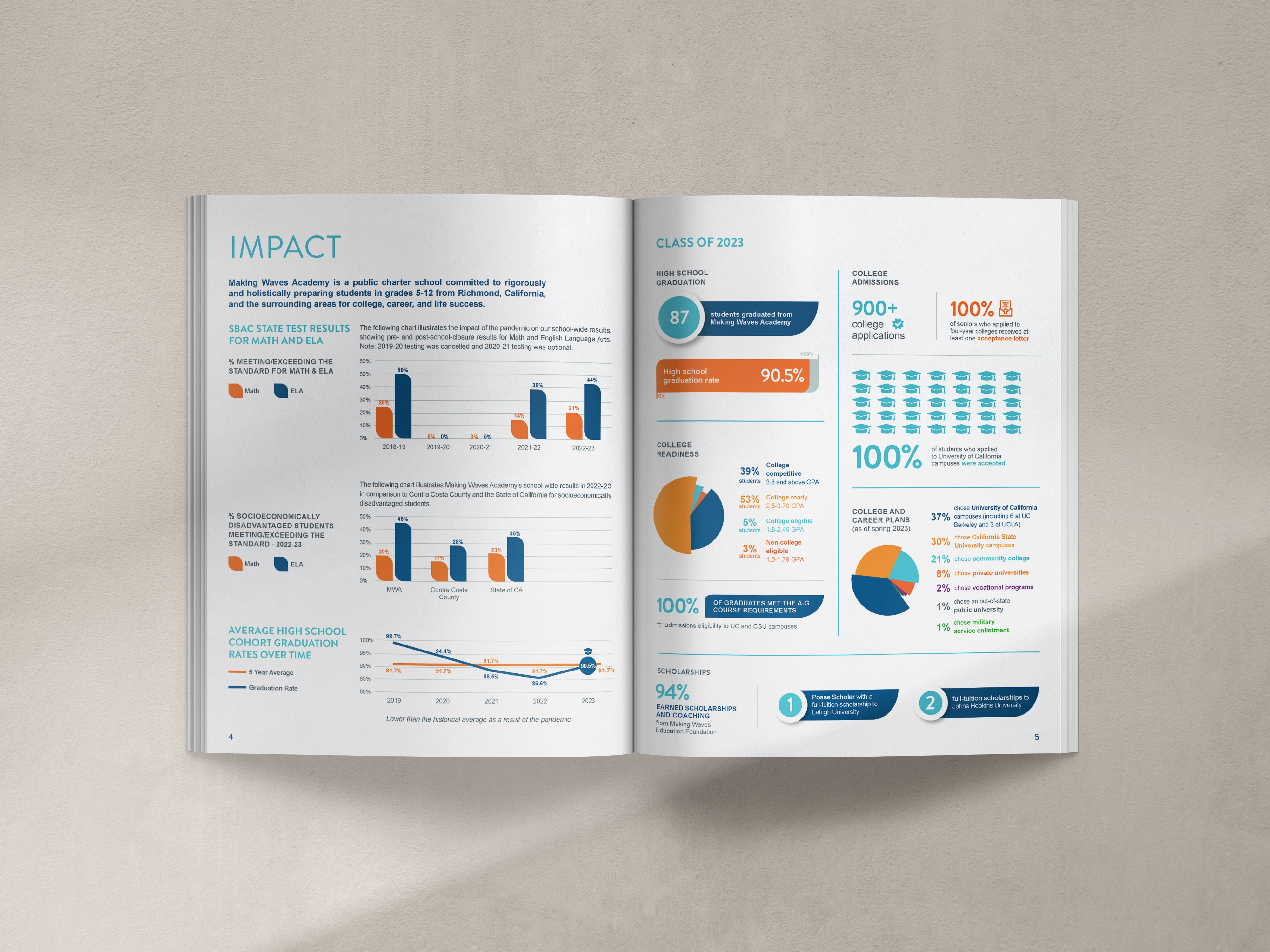
3. Making Waves Academy: Academic Reporting That Doesn't Feel Academic
Format: Interactive PDF + Print
Focus: Charter-school achievement and college readiness
Charter schools have a particular challenge with annual reports: their audiences are wildly different. Parents care about their kid's school. Funders care about outcomes at scale. Donors care about whether this model is worth supporting. Educators care about the methodology.
Making Waves Academy's 2023 Impact Report manages to speak to all of them without feeling like it was written by committee. That's harder than it sounds.
What I'd borrow:
- The visual hierarchy is doing real work: large headlines, quick metrics, short blurbs. It respects the reader's time without dumbing down the content.
- Their "By the Numbers" page is designed to be pulled out and used as a social graphic. I love this intentionally. If you're not designing your report with repurposing in mind from the start, you're leaving content on the table.
- Design alignment with the Foundation's materials reinforces a shared mission. When your academy and your foundation look like they're on the same team, donors feel the coherence of your work.
The takeaway: Design for all three attention spans in your audience: the skimmer, the scanner, and the reader who wants the full story. A well-structured report serves all three without compromising for any of them.
.avif)
Get The Annual Report Checkpoint

Donor Thank You Postcards Templates
Enter your info and we’ll send the postcards straight to your inbox:
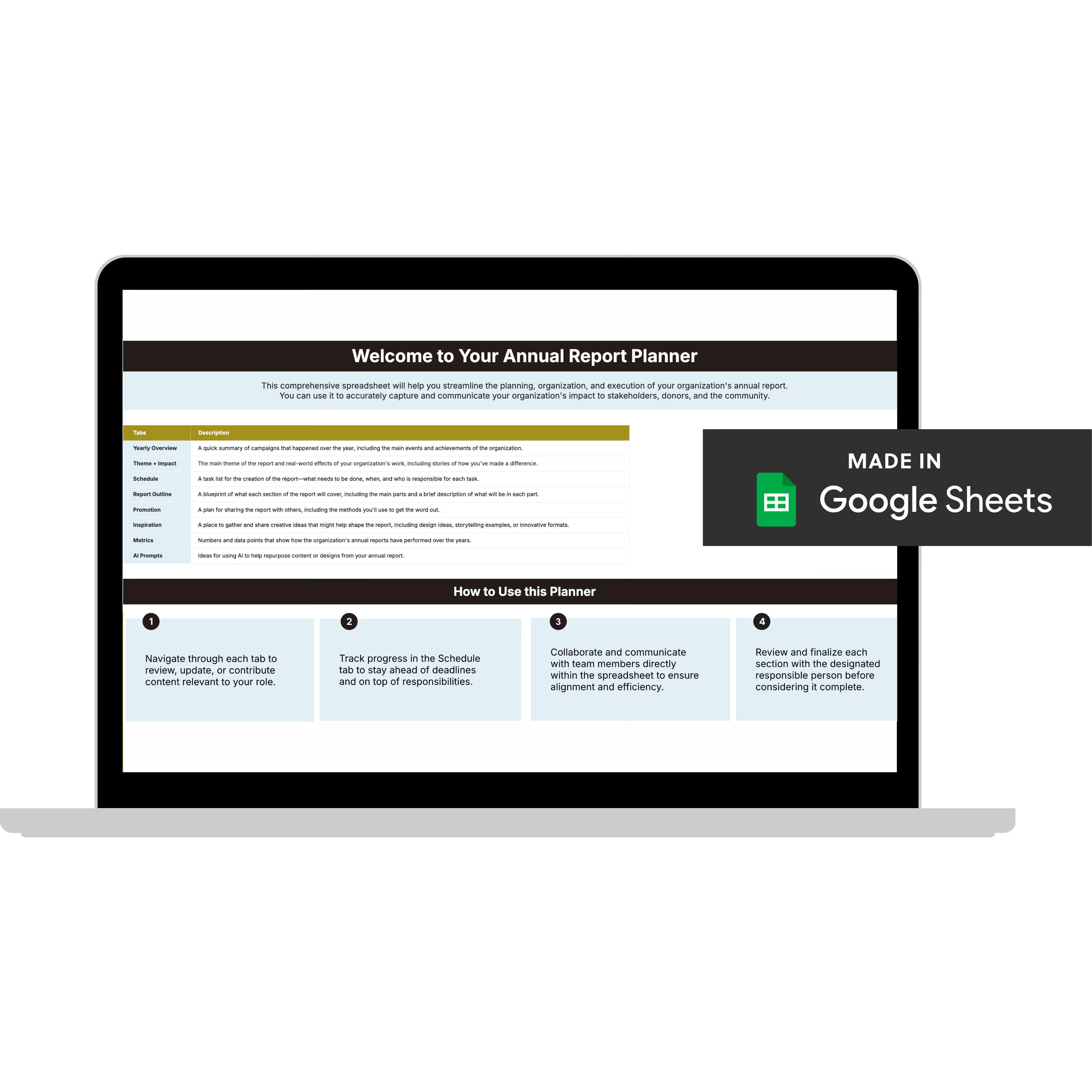
Annual Report Planner
Get a clear content roadmap so your annual report builds belief, earns trust, and actually gets used after launch—plus the same planning approach we use with our 1:1 clients, built in.
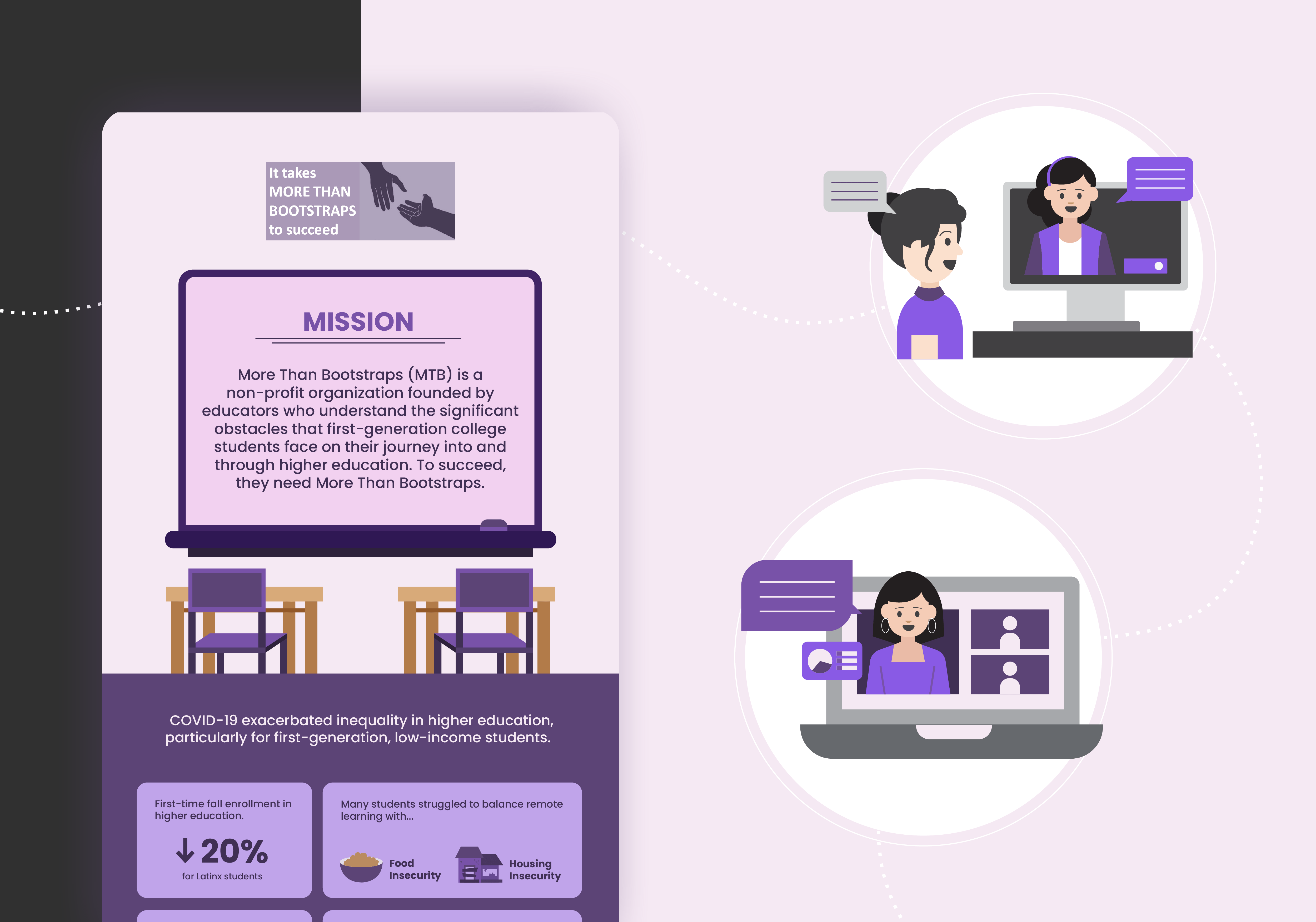
4. More Than Bootstraps: Proof That Small Teams Can Make a Big Statement
Format: One-page infographic
Focus: First-generation college student outcomes
I have a lot of respect for this one. Not because it's the most elaborate, it's the opposite. More Than Bootstraps distilled a full year of impact into a single bold visual, and it works precisely because they didn't try to do more than that.
There's a tendency in small nonprofits to apologize for not having a 20-page report. Not always necessary. A single infographic that communicates clearly is worth ten pages of content nobody reads.
What I'd borrow:
- It opens with the challenge (college access gaps) before celebrating progress. This sequencing matters. Leading with the problem before the solution builds credibility and emotional investment simultaneously.
- Color and typography direct the eye in seconds. When you have one page, every design decision is load-bearing.
- It's designed to live in different spaces: embeddable in newsletters, printable as a poster, shareable on social. Format as strategy, not an afterthought.
The takeaway: If your team is small and your budget is tight, start here. One great infographic beats a 20-page PDF nobody opens. Constraints force clarity.
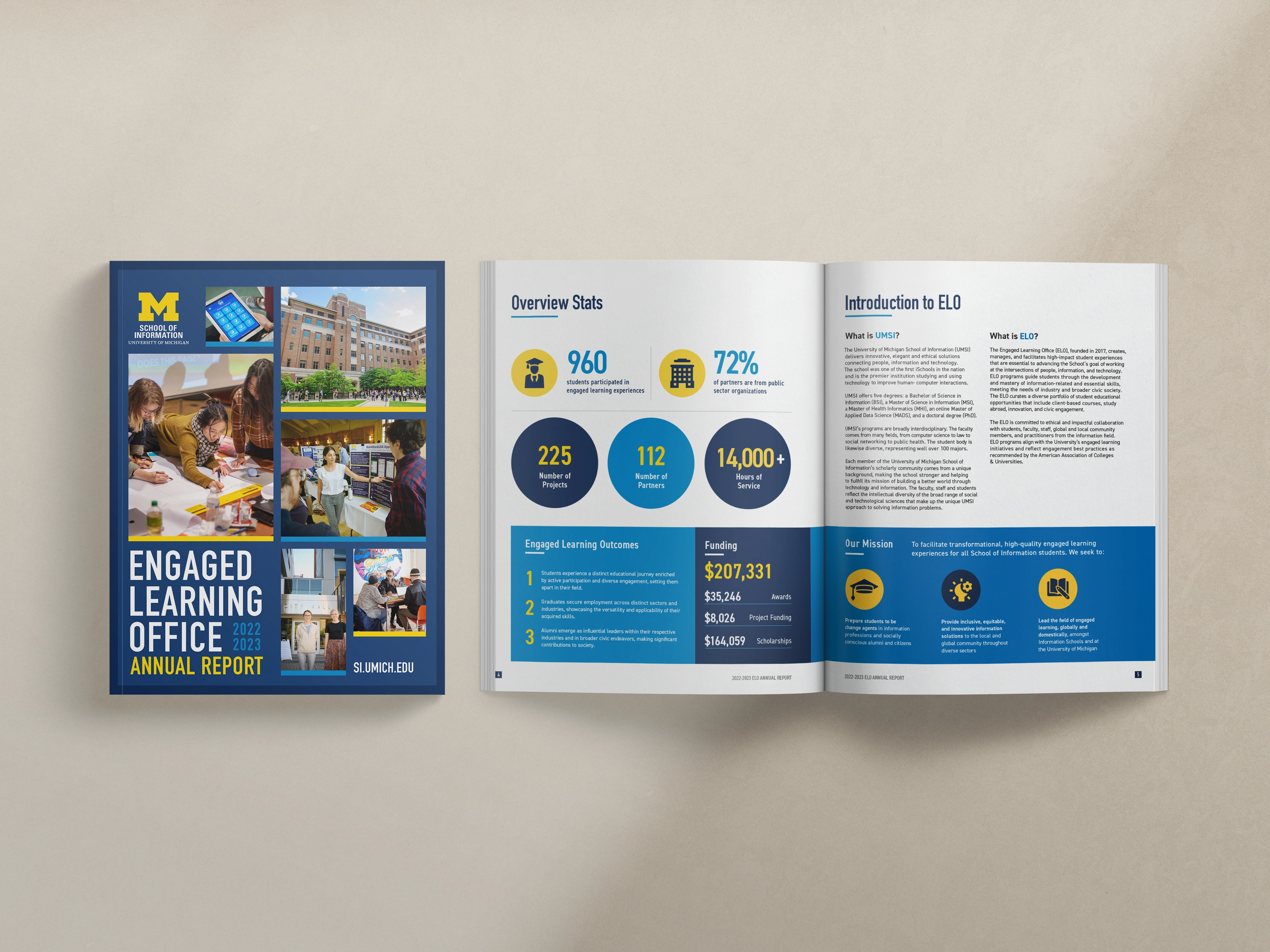
5. University of Michigan, Engaged Learning Office: What Institutions Can Learn From This
Format: 28-page Digital + Print Annual Report
Focus: Access, civic engagement, and community-based learning
UMich ELO isn't an educational equity nonprofit, and I want to be upfront about that. They're a university office focused on experiential learning for graduate students. But I included them here because they solved a problem that equity organizations wrestle with constantly: how do you make large-scale work feel human?
Because that's the trap. The bigger the org, the more the report starts to read like a brochure for the institution rather than a story about the people it serves. UMich ELO avoided that, and the way they did it is worth studying.
What I'd borrow:
- They let the community stories lead, not the university brand. For an institution of that size, that's a deliberate choice. The people don't feel like footnotes to the mission.
- 960 students, 225 projects, 112 partners, 14,000+ service hours—impressive numbers that land because they're wrapped in context, not presented as proof of scale.
- Each section (Civic Engagement, Course-Based Learning, Global Engagement) blends data and narrative consistently. The structure is doing the heavy lifting so the content doesn't have to.
The takeaway: If your equity org is growing and you're worried about starting to sound institutional, this is the antidote. Clarity + story + structure keeps the people at the center even when the numbers get big.
What Every Strong Educational Equity Annual Report Has in Common
After designing and reviewing reports across this sector for years, here's what I keep seeing in the ones that move people:
- Lead with outcomes. Show measurable change right up top, not buried in an appendix.
- Humanize the data. Every chart deserves a face or a quote next to it. Every time.
- Design for ease. Short sections, strong visuals, generous open space. Your reader is busy.
- Show gratitude with intention. Donor recognition that feels like an afterthought IS an afterthought.
- Invite action. End on next steps, not periods. What do you want readers to do after they close this?
The best annual reports help people feel your mission. Design that's simple, intentional, and human isn't a nice-to-have for educational equity work, it's the work. Because if your report is hard to read, it's not equitable communication.
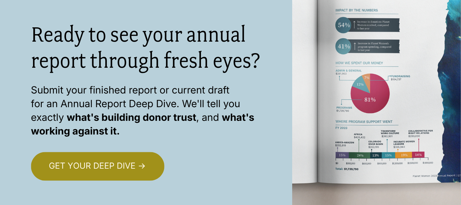
Ready to get your story and design working together?
You've seen what it looks like when they are. The reports that move donors are the ones where every design decision is pulling in the same direction as the story.
The Annual Report Deep Dive is where we start. I'll go through your report page by page and tell you exactly what's working, what's quietly working against you, and what to fix first.
You'll walk away with three things:
✅ A Loom video walkthrough: me reviewing your report live, page by page, with real commentary on what I'm seeing and why it matters. Share it with your boss, your board, your whole team.
✅ Your BELIEF by Design™ Scorecard: your report evaluated across six areas: audience clarity, narrative trust, visual credibility, data presentation, emotional arc, and repurposing potential. You'll know exactly where you stand.
✅ A Priority Action List: ranked, specific, and ready to use. What to keep, what to cut, what to restructure, and what to add. No guesswork.
All of it delivered in 3 business days. And if you want to talk through implementation together, you can add a 60-minute strategy call.
Everything else (the design, the templates, the full-service work) flows from here. But this is where we start.