How to Improve Donor Engagement on Your Website

Written by

the Acton Circle Team

/

Updated

May 3, 2024

Donor engagement isn't just nice to have—it's EVERY thing. The more your donors feel connected to your work, the more likely they'll stick around and tell their friends about you.

A solid donor relationship strategy hits multiple touchpoints: recognition, showcasing donors in your annual reports, staying present on social. But here's the thing—your website is the *one* place where everything converges. New supporters land there first. They're checking out your mission, values, impact. And yeah, that's where they should figure out how to support you.

Think of your website as the front door of your nonprofit. It's where decisions get made.

How Website Design Moves Donors

Your supporters' giving mood depends on three things: the stories you tell, how you tell them, and whether they see themselves in your mission. That's what shapes your website design—it's gotta be compelling, crystal clear, and built to convert.

Obviously your setup depends on your nonprofit's work. But EVERY organization should nail these four things:

1. Messaging and Storytelling

Good storytelling lives at the intersection of branding, design, and words. You need to know your audience, communicate something real, and make it *look* good while you're at it.

Your website should tell a story that moves. One that shows what your organization stands for and why it matters. When donors read your copy, they should *feel* the impact of their contribution—before and after.

2. Branding

Your brand is how people know what to expect. Are you sharp and professional? Warm and scrappy? Authoritative or grassroots? That feeling hits before a single word gets read.

Brand is the bedrock of good messaging and design. It dictates how your site looks and how you write. If your brand doesn't match who you *really* are, fix that first before redesigning your website.

3. User Experience

For nonprofits, good UX means more than speed (though that matters). It's about information architecture, visual flow, and whether things make sense. If your site is confusing, donors bounce before they reach your donate button.

Make it dead simple to explore your mission, values, programs, impact, and next steps. A clear path to your donation page? Non-negotiable. Donors want proof their money creates change.

4. Connection Building

Some supporters need to see your impact in action before they commit. They want to know what's happening *now*, who's involved, and what difference they'd be making.

So make it easy. Events, newsletter signup, social links—all obvious and accessible. Let people stay close before they give.

Let Your Website Do the Nurturing

If donor engagement on your site feels weak but you're intimidated by the overhaul, start simple. Do a quick audit from a donor's perspective.

Visit your own site like you've never seen it before. What's the first thing you notice? Can you find your mission? Navigate easily? What feels broken or buried? Write it down.

If you've spotted multiple friction points—or if there's just no obvious way for people to act or connect—a redesign might be your next move. That's where we come in. We've worked with 60+ nonprofits since 2019 using our BELIEF by Design framework.

At Acton Circle, we design nonprofit annual reports and interactive digital experiences—landing pages, microsites—that keep donors engaged all year long, not just at grant time.
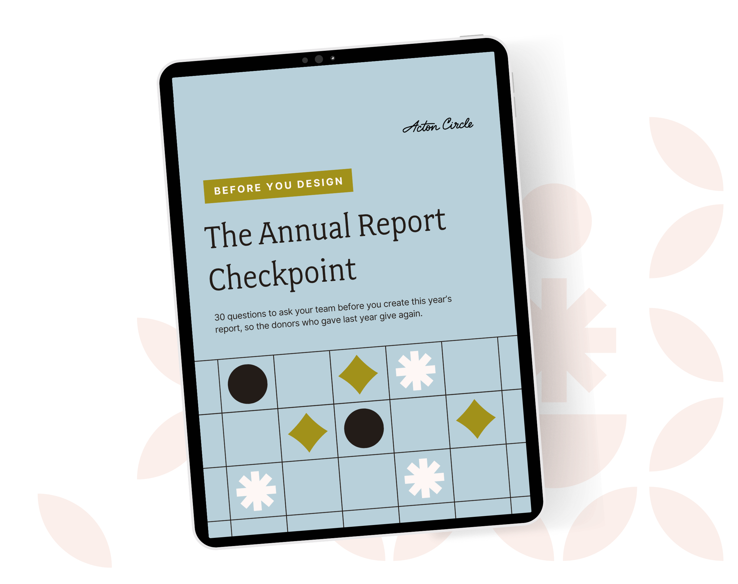
Get The Annual Report Checkpoint
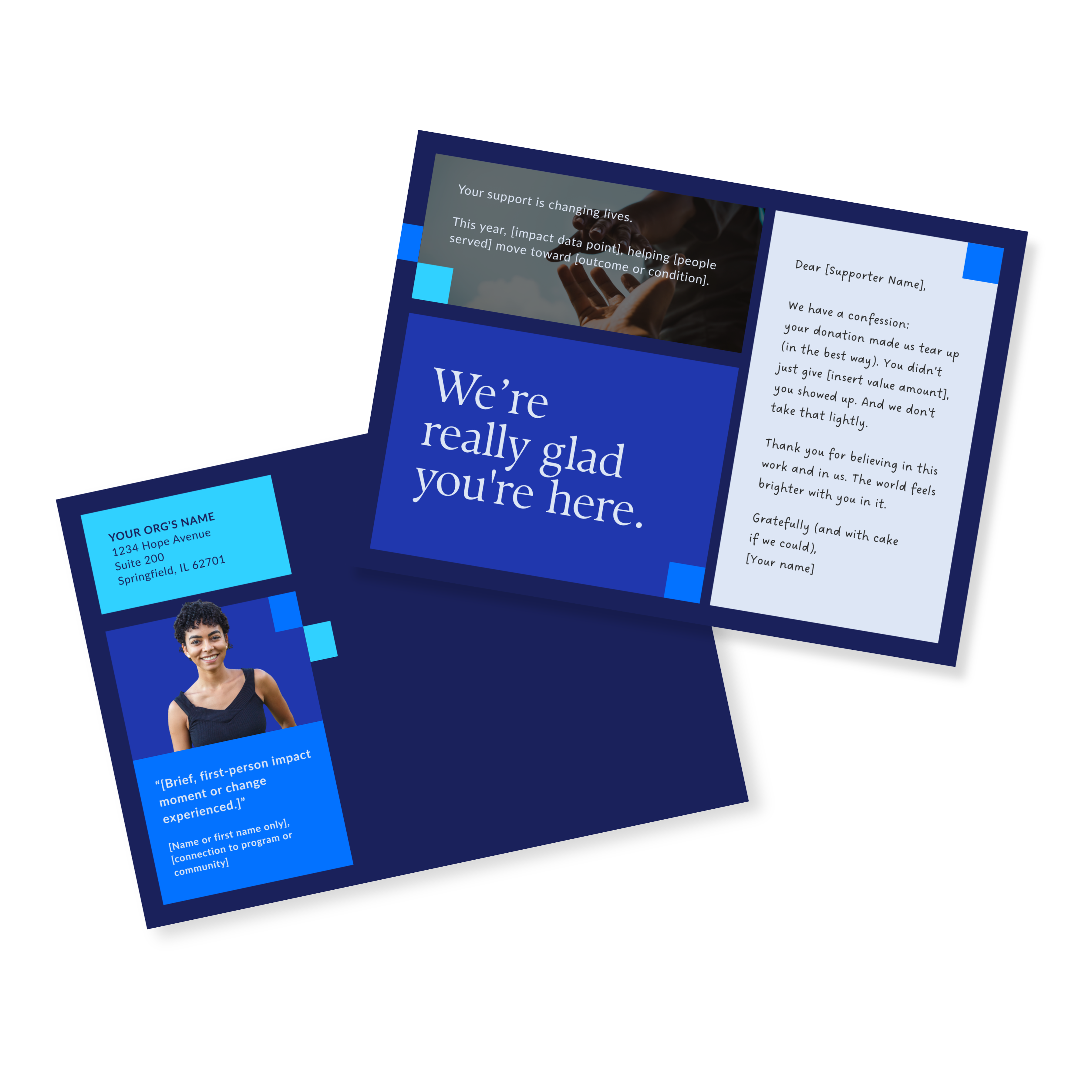

Donor Thank You Postcards Templates

Enter your info and we’ll send the postcards straight to your inbox:

Monthly Design Workshop

If you’re the one who usually handles design at your org, this is meant for you. You’ll leave with useful design tips you can start using right away.

see upcoming sessions
👋🏽 Hi, I'm Krista Reyes

I'm a writer and editor with almost a decade of professional experience. I spent most of my formative years working with local and international nonprofits, channeling my passion for worthy causes into written works with depth, value, and intention.

If I'm not working, you'll find me reading books, watching movies, playing chess, or bonding with my four dogs.

👋🏽 Hi, I'm Olivia Wheeler

I'm a creative leader with high standards for nonprofit storytelling. I work between homeschooling and gym sessions, obsess over typography, and believe your annual report should make supporters feel your mission in their bones.

I help nonprofits connect with new audiences and look like the org they're becoming, not the ones they were five years ago.

The stuff you’re wondering, answered straight

Why only 1 in 4 donor ever gives again

Your annual report is a stewardship and retention tool waiting to be used.

Most orgs treat it like a formality. Design it, ship it, forget it. Then wonder why the same donors don't show up again next year.

Donors leave because nobody showed them their gift mattered after they gave it.

First-time donors are THE MOST fragile group you have. One good report = a second gift.

We wrote about exactly how to use your annual report as a stewardship tool, not just a recap: Your Annual Report Is a Stewardship Tool. Here's How to Actually Use It That Way.

Why only 1 in 4 donor ever gives again

Great work along does not raise money

Programs don't fund themselves. Understood value does.

You can run the best program in your sector and still lose funding, because funders and donors don't fund what you did. They fund what they understood.

Most impact sections list activities. Meals served, kids reached, hours logged. None of that tells anyone what changed.

The gap isn't your work. It's the translation between your work and what the reader actually feels reading about it.

I broke this down here: How to Measure Your Nonprofit's Impact (And Make Sure It's Felt)

Great work along does not raise money

Where donors stop reading

Donors give you a few seconds before they decide if your report is worth their time.

Dense pages, no hierarchy, and nothing to pull the eye to what matters don't help.

I wrote about what actually earns attention in that window here: Annual Report Layout: Tips for a Report Donors Will Read

Where donors stop reading

A faster way to build your report

So you're doing your annual report solo again this year, huh? Same deal as last time: last year's PDF open in one tab so you can copy the bones, and a blank Canva doc that doesn't carry a single thing over.

A template is the thing that should've existed the first time you did this solo.

Here's a better approach to your report if you're handling it in-house: The Faster Way to a Beautiful Annual Report

A faster way to build your report

What you're not pulling from your own report

Your annual report is the most content-rich thing your org makes all year. And then it just sits on your website.

Real stories, real numbers, real proof your mission works, all sitting in one PDF that gets opened once and forgotten.

That same content could be twelve LinkedIn posts, three newsletter sends, a case study, a slide for your next pitch deck. Every one of those keeps your mission in front of donors between asks, not just during them.

More on how to make your report work past launch day: Simple and Flexible Annual Report Ideas for Busy Nonprofits

What you're not pulling from your own report

Explore more articles

Branding & Marketing
What belongs in a nonprofit brand guide, and what's just bloat? From lengths and chart rules to common pitfalls, let's dive into it.
Branding & Marketing
Learn how to build a nonprofit brand that earns donor trust, increases recognition, and supports fundraising with practical branding strategies and examples.
Branding & Marketing
Most nonprofits do good work. So why do some thrive while others struggle to stay funded? Here are 7 tips for running a successful nonprofit organization.