Your nonprofit’s website is one of your most important assets. It is how you get discovered online and often serves as the first touchpoint for potential donors.
That is why it is essential that your website is accessible to every future supporter, whether they have low vision, are hard of hearing, or have other disabilities. Accessibility helps nonprofits reach more people, serve their mission, and build trust.
As a nonprofit, your organization has an impressive trait: making change and pushing back against your community's biggest struggles. With that mission comes responsibility to provide access to all, and you can start today by improving your nonprofit web accessibility.
How to Make Your Nonprofit Website More Accessible
Website accessibility is increasingly important and it's designed to help everyone be included and have access to the same information.
With more people discovering your website, understanding your mission, and noticing your impact, your community grows. You connect with donors you'd never have found otherwise.
Your nonprofit might feel the ethical pull to create an accessible website. You may also have a legal responsibility. Many nonprofit websites are subject to ADA or state accessibility laws.
Both should matter. Neither should create paralysis. Here's the practical truth: you can take it step-by-step and improve your nonprofit website accessibility over time with a clear goal and timeline. Small wins compound.
Here's how to start:
1. Use a clear heading structure
A clear heading structure improves the organization of content, making it easier to scan and understand. It also enhances search engine optimization (SEO), making your website easier to rank on Google.
When it comes to maintaining an accessible website, a clear heading structure also aids screen reader users in navigating sections. The easiest way to do this with blog posts is to use H1 headings for titles and H2 headings for sections of your text.
2. Add alt text to your images
Alt tags (alternative descriptions) are written copy that appear when an image fails to load. They're also an easy accessibility win.
Image alts should describe what's in the image, usually with context. Alt text helps screen-reading tools describe the image to people with visual impairments. Bonus: it also helps search engines crawl your website better.
3. Add visuals to explain complicated ideas or data
When working with complex ideas or data, present the information in ways everyday readers can understand. Infographics are great tools to simplify data, but they should be paired with an image description.
Infographics can highlight, explain, and enhance text-based information, making it easier for donors and your community to grasp your impact.
4. Keep navigation simple and clear
ADA compliance requires that you provide multiple ways to reach any page on your website. Navigation bars are the most effective way to do this. Add a top nav, a footer menu, and a search option. Create a table of contents and a sitemap for good measure.
Simple, clear navigation helps visitors with vision impairment and those with cognitive impairment navigate your site and find what they're looking for.
.avif)
Get The Annual Report Checkpoint

Donor Thank You Postcards Templates
Enter your info and we’ll send the postcards straight to your inbox:
5. Have appropriate text size and contrast
Accessibility applies to the text on your website and in your documents. Same goes for contrast. If accessibility is a priority (and it should be), you may need to adjust your font type and style in your nonprofit's branding.
Your text size should be:
- 12–16pt on Mobile
- 15–19pt on Tablet
- 16–20pt on Desktop
For color contrast, your text should have a ratio of 4.5:1 or greater with the background. Unsure about your contrast ratio? Check it with this free color contrast checker. Good contrast helps everyone read. It's particularly important for those with impaired vision or color blindness.
6. Add captions and/or transcripts to videos
People who are hard of hearing may have a difficult time following along with your videos, even when you speak slowly and clearly.
The solution is not to get rid of videos entirely. Instead, add captions to your videos to make it easier for users to follow along. As an added bonus, transcripts can also be helpful to users who prefer reading and taking in information visually rather than watching long-form videos.
FAQ About Nonprofit Website Accessibility
Do nonprofit websites need to be ADA compliant?
Yes, nonprofit websites should maintain accessible websites to ensure ADA compliance. Courts have ruled that the ADA applies to websites and apps, and so organizations should make sure their websites are accessible to prevent litigation.
What is WCAG?
While there isn’t an official set of guidelines, the Department of Justice has spoken positively of the Web Content Accessibility Guidelines (WCAG). It has numerous benefits, such as being widely used and updated regularly, and it comes with a clear success criteria.
The guidelines contain three compliance levels: A, AA, and AAA. Websites that meet the criteria of levels A and AA are usually considered to be accessible for people with disabilities. Each level builds upon the other; you can’t meet level AA requirements fully without also meeting level A requirements.
How can I test my website’s accessibility?
There are numerous website checkers to ensure ADA and WCAG compliance. If you’re unsure about your website, check with this free website checker to identify and troubleshoot errors.
Microsites, Annual Reports, and Accessibility
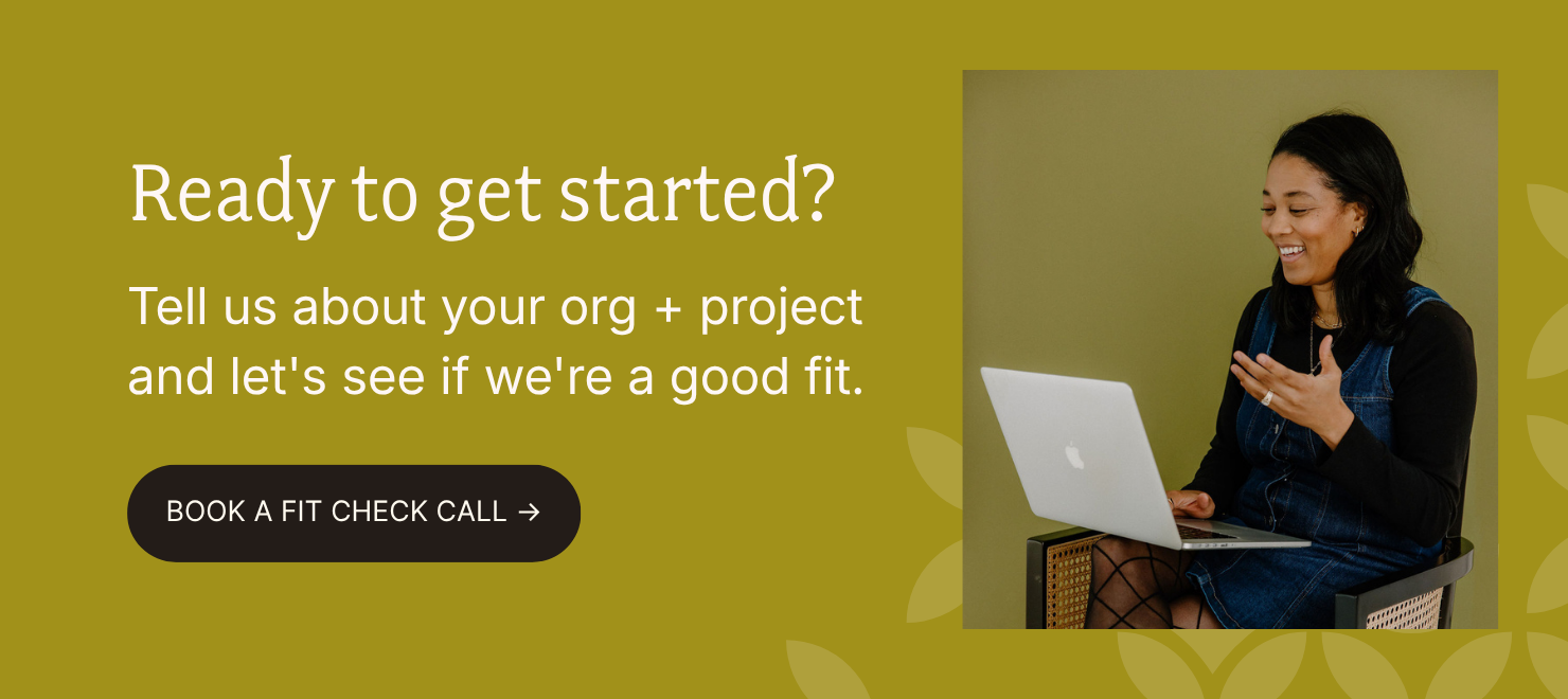
ADA compliance and accessibility can feel overwhelming, especially for a growing nonprofit. You want to include everyone. You don't want to accidentally exclude a potential community member or donor. But making sure everything is just right with your text, design, descriptions? That's usually too time-consuming for an internal team.
So if accessibility is on your 2026 checklist, let our team handle it. Our expertise is professional, engaging design with humans always at the center. Ready to move forward? Book a call, and let's find out what works for you.