Six years in. I've learned what matters to our clients, what actually moves the needle, and where my own passions live. So it was time to show that in how we present ourselves.
When I started Acton Circle in 2019, I was figuring it out as I went. Fresh off a full-time design job with a newborn and a lot of hunger to do more meaningful work. I worked with all kinds of businesses at first. But a few years in, I felt the pull toward nonprofit work. That's when everything clicked.
Now I work with purpose-driven organizations. I understand their challenges, their passion, the way they show up every single day to create change.
But here's what stayed the same: the heart of Acton Circle. Our mission is still to use design for social good. To create more good, amplify voices, and drive real impact.
Why We Rebranded
Honestly, I undersold what we do for years. I had the expertise... 60+ nonprofit clients since 2019 will tell you that. I had the team and the track record. But I didn't price it that way, or present it that way.
Then I stepped back and looked at what we're actually offering. Design that donors remember. Reports that get partners excited. Microsites that convert. Storytelling that is memorable.
We aren't the cheapest option in the market. We do some of the best design work in the nonprofit space, and our clients know it.
So we rebranded to reflect that. Not as a power grab, but as honesty. We're a premium design partner. We bring specialized expertise. We deliver exceptional value. And our pricing now matches the work we do.
The Heart Behind It
The new brand is rooted in something real. My grandparents (Cornelius and Essie) instilled in me a deep sense of service, love for people, and faith in God. That's not separate from the work. That's where it comes from.
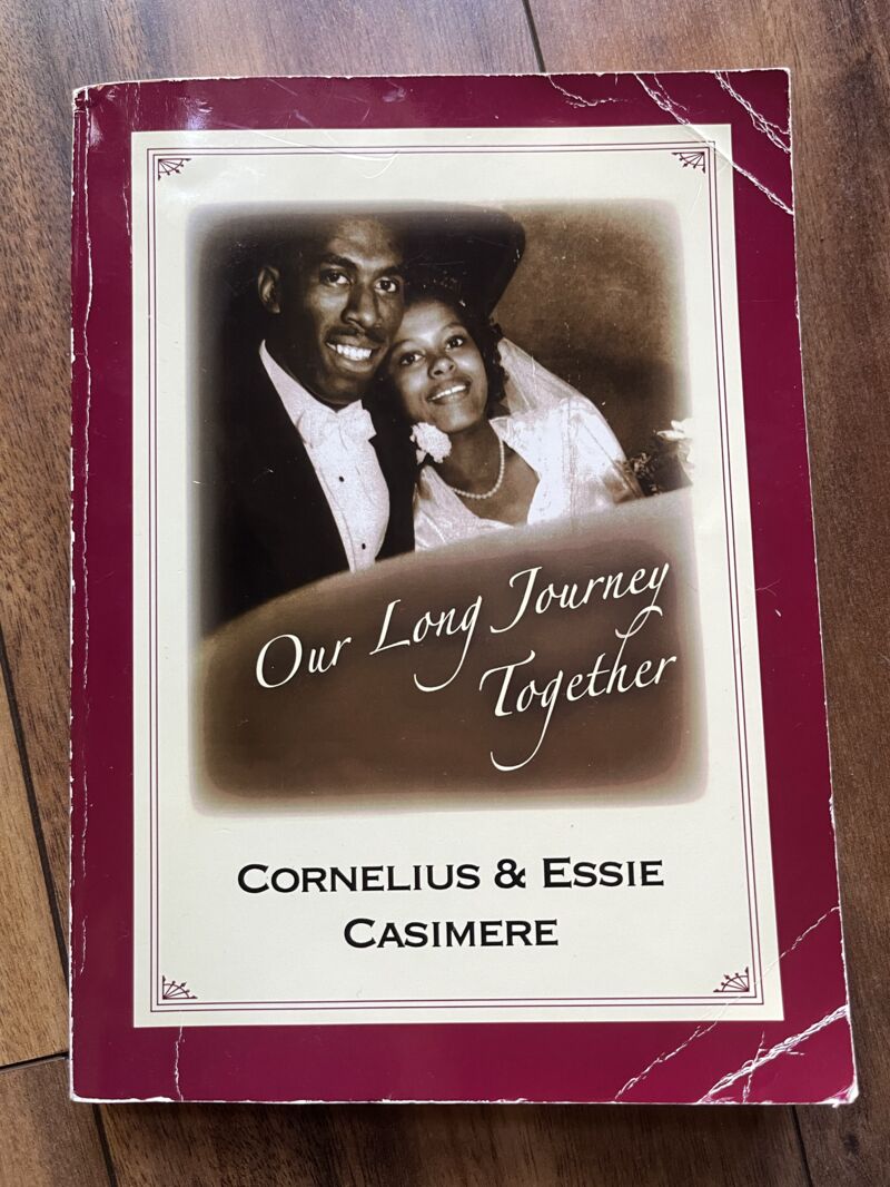
Even the design carries meaning. The handwritten elements in our signature pay homage to my grandfather's penmanship, pecifically the way he wrote the letter "C" and his distinct line strokes.
For the font, I chose Fairplex. It has warmth, professionalism, and prestige without trying too hard. The color palette is calm but engaging. Playful, abstract icons and patterns that actually reflect who we are as a team: dynamic and thoughtful, not stuffy or corporate.
The brand looks different. The essence is richer than ever.
Acton Circle is built on:
- A Legacy of Service: Carrying forward meaningful impact, approaching every project with purpose.
- Intentional Craft: Every design choice made with care. Quality over quantity, always.
- Heart for Mission: Deep understanding of nonprofit work. Genuine care for client impact. Mission-aligned partnerships.
- Strategic Wisdom: Experience-informed guidance. Purpose-driven solutions.
How It Benefits You
We've refined everything. Annual reports now take two to four weeks instead of months. We help you repurpose content, maximizing your investment. We expanded our interactive and microsite services because more orgs are shifting toward digital storytelling.
We also brought in Krista as our content and editing expert, so clients get support they didn't have before. I'm still here leading creative direction and sharing what we learn through education and resources.
Our focus is clearer. We serve fewer clients, but we serve them better.
The Learning Process
This rebrand taught me something I tell our clients all the time: even when you know your brand inside out, you need a plan. I skipped some of that thinking I could just know my way through it. I was wrong. Without a more defined plan, things took longer. I did more work than necessary. And it reminded me why our process works for nonprofits, and why briefs really matter.
Here's what stuck with me:
Start with positioning. Before design, talk to someone who can identify the gaps between how you're showing up vs. how you want to show up. That outside perspective is worth it.
You hold the vision. Even if you outsource parts, you're the one who knows what's true. Stay involved. Give feedback. Make refinements.
See it before you judge it. Sometimes you need to watch something come to life before you know if it's right. That's the process. Go back to your goals and adjust.
Plan the rollout. Branding updates, website changes, new materials; there are a lot of moving parts. Prioritize. Execute in phases.
Start Your Design Journey With Us
Here's how we can support you:
- Explore our resources: Blog posts, guides, case studies on how purpose-driven organizations use design to amplify impact.
- Book a call: Let's talk about how we can help turn your annual report into a real fundraising and visibility tool.
Choose what fits your needs. We're here to support your mission.
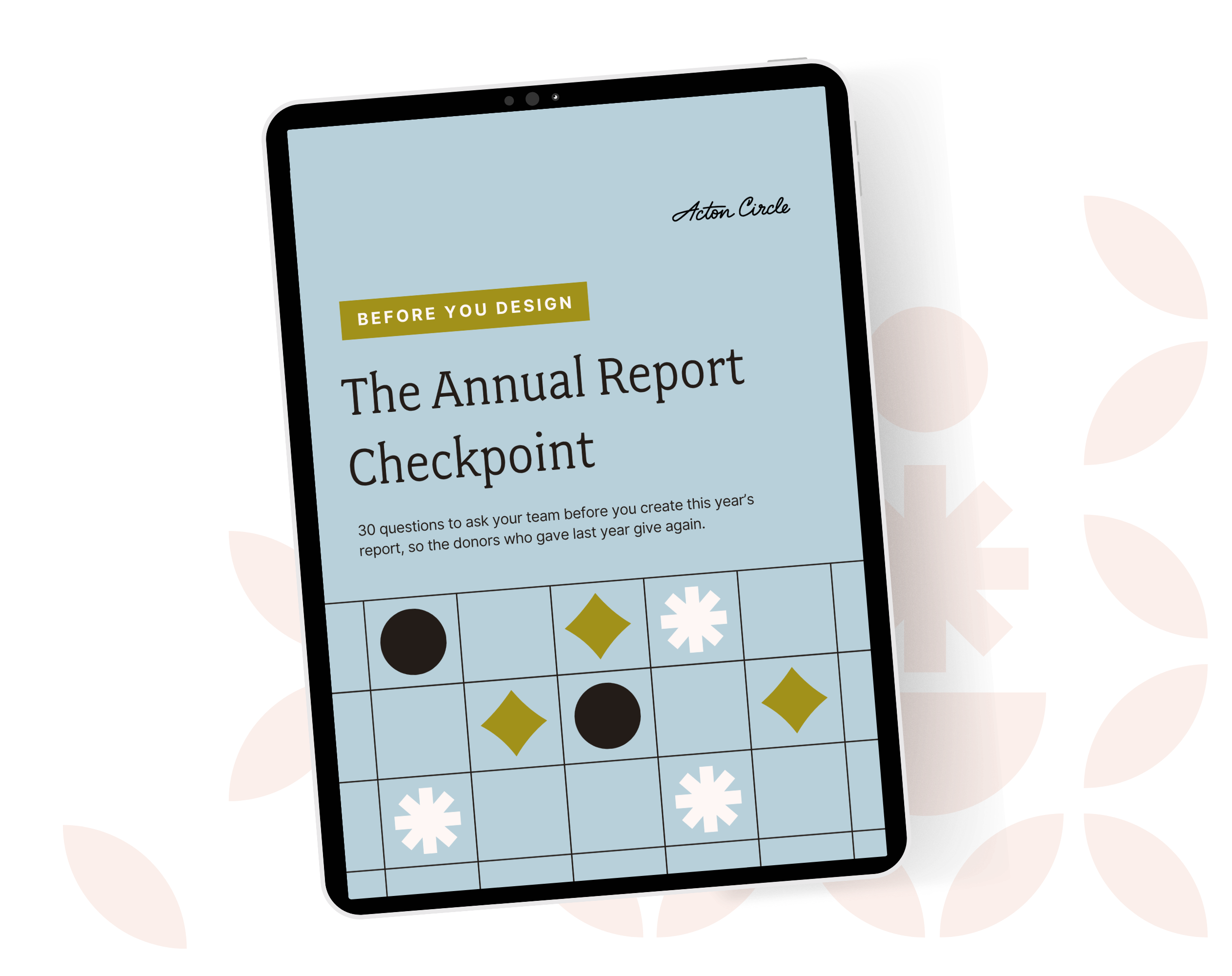
Get The Annual Report Checkpoint