Supporting your community for 75 years is a huge accomplishment. But it also brings extra pressure when it's time to put together the annual report.
A milestone report is more than just an update. It sends a message. Longtime donors notice, and new supporters form their first impressions from it. The board might choose to share it or not. If it looks like every other year, you lose a big chance to stand out.
Peninsula Family Service saw this challenge immediately. As their 75th anniversary got closer, they asked a question many orgs face but rarely discuss: How do you celebrate 75 years of history without looking old-fashioned?
A 75-Year-Old Nonprofit That Had Been Operating Like a Secret
Since 1950, Peninsula Family Service has helped children, families, and older adults in the Bay Area. This long history has built strong trust with longtime donors and board members who have watched the org grow.
Their Chief Marketing Communications Officer had started just a few months before. She quickly saw the problem: PFS was doing great work, but hardly anyone knew about it.
The annual report was there, but it was mostly seen as something for the advancement team, not a real communications tool. There was no content strategy, no design system, and no plan to reuse any of the material.
She wanted to change that, and the 75th anniversary was the perfect time to start.
There was also a challenge with donors. The same longtime supporters had been coming to galas for years. PFS needed to reach a more diverse group (younger donors, smaller contributors, and people who hadn't heard of them yet). The annual report needed to speak to this new audience too, not just the regulars.
Two audiences. One report. No budget for a full rebrand.
How One Anniversary Report Became the Design Standard for Everything That Followed
The design had to balance honoring the past with looking ahead. It also needed to fit within the existing brand, which hadn't changed in years. There was no rebrand, just a smarter, more thoughtful use of what they already had.
So we:
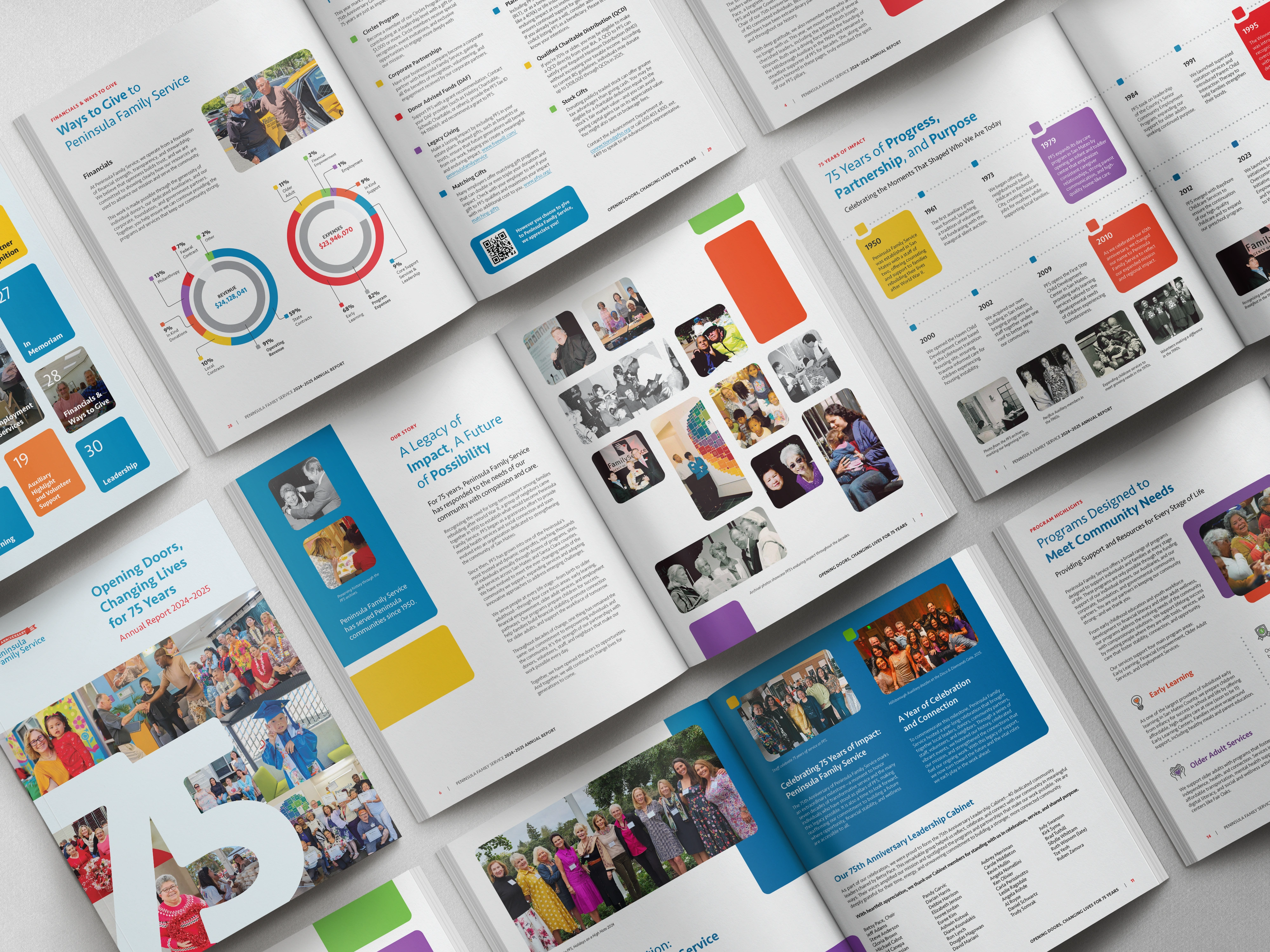
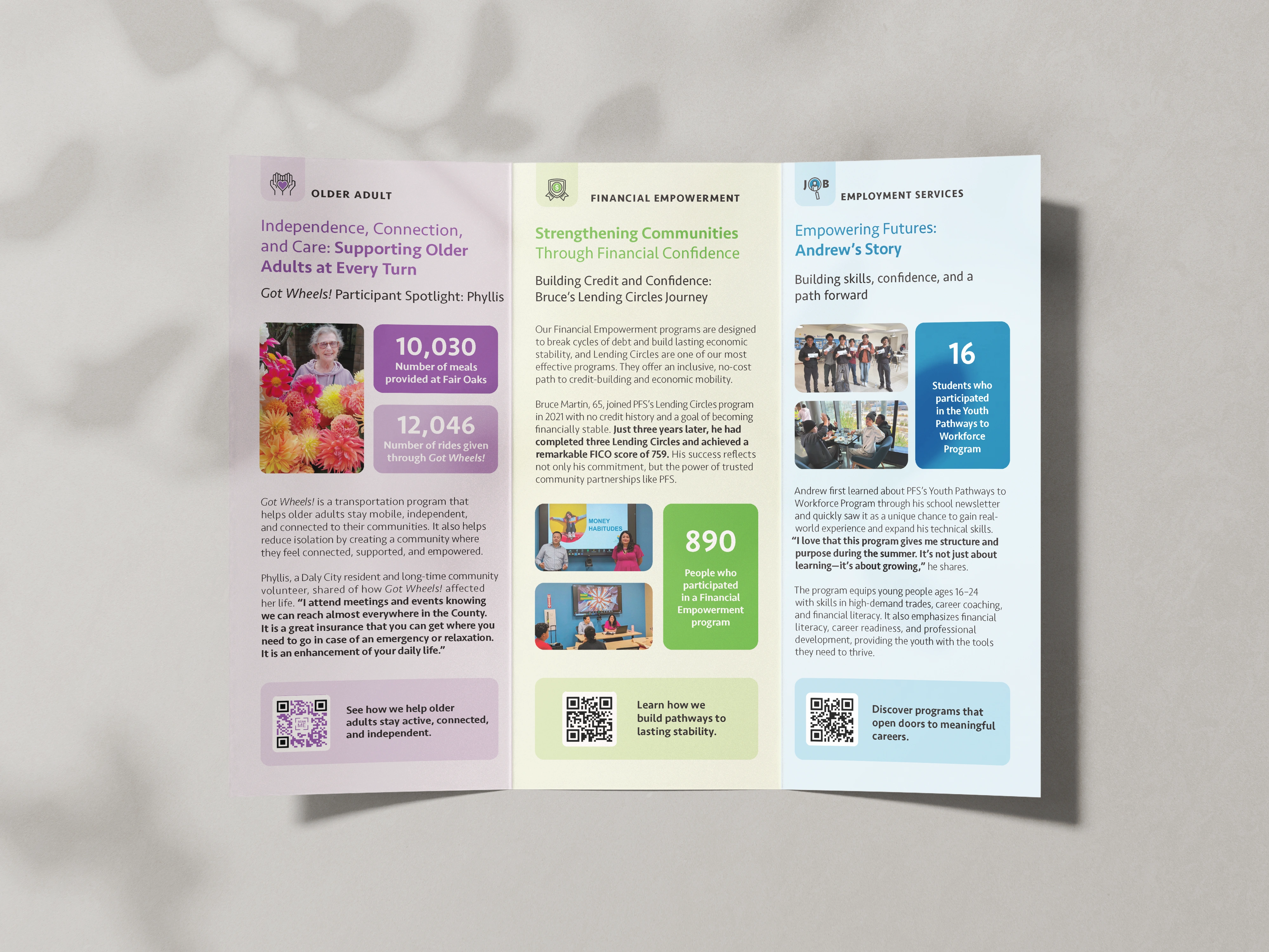
- Created a 32-page annual report with modern layouts and warm photos of the community
- Used images focused on real people, not just numbers
- Updated Peninsula Family Service's signature tile style to add more visual interest while keeping it familiar for longtime supporters.
The final report was an animated, interactive PDF, ready to be shared by email and on social media without losing its visual impact.
Then the project got bigger than a report.
We also created over 15 digital assets, like social graphics, email graphics, infographics, one-pagers and donor outreach materials. This way, the anniversary could be celebrated all year, not just during the week the report was released.
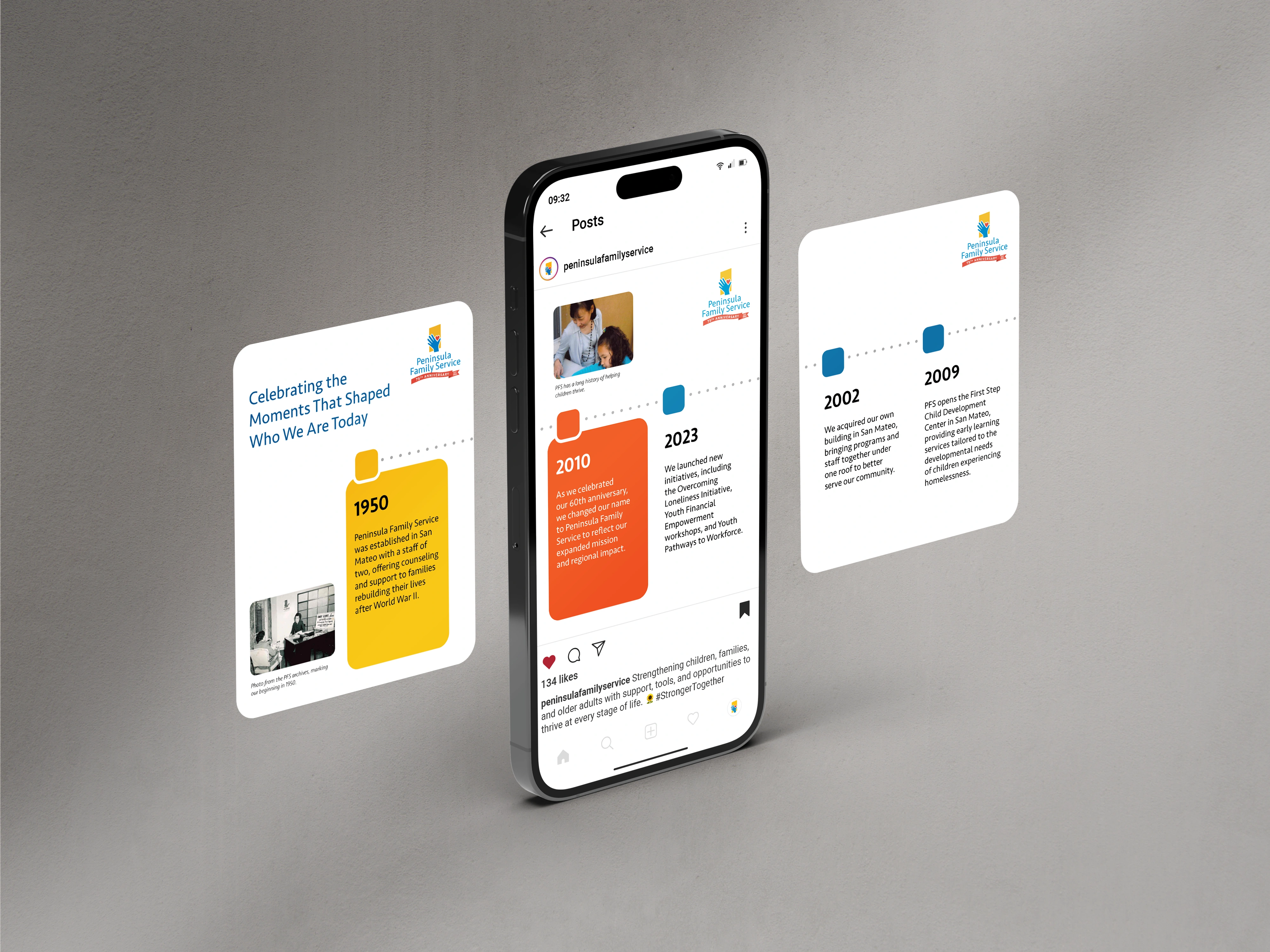
A few weeks later, our client came back.
Their presentation deck was a bit of a mess. It looked outdated. And with PFS about to start grassroots fundraising by reaching out to new donors, government officials, and community partners who didn’t know them yet, they couldn't afford to present themselves that way.
So we built a PowerPoint template based on the annual report's design system. It used the same visual style, but adapted for presentations. We included slides for mission and vision, leadership profiles, program overviews, stats, and storytelling templates, so the team could walk into any room and feel confident in their materials.
One design system. An annual report. An animated PDF. Over 15 assets. A presentation template now used by the whole organization. This is what happens when design is seen as part of the foundation, not just a one-time project.
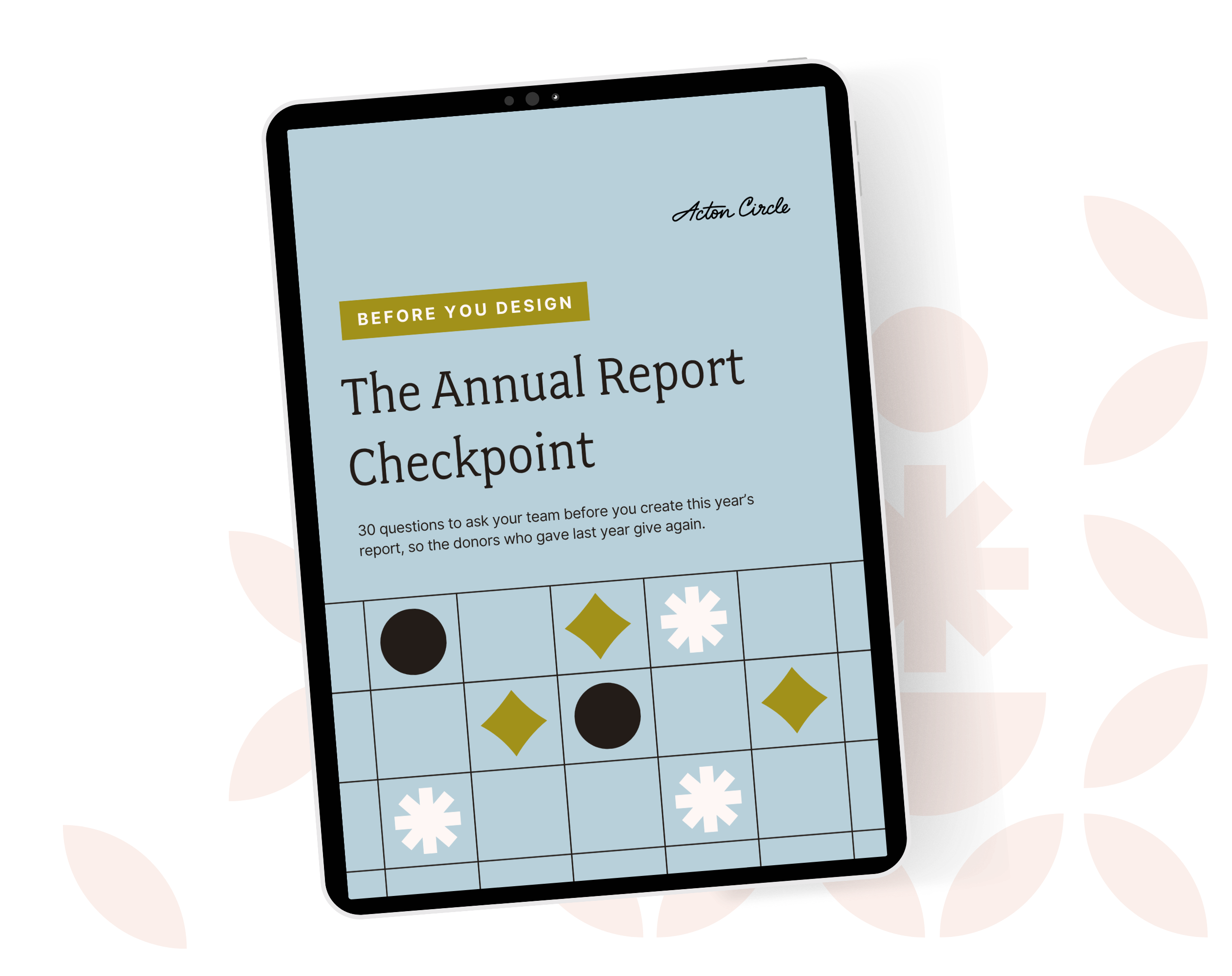
Get The Annual Report Checkpoint
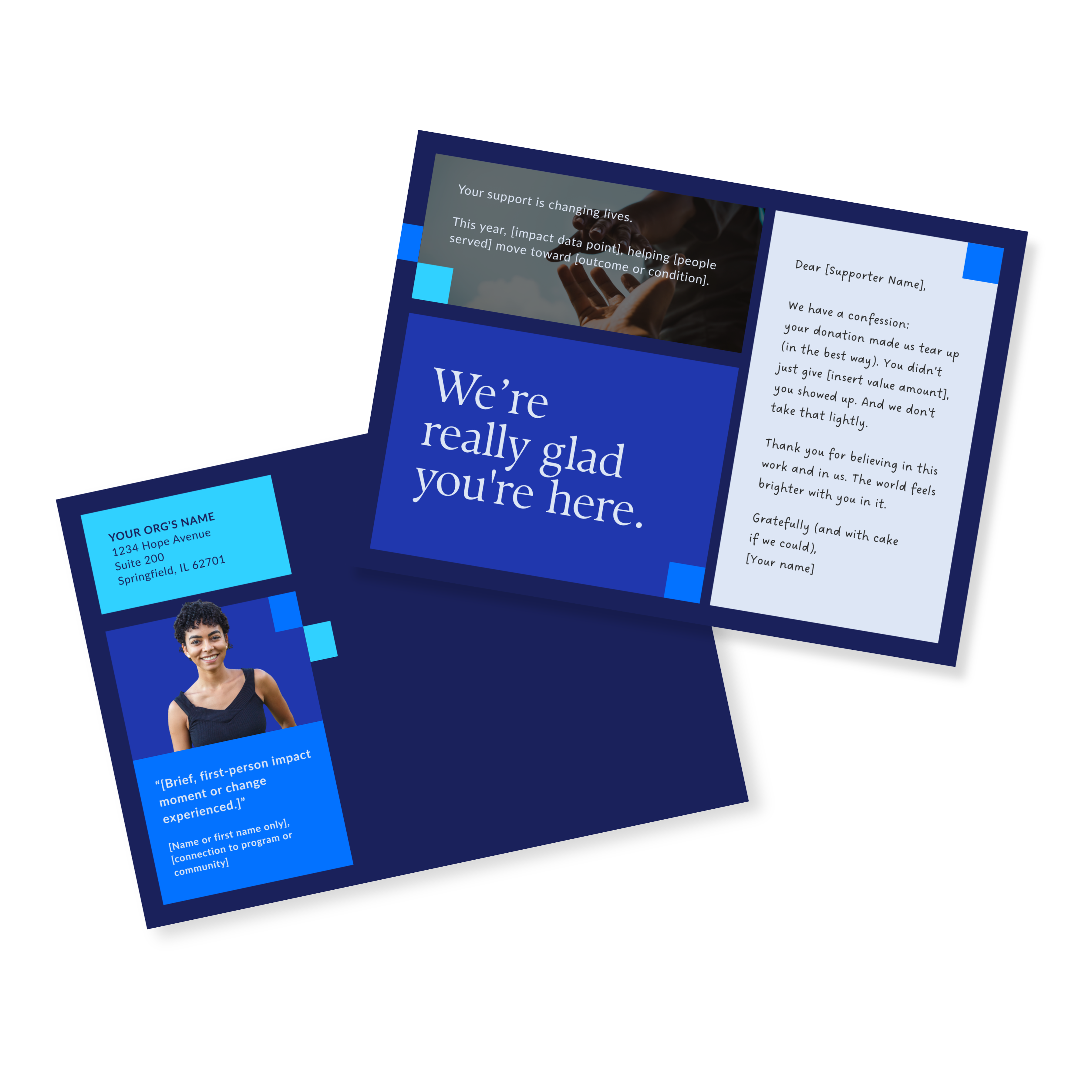
Donor Thank You Postcards Templates
Enter your info and we’ll send the postcards straight to your inbox:
What the Chief Marketing Communications Officer Said
"I had the pleasure of working with Olivia on our annual report, and I can’t say enough about her talent and professionalism. She took my initial vision and elevated it, bringing a fresh, modernized look and feel that truly captured our brand. Olivia has an incredible creative eye and she just got it from the start. What stood out most was her ability to take feedback and not just incorporate it, but enhance the work with each round. It took very few revisions to reach the final product. She was also very organized, responsive, and met every milestone and deadline ahead of schedule."
— Koren P., Chief Marketing Communications Officer, Peninsula Family Service
Why She Came Back and What That Proves
The board didn't just approve the report... they were excited to share it. Internal teams noticed the change too. There was a new standard, and everyone could feel it. Everyone could see it.
What happened next proved the impact. When our client returned for the PowerPoint, she kept using the annual report as her visual guide.
"I think some of what we included in our annual report could be repurposed," she said. She wasn't starting from scratch; she was building on what was already there. That's exactly how it should work.
The investment kept paying off even after the anniversary year ended. The assets are still being used. The presentation template is now used for board meetings, donor pitches, and other presentations. PFS is showing up consistently everywhere, not just in their annual report.
A 75-year legacy requires materials that are just as consistent and credible, without needing extra explanation. The work was too important to look like any other year.
Before You Build This Year's Report, Score Last Year's
You can have great photos, solid numbers, a clean layout, a mission worth funding... and still lose donors by page 4.
The Annual Report Checkpoint is a self-assessment that shows you where your report is building belief and where it's leaking trust.
It takes 10 minutes. And it'll save you a season of second-guessing.
See the full project in our portfolio: Peninsula Family Service.
Related case studies: Chiron's report-to-brand system.