People judge with their eyes first. They scan, decide, move on. If your report looks rushed or homemade, that’s the message. Not the mission. Not the impact. Just: this doesn’t look like it matters.
That gap between how deep your work goes and how it’s received can be one of the most frustrating parts of being a nonprofit leader. You know the work speaks for itself. What you don't always know is how to make it SHOW for itself too.
That’s exactly where Chiron Community Giving Foundation (CCGF) was when they reached out to us. And what happened next is worth a closer look.
Where They Were Starting From
CCGF does important, focused work in North St. Louis. They fund organizations that improve mental healthcare access, meet basic needs, and support education. They put money in the areas with the greatest need.
They had put together a major mental health report covering three areas: mental health outcomes, access to care, and the social factors that drive both. The findings were comprehensive with direct consequences for policy, investment, and community action.
The challenge was that dense data without a clear story or good design doesn’t move people. It might inform them, but it doesn’t create urgency, spark collaboration, or make policymakers take notice.
CCGF needed the report to do more than just document their findings. They wanted it to show why it matters, so that community partners, donors, or city officials could quickly understand its importance.
How One Report Became The Foundation for Everything
We started like we always do with the question: Who is reading this, and what do we need them to feel and do by the end?
Not what do we need them to know. What do we need them to feel.
That difference changes everything. A report that only informs is often ignored. A report that builds belief is shared, discussed, and acted on. That’s what CCGF needed, and that’s what we set out to create.
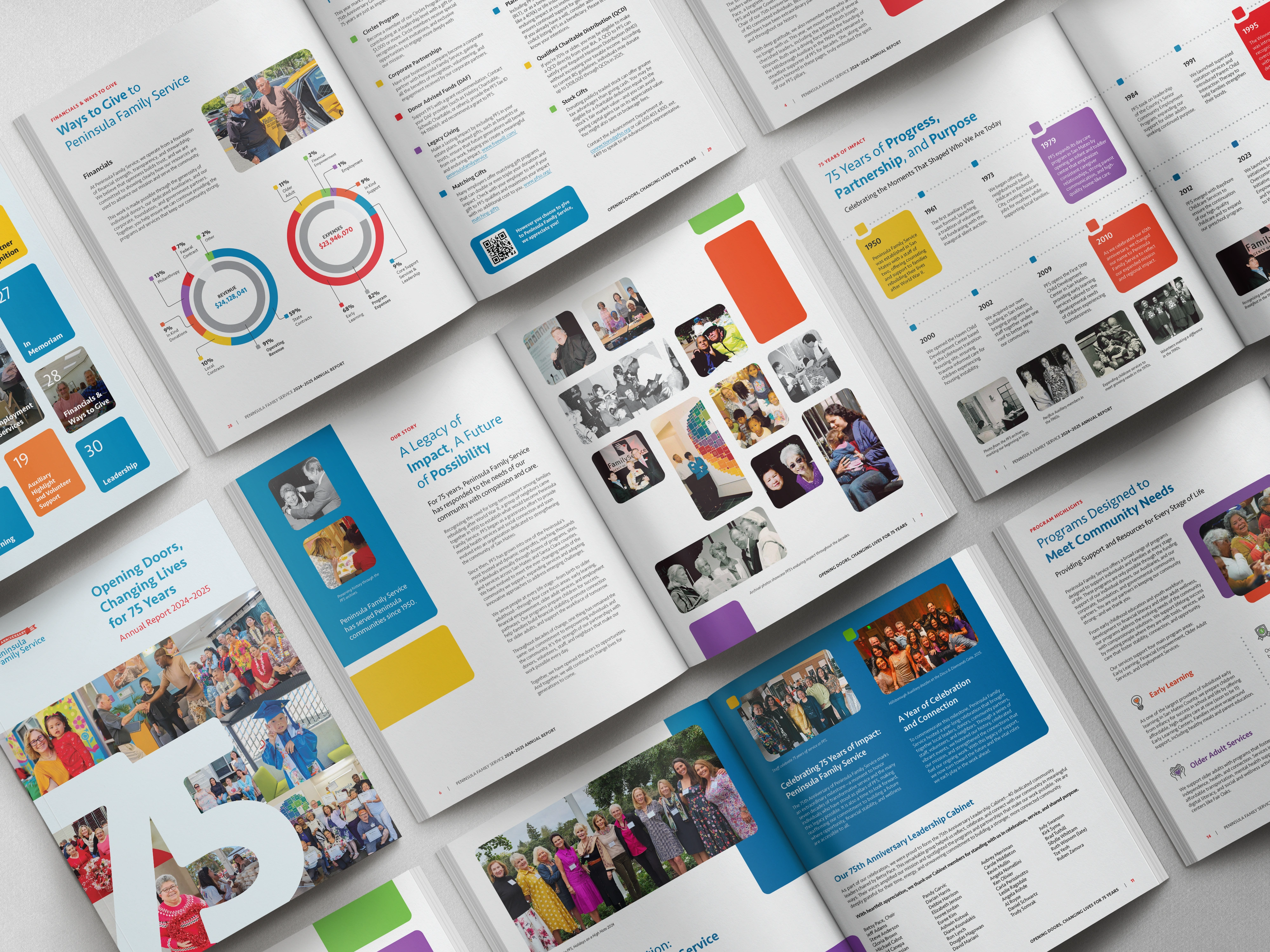
Every part of the report was chosen to show not just what CCGF does, but who they are. The layout, typography, and data visuals were all chosen with purpose, not just for decoration. We wanted community partners and city officials to feel CCGF’s mission before they even read any statistics.
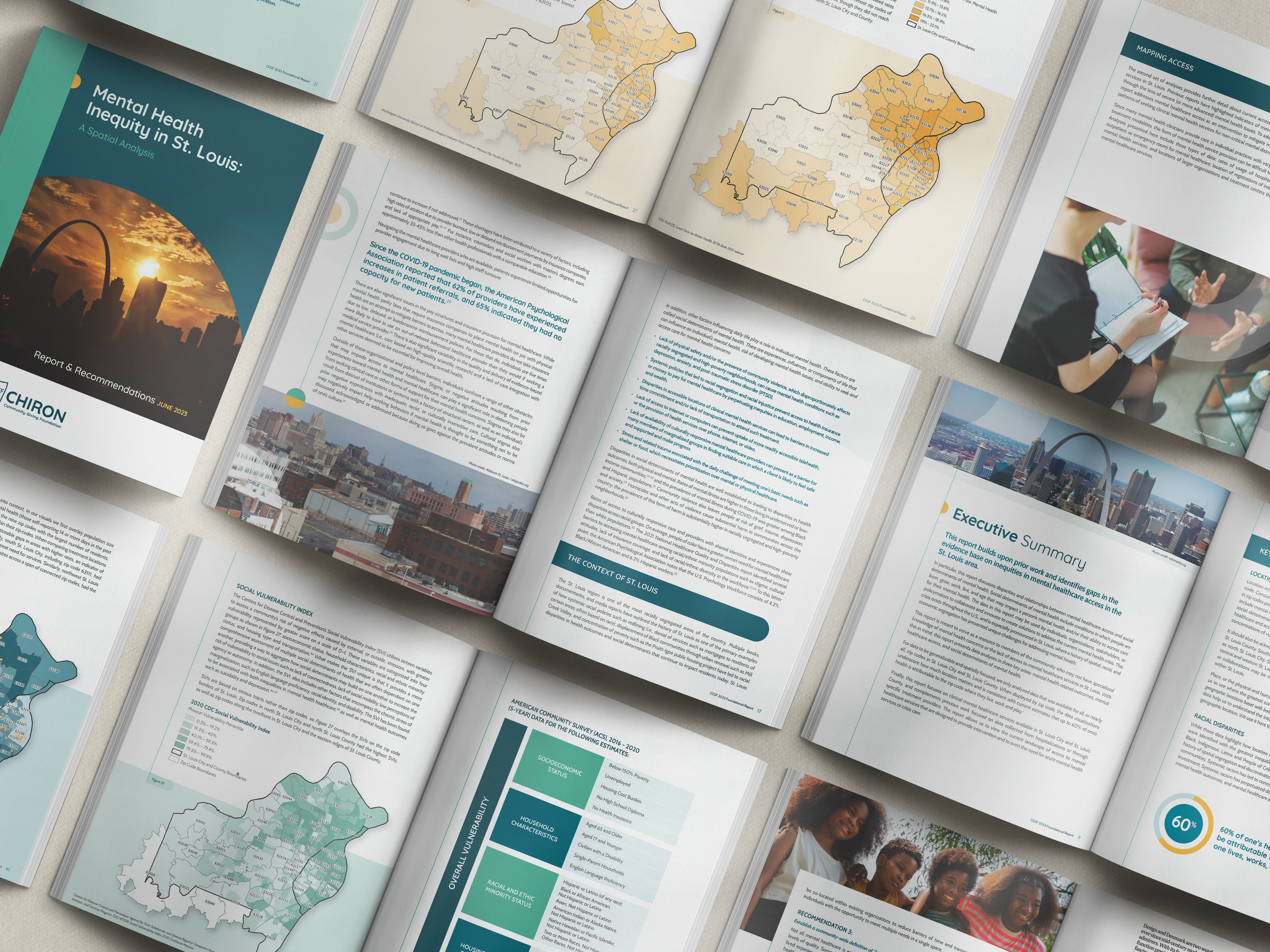
We turned the dense mental health data into infographics and visuals so anyone could understand the findings even without a policy background. We clearly showed areas with higher needs and made the links between healthcare access and factors like housing, jobs, and transportation easy to see. The case for targeted investment became something you could see, not just discuss.
The report was designed for digital use and optimized for the 8.5x11 screen size that most people use. We worked with CCGF’s existing brand, refining it and adding purpose, so the final product felt true to them, only more polished.
There was also something unexpected that came out of the process.
This happens more often than people think. When you dig deep into a report, you often end up doing brand work too. To make every visual choice meaningful, you need to know who the organization is. Their colors, fonts, icons, and images all need to fit together. If there’s no system, you create one.
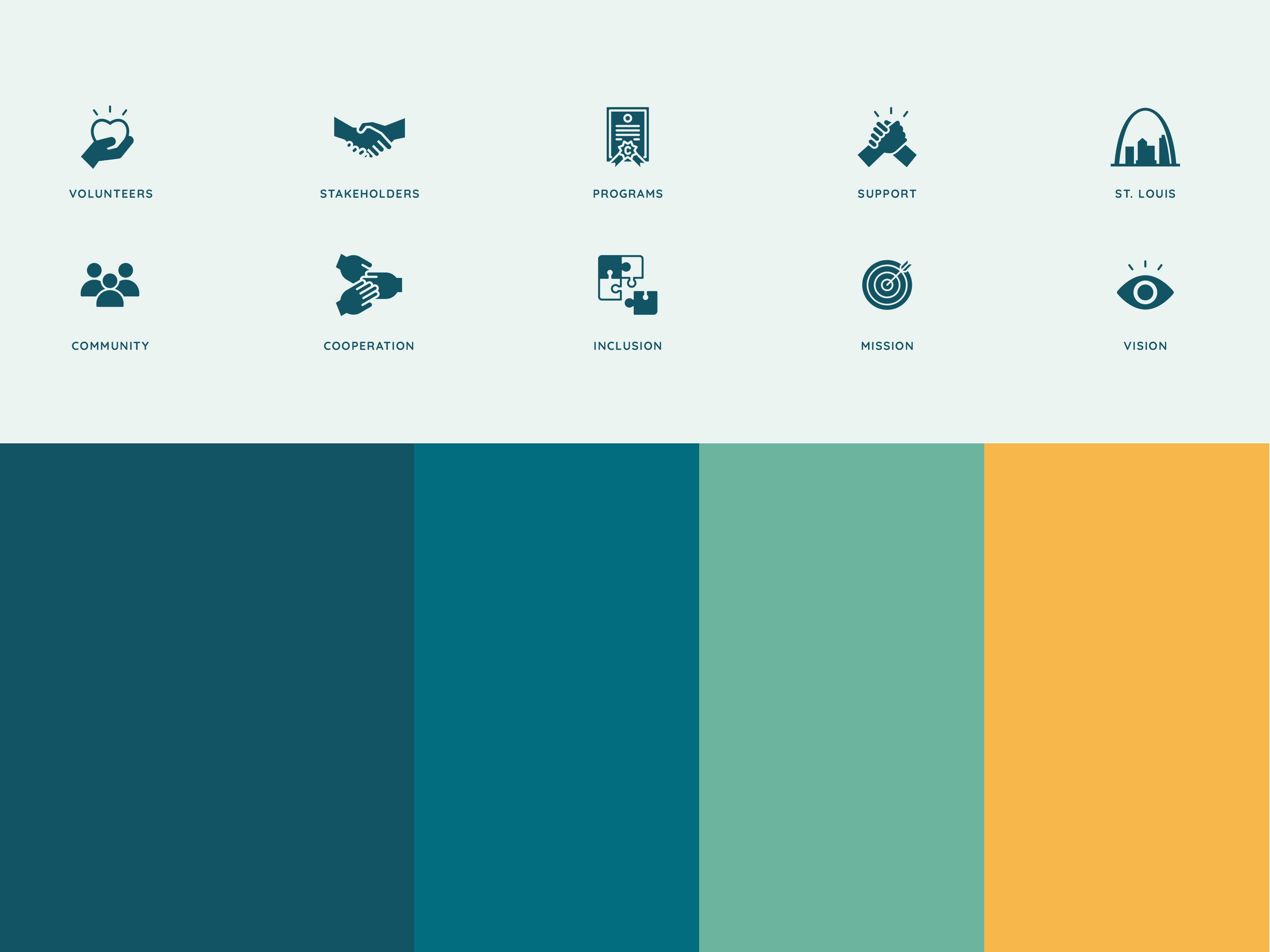
That's what happened here. While building the report, we saw that CCGF didn't have a consistent visual foundation. So we created one alongside the report: a full brand style guide covering logo usage, color palette with hex codes and Pantone values, typography specs, new design elements, new icon designs + guidelines, imagery standards, and layout systems. Now the team has everything they need to present themselves consistently every time.
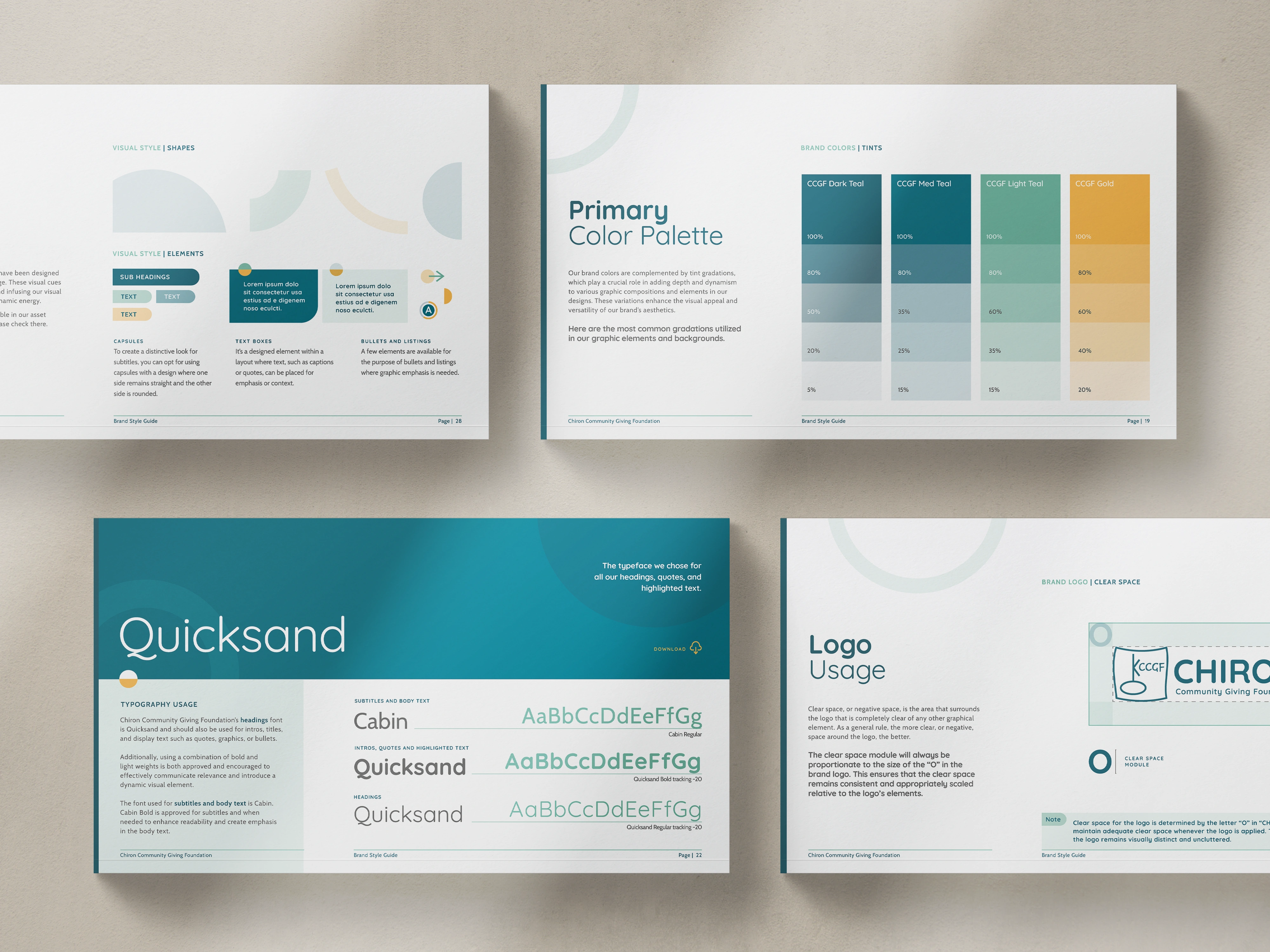
CCGF didn't just leave with a beautiful report. They left with a system. One project became the foundation for every communication that follows. That's what we mean when we say design is infrastructure. It's not a one-time deliverable. It's what makes everything after it easier, more consistent, and more credible.
.avif)
Get The Annual Report Checkpoint

Donor Thank You Postcards Templates
Enter your info and we’ll send the postcards straight to your inbox:
What The CEO Said When It Was Done
"A beautiful job bringing our foundation's report to life. The visualized data and narrative were enhanced by the very professional graphic design services provided by Acton Circle."
— Kris L., President & CEO, Chiron Community Giving Foundation
Why Design Build Belief Before a Word Is Read
It’s not just that the report looks good now (though it does). People actually read it. Bring it up in meetings. Pass it along.
Now, when community partners, donors, or policymakers see CCGF's materials, they sense credibility before reading a word.
People decide whether to trust an organization in seconds, based on what they see, not what they read. If materials are inconsistent, cluttered, or look homemade, that sends a message, even if the mission is great or the work is life-changing.
CCGF's report needed to communicate the opposite. These are serious people doing serious work with real accountability and real results. And now it does.
That's what we mean when we say design builds belief. It's not just about looking professional. It's about making sure every visual choice, layout, data visualization, and typographic detail shows the true quality of the organization.
The work was too important to look like it wasn't.
Ready to start your project?
CCGF needed their work to be felt, not just read.
That's the standard we hold every project to.
If your materials still don't reflect what you know is happening inside your org, this is the conversation worth having.