10,000 Degrees does something obvious and critical: they get students from underserved communities into college and through to completion. No BS. Just real, hard work.
When they came to us, they had a solid mission but their materials didn't match the urgency. Everything felt a little... polished. Distant. Like something designed *about* their work, not *for* their work.
They needed materials that moved people the way their actual mission does.
The Challenge
How do you design something that doesn't soften the reality? These are real students with real barriers. Real lives changing. Real stakes.
Most nonprofits do what's safe: they add inspiring imagery, smooth language, feel-good vibes. And yeah, donors like that. But it doesn't *match*. It doesn't reflect the actual urgency and grit of the work happening on the ground.
10,000 Degrees' leadership was clear: don't make it pretty in a way that *hides* the work. Make it clear. Make it real. Make someone see what's actually at stake and why it matters.
What Changed
We shifted the entire visual language. Raw typography over soft imagery. Student stories front and center—not anonymized impact data. Clear, specific numbers (not vague "life-changing" language). Design that moves *because* it's honest, not despite being honest.
Every choice had to answer: does this help a donor understand why this work is EVERY thing?
The Result
Materials that actually *feel* like 10,000 Degrees. Urgent but not frantic. Clear-eyed about barriers but unapologetic about possibility. Design that respects the intelligence of their audience and the realness of their mission.
That's what happens when design serves the actual work instead of just decorating it.
It's why we do what we do. Every nonprofit deserves materials that match their urgency, their clarity, and their impact.
.avif)
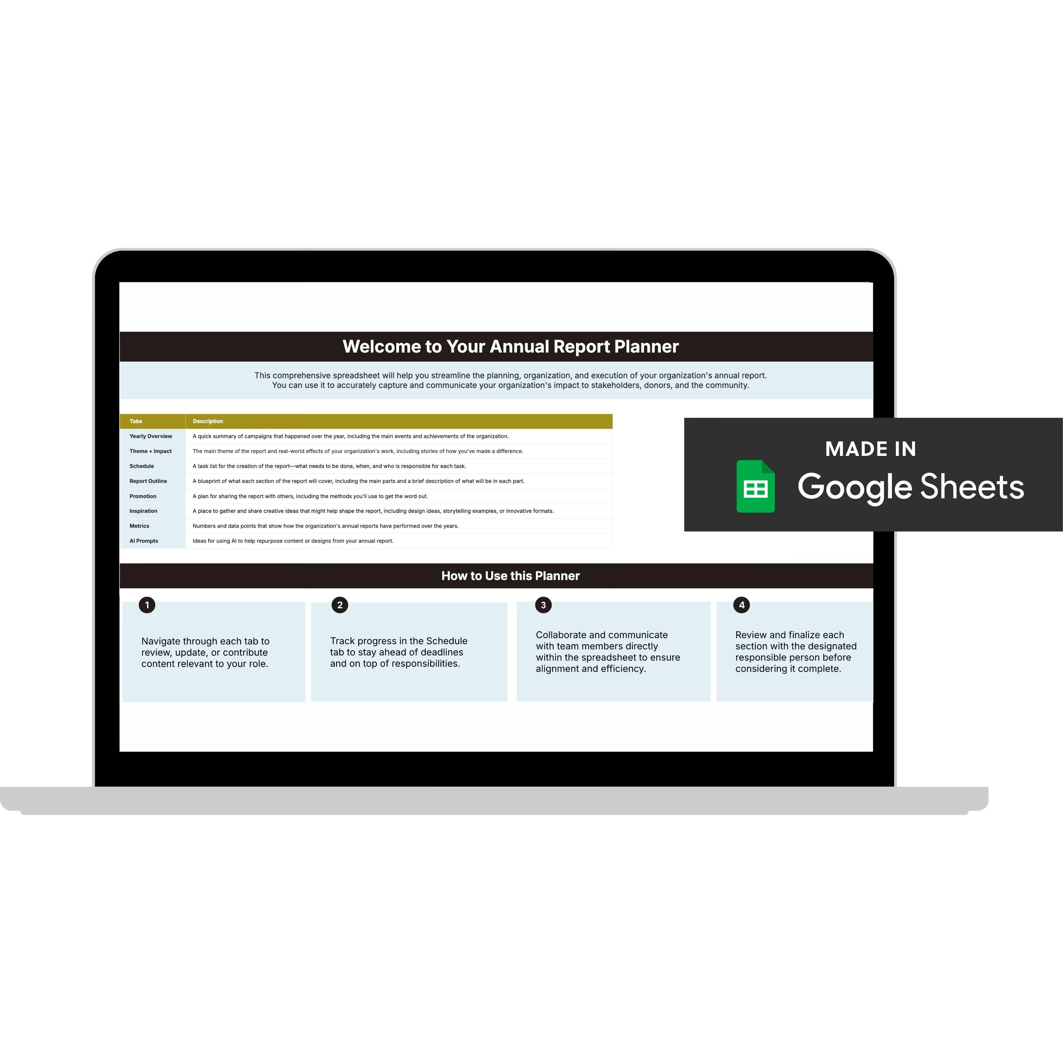
Get The Annual Report Checkpoint
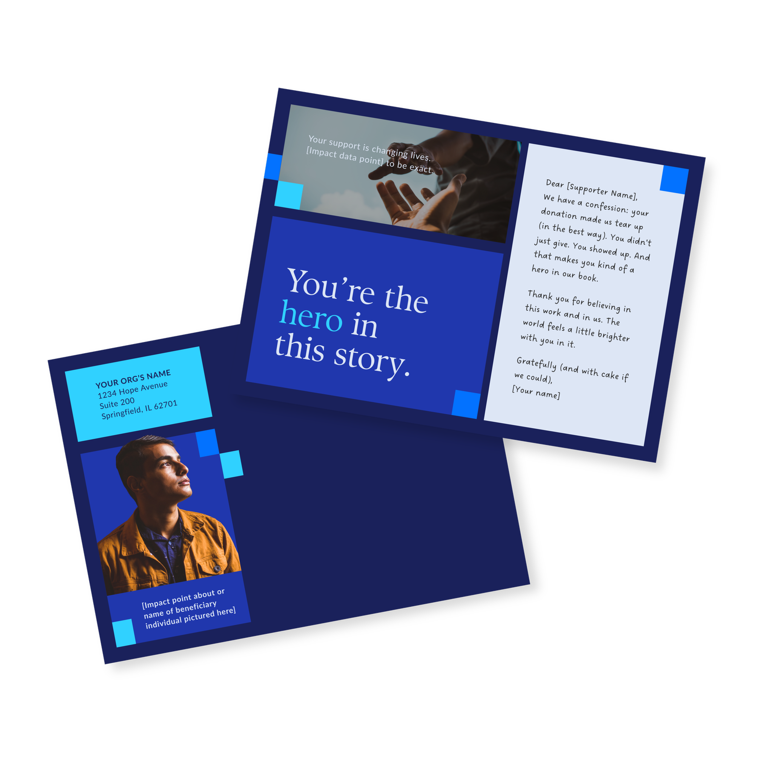
Donor Thank You Postcards Templates
Enter your info and we’ll send the postcards straight to your inbox: