Writing a nonprofit annual report means holding three different pressures at once: what the board wants to see, what funders expect to hear, and what your program staff are witnessing on the ground.
Most teams resolve that tension by simplifying to one clean headline, one big stat, and one story that represents everything.
The problem is that community-centered work doesn't compress that cleanly, and readers can sense when something important has been smoothed over.
I recently saw a callout quote in a report that said something like: "Most people experiencing X don't deal with Y." It was framed as a data point, but without context it raised more questions than it answered.
Which program? Which year? Which population? When I checked with someone working directly with that community, their lived experience didn't line up.
That's not necessarily because the data was wrong, but it wasn't explained. And that's where trust starts to slip.
The Real Challenge in How to Write an Annual Report
Community-centered work is genuinely complex; funding restrictions, program changes, shifting needs across different populations. But annual reports often try to compress all of that into one page, or worse, one headline.
When I review reports with teams before design begins, this is one of the most consistent gaps I find: the summary language doesn't match the nuance the program staff can speak to. The report is accurate in numbers but misleading in context.
This usually shows up in:
- the executive summary
- the “By the Numbers” spread
- the impact highlights page
- the opening letter from leadership
And that’s how we end up with swings like:
“The need has never been greater” (based on intake numbers)
“Outcomes are improving” (based on follow-up surveys)
Both might be true, but not for the same group of people.
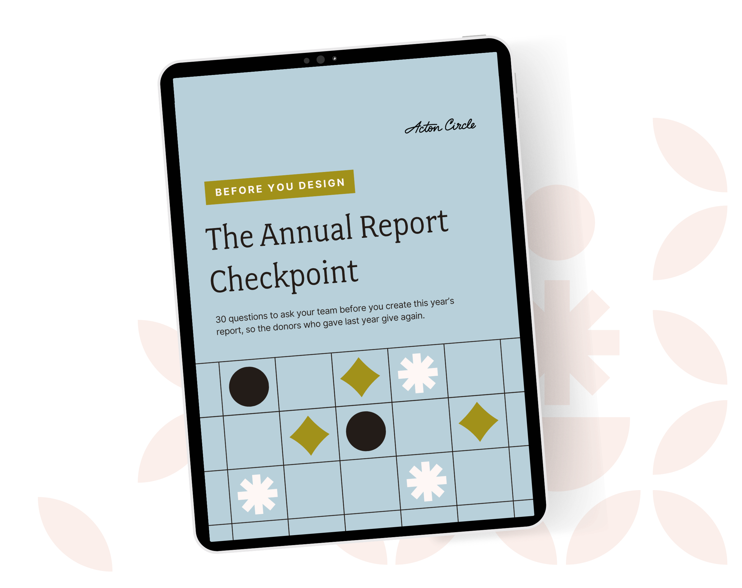
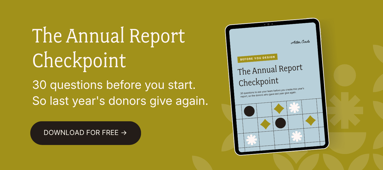
Get The Annual Report Checkpoint
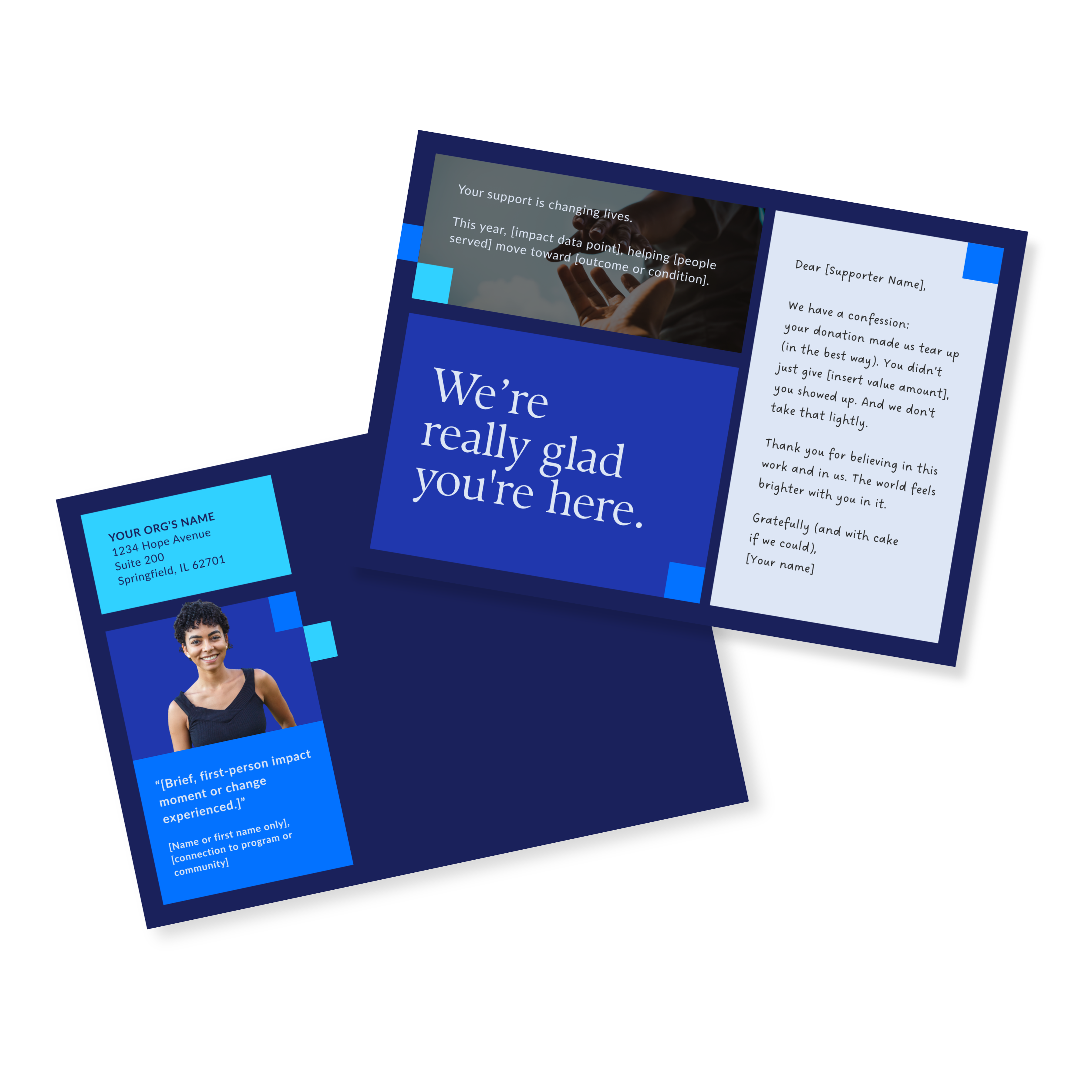
Donor Thank You Postcards Templates
Enter your info and we’ll send the postcards straight to your inbox:
Why "Most People" Is a Red Flag in Annual Reports
Phrases like:
- "Most people experience…"
- "The majority of families don't…"
- "Typically, clients no longer face…"
They sound confident, but they also leave gaps. Readers start wondering:
- Who's counted in that "most"?
- Were they long-term participants or crisis intakes?
- What about the folks who dropped out early?
When that info is missing, it feels both incomplete and curated.
How to Write an Annual Report With Specificity (Without Undermining Confidence)
Here's how to build trust without oversimplifying:
1. Be precise about who you're talking about
Specificity builds trust. Replace generalities such as "people," "families," or "clients" with specific groups.
- Instead of: "Most people experiencing food insecurity…"
- Use: "Among households enrolled in our weekly grocery distribution for at least six consecutive months…"
2. State what the data includes and what it excludes
Your charts don't need to tell the full story, but they should say which slice they're showing.
Try adding:
- "Based on participants who completed a 90-day follow-up survey."
- "Emergency intakes not included."
That one line protects the integrity of your work.
In many of the annual reports I work on, this is the edit that changes how the whole report feels. One line of context (who was counted, over what period, with what caveat) shifts the reader's experience from suspicious to trusting. It's a small change with a big effect on credibility.
3. Connect stats to real-world outcomes
Numbers feel abstract unless they're grounded in reality.
- Instead of: "62% reported improved food stability…"
- Follow with: "For one parent, that meant no longer skipping meals at the end of the week to feed their kids."
It helps the reader feel the data.
4. Name variation instead of smoothing it out
Progress rarely looks the same across programs. Say so.
- "Outcomes differed between urban and rural sites."
- "Retention was stronger among families with stable housing."
This doesn't weaken your case, it strengthens credibility.
A comms team member at East Bay Community Foundation put it this way after working through content decisions together:
"They thoroughly capture all the information needed and make translating project needs into a design look like magic."
That's what intentional content clarity does before anything gets built.
Your Annual Report Is a Tool For Belief
Annual reports aren't skim-only documents. They're reviewed by board members assessing strategy, funders deciding whether to reinvest, partners evaluating alignment, and staff looking for honest reflection of their work. These readers are capable of nuance. Most of them expect accuracy more than optimism.
If your goal is belief—belief in the mission, the model, and the people doing the work—the answer is more context.
People don't lose trust because your work is complex. They lose trust when complexity gets hidden. That's the real work of writing an annual report that actually builds belief over time.
If you're reworking your annual report this year and want an honest read on whether your current approach is building belief or just checking boxes, start with the Annual Report Checkpoint.
It's a free self-assessment across five key areas, from how your report looks to what it's actually trying to say. Each section gives you direction on what to explore, fix, or strengthen before you invest time and budget into production.