Every year I talk to marketing and development directors who are asking themselves the same question: is the annual report worth it? Heck, I recently went on Reddit and saw someone asking this EXACT question.
The hours. The stakeholder wrangling. The design budget. The three rounds of edits from a board member who had just a few small changes. Is any of this really moving the needle?
I get it. Annual reports are expensive in time if nothing else. And if your last one got a few nice replies and then sat for eleven months, the ROI case is hard to make.
But here’s what I’ve watched happen across hundreds of nonprofit projects: when a report is built with intention (designed to communicate something specific to specific people), the return shows up in ways that are real and measurable. Not always in the week it launches. But over the months that follow.
This is what that looks like.
First: What “ROI” Means for a Nonprofit Annual Report
I want to name something before we get into specifics.
Nonprofit ROI is not the same as corporate ROI. You’re not running a conversion funnel. The “return” on a well-designed annual report is measured in trust, retained donors, stronger funder relationships, aligned partners, renewed grants, a team that feels proud of what they put into the world, and, most importantly, more lives changed. Some of that is quantifiable. Some of it isn’t.
Both kinds matter.
The orgs I’ve seen get the most out of their reports are the ones who stopped asking “is this worth the cost?” and started asking “what do we want this to make possible?” That reframe changes everything about how the report gets built.
So when I talk about ROI here, I mean: what does a thoughtful annual report make possible that a mediocre one doesn’t? Let’s get specific.
ROI #1: Donor Retention Starts With a Report That Makes Them Feel Like Part of the Work
Acquiring a new donor costs roughly 7 times more than retaining an existing one. Your annual report is one of the most underutilized donor retention tools you have.
When a donor receives a report that shows them (specifically and personally) what their investment made possible, they feel accountable for the work. They feel like part of it. And people who feel like part of something give again.
The reports that do this well are the ones where donors can see themselves in the story.
With 10,000 Degrees, we designed their donor recognition to center community first, not names in a list, but a narrative booklet (in addition to their annual report) about what the collective investment made possible. Donors got real estate. Their contribution had context and was spotlighted.
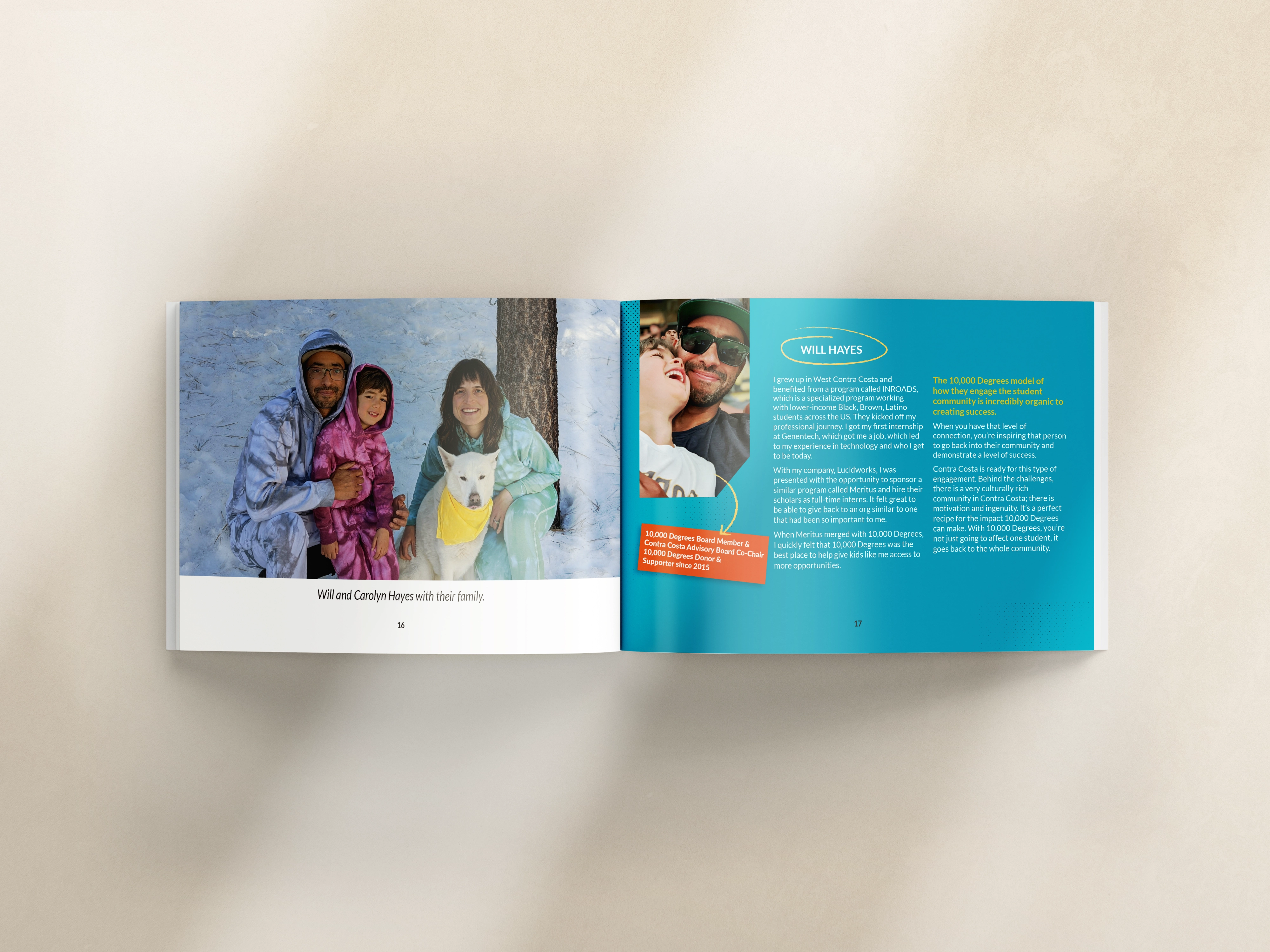
When people are honored instead of catalogued, the relationship changes. Whether that shows up in a renewal rate, a handwritten note, or a conversation at the next gala. That's real return, even when it doesn't fit in a spreadsheet.
That kind of response doesn't happen by accident. It's designed.
ROI #2: Funder and Partner Confidence (Before You Even Get on the Call)
Funders look at your annual report before they read your proposal. Corporate partners do it too, maybe more ruthlessly.
I was on a call recently Dan Drucker, a consultant who helps nonprofits build corporate partnerships. He said something I haven't stopped thinking about: "Companies don't want to be associated with an organization that doesn't APPEAR to be well run."
They're not just vetting your pitch. They're vetting your whole operation. And that includes your design.
Corporate teams live in dialed-in materials. When something feels thrown together (even if your mission is incredible), that experience is telling them something you didn't mean to say.
Sometimes the difference between a one-time sponsorship and a multi-year partnership isn't the size of the ask. It's whether they felt confident putting their logo next to yours.
Your annual report is one of the first places they look.
ROI #3: Board Buy-In
Your board members are often your best major donor prospects and your most powerful ambassadors. And yet most of them receive an annual report and don't take a second look.
A report that’s genuinely well-designed (one that reflects the caliber of the organization they’ve attached their name to) does something different. It makes them proud, and proud board members share things.
I’ve heard it directly from clients more times than I can count: “Our board was so impressed.” That’s not a vanity win. That’s major donor access you didn’t have to manufacture.
With Peninsula Family Service’s milestone report, we designed something board members could put in front of major donors with confidence. The print version became a leave-behind in high-stakes meetings. The digital version got shared at a board level in ways their previous reports never had been.
When the design matches the legacy of the organization, board members feel it.
A marketing leader at Peninsula Family Service put it simply:
"It took very few revisions to reach the final product."
.avif)
Get The Annual Report Checkpoint

Donor Thank You Postcards Templates
Enter your info and we’ll send the postcards straight to your inbox:
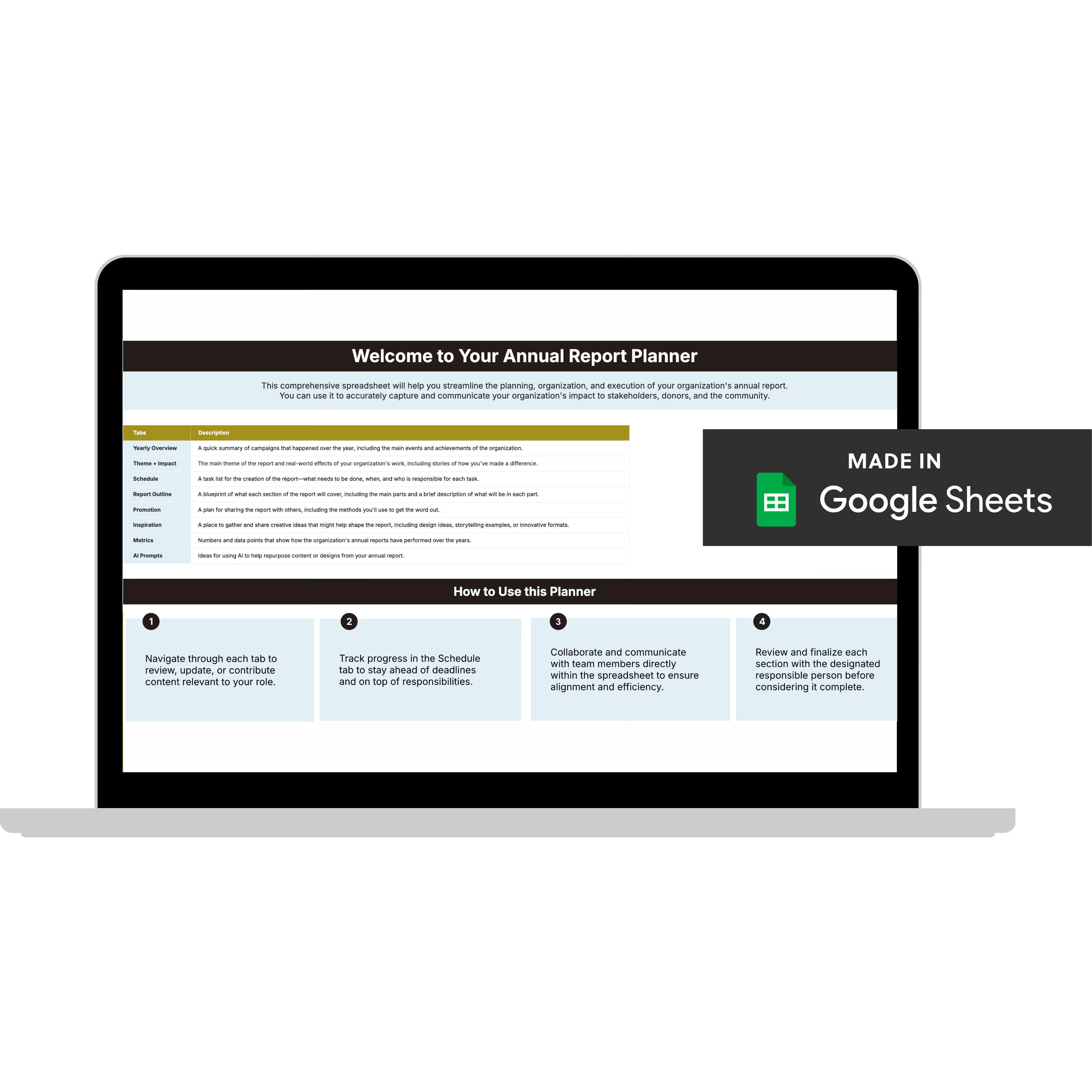
Annual Report Planner
Get a clear content roadmap so your annual report builds belief, earns trust, and actually gets used after launch—plus the same planning approach we use with our 1:1 clients, built in.
ROI #4: Content You Can Use for 12 Months (Not 12 Days)
This is one of the most practical ROI arguments I make to orgs who are on the fence about investing in a quality report.
Everything you created for that report (the stories, the stats, the photography, the data visualizations) is content. Twelve months of content if you use it right.
- Impact stats → year-end appeal email
- Donor quotes → social proof for campaigns
- Program highlights → funder presentation slides
- Leadership letter themes → board meeting talking points
- Photography → website, social, event materials
When the report is designed with this in mind from the start (modular layouts, reusable components, export-ready visuals), your team isn't starting from zero every time they need donor-facing content.
Planet Women's annual report was designed specifically to become a year-round storytelling asset. The content system we built around it gave their team materials they used for months after launch. One production cycle, ongoing return.
That's what designing for repurposing looks like in practice.
ROI #5: When Donors Can't Follow the Story, They Fill the Gaps With Assumptions
There's a version of your org that donors, funders, and partners BELIEVE you are, and a version they see when they look at your materials. When those two things are misaligned, you have a positioning gap.
A well-designed annual report closes that gap. It makes the org you ARE visible to the people who need to see it.
For larger or more complex orgs, this matters even more.
When your programs span multiple populations, geographies, or issue areas, the report is often the only place where a fuller picture lives. If that picture is hard to follow, people fill in the gaps with assumptions, and those assumptions aren't always generous.
With the American Diabetes Association, we took complex program data spanning multiple initiatives and turned it into something funders and partners could understand. The design wasn't decorativ, it was doing organizational communication work.
Clarity IS credibility.
"We Don't Have the Budget" and Other Objections Worth Questioning
"We don't have the budget for a well-designed report."
I hear this one A LOT. And I want to name what's underneath it: orgs are often comparing the cost of a well-designed report to the cost of doing it themselves. What they're not comparing it to is the cost of donor attrition, missed grant opportunities, and a board that's embarrassed to share the thing.
If budget is genuinely the constraint, that's what our Template Kits are built for. They include donor-aware layouts and are designed for annual reports specifically.
"Our donors don't care about design."
With respect, they absolutely do. They may not come right out and say it. But in 2026, good design is required to build a strong brand.
Design that's hard to follow creates friction. Friction creates doubt. Doubt creates donors who give less or don't renew. They won't tell you that's why. But it's why.
Design talks first. Every time. Before a single word is read, the design has already communicated something about your org. Make sure it's saying what you intend.
"We only have a few weeks to pull this together."
This is a planning problem, not a design problem, and it's the most fixable one on this list. The org that consistently produces strong reports starts earlier than it feels necessary. That's genuinely the whole secret.
If you're already in the weeds, a template kit can compress the production timeline significantly. If you want to do it differently next year, starting with a deep dive on your current situation is where I'd begin.
What This Means for Your Next Report
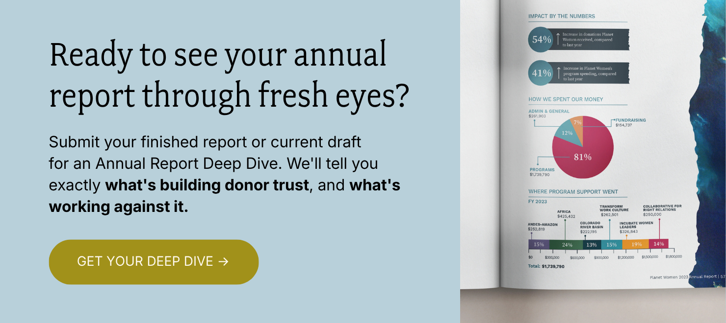
If you read this and want to do things differently, the Annual Report Deep Dive is the right next step.
I'll go through your report page by page and tell you exactly what's working, what's working against you, and what to fix first.
You'll walk away with three things:
✅ A Loom video walkthrough: me reviewing your report live, page by page, with real commentary on what I'm seeing and why it matters. Share it with your boss, your board, your whole team.
✅ Your BELIEF by Design™ Scorecard: your report evaluated across six areas: audience clarity, narrative trust, visual credibility, data presentation, emotional arc, and repurposing potential. You'll know exactly where you stand.
✅ A Priority Action List: ranked, specific, and ready to use. What to keep, what to cut, what to restructure, and what to add. No guesswork.
All of it delivered in 3 business days. And if you want to talk through implementation together, you can add a 60-minute strategy call.
Everything else (the design, the templates, the full-service work) flows from here. But this is where we start.