Measuring nonprofit impact is one of those things that sounds straightforward until you're sitting with your data, trying to figure out what to say about it.
You have a year's worth of work that you know was great. But somewhere between the spreadsheet and the donor's inbox, something gets lost. The report goes out. The response isn't what you hoped. And you're not sure if it was the data or the way you presented it.
After working with 60+ nonprofit teams on their donor communications, here's what I've seen: orgs aren't measuring the wrong things. They're just not connecting what they measure to what donors need to see and feel.
That gap (between data collected and belief built) is what this article is about.
What Measuring Nonprofit Impact Means
Let's keep the definition simple.
Measuring nonprofit impact means tracking how your work creates change, and then using that info to make better decisions, strengthen your programs, and communicate your results to the people who fund them.
More than a highlight reel, it's a clear look at what you did, who it affected, and what changed because of it.
A lot of orgs are measuring the wrong layer. They're counting activities (events held, meals distributed, people who walked through the door) and calling that impact. Those are outputs. Outputs are what you did. Outcomes are what changed because you did it.
Here's the difference in practice:
→ Output: 400 students completed our after-school program this year.
→ Outcome: 87% of those students improved their reading level by at least one grade.
One tells donors what you did. The other tells them why it changed lives. Both belong in your report. But most orgs stop at the first one and wonder why donors aren't super engaged.
Measuring to Communicate, Not Just to Report
Most guides treat impact measurement like an internal ops thing... define your outcomes, collect your data, review it quarterly, improve your programs. And yeah, that stuff matters. Bridgespan goes deep on it if that's where you need to start.
But for small nonprofit teams, there's a more pressing problem: you have data, and donors aren't feeling it.
Measuring nonprofit impact is only half the job. Making sure donors ABSORB what you measured is the other half. And it doesn't happen by accident.
Outputs vs. Outcomes: Know the Difference, Tell a Better Story
This is the most common place I see orgs get stuck, so it's worth real time here.
Outputs are the things you can count directly:
→ Number of people served
→ Programs delivered
→ Events hosted
→ Volunteer hours logged
→ Dollars raised
Outcomes are the changes those activities created:
→ Families who achieved housing stability
→ Students who graduated
→ People who gained employment
→ Communities with improved access to care
Outputs are easy to track. Outcomes require you to follow up, ask harder questions, and sometimes admit that the change is harder to measure than you'd like.
But outcomes are what donors are funding. They're giving to your program BECAUSE of the change your program makes. If your report is full of outputs and light on outcomes, you're showing donors the engine, not the road you traveled.
7 Metrics Worth Tracking (And What to Do With Them)
Every mission is different, but these are the data points most orgs should have a handle on. I'm not an impact measurement specialist (my lane is design and donor communication) but after working alongside 60+ nonprofit teams, these are the ones that come up again and again.
1. People Served
Start here. Who are you helping, and what did they come to you needing? Break it down by demographic, location, or program if you can. The number alone isn't enough, so pair it with what those people were able to do, access, or become because of your work.
2. Volunteer Hours
Volunteer hours represent real monetary value. The current national value of volunteer time is $33.49/hour (Independent Sector, 2024). If your org logged 2,000 volunteer hours last year, that's $66,980 in contributed labor. Put that number in your report.
3. Donor Trends
Total donations matter, but the more interesting data is underneath: new vs. returning donors, average gift size, donor retention rate. A high retention rate tells funders your community believes in your work enough to come back. That's a story worth telling.
4. Program vs. Admin Expenses
Transparency here builds trust, but let's be honest about what this metric means.
The overhead ratio gets a lot of attention from donors and rating platforms like Charity Navigator. And yes, showing where the money goes matters. But overhead isn't the enemy. Paying your staff fairly, investing in infrastructure, building capacity is NOT waste. That's how missions sustain themselves.
What donors want to know is that you're being honest. Break it down visually, show the categories clearly, and if your overhead is higher than the sector average, say why.
A brief note explaining that competitive salaries are how you keep the people doing the work is far more trust-building than a pie chart that hides the reality.
5. Budget vs. Actuals
Did you spend what you planned to spend? This data shows funders you manage resources responsibly. It also gives you something honest to say if things shifted mid-year, which, for most nonprofits, they did.
6. Net Income
Revenue minus expenses. You came out ahead? Show it. You came up short? Say why. Either way, pair the number with a brief note on what it means for next year. Donors who understand your financial picture are more likely to give thoughtfully.
7. Mission-Specific Metrics
This is where your org becomes irreplaceable. Graduation rates if you work in education. Housing stability if you work with families experiencing homelessness. These metrics are YOURS because they reflect the specific change your mission exists to create, and no other org can claim them.
According to CAPTRUST, 98% of donors ranked impact as the most important factor when considering a charitable donation, above mission, above legal status, above everything else. And orgs that proactively share metrics and results receive 53% more in contributions than those that don't.
And this was a few years ago. With funding uncertainty, a tighter economy, and donors doing more research before they give, the bar for proof has only gone up.
Your mission-specific metrics aren't just a nice section in your annual report. They're what donors are looking for before they decide whether to give again.
.avif)
Get The Annual Report Checkpoint

Donor Thank You Postcards Templates
Enter your info and we’ll send the postcards straight to your inbox:
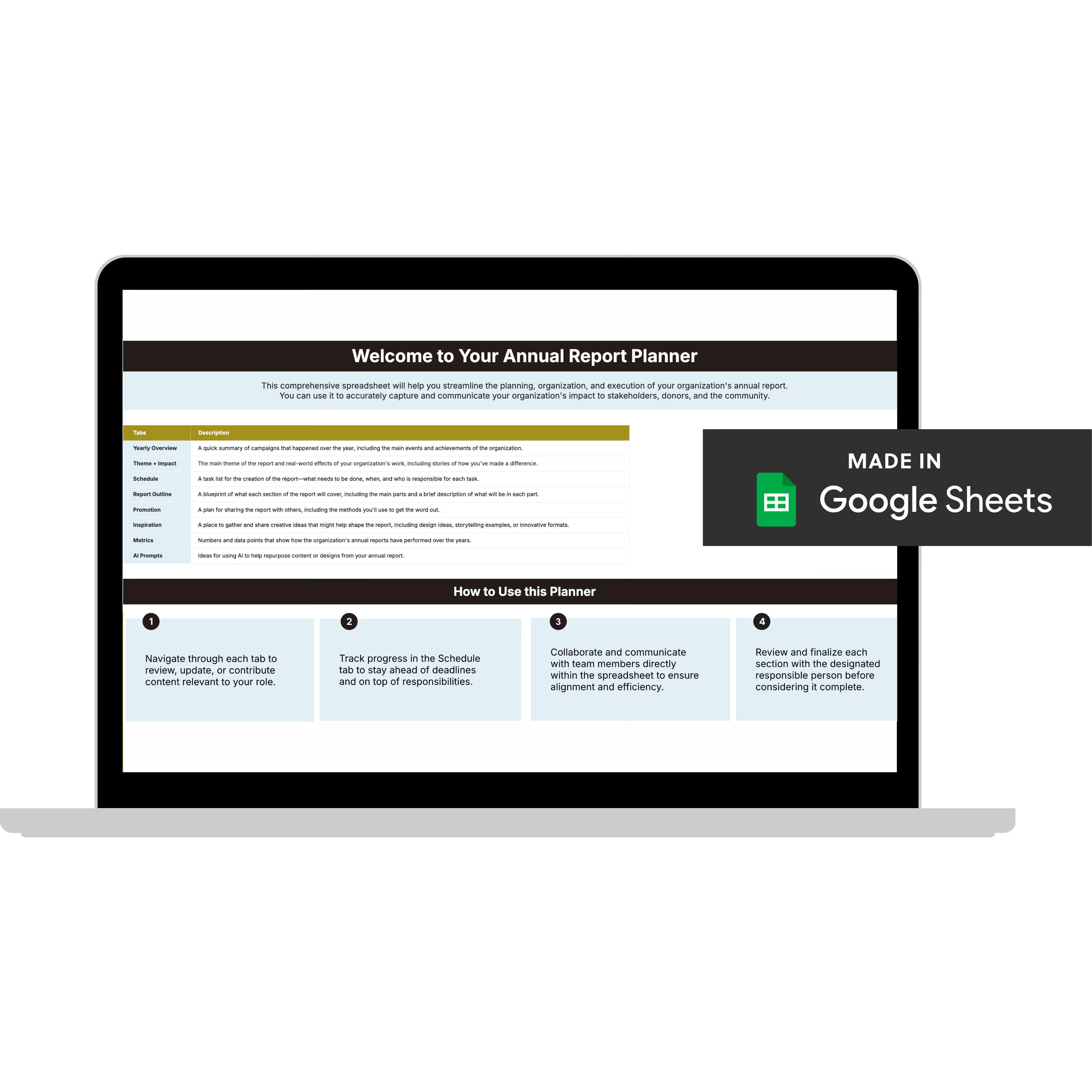
Annual Report Planner
Get a clear content roadmap so your annual report builds belief, earns trust, and actually gets used after launch—plus the same planning approach we use with our 1:1 clients, built in.
The Gap Between Data and Belief
I've watched this happen more than once. An org has done real, meaningful work in their community, but the report they put out doesn't reflect any of it.
The stories are written in org-speak that nobody outside the building would feel anything reading. And the team wonders why retention is down.
This is what I mean when I say measuring nonprofit impact is only half the job. The data has to come to life, and that's where design comes in.
Outputs Tell. Outcomes + Design Convince.
There's a version of impact reporting that says "thank you for your support" and a version that says "your gift funded three months of after-school programming for 40 kids, and here's what that looked like."
One of those donors gives again.
Pair your stats with stories. "10,000 meals served" gives donors scale. "Maria fed her kids during a job loss because of our emergency pantry" gives them a reason to care. Together, that's the combo that builds the kind of trust that shows up in your retention numbers.
A few things that make impact data land better on the page:
→ Before/after snapshots that show change over time, not just where things stand now
→ One strong human story per major program area
→ Visual data: icons, simple charts, bold callout stats
→ Outcome framing over output framing in every headline and pull quote
A Simple Starting Point If You're Just Getting Going
If impact measurement feels like a lot, start smaller than you think you need to.
1. Pick three outcomes you believe in
The ones that reflect the real change your work creates. Write them down in plain language, no org-speak allowed.
2. Choose two to four metrics that connect to each
Don't try to track everything. Track what you can collect consistently and what your donors will care about.
3. Decide how you'll collect the data
A spreadsheet is fine. A CRM is great. Whatever your team will maintain. Consistency is more important than sophistication at this point.
4. Review it quarterly, not just at year-end
The orgs that tell the strongest impact stories aren't pulling data together last minute. They're collecting and reviewing throughout the year so the story has time to develop.
5. Build the communication plan alongside the measurement plan
Before you decide what to measure, ask: where will this data show up? Annual report, donor newsletter, grant applications, social media? How it gets used should inform what you track.
Measuring Your Impact Is the First Step. Making Donors Feel It Is the Second.
You've got the data.
The disconnect is in the translation, turning what you tracked into something donors can actually feel. If your report is going out and the response isn't what you hoped, that's a fixable problem.
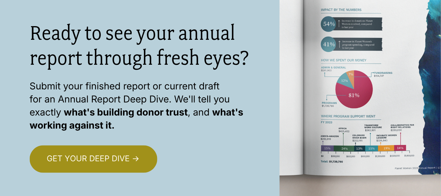
The Annual Report Deep Dive is a fresh set of eyes on exactly that.
I'll go through your report page by page and tell you exactly what's working, what's working against you, and what to fix first.
You'll walk away with three things:
✅ A Loom video walkthrough: me reviewing your report live, page by page, with real commentary on what I'm seeing and why it matters. Share it with your boss, your board, your whole team.
✅ Your BELIEF by Design™ Scorecard: your report evaluated across six areas: audience clarity, narrative trust, visual credibility, data presentation, emotional arc, and repurposing potential. You'll know exactly where you stand.
✅ A Priority Action List: ranked, specific, and ready to use. What to keep, what to cut, what to restructure, and what to add. No guesswork.
All of it delivered in 3 business days. And if you want to talk through implementation together, you can add a 60-minute strategy call.
Everything else (the design, the templates, the full-service work) flows from here. But this is where we start.