If you work in nonprofit comms or fundraising, you already know... donor engagement is one of those things that never leaves your plate.
Every year you see donors getting more distracted. Inboxes overflowing. Attention split six ways before lunch. But here's the thing: donors don't care less. They're just being handed materials that don't match the depth of what your organization does.
Visual storytelling is how donors feel the mission, understand the impact, and decide whether to trust what you're saying.
During crunch seasons especially, nonprofits get sharper results when they rethink their materials through the lens of intentional design.
Remember, donors read with their eyes first. Design decides if they keep reading at all.
Donor Engagement Starts With Feeling, Not Reading (and That's Why Visuals Win)
Donors form opinions before they read anything. It happens in the first few seconds, when they're responding to what they see.
Design tells them:
- if you're trustworthy
- if you have your act together
- if your mission feels real and human
- if they're invited into something that matters, or if it's just noise
Most nonprofits miss this entirely.
This matters especially during campaigns, when urgency can make everything feel frantic. But when your design feels cool, calm, and collected? That's when donors slow down and listen.
Real impact storytelling requires honesty. There's a huge difference between authentic narrative and manipulation. That's why staying true to your mission through design is everything. Donors know instantly when a story respects their intelligence versus when it's trying too hard to move them.
Here's what happens: design creates permission for donors to stay with you.
→ Get the free Annual Report Checkpoint
The Design Elements That Build Donor Belief
When design is treated as part of your mission (not decoration) it becomes your system for building real trust with supporters.
We've worked with 60+ nonprofits since 2019, and here's what moves the needle most:
1. Consistency: the trust signal that works every time
When your thank-you card looks nothing like your case statement, and your social graphics don't match your website, donors feel the disconnect. Inconsistent visuals say you're king of a mess internally.
A cohesive visual identity (the kind that makes you look like you know what you're doing) gives donors clarity about who you are.
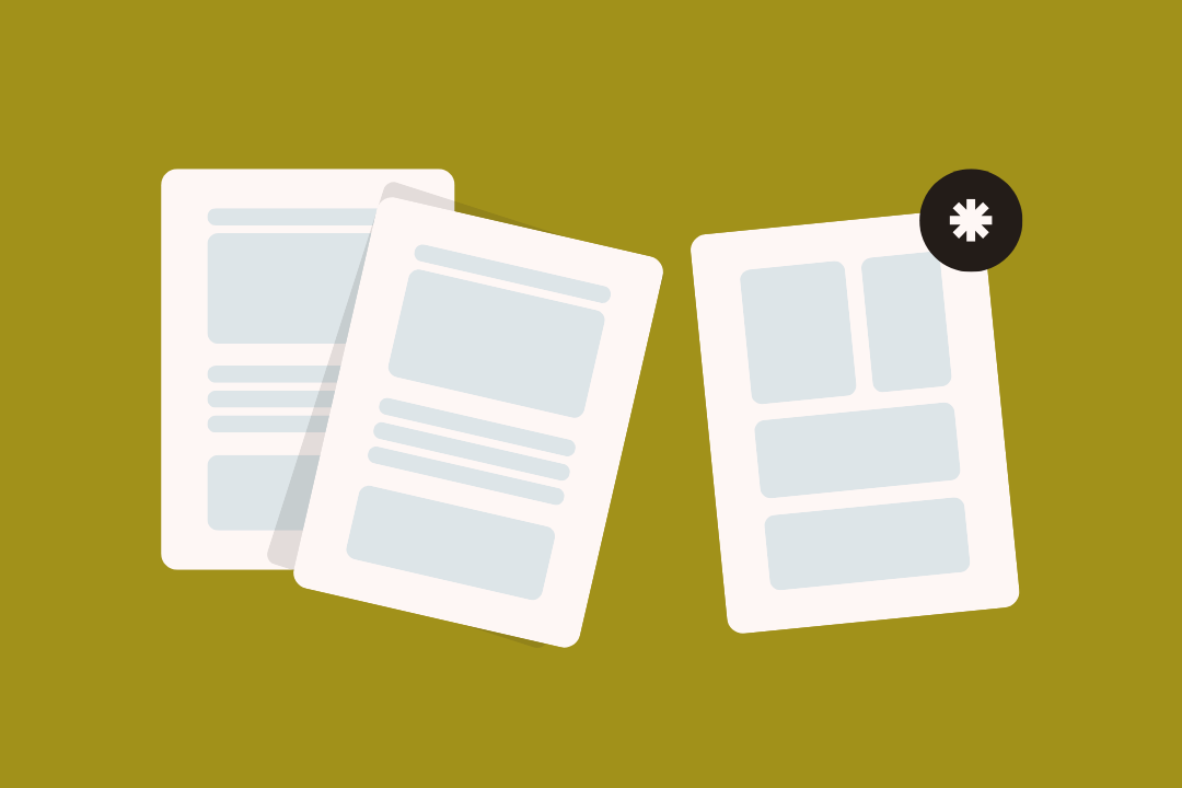
2. Clean layouts that make information land faster
Donors shouldn't dig through walls of text to understand your work or what you've accomplished.
Legible fonts, breathing room, and simplicity help donors absorb your story in seconds. This is crucial when you're communicating outcomes or metrics. The clearer your data presentation, the more accessible your impact becomes.
Design can turn overwhelming information into something donors trust and understand. That's the whole point.
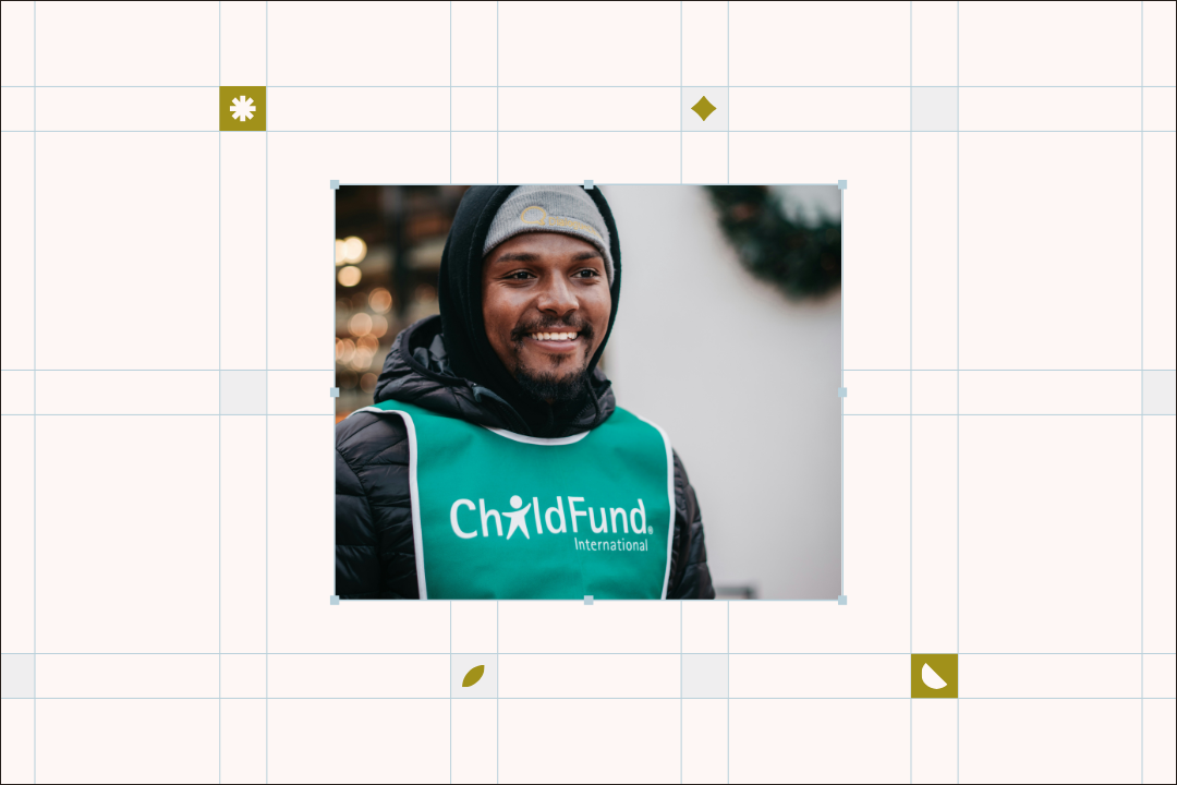
3. Emotion-forward storytelling creates real connection
Visual storytelling is what makes your work human. Donors connect when stories have:
- real faces
- authentic photography
- powerful quotes
- space to breathe
- intentional flow
Emotion-forward design is what brings your mission to life in a way donors immediately feel. That's how you move supporters from knowing your mission to believing in it.
4. Design systems that repurpose across channels
Donor engagement deepens when supporters see consistent, familiar messaging everywhere they encounter you.
Templates, clear layouts, and a solid visual system make ongoing communication easier for your team, and clearer for donors. It's how you build steady, year-round connection.
5. Accessible design says that you care who sees it
Accessibility is how you show your values in action.
Readable type, strong contrast, alt text, inclusive imagery, and clear hierarchy send one message: We care how our message comes across, and who feels welcome in it.
That deepens trust with every donor who encounters you.
Which Donor Touchpoints Matter Most (and How Design Changes the Game)
Some touchpoints should be prioritized—thank-yous, recognition, campaign launches—and design shapes how each one resonates.
Thank-you moments that stand out
A thoughtful thank-you experience sets the tone for everything that follows.
When it's warm, intentional, and visually personal, it builds retention and emotional connection that lasts.
Even small touches leave lasting impressions on donors.
Recognition that feels genuine, not like a form letter
Donor recognition works when it feels intimate, not formulaic.
Visual approaches that function like love letters to your supporters make gratitude feel heartfelt and human. That's real donor recognition.
Design-led fundraising
Nonprofits can borrow a lot from design thinking to create campaigns that feel intuitive and modern. Clean visuals, emotional understanding, and intentional formatting help donors feel oriented from the start.
When you combine design thinking with fundraising strategy, you reduce confusion, improve readability, and make campaigns more intuitive for donors. That's the shift that matters.
Campaigns That Feel Urgent Without Feeling Panicked
Urgency works when donors feel supported with clear next steps, not pressured. During giving season, what moves donors comes down to thoughtful pacing, emotional sincerity, and visuals that guide instead of demand.
Communication That Respects Donor Time
Donors don't need more emails, more graphics, or more updates. They need communication that helps them understand, not more work.
You'll keep donors engaged when every message is to the point, well-paced, and thoughtfully simple.
5 Quick Design Wins That Strengthen Donor Engagement (High-Impact, Low-Lift)
These five upgrades build trust without requiring a full rebrand.
1. Redesign one high-visibility donor asset with intention
Pick the touchpoint donors interact with most: thank-you emails, case statements, or appeals.
Why: small design shifts send strong trust signals.
2. Build a simple internal visual system
Create 2-3 reusable layouts, consistent colors, and a defined font set.
Why: consistency builds recognition, and recognition fuels belief.
3. Turn your impact stories into visual experiences
Break long paragraphs into human-centered pieces: photos, quotes, callouts, icons.
Why: donors skim, and visuals help your meaning land faster.
4. Improve your thank-you experience
Bring warmth, humanity, and simplicity to thank-yous and emails.
Why: gratitude is one of your strongest retention tools.
5. Repurpose one strong asset into multiple touchpoints
Your annual report, a blog post, or case statement can generate weeks of donor-ready content.
Why: repetition strengthens familiarity, and familiarity builds belief.
FAQs About Nonprofit Donor Engagement
What improves donor engagement the most?
Donors connect deeper when visuals feel organized, human, and intentional.
Does design really influence donor retention?
Yes. Design shapes emotion, trust, and comprehension long before messaging ever does.
Which donor touchpoint matters most?
Thank-you experiences. Small, personal moments that leave lasting emotional impressions.
How often should nonprofits engage donors?
More regularly than you think, but with steady, intentional visuals that don't overwhelm.
Where should small teams begin?
Start with your most visible donor touchpoint and build a simple visual system around it.
Donor Engagement Is Built Through Visual Trust
Design is the first impression. It's how donors interpret your mission, how they decide to trust you, and how they understand the impact you're making.
When your visuals reflect the integrity of your work—warm, grounded, clear, human—donors don't just understand your mission.
They believe in it. And belief is what keeps them close.
.avif)
Get The Annual Report Checkpoint

Donor Thank You Postcards Templates
Enter your info and we’ll send the postcards straight to your inbox:
5. Repurpose one strong asset into multiple touchpoints
Your annual report, a blog post, or a case statement can generate weeks of donor-ready content.
Why it matters: repetition strengthens familiarity and familiarity builds belief.
FAQs About Nonprofit Donor Engagement
What improves donor engagement the most?
Donors connect more deeply when visuals feel organized, human, and intentional.
Does design really influence donor retention?
Yes. Design shapes emotion, trust, and comprehension long before messaging does.
Which donor touchpoint matters most?
Thank-you experiences. They're small, personal moments that leave lasting emotional impressions.
How often should nonprofits engage donors?
More regularly than you think, but with steady, intentional visuals that don't overwhelm.
Where should small teams begin?
Start with your most visible donor touchpoint and build a simple visual system around it.
Donor Engagement Is Built Through Visual Trust
Design is the first impression. It's how donors interpret your mission, how they decide whether to trust you, and how they understand the impact you're making.
When your visuals reflect the integrity of your work—warm, grounded, clear, human—donors don't just understand your mission.
They believe in it. And belief is what keeps them close.