If you're in the nonprofit world, you already know: your year-end fundraising campaign is the event.
Between Thanksgiving and New Year's, donor generosity spikes. People reflect, they give back, and yeah—those last-minute tax deductions don't hurt. This is your window.
But here's the thing: being the fundraising season doesn't automatically make your ask stand out. Everyone's competing for attention. Your direct mail goes unread and your social post is one of hundreds.
So how do you cut through the noise?
Good design.
When your year-end campaign uses strong visuals, clear copy, and strategic CTAs, you can command attention
Below, we'll walk through real examples of how smart design principles transform year-end fundraising into campaigns that move people to give.
The Psychology of Year-End Giving Design
Before we dive into examples, it helps to understand why design matters for fundraising specifically.
Year-end giving happens in a context of reflection and nostalgia. People are thinking about what mattered to them during the year. They're feeling generous. But they're also overwhelmed with holiday crazyness, getting their own work done before they take a break, and prepping for the new year.
Your design's job is to cut through that noise by:
- Creating visual calm in a cluttered digital space
- Guiding attention to your core message and CTA
- Building trust through thoughtful, intentional design
- Evoking emotion that connects to your mission
Let's look at some real design patterns that succeed at all four.
Year-End Fundraising Design Examples
Bold, High-Contrast CTAs
This principle comes straight from user experience design: people's eyes go where contrast takes them.
When your CTA (donate button, call-to-action copy, giving link) sits on a high-contrast background, it becomes the focal point of the page or design. It's not demanding attention in a pushy way; it's offering clarity.

In the example above, notice how the bright, saturated color of the CTA button immediately draws the eye, even at a glance. That's not accidental.
For nonprofits: Your donation button should be the most visually prominent element on your page or email (almost obnoxious that it doesn't go unnoticed). Choose a color that contrasts sharply with your background. Make it large enough that it says click me.
Strategic Use of Negative Space
Negative space (the empty space around elements) is a powerful design tool that many nonprofits overlook.
When elements are crammed together, they compete for attention. The eye doesn't know where to look.
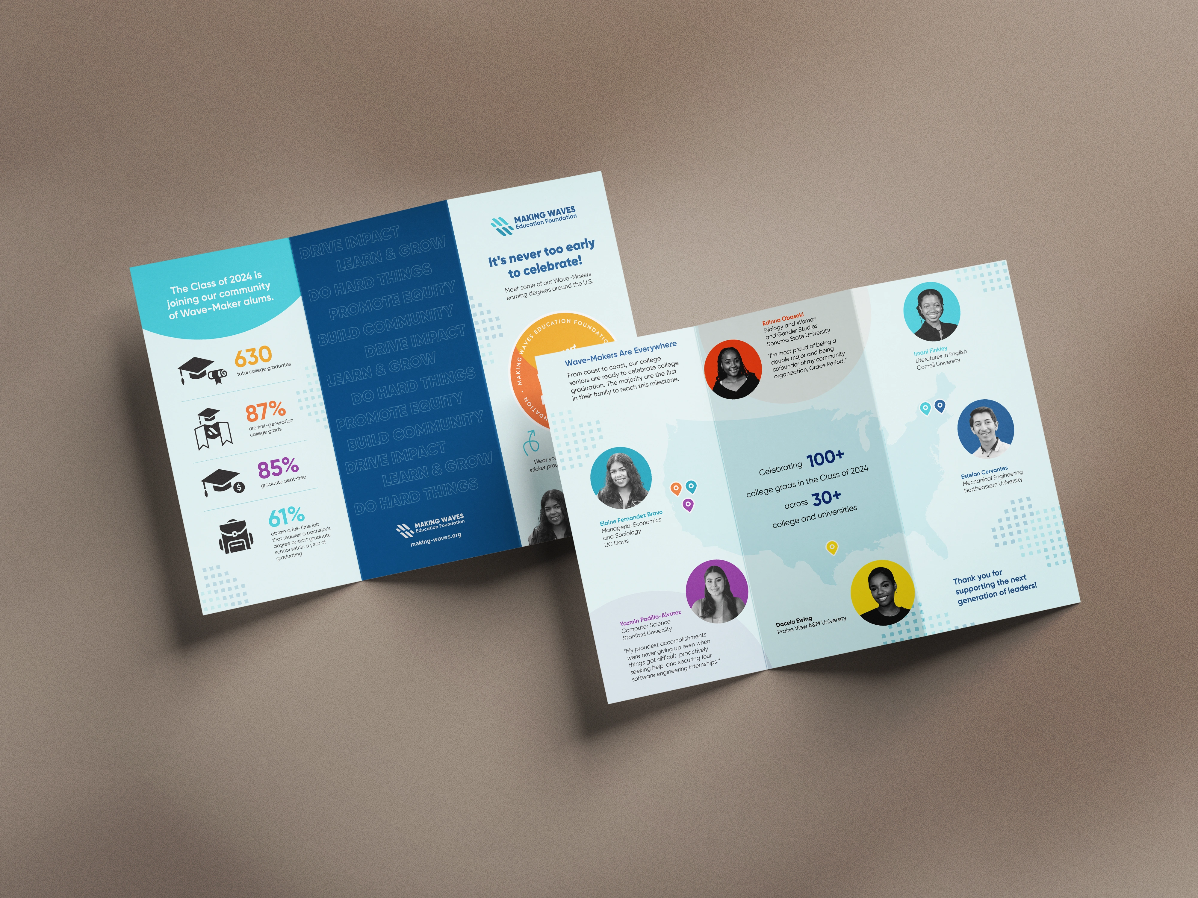
Strategic negative space, like in the example above on the map page, does the opposite. It makes your most important information feel valued and considered.
For nonprofits: Leave breathing room around your key message. Don't fill every pixel. Use margins generously. Your donor's eye should be guided, not bombarded.
Authentic Imagery + Bold Typography
Design trends come and go, but authentic imagery never goes out of style.
When donors see real people (not stock photos of models), real moments, and real impact, trust builds immediately.
Pair that with bold, readable typography, and you've created a design that feels both human and professional.
For nonprofits: Invest in photos of the people and communities you serve. Pair those with confident font choices. Avoid the trap of making everything too small or too delicate.
Color as an Emotional Anchor
Color psychology is real. Warm colors (reds, oranges, yellows) tend to feel energizing. Cool colors (blues, greens, purples) feel calming. Neutral palettes feel trustworthy.
For year-end campaigns, consider what emotional response you want to evoke.
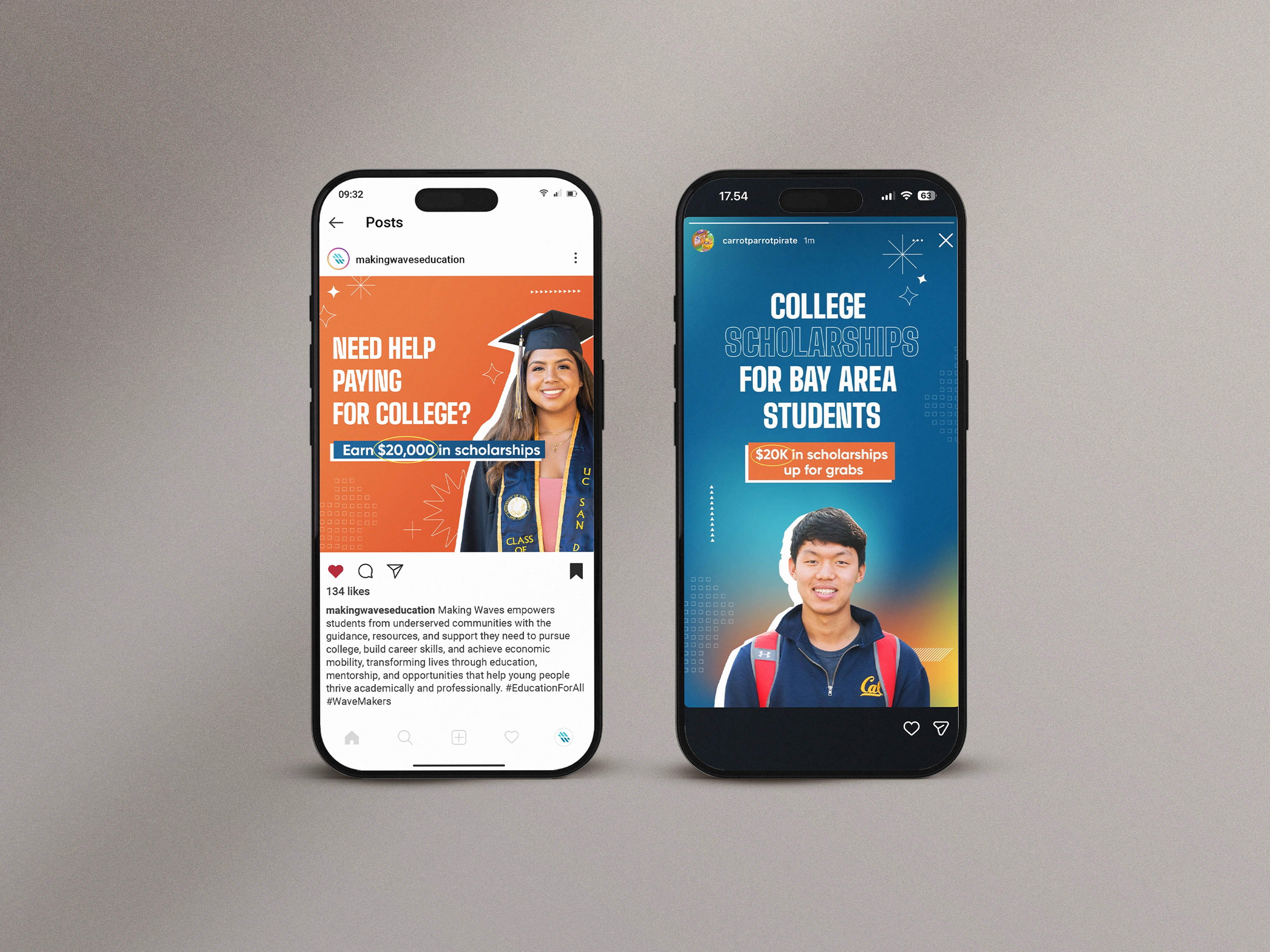
A climate nonprofit might use earth tones and deep greens to ground the message in nature. An education nonprofit might use bright, optimistic colors that feel forward-looking. A social justice org might use bold, unapologetic colors that demand attention.
For nonprofits: Choose your color palette intentionally. Make sure your CTA color stands out from your background. Avoid default blues and greens unless that genuinely matches your brand identity.
Motion + Storytelling
If you're designing a digital experience (email, landing page, website), consider how motion can guide attention and tell a story.
A subtle scroll-reveal animation can guide the eye down the page and create a sense of discovery as donors engage with your story.
For nonprofits: If you have the technical capacity, consider a simple animation that reveals key stats, quotes, or images as donors scroll. This keeps them engaged and moving toward your CTA.
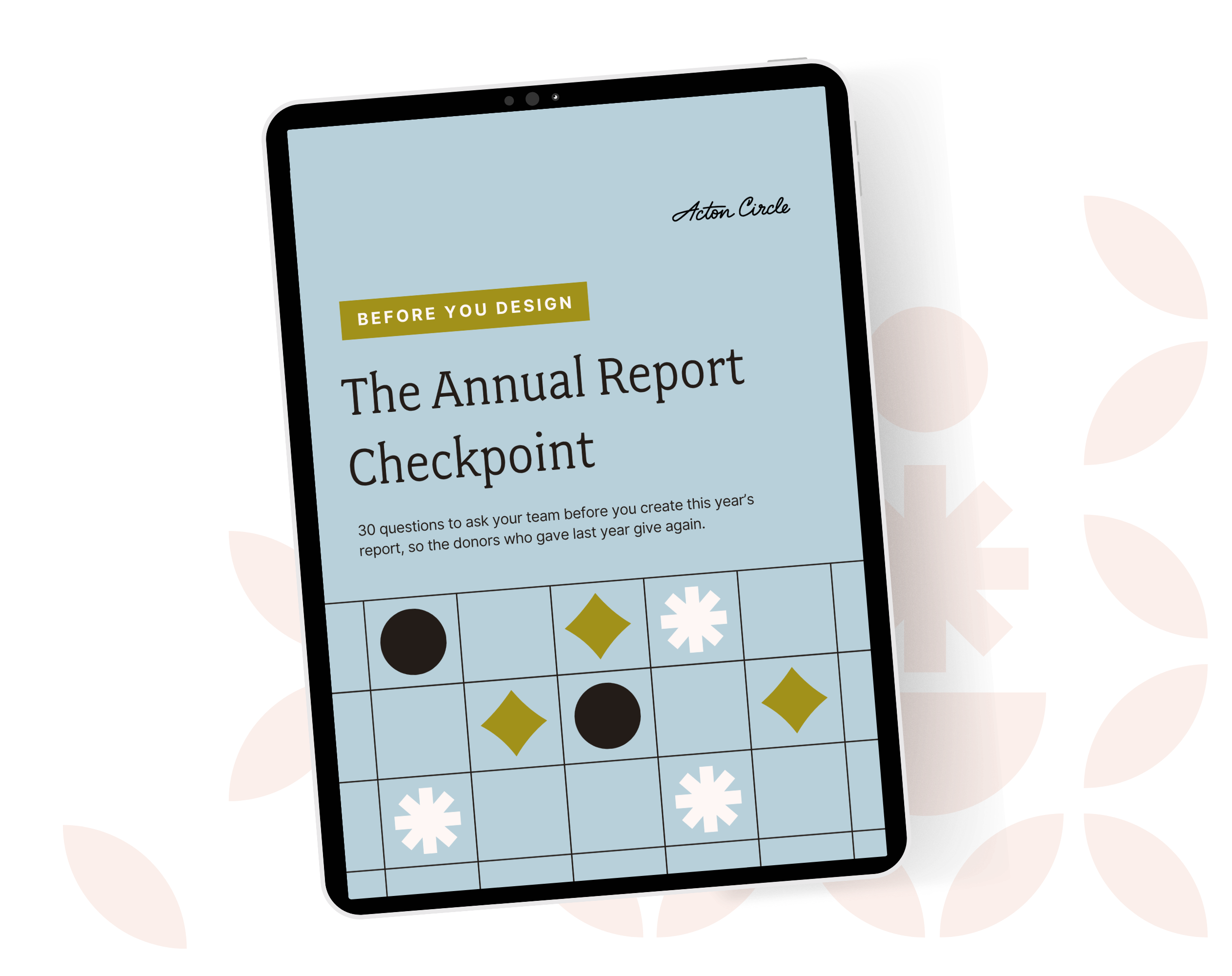
Get The Annual Report Checkpoint
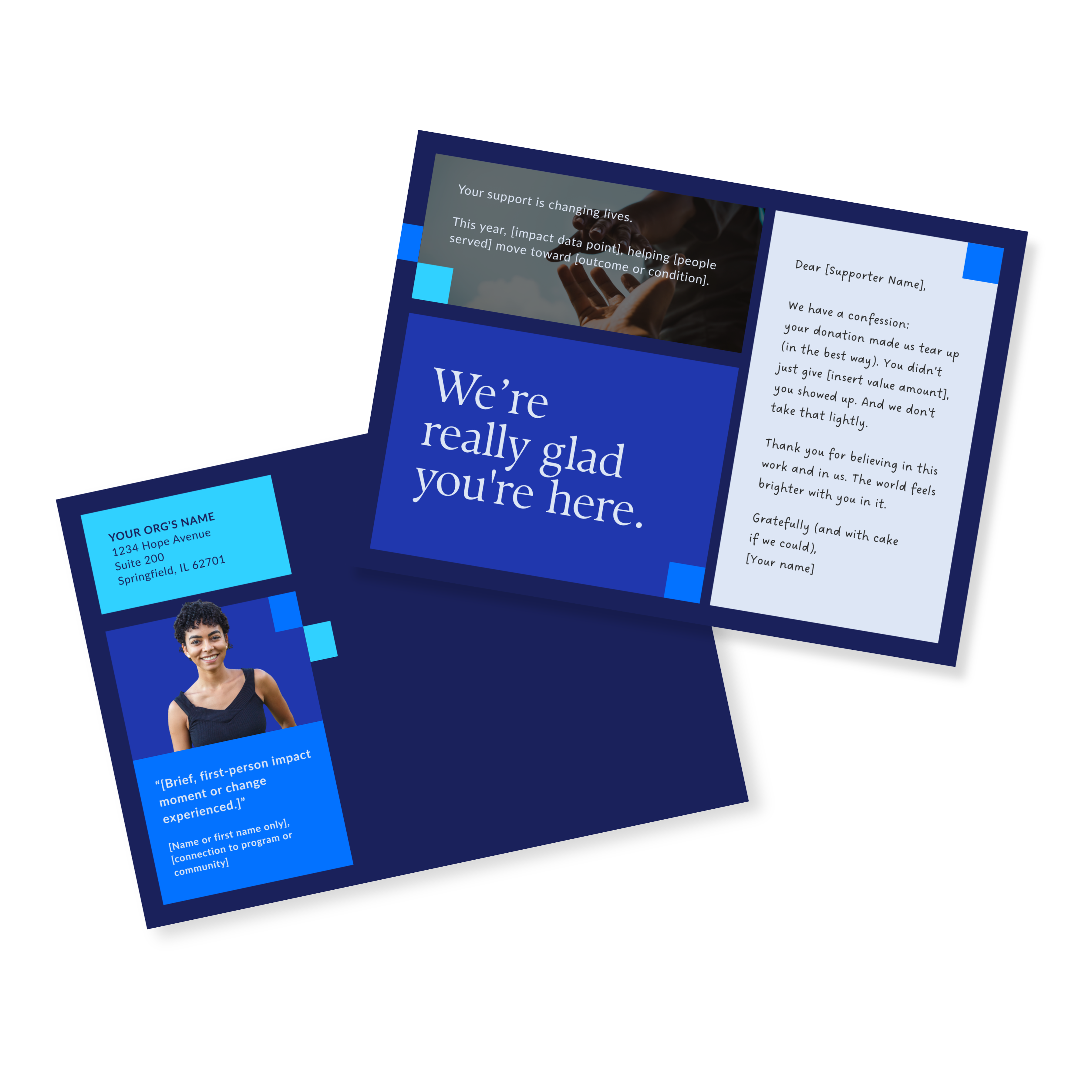
Donor Thank You Postcards Templates
Enter your info and we’ll send the postcards straight to your inbox:
The Design Strategy Behind Successful Year-End Campaigns
The examples above work because they follow a shared strategy:
- Visual Emphasis: Make your most important information (your mission, your impact, your ask) visually dominant
- Clarity: Cut jargon and use short sentences. Make your message scannable.
- Trust-Building: Use real imagery of your people and programs and honest language to show donors you're a serious, mission-driven organization
- Emotional Connection: Don't just ask for money. Help donors feel the impact their support creates.
- Clear CTAs: Make it stupidly easy to give. Your CTA should be unmissable and unambiguous.
Three Quick Design Wins for Your Year-End Campaign Right Now
Here are three things you can do immediately to strengthen your year-end campaign:
1. Audit Your CTA
Is your donation button/link the most visually prominent element on your page or email? If donors had to squint to find it, you've failed the basic test. Make it bigger and bolder.
2. Simplify Your Copy
Cut 20% of your words. If you can say it in one sentence instead of three, do that. Year-end inboxes are filled to the brim.
3. Choose One Clear Story
Don't try to tell your whole year in one campaign. Pick one story that shows the ripple effects of generosity. Make that the emotional anchor of your appeal.
Your year-end campaign is coming. Does your design pass the test?
You just saw what high-contrast CTAs, strategic negative space, and authentic imagery actually do for donor behavior. Now think about your own materials, specifically your annual report. Does your donation CTA command attention? Does your imagery build trust before anyone reads a word?
If you're not sure.... that's the answer. Start with the Annual Report Checkpoint, a free self-assessment that shows you where your report is building belief and where it's leaking trust.
It takes 10 minutes. It'll save you a season of second-guessing.