

.avif)
.webp)


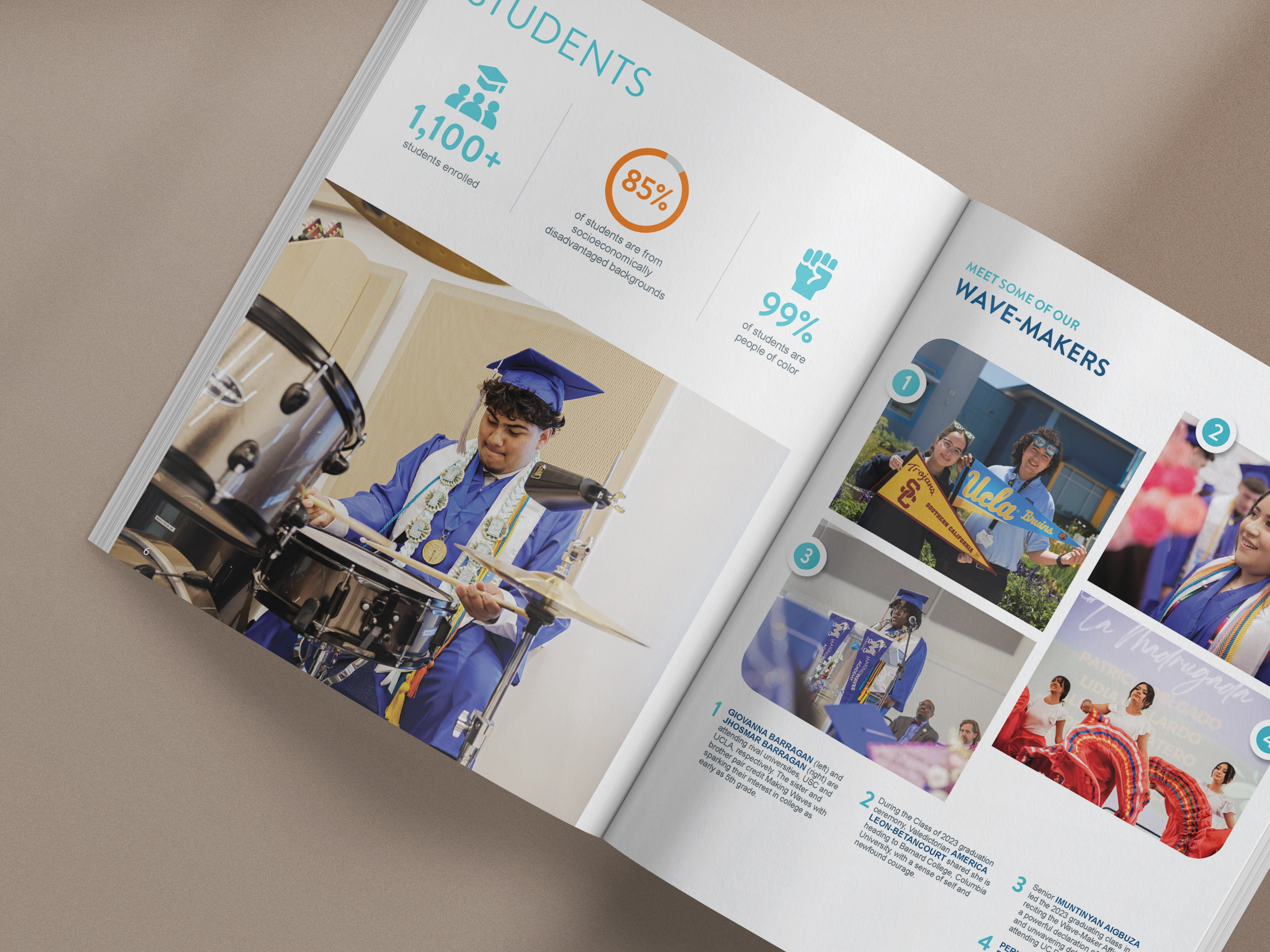
A clear, collaborative process that gets your report from idea to done, built around your team's pace. Most projects are completed in 10-16 weeks.
Strategy Session
We step back and look at your report as a whole: what it needs to communicate this year, what’s already working, and what’s getting watered down.
You leave with aligned priorities and a shared direction before design begins.
This is the step most teams skip. It's also the reason most reports feel assembled instead of intentional.

Strategic Copy Refinement
We review your draft for readability, flow, and whether it makes sense.
You receive a redlined document with edits and recommendations that strengthen the throughline before visuals are applied.
This is where "all data, no story" gets fixed. Before a single design decision is made.
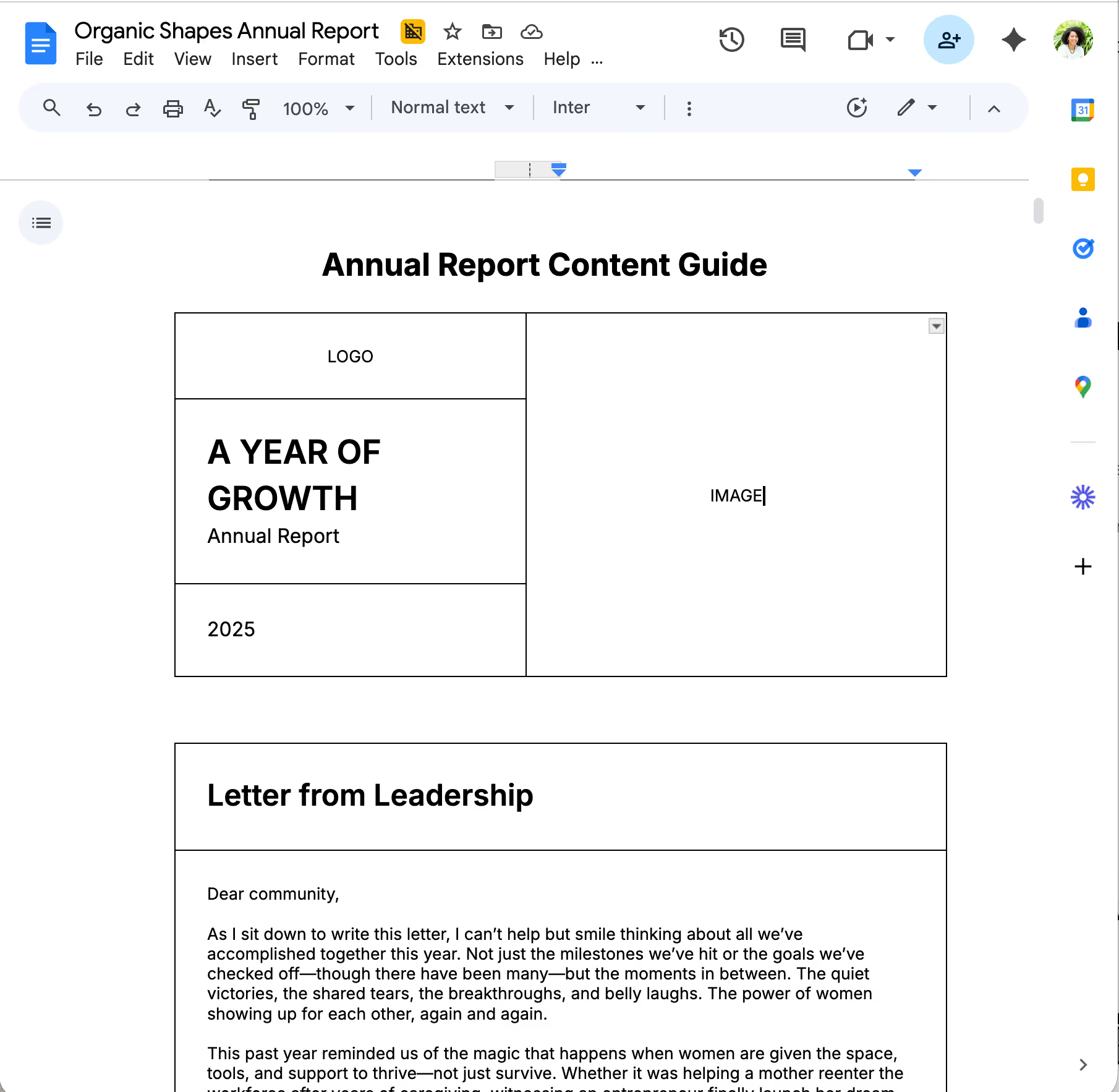
Design Creation
We translate strategy into visual direction and build early layouts (usually the cover + key spreads) to establish structure, pacing, and hierarchy.
Once approved, we move into full production.
You'll see the direction before we build everything. No surprises at the finish line.

Refinement & Finalization
We complete the report, polish visuals, create your impact reel, and prepare final files for print and digital use.
Everything is delivered organized, editable, and ready to circulate.
Organized files. Labeled folders. Promise.

Digital Experience, Repurposing, & Delivery
Report & Repurpose and Visibility System packages
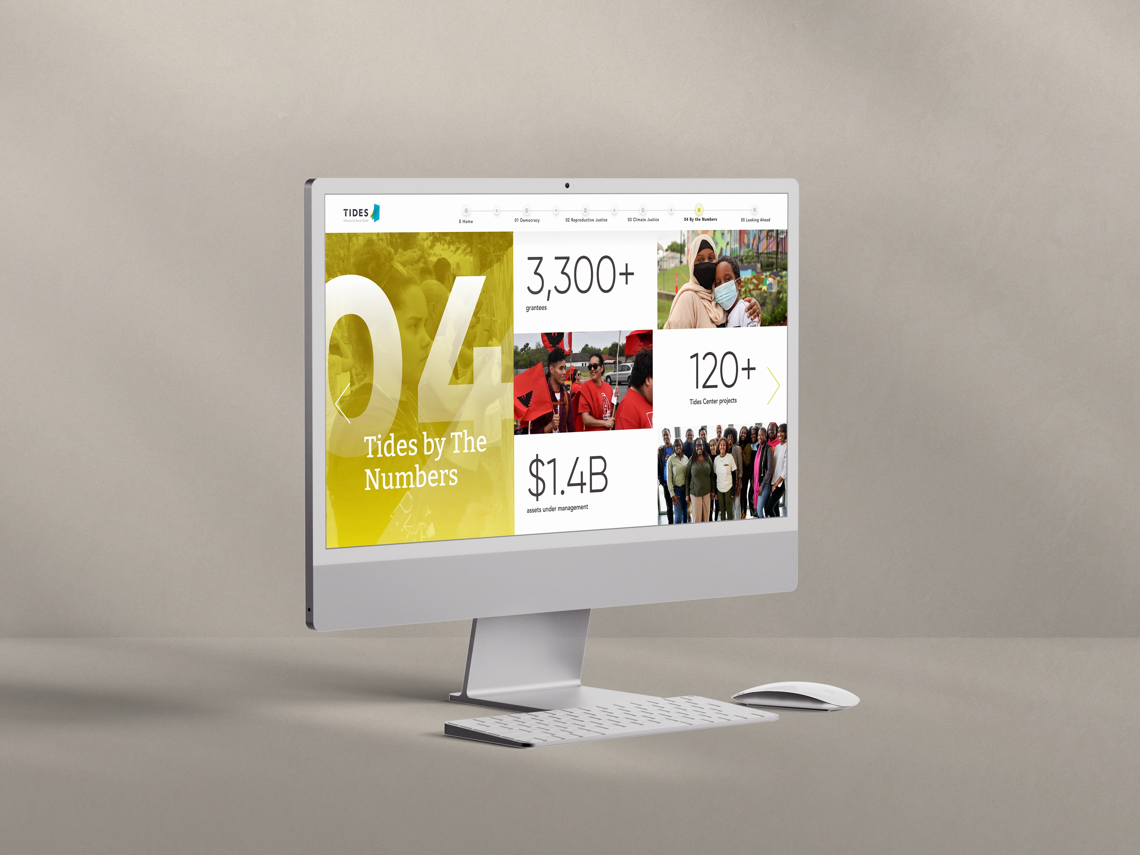
Your report gets delivered as an interactive digital experience, ready to link, share, and pull from all year.
Plus repurposed evergreen assets your team can use across email, social, and donor conversations long after launch.
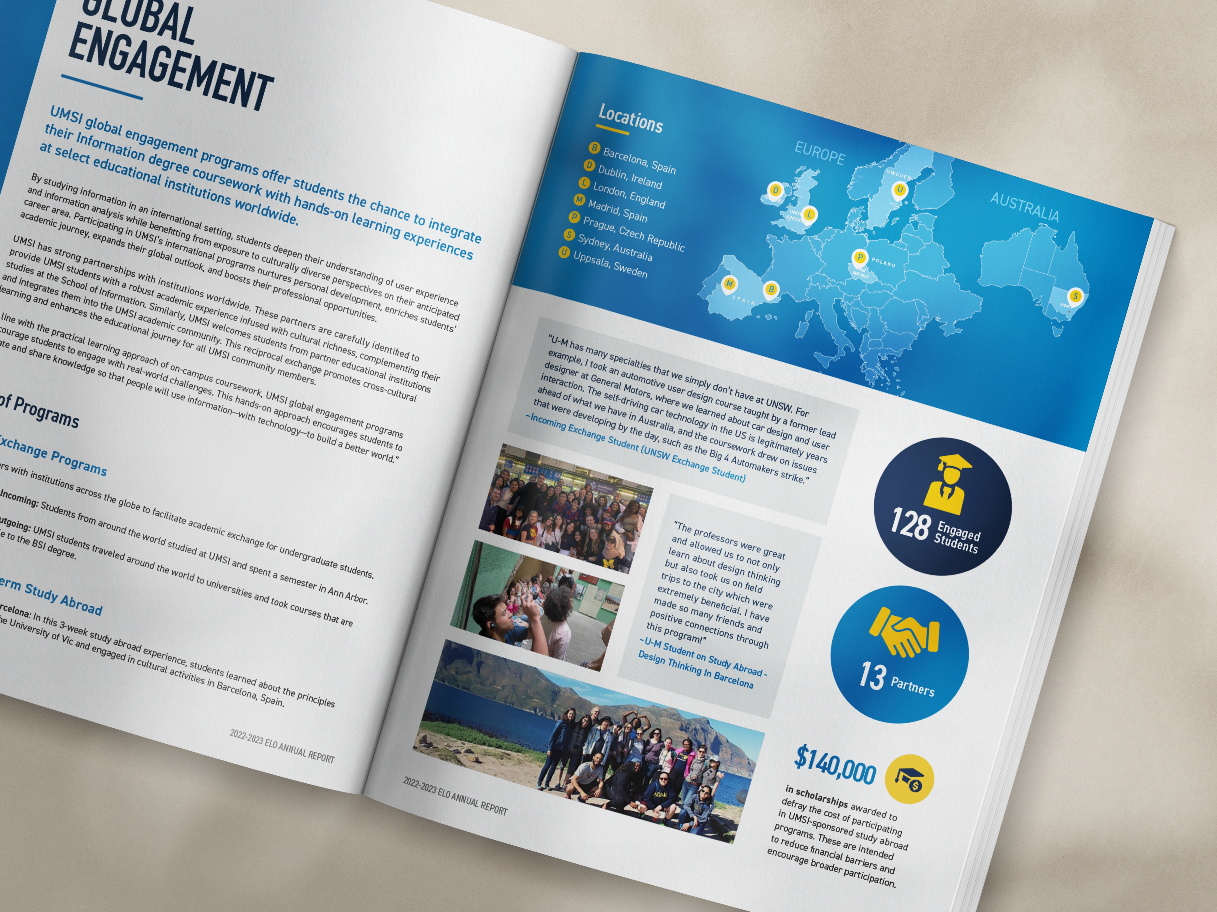
Quarterly Asset Refresh
Visibility System package only
Three times a year, we reconnect to keep your report assets current and your content aligned with what's happening in your organization. Each quarterly refresh includes:
+ Copy updates. We swap in current impact stats, dollar figures, dates, and story details, and lightly edit the copy so it reads cleanly with the new content.
+ Image swaps. We replace up to 3 photos or graphics per asset with new imagery you provide, sized and color-corrected to match.
+ Data refresh. We update any charts, infographics, or numbers pulled from your impact data so they reflect the latest reporting.

Big reports, small teams, tight deadlines. We've designed for all of it. And we know what's at stake when it doesn't connect.

We know nonprofits, and we know design. We understand your board, your funders, and the need to earn trust. Your annual report speaks to many readers at once, so we design it to work for all of them.

You get clear timelines, regular updates, and set review points. You always know what's next and why. You're already doing the work of three people. You shouldn't have to chase us too.

We don't just make your report look nice. We help donors feel your mission. Every font, photo, and layout has a job. If your story is almost there, we fill in the gaps so it all makes sense.

No surprise bills. Our annual report design services come with a fixed price and a clear list of what you get. We share the cost up front, before you commit.

Most designers stop at "looks professional." We don't. Your report should be as strong as the work your team does. Donors can tell when something was made with real care, and that care earns their trust.
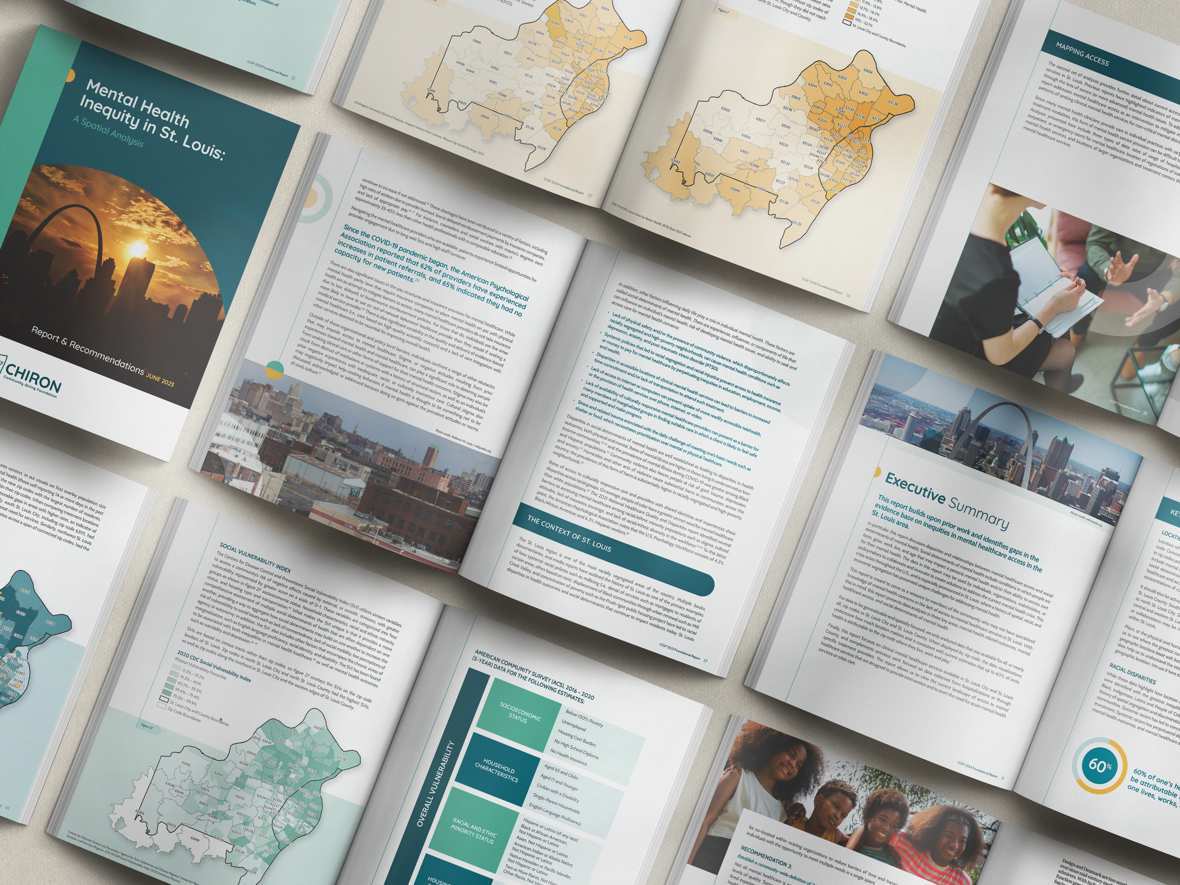
What happens next
→ Pick your package + sign the agreement — Tell us which package you want, and we'll send a formal agreement with a clear scope of work.
→ Pay your first invoice — Your spot on the calendar is locked.
→ Book your kickoff strategy session — This is where the real work starts.
→ We get the show on the road — You always know what's coming next. That's the whole point.
Most projects wrap in 10–16 weeks. That said, the timeline is really driven by you, how quickly your team can get us content, feedback turnaround, that kind of thing. If you need it faster, let's talk. We've made tighter timelines work.
Your existing content like, program recaps, stats, stories, photos, and any copy you have. You don't need to have it all perfectly organized. We're used to working with messy folders and half-finished drafts. That's part of what we do.
We don't offer standalone copywriting, but every package includes some form of copyediting.
Our Report & Repurpose and Visibility System packages include deeper copy work that sharpens your grammar and narrative.
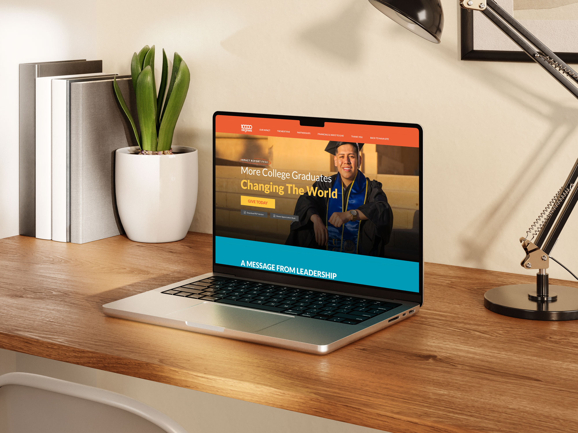
A dedicated, condensed digital version of your report built to share, link to, and send donors to instead of just attaching a PDF. It's clean, on-brand, and designed to keep people engaged longer than a downloaded file ever would.
We live in Squarespace and Webflow.
You walk away with fully editable files that belong to you and a report you'll be so proud to share.
For Report & Repurpose clients, you've got 5 assets ready to use across email and social.
For Visibility System clients, we stay connected through quarterly refreshes tied to your giving calendar. Nobody gets handed a ZIP file and ghosted
Things like donor emails written around a key story from your report, social graphics pulled from your impact stats, a one-pager for board meetings or funder conversations, or a short email sequence leading into your year-end campaign.
Every asset is built from content that already lives in your report, so we aren't starting from scratch; we're just putting it to work.
Freelancers are great until the report hits a strategic snag and they're not sure how to navigate it. Agencies are great until you realize you're working with a junior designer and the senior person you hired disappeared after the kickoff call.
We're a boutique studio that ONLY does this work, for organizations exactly like yours. You get senior-level thinking and execution every single time.