Snapshot
Audience: Funders, policymakers, healthcare partners
Challenge: Strong results scattered across internal documents
Solution: Digital impact report + visual storytelling system
Result: A clear, human report ADA can confidently share externally
Where They Started
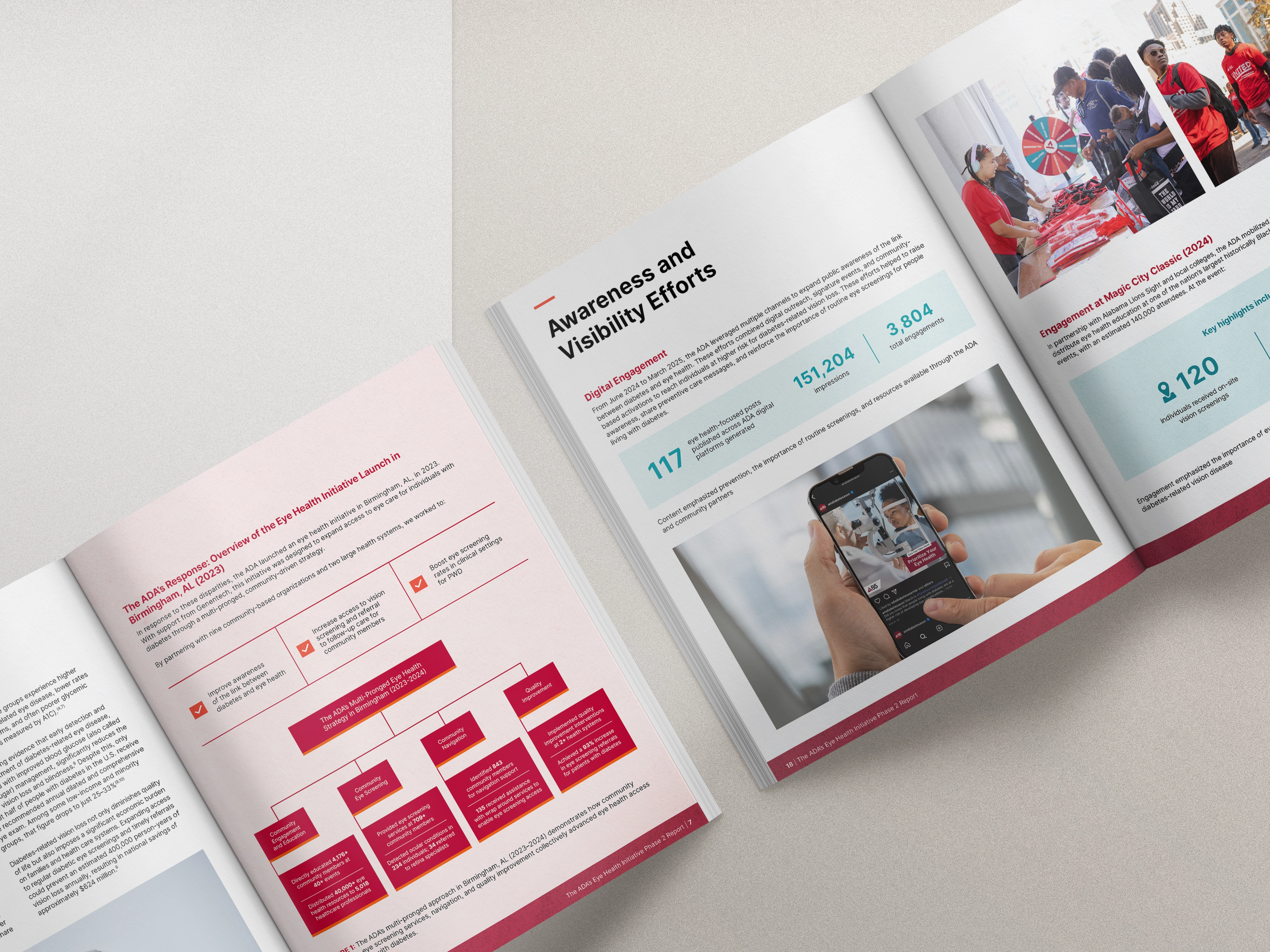
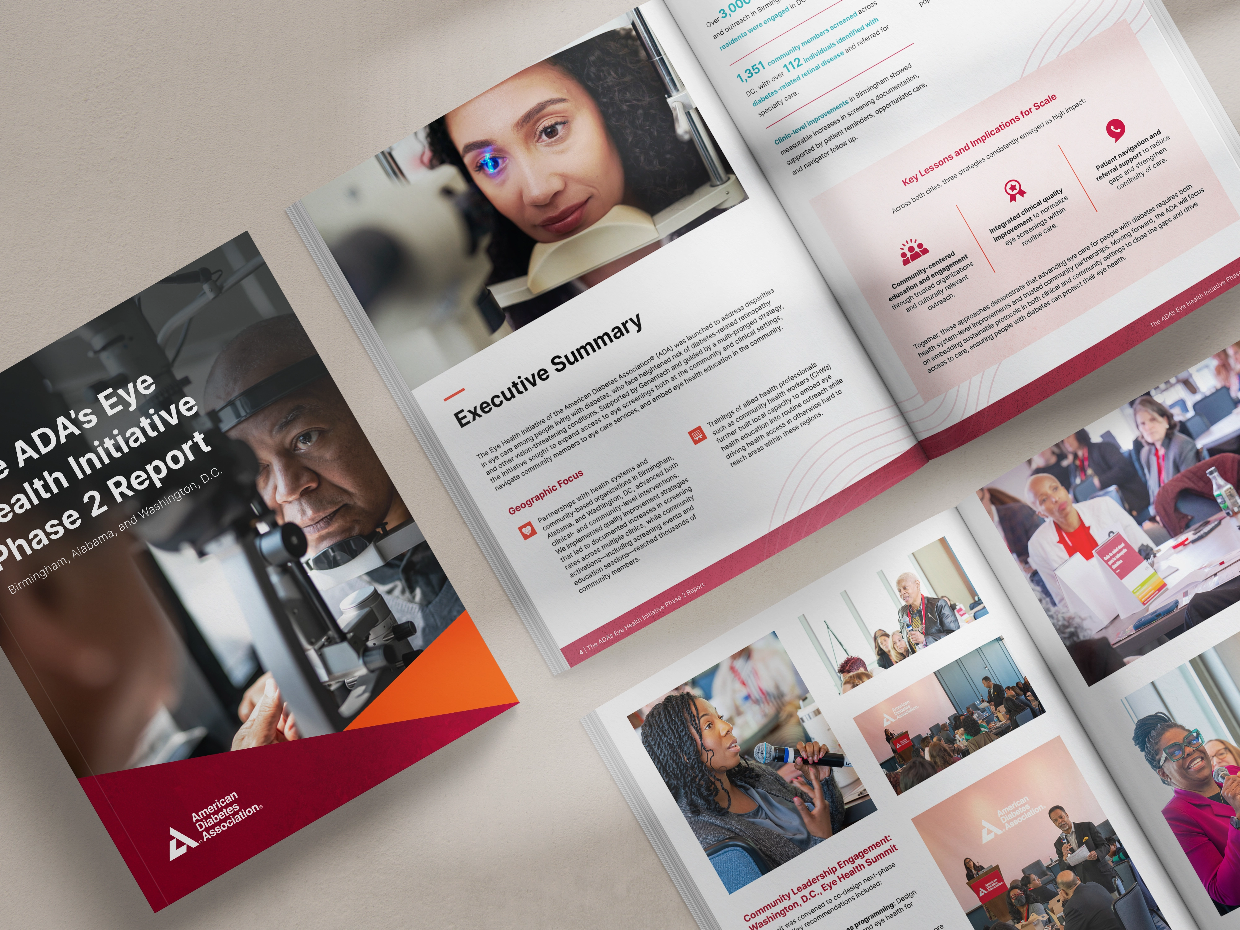
The American Diabetes Association’s Eye Health Initiative had real progress to show.
They were expanding access to screenings, reducing preventable blindness, and reaching communities that needed care.
But the story of that progress lived in spreadsheets, internal notes, and documents within different departments. Teams understood the work. External partners didn’t get the full picture.
ADA needed a report that gathered everything into one place and explained the impact in a way funders and partners could immediately understand.
Not just accurate but clear, human, and shareable.
What Was Getting in the Way
With a busy marketing team and a program director managing day-to-day operations, there wasn’t extra capacity to turn complex program data into a polished external story.
The program had strong outcomes, but dense data and multiple contributors made it hard to present as a single, cohesive story.
The report needed to:
- Show measurable progress without overwhelming readers
- Balance numbers with real community impact
- Work for funders, policymakers, and healthcare partners
- Stay aligned with ADA’s national brand
- Read cleanly on screen for digital viewing
We needed to make their work easier to understand.
What We Built
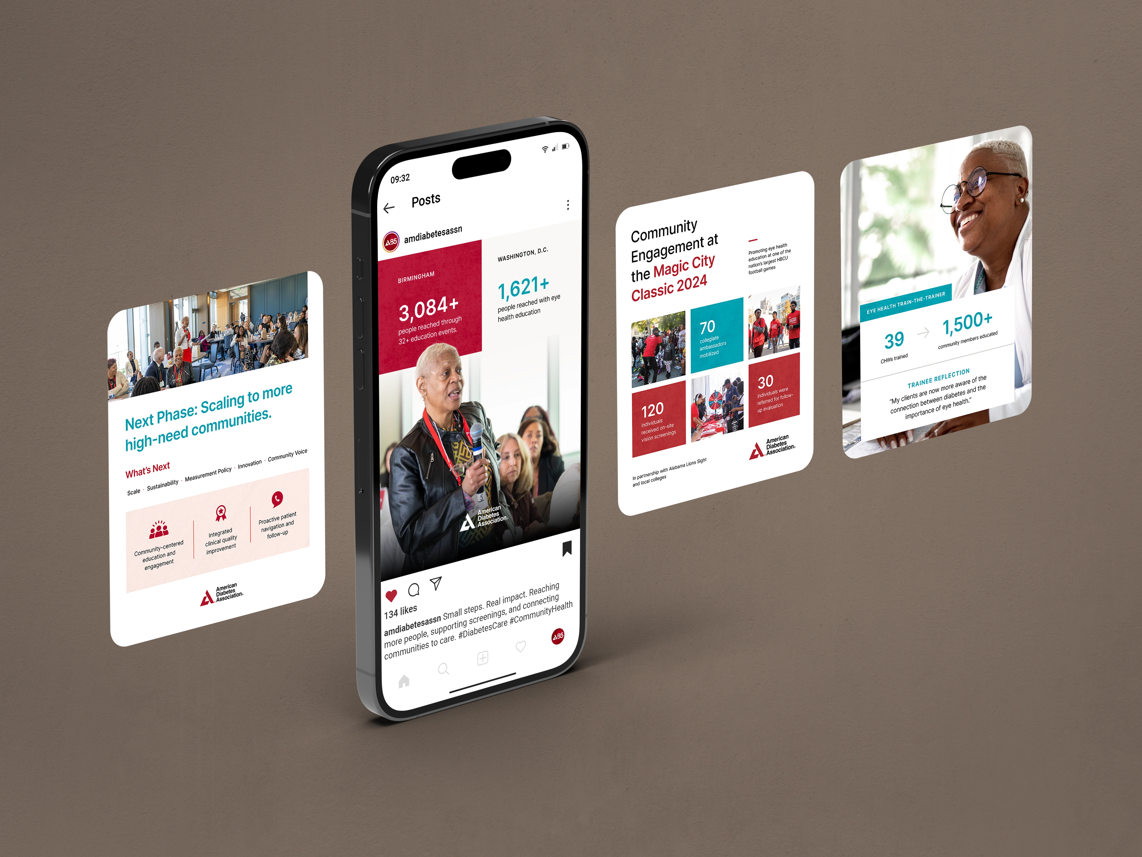
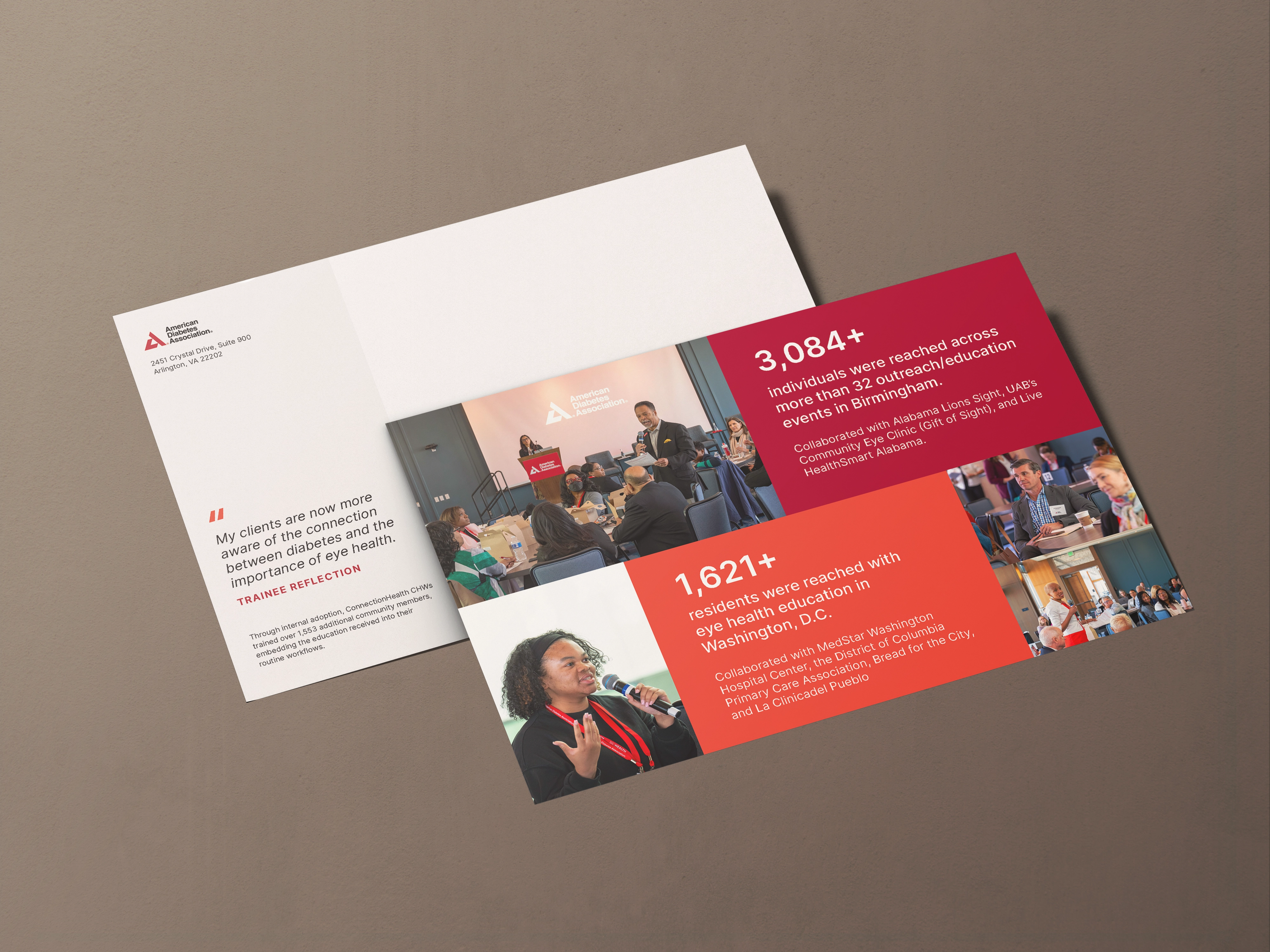
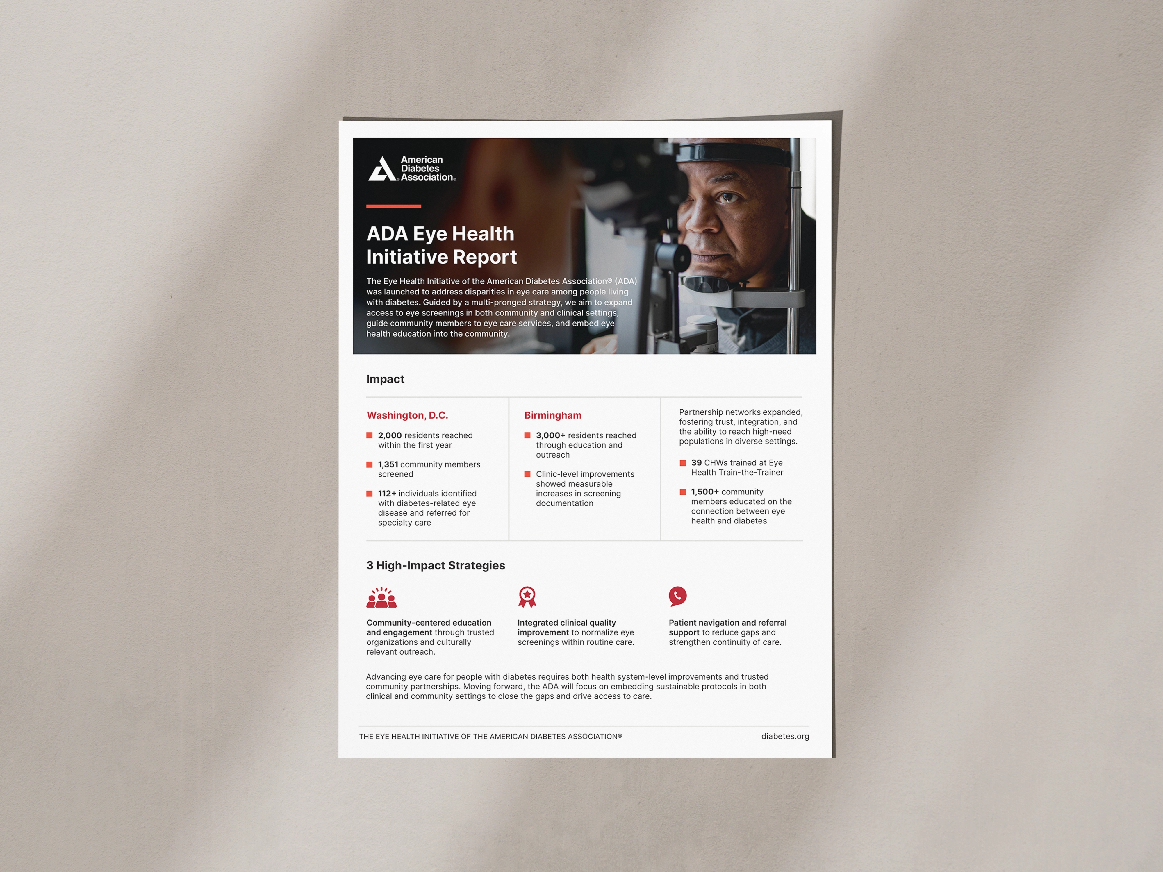
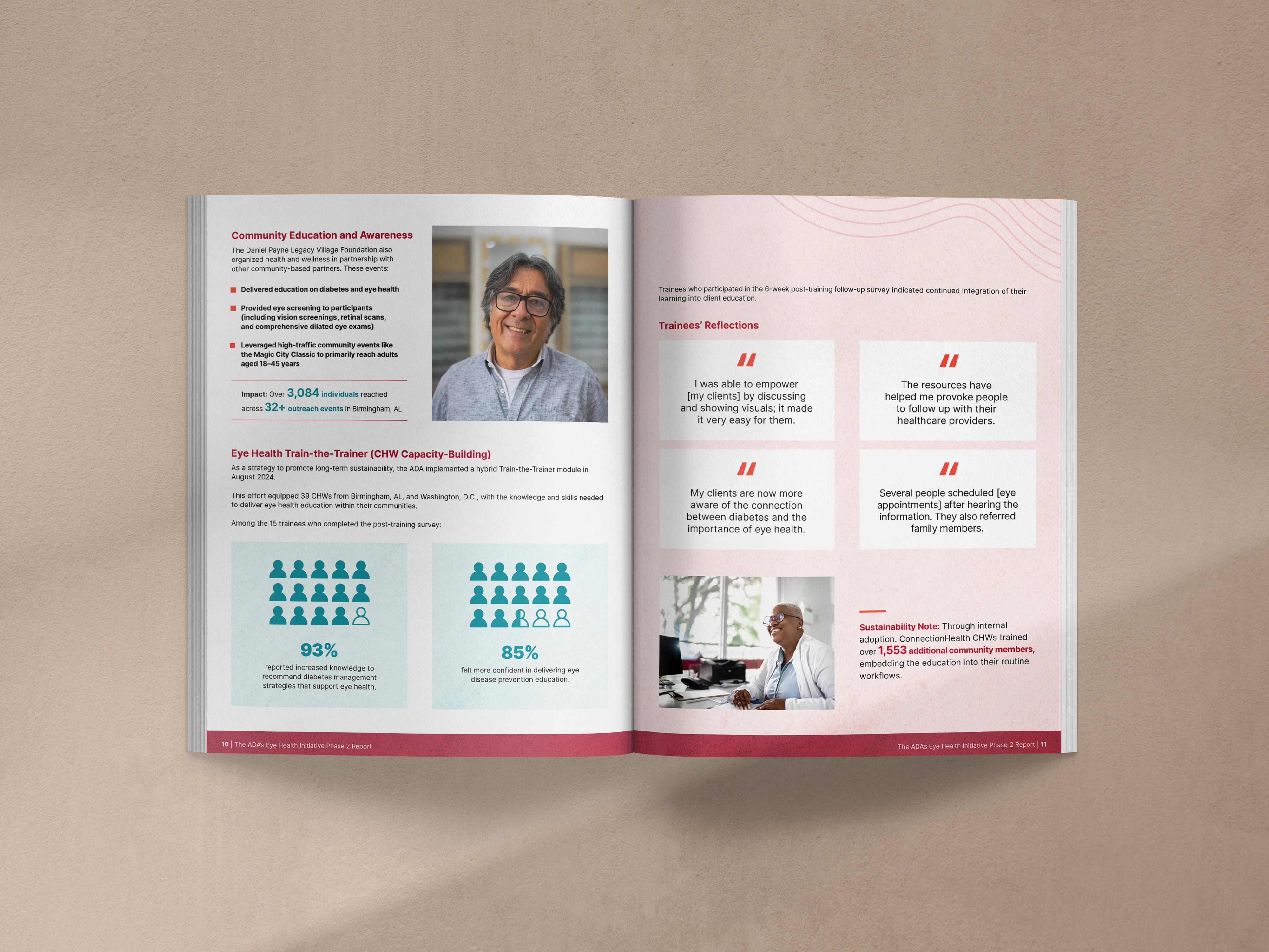
We designed a 21-page digital impact report that organizes ADA’s results into a clear narrative.
Each section follows a flexible structure so content could evolve without breaking the layout. Infographics and callouts highlight key takeaways. Quotes and visuals bring the human side of the work forward.
We created a custom map visualization to connect outcomes to geography, helping readers quickly see where the initiative is making a difference.
Every design decision supports readability. This report was built for real-world use—people reviewing it on laptops, tablets, and phones during meetings and funding conversations.
We also edited and refined the copy to create a consistent voice across contributors.
What Changed
ADA now has a report they can confidently share with funders and partners without extra explanation.
It can be used as a shared reference point during outreach and presentations. The story of the program is unified, visual, and easy to follow.
Beyond the report itself, we created supporting assets including social graphics, email visuals, and a one-pager so that ADA could reuse the story across channels instead of starting from scratch each time.
The final package document results and helps ADA communicate impact with ease consistently.