There's a street in the Bay Area called Acton Circle.
My grandparents lived there. It's where I spent summers as a kid, where my creativity first came alive, and where my faith started to take root too. When I named this studio, I chose Acton Circle as a daily reminder of that. Of why the work matters. Of who taught me that what you make with your hands can be an act of love.
I tell you that because it explains everything about how we work here.
This isn't a production shop. We're not taking orders and delivering files. Every project that comes through Acton Circle gets treated like it counts. Every annual report, every supporting graphic, every donor piece. Because it does. The orgs we work with are doing the hardest, most important work. They NEED materials that really reflect that.
(And if you've been following along for a while, you already know we're all about mission-deep, belief-building design. 😊)
Why Great Nonprofits Still Lose Donors
After formally working with over 60 nonprofits since 2019 (I've also volunteered and freelanced with nonprofits, pre-Acton Circle), I’ve noticed the same thing again and again:
Orgs doing important work often send donors materials that don’t show their real impact. The annual report can seem thrown together (eek!). The presentation for a major gift meeting might look rushed. Sometimes, event materials feel like they came from a different place entirely.
(You know the one (or two) pieces of marketing/fundraising materials. We've all been there.)
When the design doesn't match the heart behind it, you lose the plot.
Many people don’t realize that design is MORE THAN decoration. And donors often judge an org's credibility by its design before reading anything.
When there’s a gap between your work and how it’s shown, you can lose donor trust, see fewer returning supporters, and miss out on major gifts.
The good news is, you can close this gap. That's the part I love telling people.
How we actually approach the work: BELIEF by Design™
Before we open a single design file, we run every project through a framework I developed after years of watching great missions get lost in generic presentation. I call it BELIEF by Design™.
Here's what it looks like in practice, and why it changes everything.
B — Begin With the Soul, Not the Surface
Before colors, before layouts, before anything, we ask: what do you want donors to feel when they close this report? What's the one thing you need them to walk away believing? What's the direction your org is heading and does this report reflect that?
Most teams have never been asked these questions before. (Seriously... I watch people exhale when we get into this part.) That conversation alone changes everything about what gets built.
E — Embody Who You Are
Every org has a unifying story running through their data, their milestones, and their programs. Our job is to find it and build a design system around it. The headlines, the visuals, and the calls to action all start pulling in the same direction.
Instead of a report that feels like a collection of sections, you get something that feels like a single, clear conviction. BIG difference.
L — Lead With What Supporters Feel
Data is important. But data alone doesn't move people, and I think deep down you already know that. We translate your metrics into emotionally intelligent visuals, pairing numbers with human narratives so donors don't just understand your impact, they feel it.
That's what makes a donor put it down or pass it along.
I — Invest in Design That Goes Deep
Good design doesn't just look right on launch day. It has to work for your team all year in grant packets, board decks, donor emails, and social media. We think about maximizing your report from the start, so your annual report becomes a content system rather than a one-time PDF. (You worked TOO hard on it for that.)
F — Feel the Mission in Every Detail
Real photos over stock images (always, if you can swing it). Headers that guide the eye. Layouts that breathe. The small stuff most people never consciously notice but that donors feel the second they open it. That's where trust gets built or lost.
.avif)
Get The Annual Report Checkpoint

Donor Thank You Postcards Templates
Enter your info and we’ll send the postcards straight to your inbox:
Real nonprofits. Real results.
Okay, I'll let the work speak here for a second.
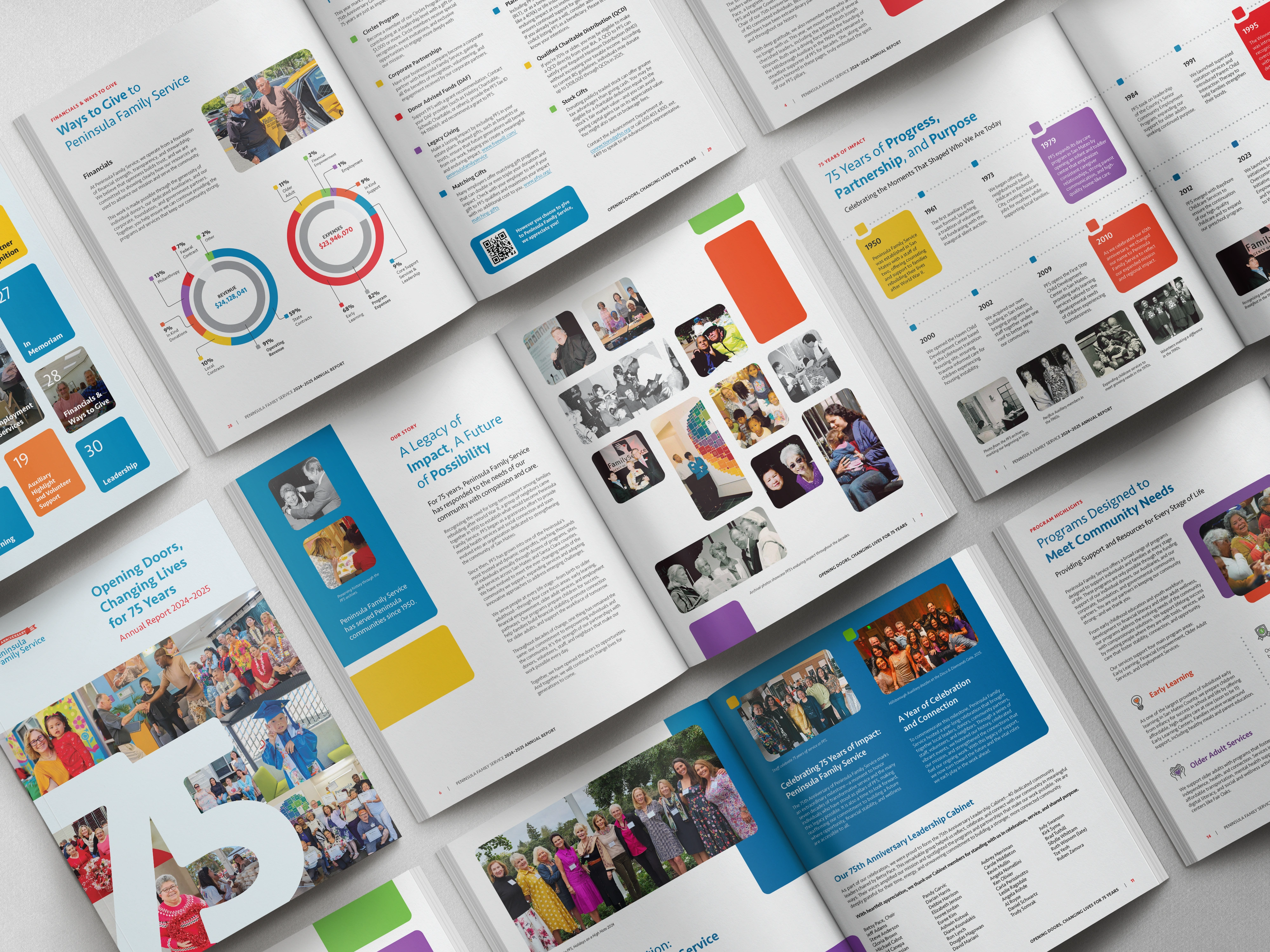
Peninsula Family Service came to us for their 75th anniversary report. What started as one animated annual report grew into 15 evergreen assets: a presentation deck that their CEO and leadership team still use on the regular, one-pagers, social graphics, and booklets that show up in donor conversations, grant applications, and board meetings. Their CMO said it took very few revisions to reach the final product. That's what happens when the foundation is right.
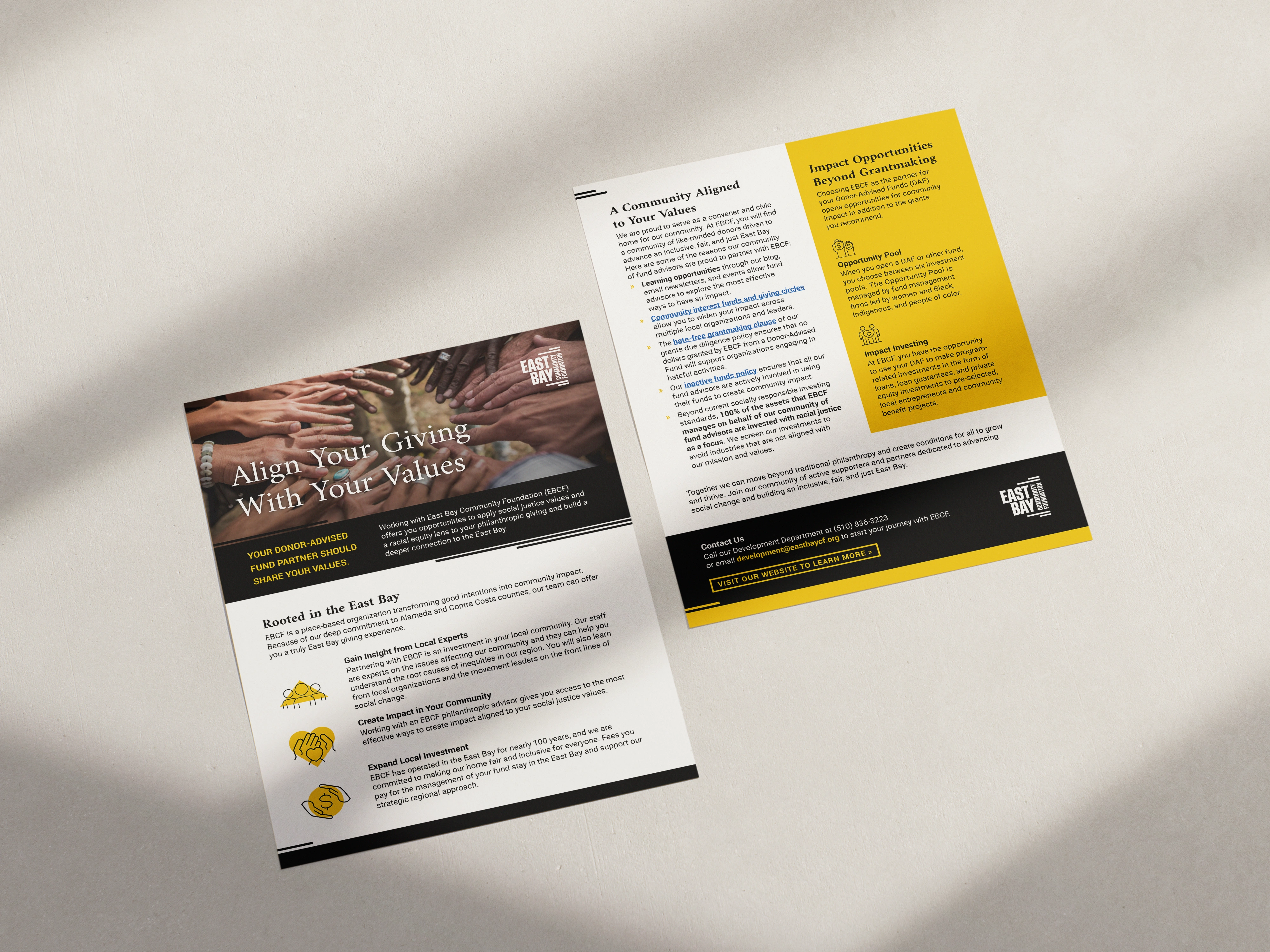
East Bay Community Foundation said our team made "translating project needs into design look like magic." (It's not magic, really. It's just what happens when you start with the right questions instead of jumping straight to aesthetics.)
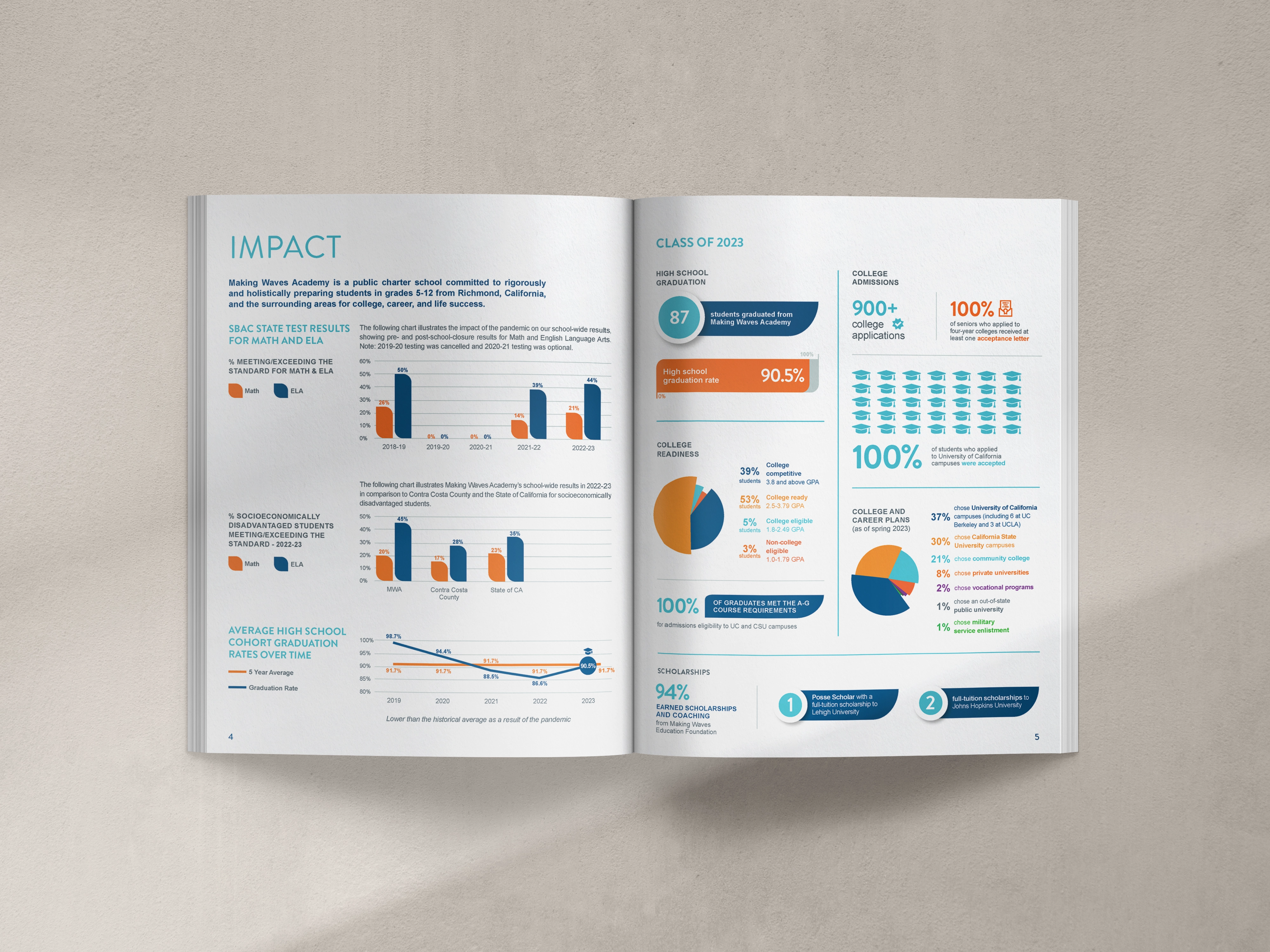
Making Waves Education Foundation has worked with us across four consecutive reports. Their VP of Marketing said Olivia "takes the time to really understand our nonprofit organization's mission as well as the goal, audience, and style for each project." Four reports in a row because the work holds up.
We've also had the privilege of working alongside Tides, 10,000 Degrees, Abode, Chiron Community Giving Foundation, CORA, National Writing Project, Orange County Community Foundation, Breast Cancer Prevention Partners, and more. Each one doing work that needs to be seen clearly.
Why I Keep Coming Back to This Work
I'll be real with you for a second.
I could do design work for a lot of different industries. My last job before going into this work was product design UI/UX) at a legal tech startup. The money was good. The people were great. And the extras (happy hours, lunches, team-building, autonomy) were all there.
But I KEEP coming back to nonprofits.
I have a folder on my desktop full of messages I will never delete.
A CMO at a Bay Area family services nonprofit sent a note the day their report launched. She loved it and asked to book the next year before the ink was even dry.
A communications director at a national health advocacy org messaged to share that four pieces of legislation had just been presented to Congress and that the report we worked on together was a major part of making that case. She came back the next year for a case statement, and her board, after eight years without something they felt confident handing donors, finally had it.
And a solo-staff team at a small nonprofit used one of our templates for their very first annual report. No design background. No agency budget. Just the template and when they were done, it looked like they'd hired a professional. The blank page that used to feel impossible? Gone.
That's what this is about for me. Not the design. What the design makes possible.
Your nonprofit is doing work that changes lives. (I really mean that.) Your materials should show it.
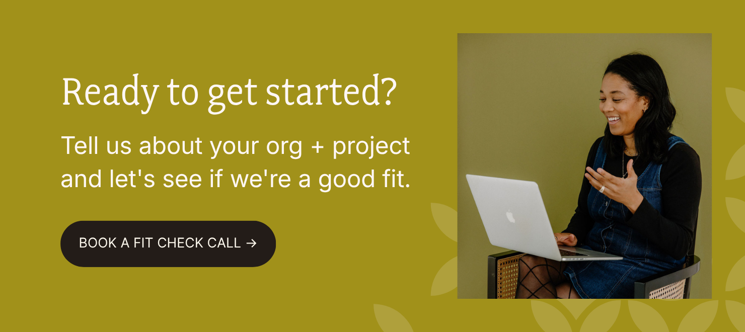
Are you ready to get your project started?
Now you have a sense of how we work.
If this message spoke to you and you found yourself thinking, “This is what we've been missing,” that’s not by accident.
These are the kinds of projects we love to take on.
Let’s start with a call. We can talk about where your organization is now, where you want to go, and see if we’re the right fit to help you get there.