A rebrand feels exciting right up until your team has to implement it.
Suddenly you're staring at dozens of assets that all need updating.
Emails.
Decks.
Brochures.
Social templates.
Website banners.
Donor materials.
Internal docs.
Everything.
😮💨
At some point in every rebrand, the same question surfaces: "Where do we even start?"
Start with your annual report.
It's the one piece where your new visual identity, updated messaging, impact narrative, data storytelling, and donor gratitude all have to show up together. That level of depth reveals instantly whether your new brand works in real life, and whether your report is doing the job donors need it to do.
Here's why making it your first move pays off across your entire rollout.
How Your Annual Report Sets the Tone for a Strong Nonprofit Rebrand Rollout
Your annual report Is the clearest expression of your new identity. Unlike quick-hit assets such as social posts or email banners, your annual report carries the full weight of your mission.
It’s the one piece where your:
- new visual identity
- updated messaging and tone
- refined impact narrative
- data storytelling
- program descriptions
- donor gratitude
…all need to show up together with intention, texture, and emotional truth, honoring the soul of your org in every detail.
That level of depth reveals instantly whether your new brand works in real life.
When your annual report reflects the rebrand early, you’re translating your new identity into a long-form donor experience. And that becomes the anchor for every communication that follows.
.avif)
Get The Annual Report Checkpoint

Donor Thank You Postcards Templates
Enter your info and we’ll send the postcards straight to your inbox:
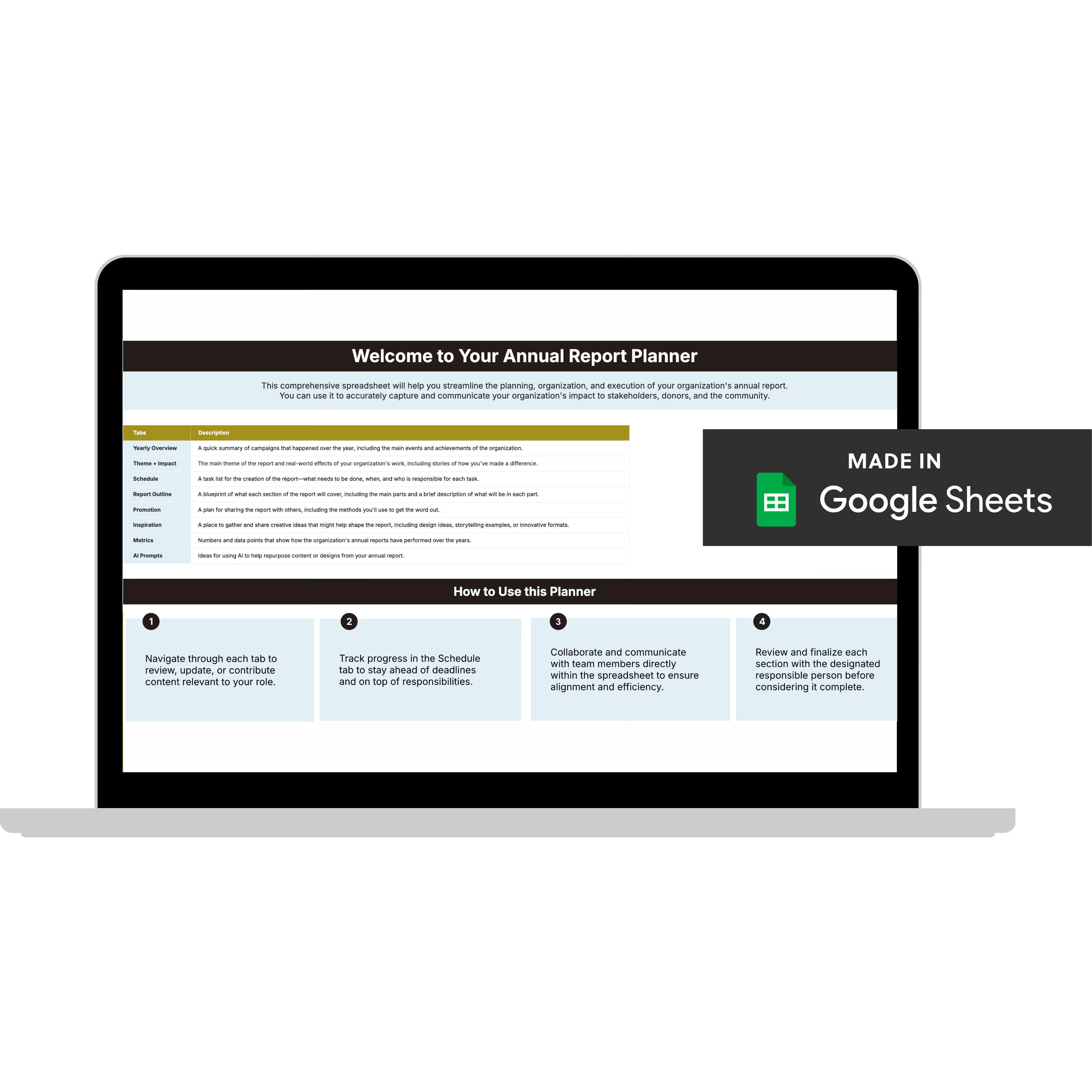
Annual Report Planner
Get a clear content roadmap so your annual report builds belief, earns trust, and actually gets used after launch—plus the same planning approach we use with our 1:1 clients, built in.
The Annual Report as Your Internal Guide for a Smooth Nonprofit Rebrand Rollout
A nonprofit rebrand rollout can easily turn into a game of telephone. One department uses outdated fonts. Another pulls last year's color palette. Your donor deck looks nothing like your website. Your social templates are in a completely different tone.
This is how rebrands lose credibility before they ever gain momentum.
When you update your annual report first, your team aligns faster—because the report forces you to define your color hierarchy, typography pairings, image style, data visualization rules, and story flow all at once. It essentially becomes your brand system in motion.
Everything else (donor decks, social graphics, program materials) can pull directly from what's already been worked out inside the report.
If you're also navigating the period before a rebrand launches, this piece on staying credible in the interim is worth a read.
Your Annual Report Sets the Standard for Donor Experience
Your donors might breeze past an email or scroll past a post. But your annual report? It's the piece funders and donors go to when they want to get beyond the surface and see what your organization is truly about, your strategy, your outcomes, your depth.
Done consistently, this kind of donor experience compounds in ways most teams underestimate.
It’s the piece that shapes how donors:
- understand your mission
- interpret your impact
- feel connected to your vision
- experience your storytelling
- build long-term trust with you
When the annual report leads your nonprofit rebrand rollout, donors experience the transition as confident and intentional, not scattered or incomplete.
It helps them understand:
- “We’re evolving.”
- “We’re growing.”
- “We’re strengthening how we communicate impact.”
And that kind of understanding is what helps donors stay connected to the work, not just the visuals.
Especially if you’re rethinking fundraising in 2026 or gearing up for a major campaign. A well-executed report becomes a bridge that carries donors from your old brand into your new identity without confusion.
Behind the Scenes: How I Support Nonprofits Through Rebrand Rollouts
Something I've noticed after working alongside nonprofits and foundations through rebrand transitions: brand agencies hand you the identity. What they don't hand you is a plan for how to use it across the 40 to 70 assets your team touches every week.
My role usually begins before the rebrand is fully approved. That might mean giving feedback on logo directions, reviewing the brand book for real-world usability, strengthening donor communications in the interim, or helping teams figure out which assets to prioritize first.
Once the rebrand is approved, we build a rollout plan and start with the annual report, because it covers the deepest, most multi-layered content. Getting that right first sets the tone for everything that follows and makes updating the rest faster, cleaner, and far less expensive. If you're struggling to get your leadership to see why this investment matters, this piece breaks down how to make that case.
Because the annual report covers the deepest, most multi-layered content, designing it first sets the tone for everything else.
And it saves orgs thousands of dollars by preventing rework and eliminating inconsistent one-off designs that agencies typically upcharge for.
Why Most Nonprofits Overspend on Their Nonprofit Rebrand Rollout—and How to Avoid It
Brand agencies often leave out something major:
Most nonprofit assets (the things you really need on a day-to-day basis) are not typically included in the rebrand package.
You’ll get the identity system—colors, logos, typography.
But the 40–70 assets your team uses every week?
That’s all extra.
Every single one.
This is where Acton Circle works differently.
We don’t just drop the brand files into your lap.
We start with your annual report because it’s the asset that forces alignment on your entire visual and narrative system. Once that foundation is set, updating everything else becomes faster, cleaner, and far more predictable.
With Acton Circle, you get:
- strategy + design + implementation
- editable templates that save your team time (and budget) long after rollout
- donor-centered guidance rooted in report design
- systems thinking, not just polished PDFs
- cross-department rollout support
And because your annual report becomes the anchor of your nonprofit rebrand rollout, every following asset—donor decks, email templates, program materials, social graphics—gets updated more consistently and with far less rework.
Starting with the annual report reduces complexity, protects your budget, and gives your entire team a clear direction to follow.
Quick Tips to Make Your Annual Report the Anchor of Your Nonprofit Rebrand Rollout
1. Define the emotional core before you touch visuals
Your annual report has to feel like your mission, not just look on-brand.
Start with: The 2–3 emotional truths you want donors and funders to walk away with.
2. Build a reusable structure, not just layouts
Sections, story flow, data placement, pull-quotes—this becomes the blueprint for every future asset.
Try: Outlining your section order and protecting it through the feedback process before placing a single design element.
3. Set your data storytelling rules early
Impact numbers look different through a new brand. The style you choose in the report will flow into decks, one-pagers, and campaigns.
Anchor: A clear approach for charts, icons, and captions that reflects your mission and not just your new color palette.
4. Establish your “signature moments” inside the report
These are the design moves or storytelling elements that communicate identity on a deeper level.
Think: A consistent way you showcase stories, spotlight people, or translate complex work into meaning.
5. Use the report to model the rebrand for your whole team
Your team will interpret your rebrand through what they see first. When the annual report leads, it becomes the example everyone copies.
Create: A mini “Rollout Reference Guide” pulled directly from the report that includes section headers, data styles, tone notes, and imagery guidelines.
FAQs About Updating Your Annual Report During a Nonprofit Rebrand Rollout
Do we have to redesign the entire annual report after a rebrand?
Yes. If you want your rebrand to build trust, your annual report has to reflect it. You don’t necessarily need a brand-new structure, but the visuals, tone, data styling, and storytelling need to align with your new identity so donors experience the shift as intentional and not confusing.
What if our report season is months away?
Still build the annual report system now. Even if the full report won’t be designed for a while, creating the core components (e.g., data styles, section layouts, story modules, tone direction, etc.) gives your team a clear North Star. It’s the system every other asset will pull from, so the earlier it’s established, the smoother your entire nonprofit rebrand rollout becomes.
What if our brand agency didn’t design report templates?
Happens all the time. Most branding agencies don’t touch long-form donor communications or annual reports, which is why orgs end up with a beautiful brand that doesn’t know how to handle real content. At Acton Circle, we build report-ready systems directly from your brand guidelines so your identity works in narrative-heavy, data-rich, donor-facing materials—the places it matter a whole lot.
Can our team handle updates in-house?
Of course! But only if you have a complete, editable library.
When the design system is fully built out (templates, components, styles, brand kit), your team can confidently handle everyday updates. Without that foundation, you end up with inconsistencies, rework, and higher long-term costs. The right library makes in-house execution not just possible, but sustainable.
Your nonprofit rebrand rollout will touch everything you put into the world
Starting with your annual report gives you a steady foundation. One that shapes donor experience, supports internal alignment, and protects your new brand's integrity from day one.
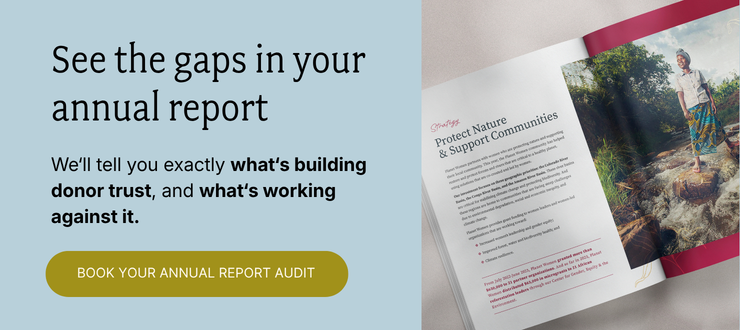
If you're heading into a rebrand and want to make sure the annual report does what it's supposed to do, the Annual Report Audit is where that work begins.
Bring your current report to a 45-minute call, and I'll score it against our BELIEF by Design™ framework, including where it's sending donors and whether the ask survives the jump.
You'll walk away with:
✅ Every gap in your report, named
✅ What each one is costing you in donor response
✅ Where donors drop off between your report and your giving page
✅ Your #1 fix, prioritized and ready to act on
✅ The scores, yours to keep (with us or without us)
If your next annual report is already in the works, this is the right time to have this convo.