Annual reports have a reputation, and we all know it's sometimes not a great one.
Too often, they become dense, data-heavy documents that only a few people read. And if you're the one responsible for pulling it together, it probably feels more like an obligation than a reflection of the work you're proud of.
But it's not supposed to be this way.
An annual report is a moment to pause. To show what changed, who was involved, and where your organization is headed next. When done well, it becomes a visual storytelling tool that helps readers believe in the work and see their place in it.
I've worked with 60+ nonprofits on this exact problem. The ones that shifted from data dumps to real storytelling? They didn't just print prettier documents. They got more aligned donors, stronger board engagement, and stakeholders who cared about the results.
1. More Than the "Who" and "What" (It's Also the "Why")
Donors, board members, and community supporters absolutely want to know how funds were used and what outcomes were achieved. But numbers alone don't answer the question they're really asking:
Why does this work need to continue?
Strong annual reports use visual storytelling to make that answer easier to grasp. Not by dramatizing the work, but by showing real people, real places, and real progress alongside the data.
Your mission's heroes aren't pie charts. And while financial breakdowns are important, they're rarely what people remember. It's the faces, moments, and stories that get etched into their brains.
That's where nonprofit storytelling (supported by visuals) shifts an annual report from a compliance document into a genuine communication tool. One that builds trust, explains complex programs, and connects donor support to real-world outcomes.
2. Story-First Doesn't Mean Strategy-Last
Let's be clear: visual storytelling doesn't replace data, but it does give it meaning.
Your annual report still needs to demonstrate financial health, operational clarity, and measurable results. Funders and partners want proof that your organization is effective and accountable.
What visual storytelling does is help people understand that proof.
Instead of burying insights in spreadsheets or small print:
- Pair key statistics with a short story, quote, or image
- Use infographics to show scale and context at a glance
- Create a rhythm between numbers and narratives so readers don't fatigue
The goal is balance: emotionally grounded, but evidence-driven.
In the BELIEF by DesignTM framework I use with nonprofit clients, this balance is non-negotiable. Your report has to hit both the heart and the head. That's what makes it work.
3. Start With the Audience, Not the Asset
One thing top visual storytelling guides emphasize, but nonprofits often skip, is being clear about who the report is for.
Before designing your annual report, ask:
- Who is this primarily for right now? Donors? Board members? Community partners?
- What do they already know and what do they need help understanding?
- What's the one thing you want them to remember after they close it?
Visual storytelling works best when it reflects how your intended reader will move through the report, not how much information you feel you need to squeeze in.
4. Using Visual Storytelling in Annual Report Design
The most effective reports are concise, focused, and visually intentional. They help readers understand the year without making them work too hard to understand what's going on.
Here's what visual storytelling looks like in practice inside an annual report:
Center on Real People and Real Outcomes
Don't try to tell every story. Choose two or three moments that clearly show what changed because your organization was involved.
That might look like spotlighting:
- One family whose experience reflects a larger program outcome
- One student, artist, or community member whose journey shows what changed
- One moment that captures the heart of the work better than a paragraph ever could
Pair those stories with:
- A short quote (not a full testimonial)
- One strong photo that adds context
- Or a QR code linking to a brief nonprofit video clip for readers who want more
.avif)
Get The Annual Report Checkpoint

Donor Thank You Postcards Templates
Enter your info and we’ll send the postcards straight to your inbox:
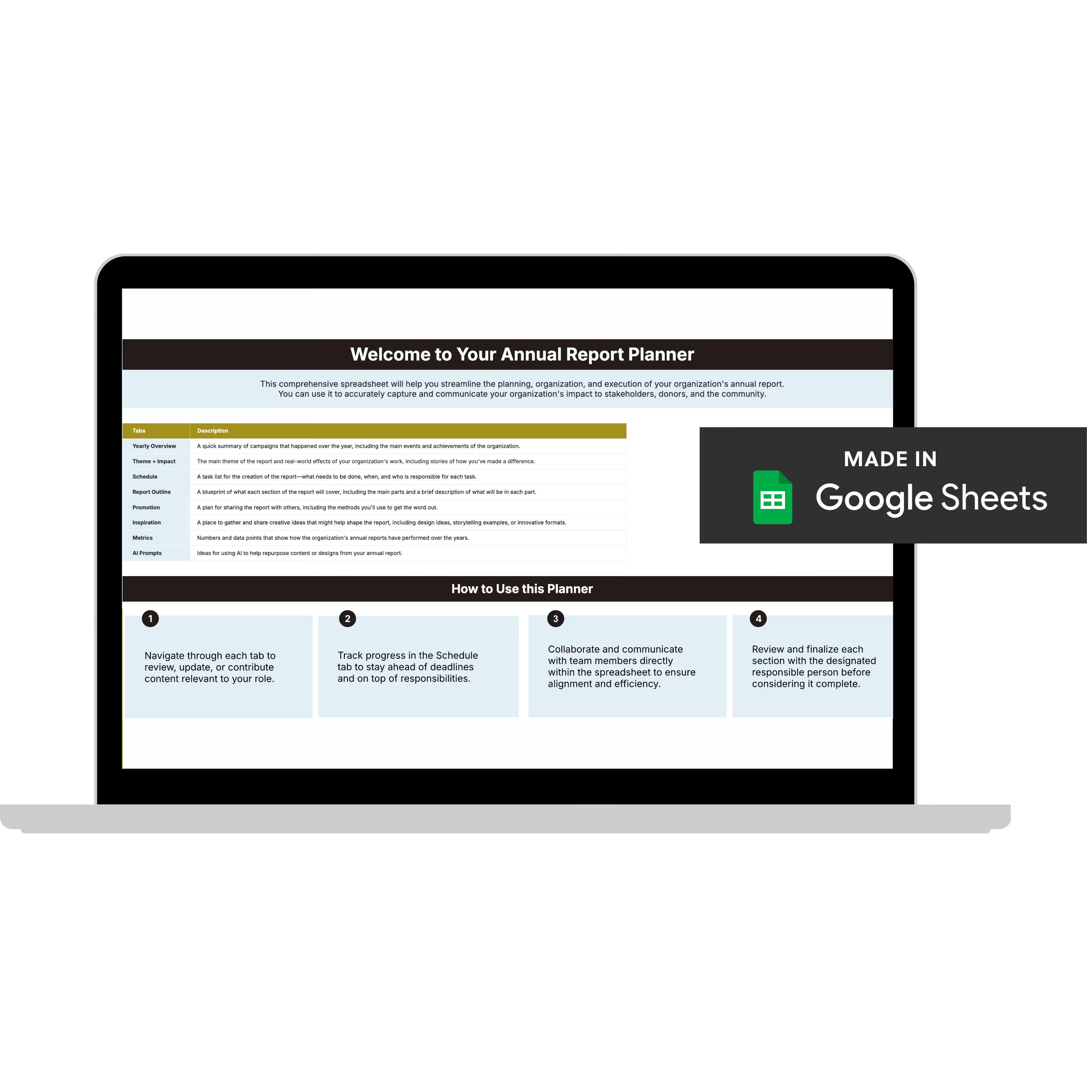
Annual Report Planner
Get a clear content roadmap so your annual report builds belief, earns trust, and actually gets used after launch—plus the same planning approach we use with our 1:1 clients, built in.
Use a Clear Narrative Arc (Yes, Even in 10 Pages)
Every good report has a simple structure, whether you name it or not:
- Here was the challenge
- Here’s what we focused on
- Here’s what changed
Before-and-after visuals, program snapshots, and simple diagrams help readers follow the work without rereading paragraphs. If the story makes sense on a quick skim, you’ve designed it well.
Keep the Design Clean and Purposeful
Visual storytelling works best when every element helps the reader understand the story more easily.
Quotes should be easy to find, photography should add context rather than decoration, and text should be broken into scannable sections that reflect how people read. Negative space and clear hierarchy help the report feel approachable and easier to move through.
5. Accessibility and Ethics Matter in Visual Storytelling
Great visual storytelling is also responsible storytelling.
That means:
- Making sure text is readable and color contrast is accessible
- Using alt text in digital reports
- Getting consent and explaining how stories will be used
- Avoiding imagery that exploits hardship for emotional impact
6. Your Annual Report Should Travel Beyond the PDF
Another common gap: distribution.
Visual storytelling works best when your report isn’t treated as a one-time download.
Strong annual reports are repurposed into:
- Email highlights
- Social posts featuring key visuals or quotes
- Short videos or reels pulled from report stories
- Simple microsites or landing pages
The more formats your story appears in, the more accessible it becomes.
7. How to Know If Your Visual Storytelling Is Working
You don’t need complex analytics to measure success.
Simple signals matter:
- Are people finishing the report?
- How much time are they spending on each page?
- Are stories being shared or referenced in conversations?
- Do donors ask more informed questions afterward?
- Does feedback shift from “this is long” to “this helped me understand”?
Not sure if your report is telling the right story?
Reading about visual storytelling is one thing. Looking at your own report and knowing whether it's doing this work is another.
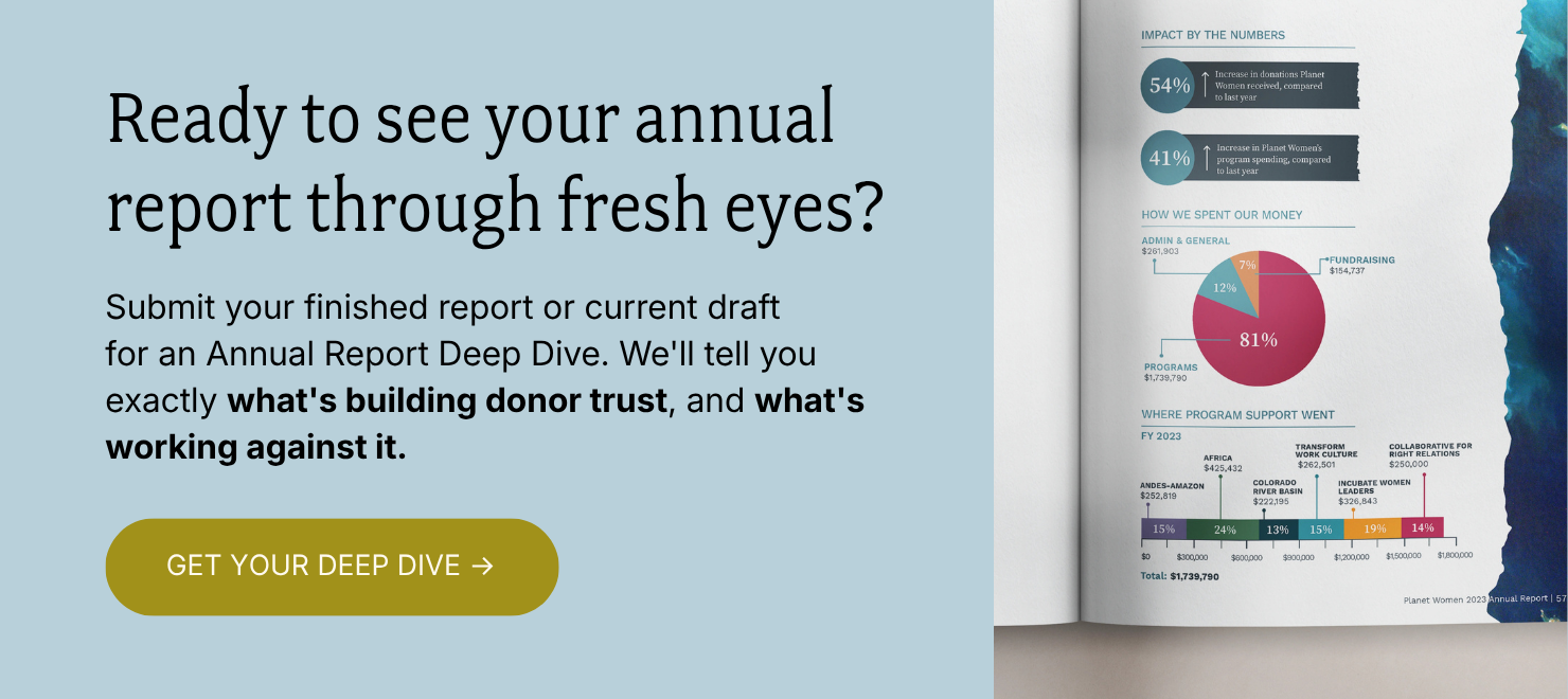
If you're not sure where yours stands, that's what the Annual Report Deep Dive is for.
I'll go through your report page by page and tell you exactly what's working, what's quietly working against you, and what to fix first.
You'll walk away with three things:
✅ A Loom video walkthrough: me reviewing your report live, page by page, with real commentary on what I'm seeing and why it matters. Share it with your boss, your board, your whole team.
✅ Your BELIEF by Design™ Scorecard: your report evaluated across six areas: audience clarity, narrative trust, visual credibility, data presentation, emotional arc, and repurposing potential. You'll know exactly where you stand.
✅ A Priority Action List: ranked, specific, and ready to use. What to keep, what to cut, what to restructure, and what to add. No guesswork.
All of it delivered in 3 business days. And if you want to talk through implementation together, you can add a 60-minute strategy call.
Everything else (the design, the templates, the full-service work) flows from here. But this is where we start.