In Q3 2025, nonprofits retained just 31.9% of donors overall. Most nonprofits try to chase that number with more emails, more posts, more asks. Few stop to look at the system behind those touchpoints: do the emails look like they came from the same organization as the social posts you’re working so hard to churn out every week?
Donors decide whether to trust you before they read a single word. Give someone who’s never heard of your organization 30 seconds on your website… if they can’t tell what you do or who you help within that time, your branding isn’t doing its job.
The good news is that strengthening your brand doesn’t always mean doing a full rebrand. It starts with making your organization easier to understand, quicker to recognize, and consistent throughout.
Let’s talk about the easy fixes that can make your nonprofit branding rise to the occasion.
Get Clear on Your Messaging Across All Donor Touchpoints
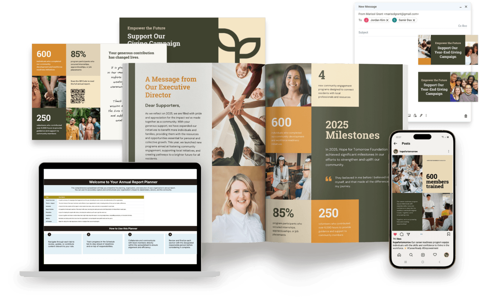
Donors judge clarity before they judge design. If a potential new donor can’t explain what you do and who you help in one sentence, your brand is working against you.
The orgs I see struggling are usually those whose homepage headline, annual report tagline, and Instagram bio describe the mission slightly differently. Their logos and palette are fine. It’s the messaging that’s failing.
A donor reading three versions of “who you are” in one sitting won’t give simply because they see your work as unclear. And unclear easily reads as untrustworthy.
Ask yourself these questions:
- Can a stranger correctly explain what we do after reading just one headline?
- If a donor goes from our annual report to our Instagram profile, will they find the same language and tone?
- Can supporters easily identify who we’re helping (not just what we believe in)?
- Can someone who’s not working in the industry understand our website, social media, and annual reports?
If you can’t say “definitely” to all four, that’s your new priority #1. Close that gap before trying to do any other big changes.
.avif)
Get The Annual Report Checkpoint
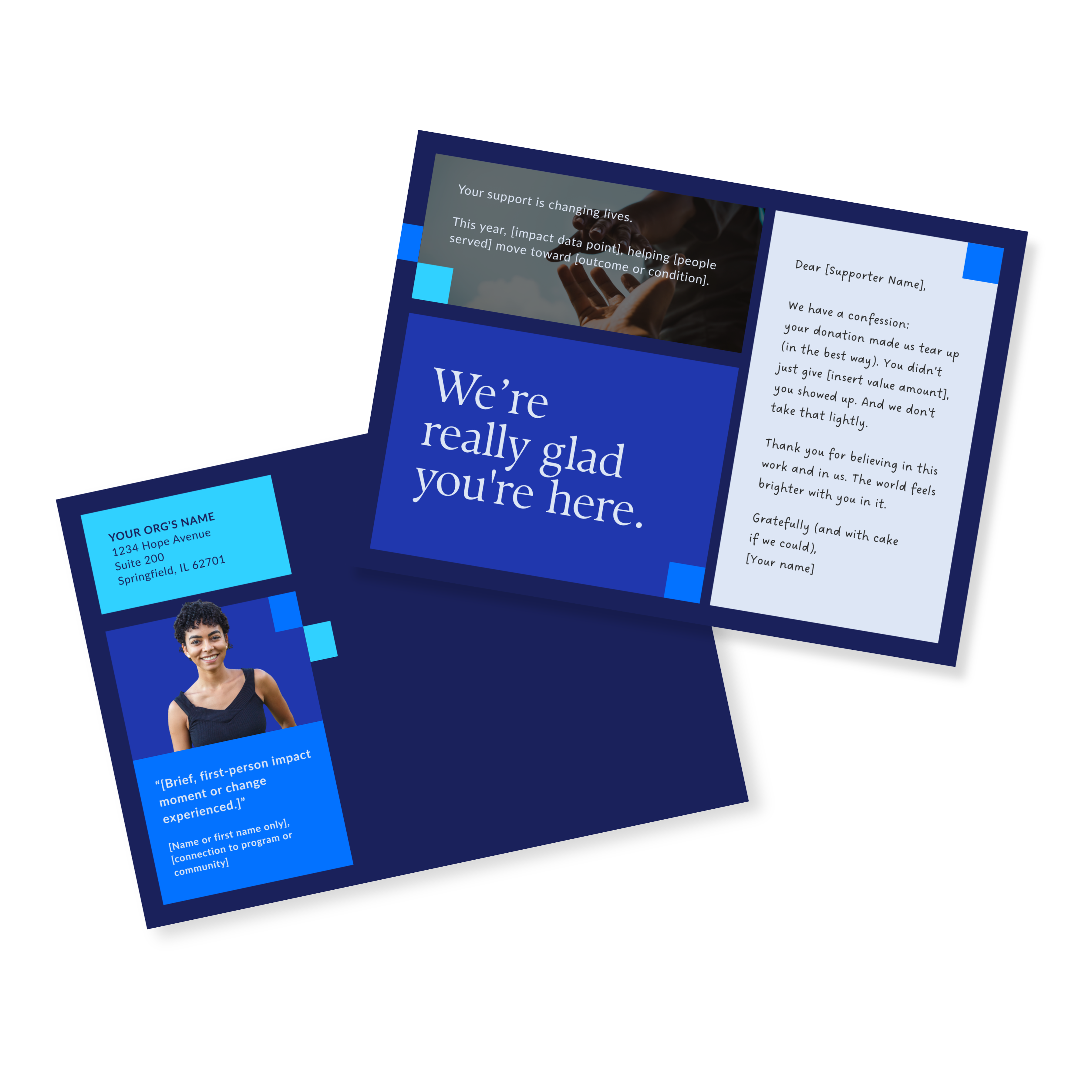
Donor Thank You Postcards Templates
Enter your info and we’ll send the postcards straight to your inbox:
Embrace the Full Potential of Your Annual Report Cover
Annual reports are literally my whole thing, so I’ll just say it: a cover that’s just a logo, a title, and a plain image is my absolute pet peeve.
It’s like handing your biggest donor a thank-you gift in the plastic bag it came in when you bought it. The gift is thoughtful, but the wrapping just told them how much you really cared.
A plain cover with no pizzazz does exactly the same thing. If there’s nothing drawing your donors in, they’re not going to flip through that report with much excitement or belief. Even worse: they might not even flip through at all.
A cover that works usually has three things going for it: a real photo instead of a stock image, one number that means something instead of five that just confuses, and a headline that says what the year was about (instead of just naming the document… they already know it’s an “annual report”).
Strong nonprofit branding often starts with details that shape a donor’s first impression. And none of it requires a bigger budget. You just have to decide that the cover matters, which is where a lot of DIY templates go wrong.
Show Up on Instagram the Way You Do on Your Website
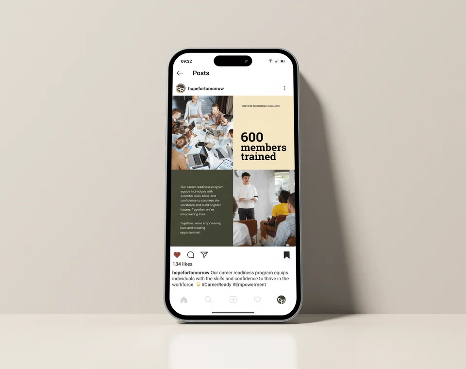
Imagine a nonprofit’s Instagram feed that looks like it belongs to a different organization every week. The fonts change. The colors change. Even the overall feel changes from post to post.
Scroll through it, and you couldn’t tell it was all coming from the same team.
If your org is suffering from this inconsistency, you’re not giving your donors the chance to get truly familiar with your brand.
Your website and social media posts don’t need to look identical (that can also get boring fast). They just need to feel related. There’s room to experiment, as long as everything still feels like it belongs to the same nonprofit.
Get yourself a few custom templates and rotate them. If you have clear brand guidelines that everyone in your team knows how to use, your supporters can clearly see who you are while bringing in visual interest each time.
Make Sure Your Look Resonates With Your Mission
Design that doesn’t reflect who you are reads as generic. Consistency is only half the job. Your branding also needs to make sense based on your mission.
Picture a nonprofit whose materials feel washed out. Not broken, just flat. The colors and images don’t mirror the identity or depth of the work, so the designs feel like they’re coming from every other corporate account.
Not amateur, not ugly. Generic. And generic almost never reads as authentic.
- ❌ A generic annual report cover has a logo, a title, and brand colors.
- ✅ An intentional one has a real photo with a face and a headline that says something about the year you had.
- ❌ A generic social media feed has “professional” and “clean” posts, but nothing stands out.
- ✅ An intentional one follows a unique style that captures the feel of the org, with room for variation and creativity.
- ❌ A generic brand palette and imagery is “nonprofit-safe” but looks like 10 other orgs in the same field.
- ✅ An intentional one reflects the specific community the org serves and the kind of work it’s doing.
These nonprofit branding examples show how small decisions can shape donor perception. Because donors can feel the difference between a brand borrowed from a template and one built around the people doing the work.
Stick with Your Rebrand Rollout Even After Launch
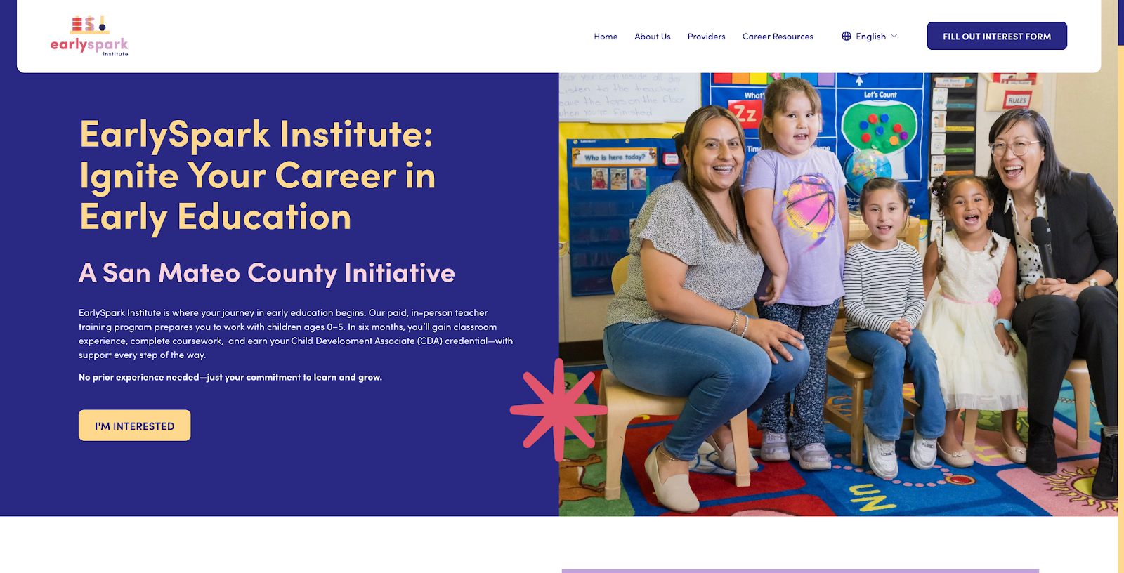
In a 2017 survey of more than 350 nonprofit decision-makers, Big Duck found that nonprofits that rebranded saw revenue climb afterward. Another study by Lucidpress found that organizations estimated they could increase revenue by an average of 23% through more consistent brand presentation.
The rebrand itself is almost never the problem. When you sit down to assess your current look, take the time to reflect on what’s not working, and actually invest in revamping it, it usually leads to an objectively better branding.
The problem is that your rebrand is losing steam before you’ve given it time to do its job.
Six months after your consultant leaves, old templates creep back in because nobody’s in charge of keeping the new one alive. The follow-through failed.
And this task doesn’t have to be a whole new position. Just figure out whoever’s already closest to comms and let them handle the one-page reference of the logo lockups, fonts, color codes, and example posts.
That page is what’ll keep a stretched-thin team from quietly drifting back to whatever’s fastest.
See Where Your Brand Stands
Donors want a consistent, honest brand (not a “perfect” one). A homepage that says what you do, a report cover that looks intentional, a feed that matches the website, and colors that truly look like you.
Get those four things aligned, and the trust follows.
Not sure where your current materials stand? Our free Annual Report Checkpoint is a fast way to see it from a donor’s perspective.
Or skip ahead and book a discovery call with Acton Circle. We’ll tell you honestly whether you need a full rebrand or just better guardrails around what you already have.