Snapshot
Audience: High net-worth donors, partners, and community supporters
Challenge: Inconsistent materials diluted brand clarity and added internal strain
Solution: Unified collateral system + refreshed templates
Result: Polished communications that save time and strengthen donor trust
Where They Started
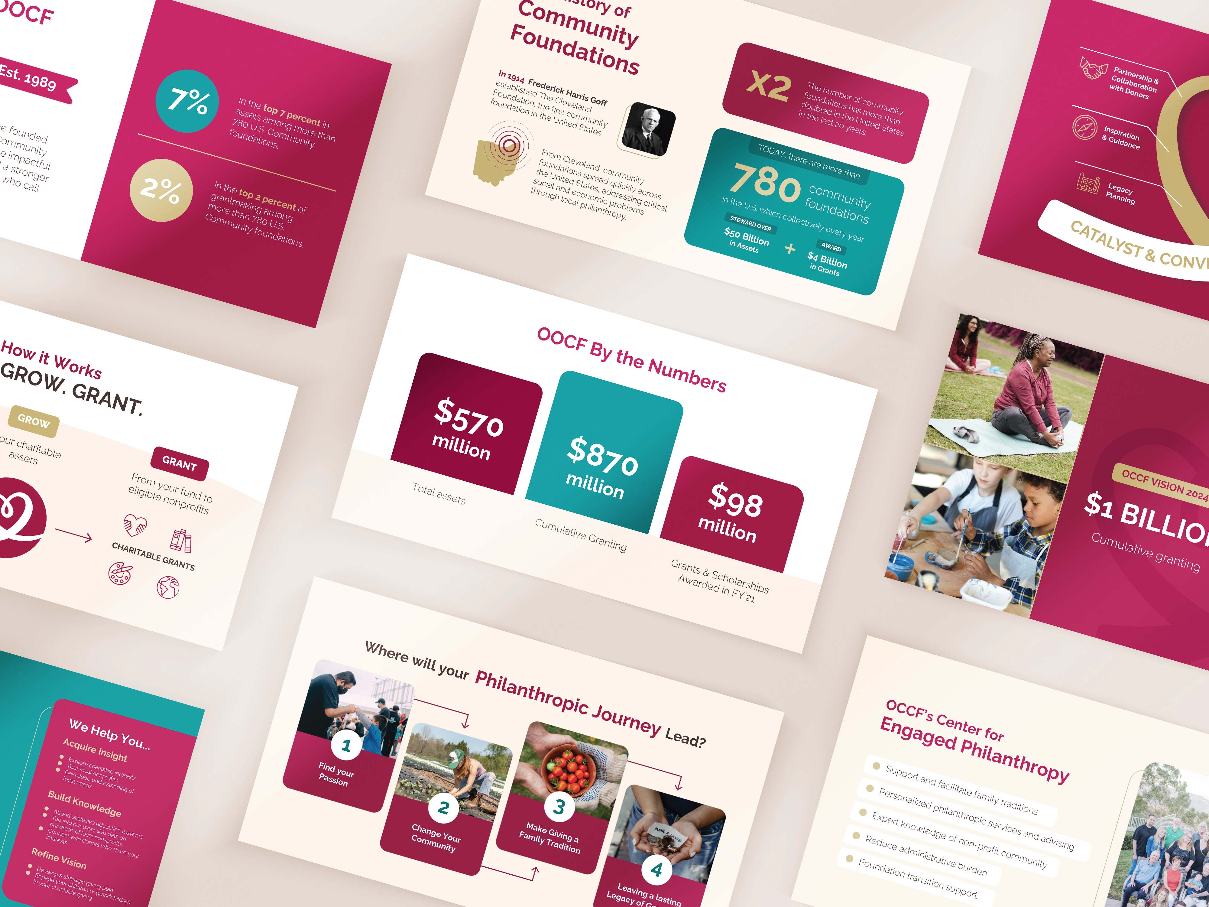
Orange County Community Foundation serves as a bridge between donors who want to make a positive impact and the nonprofits addressing critical social issues across Orange County. Through giving events, fund stewardship, and strong donor partnerships, OCCF plays a central role in strengthening its community through generosity.
As their impact expanded, OCCF saw an opportunity to ensure their marketing materials reflected the same professionalism, clarity, and warmth donors experienced through their programs. The foundation had a wide range of materials created at different times by different designers. Each piece worked on its own but didn’t fully communicate a unified vision.
The organization wanted their communications to match the caliber of their mission and audience.
What Was Getting in the Way
OCCF’s team was spending unnecessary time trying to maintain brand alignment across materials that weren’t built from a shared framework.
They needed design that could:
- Create consistency across presentations, one-pagers, and event materials
- Align visuals with the professionalism expected by high-value donors
- Reduce internal strain on staff managing brand standards
- Add warmth and polish without losing credibility
The challenge was transforming an existing ecosystem into a cohesive system.
What We Built
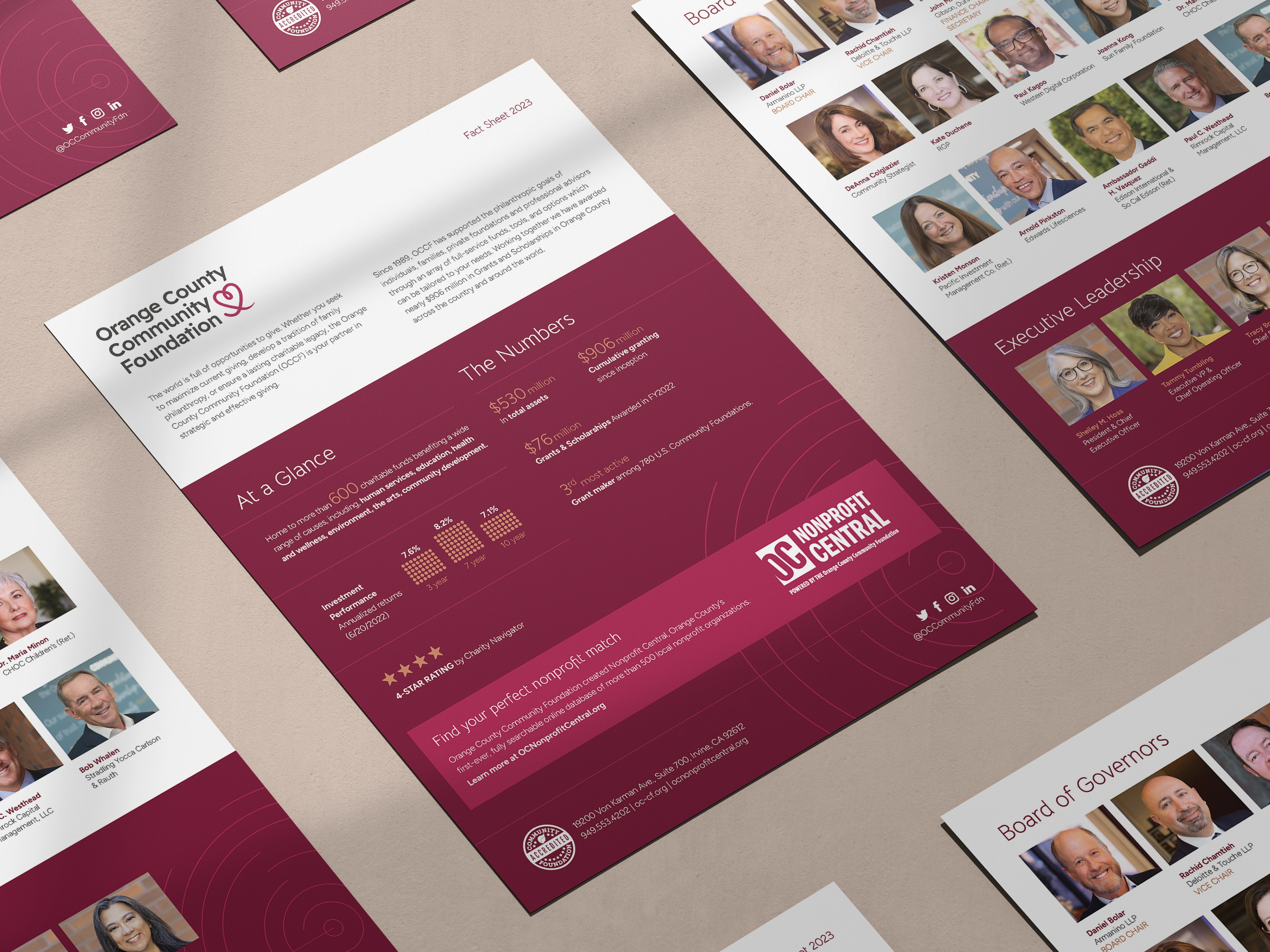
Through an ongoing design partnership, Acton Circle refreshed and modernized OCCF’s collateral into a unified visual language.
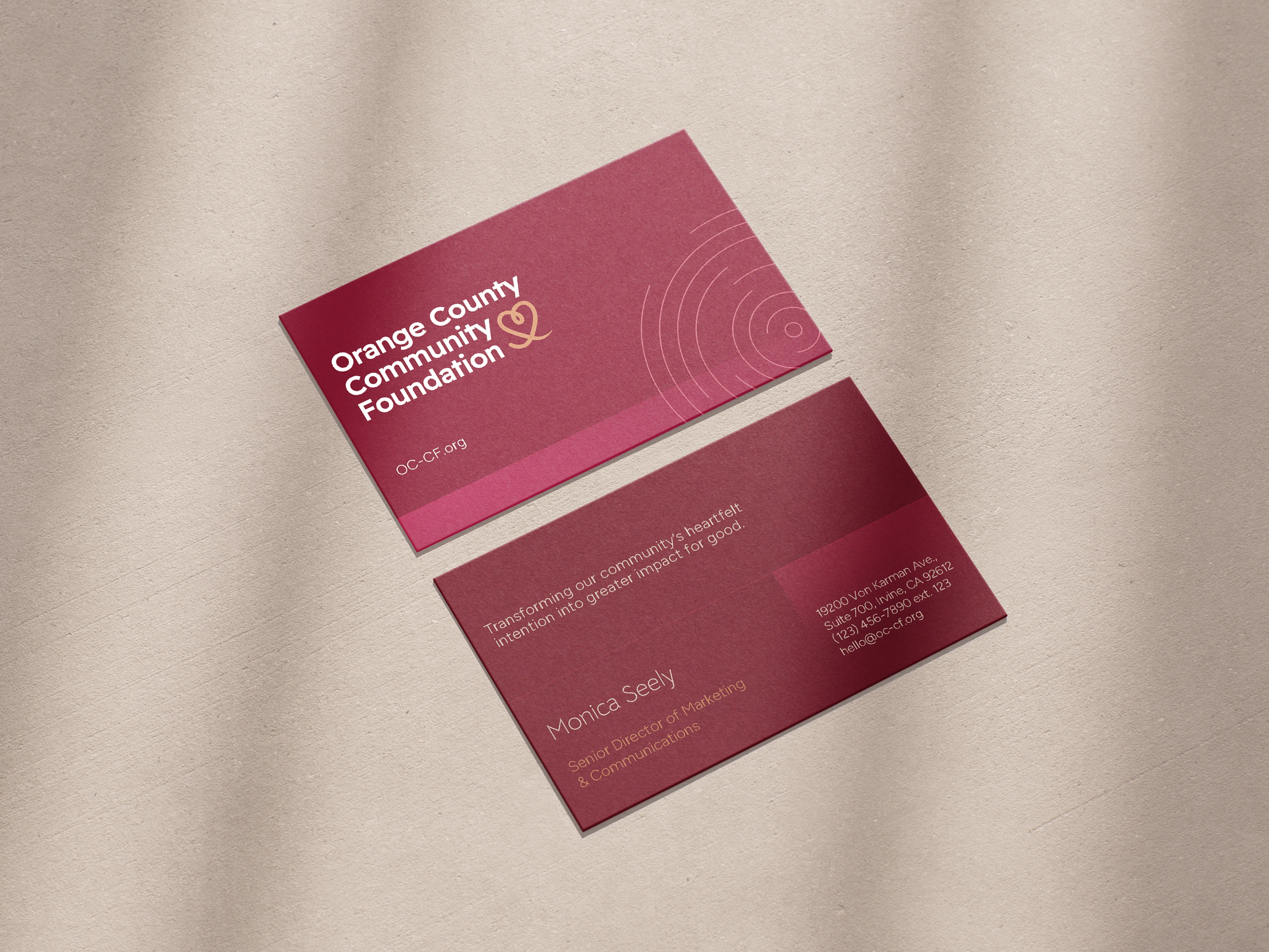
We streamlined existing materials and introduced a consistent structure that could adapt across presentations, brochures, and donor-facing pieces. When OCCF launched a refreshed brand identity, we integrated new fonts, colors, and logos across every asset to ensure a seamless transition.
Deliverables included:
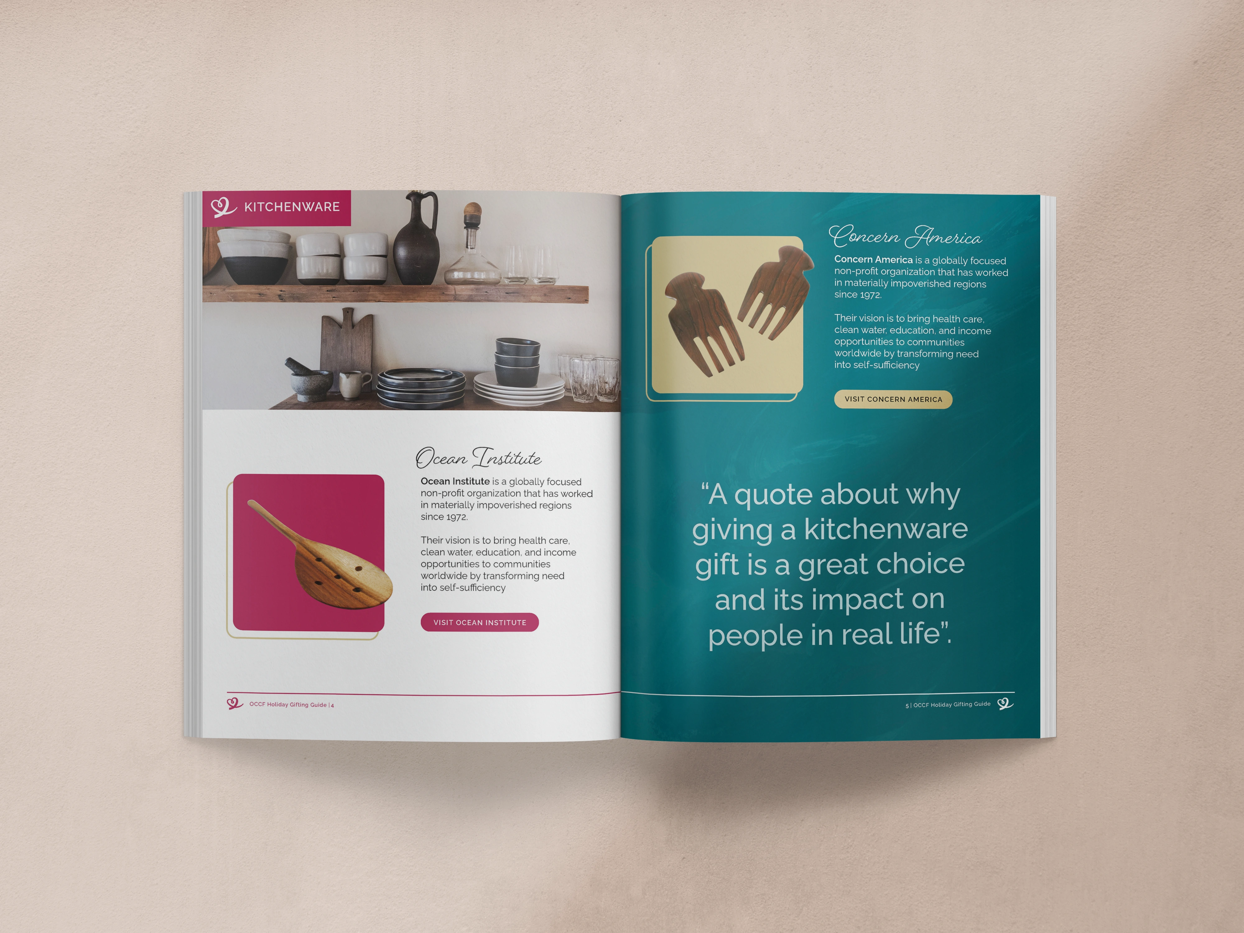
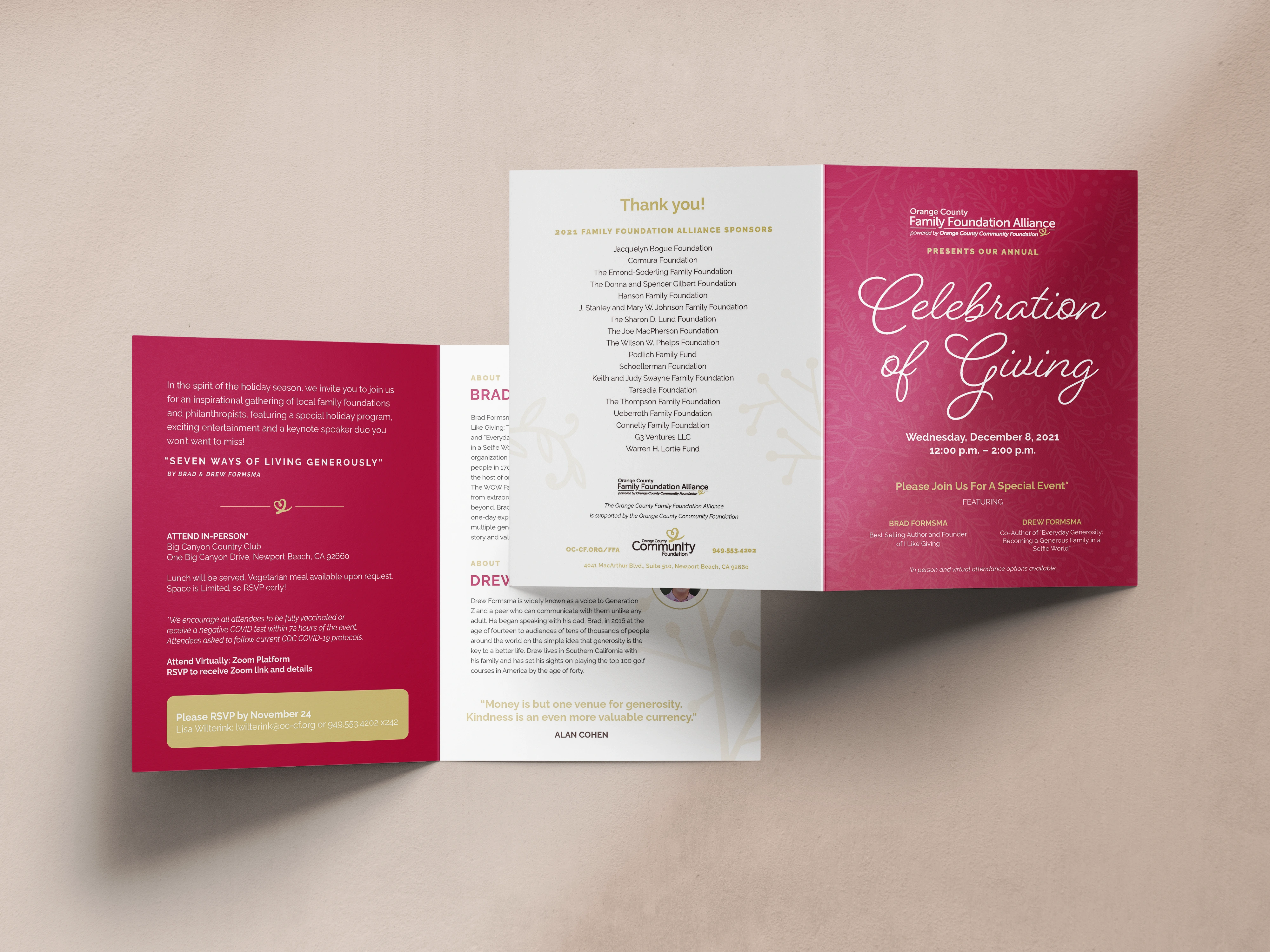
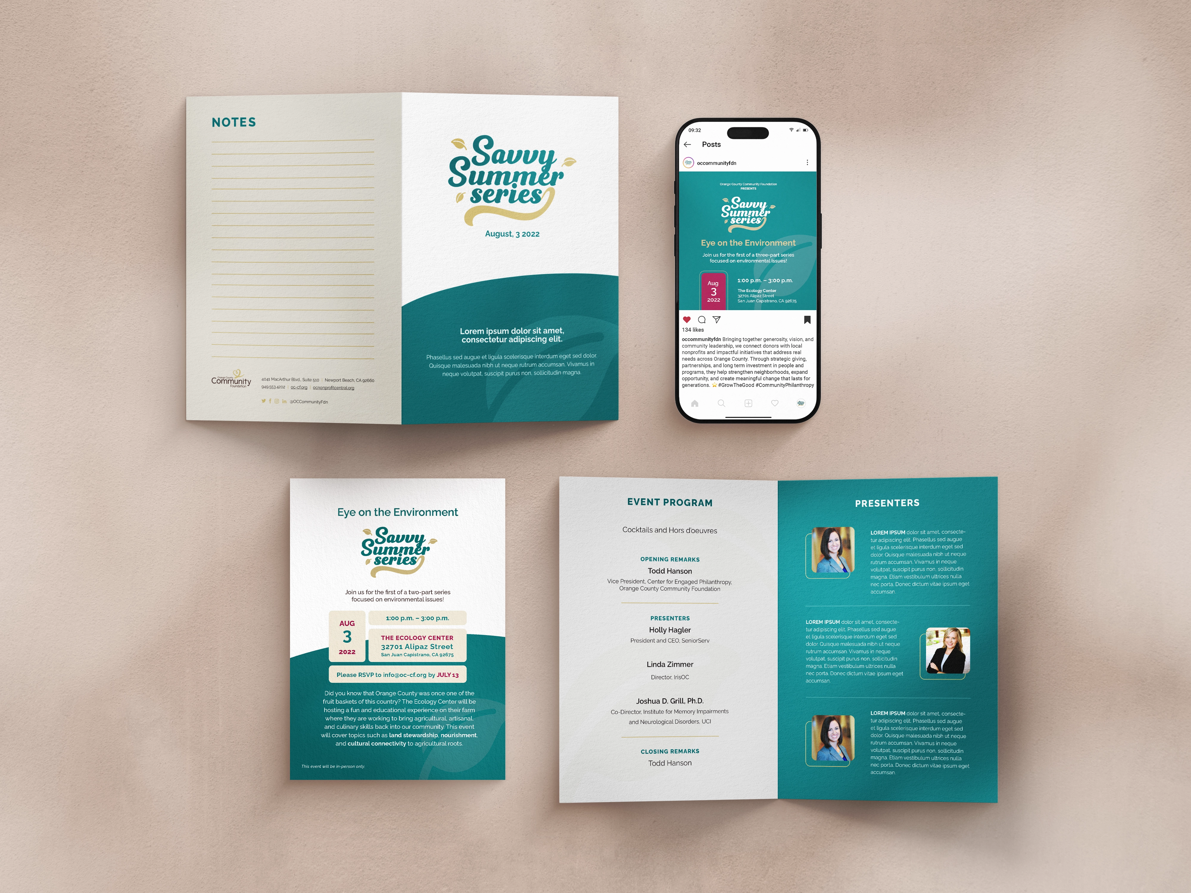
- Redesigned presentations, brochures, one-pagers, and invitations
- A branded holiday guide and program materials
- Sub-brands for funds and educational series tied to the parent identity
- Easy-to-use marketing templates for internal teams
Each piece reinforced the same visual standards, making the system sustainable long after launch.
What Changed
OCCF now communicates with a unified visual presence that reflects the professionalism and warmth donors expect.
The team spends less time troubleshooting design and more time focusing on relationships and impact. Materials feel consistent across events, campaigns, and donor touchpoints, strengthening trust and credibility at every interaction.
The work created a system that supports long-term growth.