Annual report infographics give your nonprofit a way to share complex data without losing the human story underneath it.
Here's what I've noticed after years of working on nonprofit annual reports: numbers get dumped into a table, and financials get a pie chart with no context. Donors, who genuinely want to understand what their support accomplished, walk away with nothing that makes sense.
By the time annual report season hits, there's usually more than enough data to work with like program numbers, financial summaries, impact stats, donor counts. The challenge isn't collecting it, but knowing which numbers move people and which ones just fill space.
Data doesn't automatically create belief. How you use it does.
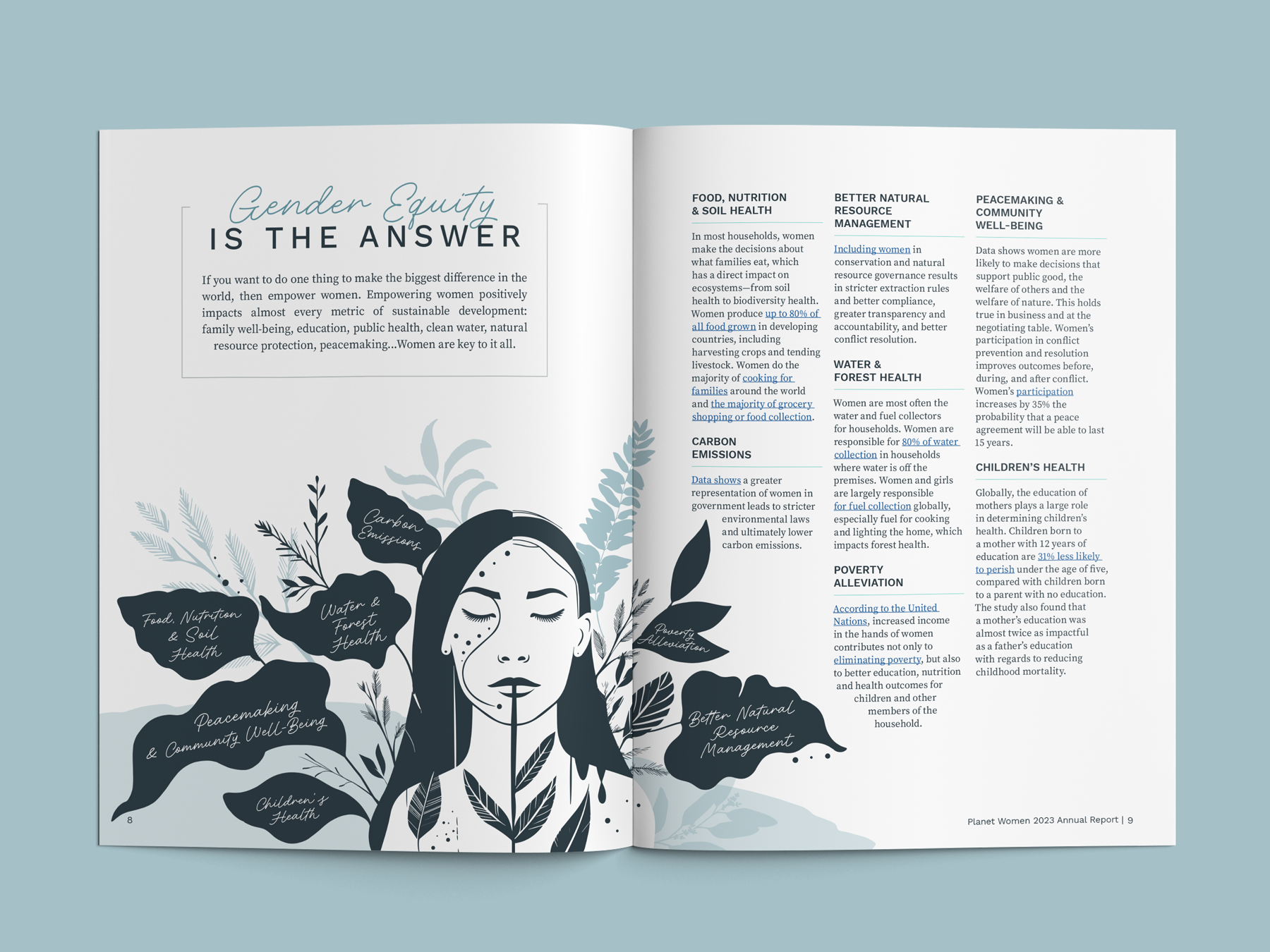
The way you present your numbers communicates something about your org before anyone reads a single thing. When I work with clients on their data sections, I'm not just trying to make things look prettier. I'm translating numbers into meaning. A visual that shows what 4,200 families looks like relative to your county's population, paired with one family's story, is belief-building.
That's the goal. Not data visualization for its own sake.
Before we get into the how-to, one thing worth naming: infographic design can't save a report that hasn't figured out which data matters most to your people. These six decisions only work when you've already answered the bigger question: what do you want donors to feel when they see this number? Start there. THEN design.
Types of Annual Report Infographics
Not all infographics serve the same purpose. Before you start designing, it helps to know which type fits your data:
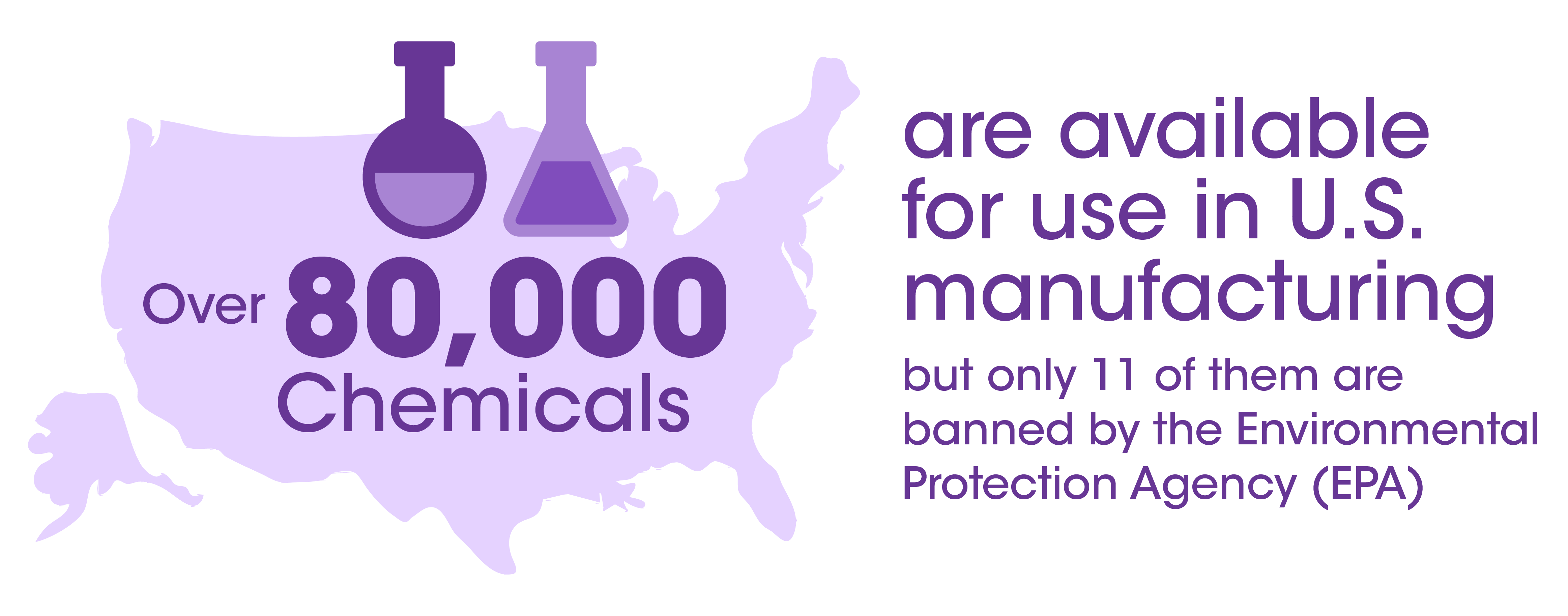
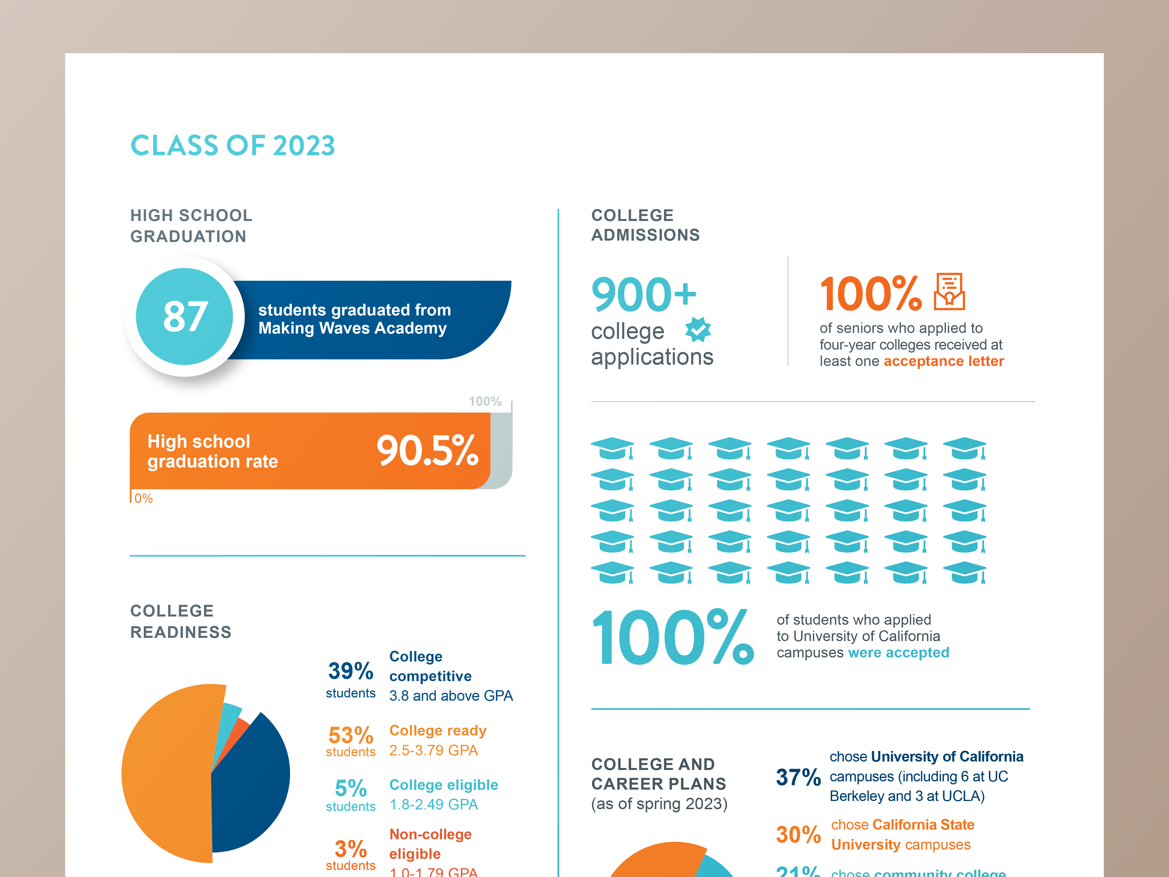
- Impact stat callout — a bold stat with a short line of context; great for key numbers like people served or funds raised
- Financial breakdown — pie or donut charts showing how funds were received and allocated
- Program reach map — geographic visualization of where your work lands
- Year-in-review timeline — a horizontal or vertical flow of milestones across the year
- Beneficiary story block — a quote, photo, and 2–3 data points paired together to humanize impact
- Donor breakdown — showing giving levels, donor retention, or funding sources
When shopping for an annual report infographic template, look for one that includes at least 3–4 of these types so you have flexibility.
Why Infographic Design Grabs Supporter Attention in Annual Reports
If you've spent any amount of time in the nonprofit space, you've probably read a good amount of annual reports. And you already know what the bad ones feel like... Excel-formatted tables, stats floating without context, a pie chart with off-brand colors and a sliver so small you can't make it out.
Donors are not going to sit with your financials and do the interpretation work for you. That's your job. And infographic design is one of the best tools you have for doing it well.
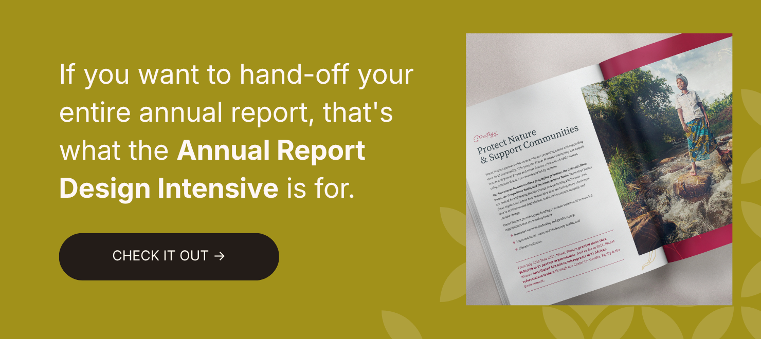
If you're not sure which numbers to lead with or how to make them land, that's exactly what the Annual Report Design Intensive is for. We figure that out before a single thing gets designed.
6 Things to Consider When Creating Annual Report Infographics (With Examples)
These aren't just design tips. They're decisions. Each one shapes whether your data builds trust or creates confusion.
1. Keep your infographic design simple. Don’t lose the point.
The first question to ask before designing any infographic: what is the ONE thing I want someone to understand from this?
Not three things. Not five. One.
Good annual report infographic design simplifies the visual without stripping the meaning. A couple of stats with a sentence of context or one line that tells the reader why the number matters, is worth more than a complex chart with no anchor. When unrelated data gets grouped together, that thread disappears
2. Pick the right visual for what your data is doing.
Not all data wants to be a pie chart. In fact, most data doesn't want to be a pie chart (ha!).
Bar graphs work well for comparisons over time. Timelines work for showing progression or milestones. Maps work when geography is part of the story. Vector illustrations work when you want to humanize a number. And sometimes a single large stat (just a number, styled intentionally) does more than any chart could.
One of the most consistent things I see when reviewing annual reports: data forced into the wrong format, or defaulted to big text and called an infographic.
If you're not sure which format works, test it. Create two versions and ask someone on your team which one they understand faster. That's your answer.

3. Keep your infographic design consistent across every section.
When every infographic in your report uses a different font, a different color palette, or a different visual language, it tells readers that your org operates in silos. Nobody planned this and nobody owns it.
Strong infographic design uses the same typographic system, the same color treatment, and the same visual hierarchy throughout.
Reminder: watch the negative space too. Crowded infographics feel anxious. Give your data plenty of room to breathe.
4. Design for the platform it’s going to live on.
An infographic designed for a printed report needs to work at 8.5 x 11 inches. That same infographic posted to Instagram needs to be vertical and condensed. Used in an email? It needs to scale down even smaller. Dropped into a board presentation slide? Different dimensions again.
The data can be the same, but the design cannot just be resized and called done. When orgs come to us after already building their report, the most common problem is infographics that were never designed with distribution in mind. They look great in the PDF and fall apart everywhere else.
Before you finalize anything, map out where this content is going to live, and design for that from the start.
5. Use infographic design to tell a story, not just report a number.
I'd tattoo this on the wall of every nonprofit comms office if I could.
Infographics are STORYTELLING tools first. The data lives inside them, but the story is what gets people in their feelings. The sequence in which info appears, the visual weight you give to different stats, the way one number flows into the next, all of that is storytelling.
Organize your info so it guides readers from one key point to the next. Use visual cues (like arrows, negative space, labels) to create flow. An infographic with a clear sequence should feel like it’s leading somewhere, not just presenting facts.
6. Get a second set of eyes before your infographics are final.
Your team has been staring at your report for weeks. You've lost perspective on what reads clearly and what requires context you've accidentally assumed everyone has.
Get someone outside the process to look at your infographics before they're final. Not just to critique the design, but to tell you what they understood. Ask them: what does this number mean to you? What does this graphic make you think about us?
Their answers will tell you more than any internal review. And if multiple people are confused by the same visual, that's a design challenge to tackle.
.avif)
Get The Annual Report Checkpoint

Donor Thank You Postcards Templates
Enter your info and we’ll send the postcards straight to your inbox:
How We Design Infographics for Our Clients
When we start a new annual report project, infographic design isn't a separate phase. It's built into how we think about the whole report from the beginning.
We look at the data a client wants to share and ask: what does this need to make people feel? Not just understand, feel. A stat about food insecurity should be brought to life differently than a stat about capital raised.
We also think about repurposing from day one. Every infographic we create is designed to work inside the report AND as a standalone asset for social, email, or presentations. One design investment, used all year.
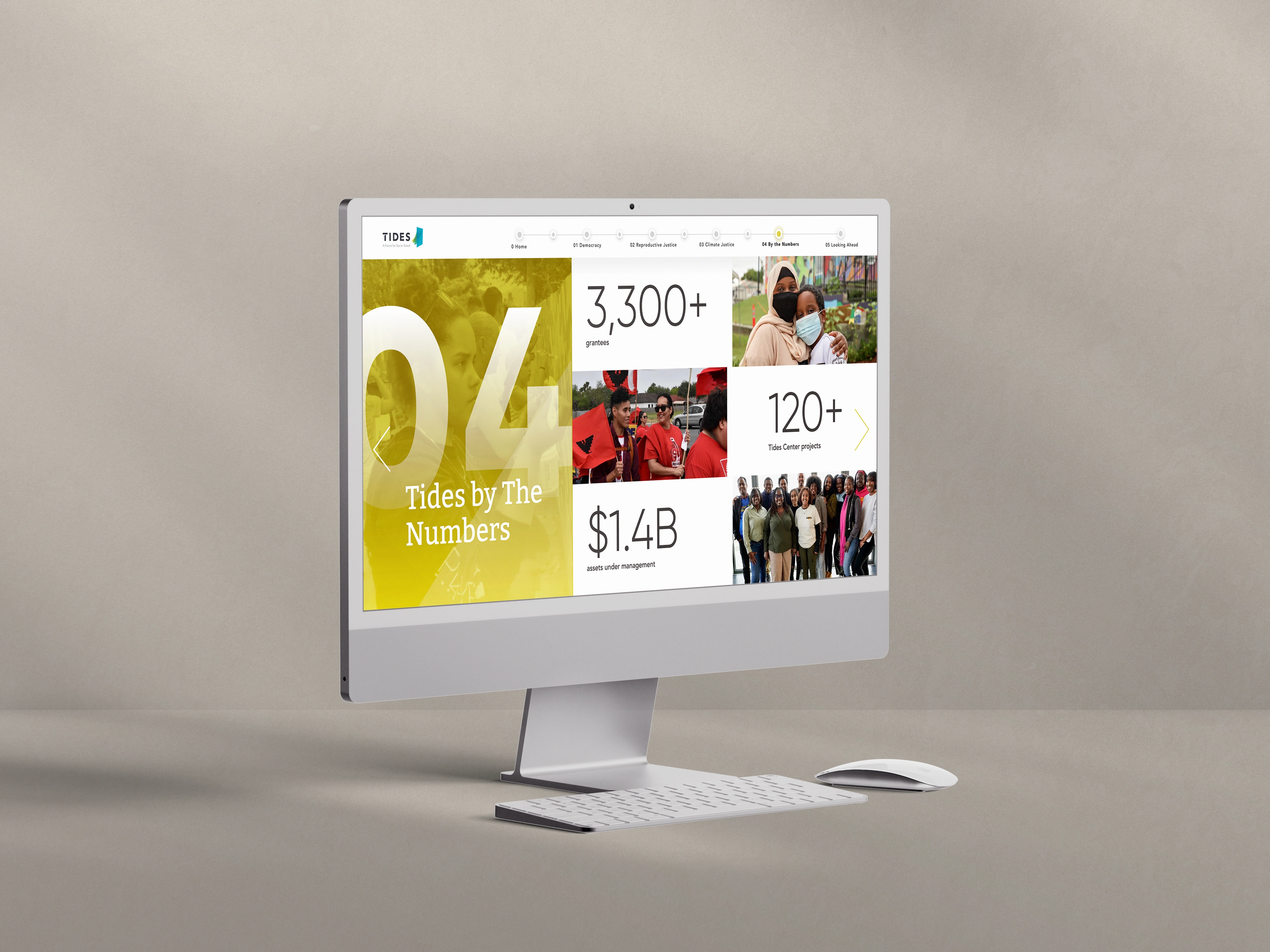
If you want to see this in practice, the Acton Circle portfolio shows how data design works across print, digital, and hybrid formats for orgs like Tides, Making Waves Education Foundation, Breast Cancer Prevention Partners, Peninsula Family Service, and more.
Infographics Don’t Save a Weak Report. But They Do Elevate a Strong One.
The part that trips most teams up is that having a lot of good data is NOT the same as having a compelling report. The strongest reports are the ones that know which proof points need emphasis, where the reader needs space to process what they're reading, and how to let the numbers support the story instead of taking it hostage.
When you've done that thinking first, infographic design is what makes it visible. It's what turns a number into a snapshot that stays in people's minds.
The CEO at Chiron Community Giving Foundation came to us with dense mental health research that needed to reach community partners and policymakers, audiences with very different levels of familiarity with the data. The design had to make complex info connect without dumbing it down.
"A beautiful job bringing our foundation's report to life. The visualized data and narrative were enhanced by the very professional graphic design services provided by Acton Circle."
Frequently Asked Questions
What makes a good infographic for a nonprofit annual report?
Easy to understand, context is included, and style is consistent across the board. A good infographic communicates one thing clearly, gives that thing enough context to be meaningful, and fits visually with everything else in the report. It should make a donor feel something, not just note a stat.
Should every section of an annual report have infographics?
No. Infographics work best where data needs translation, financials, impact metrics, program reach. Narrative sections, leadership letters, and donor spotlights don't necssarily need infographics. Forcing them in just creates visual noise.
Can we reuse annual report infographics on social media?
Yes, and you should. This is one of the highest-value things you can do with your report content. Design your infographics modularly from the start so they can be cropped, resized, or repurposed without a full redesign. A well-designed infographic becomes a social post, an email header, a slide in a donor presentation.
What’s the difference between an infographic and a data visualization?
Technically, all infographics involve data visualization, but not all data visualizations are infographics. A data visualization is any visual representation of data: a chart, a graph, a map. An infographic typically combines multiple visual elements into a cohesive, story-driven piece. In annual reports, you'll usually use both.
Want infographics built into your report from page one?
If your data sections feel all over the place, your visuals feel disconnected, or you're not sure what story your numbers are telling, that's usually a sign the report needs a closer look before design starts.
The Annual Report Design Intensive is where we come in and do that work with you. Strategy first. Infographics built to work inside the report AND everywhere else you're showing up. One design investment, used all year.
See what the Design Intensive includes.