Here's a convo I have more than you'd think:
A nonprofit comms leader reaches out. She know her mission inside and out. She's got a clear vision for what she wants. She's already written the outline, pulled the stats, mapped the sections. She knows exactly what kind of end product she's after... she even sent me a reference example she loved.
And then she tells me: "We don't really have the bandwidth for this right now. We don't have a designer. I'm not a designer. But I want it to look beautiful and professional."
So we talk through the options. She sees the investment. And then… almost always… she says something like: "We might just do it quick and dirty. Get the stats up there. At least we've published something."
And she does. I hear nothing more.
… until next year, when she's back in the same spot. Except now, the quick-and-dirty version is sitting on her website. She still doesn't love it, and the rebrand she was waiting on has pushed back another three months.
The "Bad Timing" Trap
I understand the hesitation. I really do.
You're in a rebrand. The website's not done. You don't have a marketing director right now. You've got the developer you don't completely love and a pile of banked hours you're not sure what to do with. And someone just handed you a price tag that made you pause.
So you talk yourself into a compromise: just get something up. It doesn't have to be perfect. It just has to exist.
Except here's what happens when you "just get something up."
Your donors see it. So does your board and prospective funders. And every single one of them forms an opinion about your organization in about three seconds (before they've read a word) based on what they're looking at.
"Quick and dirty" doesn't look like a scrappy, resourceful nonprofit doing their best. It looks like an org that doesn't take its communications seriously. That's not fair. But that's how it works.
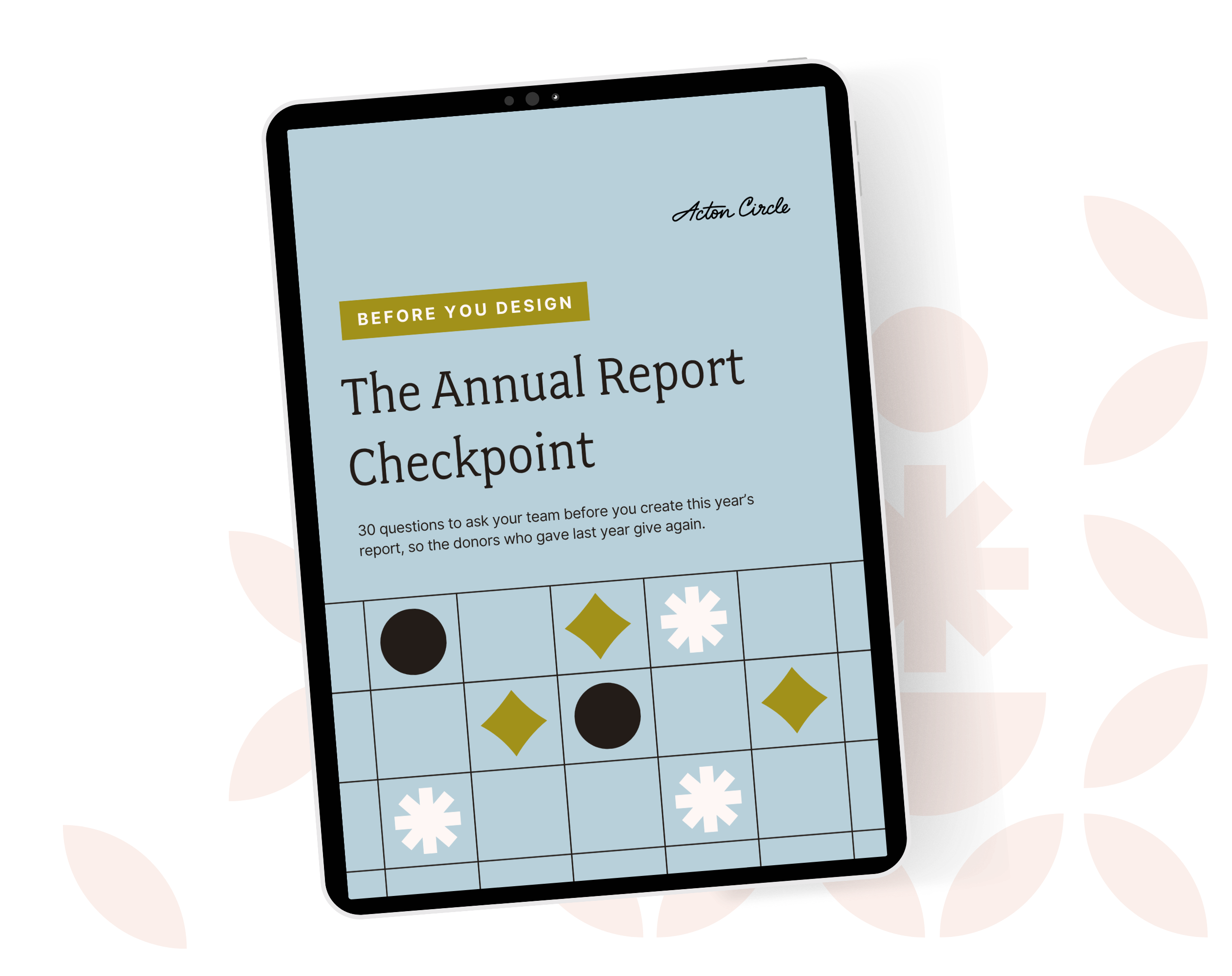
Get The Annual Report Checkpoint
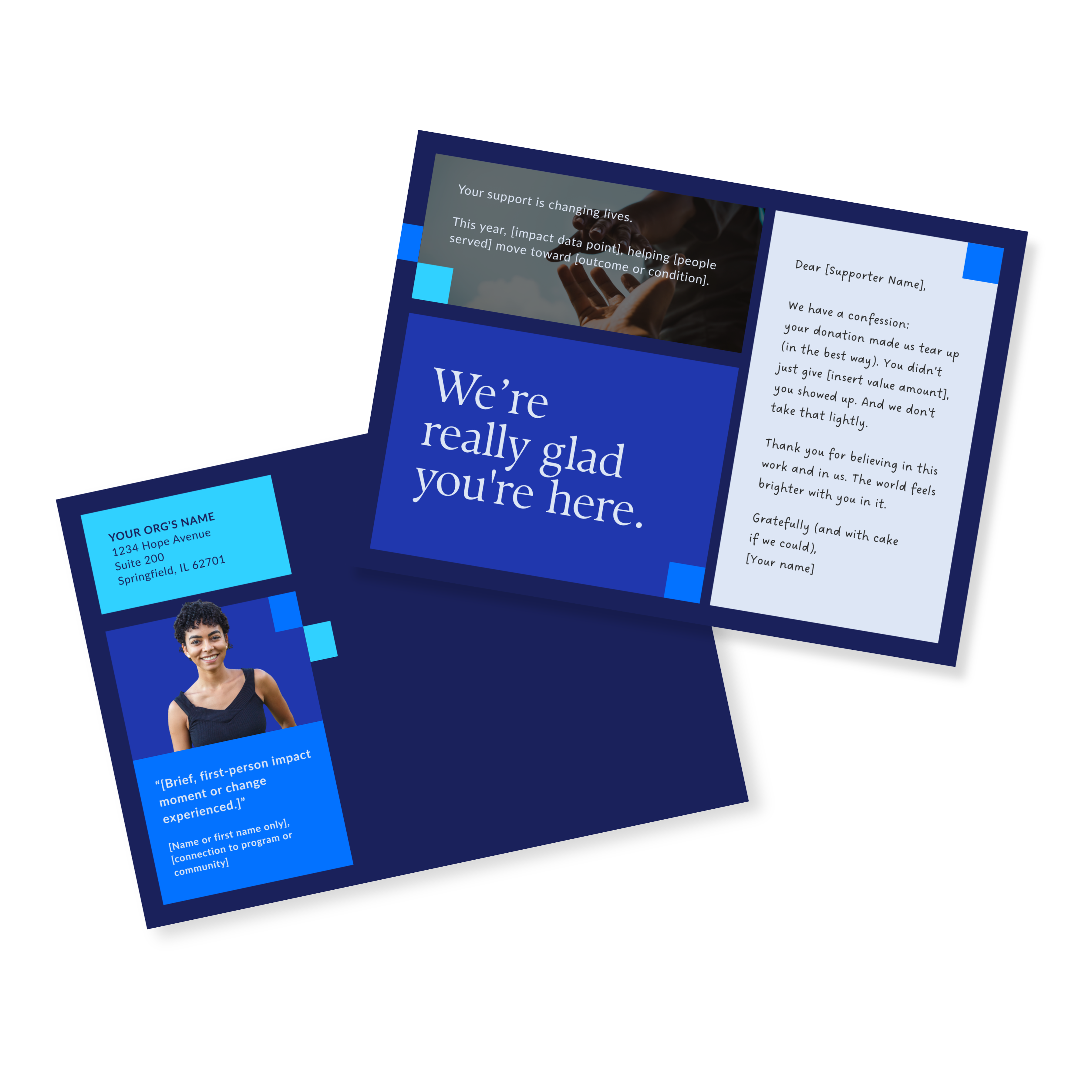
Donor Thank You Postcards Templates
Enter your info and we’ll send the postcards straight to your inbox:
The Most Common Blockers
This is the part that gets me.
Almost every person who ends up doing it in-house already said, out loud, that they didn't think they could do it well in-house. They said: I'm picky. I want it to look professional. I don't think we can get there ourselves.
And then they talk themselves out of outsourcing anyway.
So what's happening there? A few things:
The timing never feels right
There's always a rebrand coming, a hire pending, a website rebuild on the horizon. If you wait for the right moment to invest in good communications, you will wait forever.
The orgs that consistently look credible don't wait for the stars to align. They make the best version of the current thing, right now, with what they have.
The price feels big in isolation
A few thousand for a custom digital impact report feels like a lot when you're looking at it as a line item. It feels different when you consider what it costs to have your highest-stakes donor communication look like it was thrown together over a long weekend. Or when the major gift prospect you've been cultivating visits your site and the first thing they land on is that.
The "just publish something" logic sounds reasonable (until it isn't)
Getting something out there matters. But there's a meaningful difference between something that builds donor trust and something that just technically exists. One of those things compounds over time. The other one is something you end up quietly embarrassed about every time someone asks for a link.
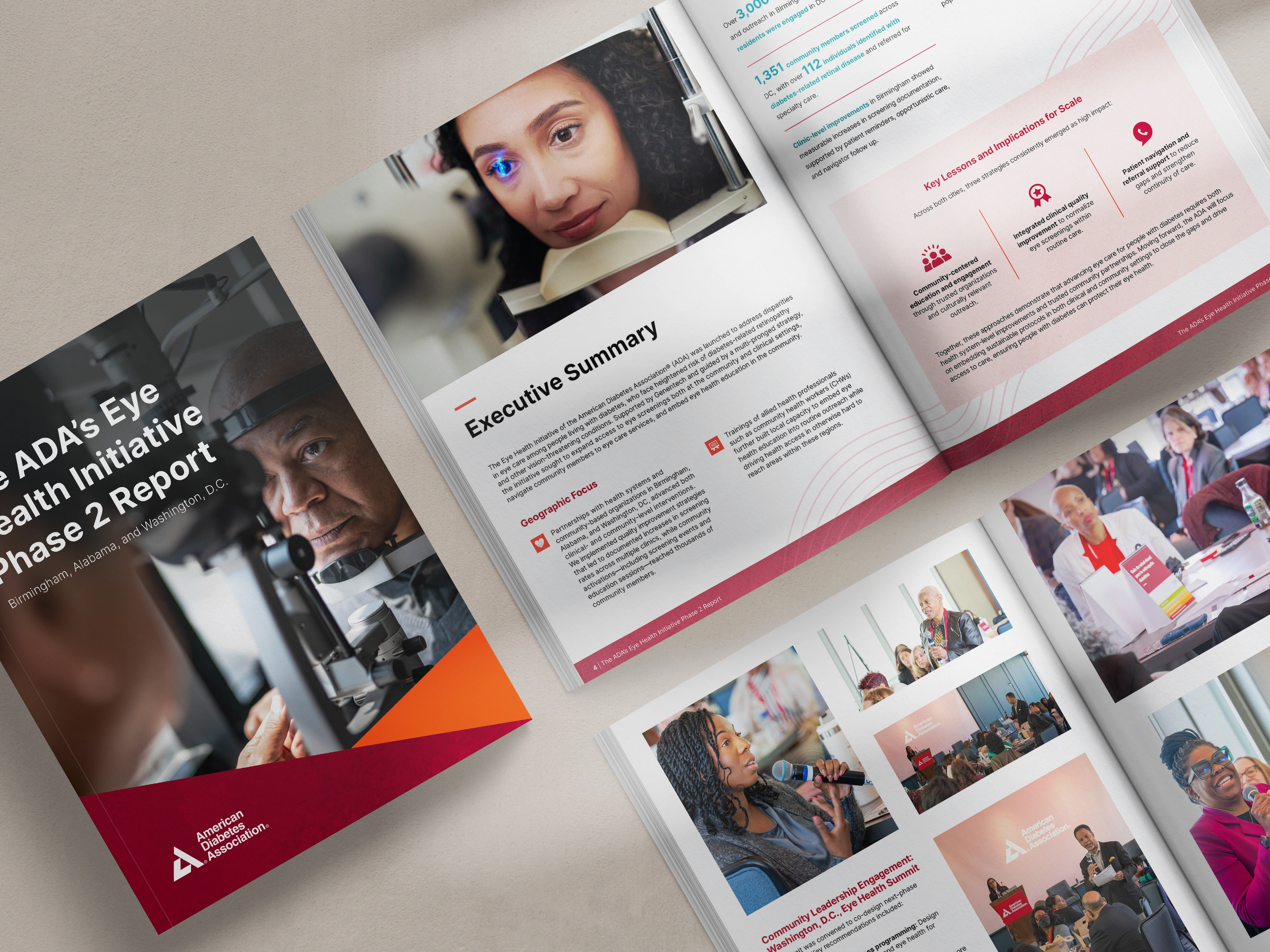
What Outsourcing Gets You (Beyond a Good-Looking Report)
When you work with a designer who specializes in nonprofit impact communications, you're not just buying a prettier document…
You're buying time back
Every hour your team doesn't spend wrestling with layouts, chasing down photo sizes, or redoing the same section because it still doesn't look right — that's an hour they're doing the work they're really good at.
You're buying strategy
A good designer isn't just executing your vision. They're asking: what does this page need to do? Where do you want the reader's eye to go? What do you want them to feel by the time they scroll to the bottom?
That's a different convo than "here's the Canva template, can someone make this work."
You're buying a starting point for next year
One well-built digital report is so much easier to evolve than starting from zero every cycle. The format is there. The framework still works. You're improving, not rebuilding.
And you're buying credibility right now
In the interim, while the rebrand closes out, while the new hire comes on board, while all the pieces you're waiting for are still getting into place. Your donors don't know about the rebrand. They see what's in front of them today.
The Real Question
Here's the one I always want to ask, but don't always say out loud:
If you knew for certain that a donor was going to read this report and make a decision about whether to give again based on what they saw, would "quick and dirty" still feel like an option?
You already know what you want it to look like. You already know your team doesn't have the capacity to get it there. You already said that.
The only question is whether you're going to let the price of doing it right stop you from doing it right.
That's a real decision with real stakes. Just make it with your eyes open.
If you're sitting with that decision right now, our Annual Report Checkpoint is a good place to start. We'll help you figure out the best next step to take.