A first annual report is a strange assignment. There is no "last year's file" to open. Nothing to update (or blame).
And it's not really a summary of the year. It's the thing every future report gets compared to. Whatever you make becomes the standard, on purpose or by accident.
The Engaged Learning Office (ELO) at the University of Michigan School of Information walked into that with a year worth celebrating: 960 students, 225 projects, 112 community partners, over 14,000 hours of service, and $207,331 in scholarships, awards, and project support.
They had the vision too. They knew how they wanted it to feel. What they needed was someone to get it out of their heads and onto the page.
Three Programs, Five Audiences, and a Brand With No Wiggle Room
The ELO's work spans three core engagement areas (civic, course-based, and global) plus innovation programming, a student exposition, and featured stories like Alternative Spring Break. Each one comes with its own data, its own partners, its own narrative.
Getting all of that into one doc is a design problem before it's a writing problem.
Then the audience list makes it harder. Donors read differently than prospective students. Campus leadership wants something different than alumni. Current students want to see themselves. The report had to reach all five without losing any of them.
And because this is the University of Michigan, there was no improvising on brand. UMSI and U-M identity standards set the palette, the typography, and the logo rules. The margin for error was thin.
How We Made One Story Out of Three
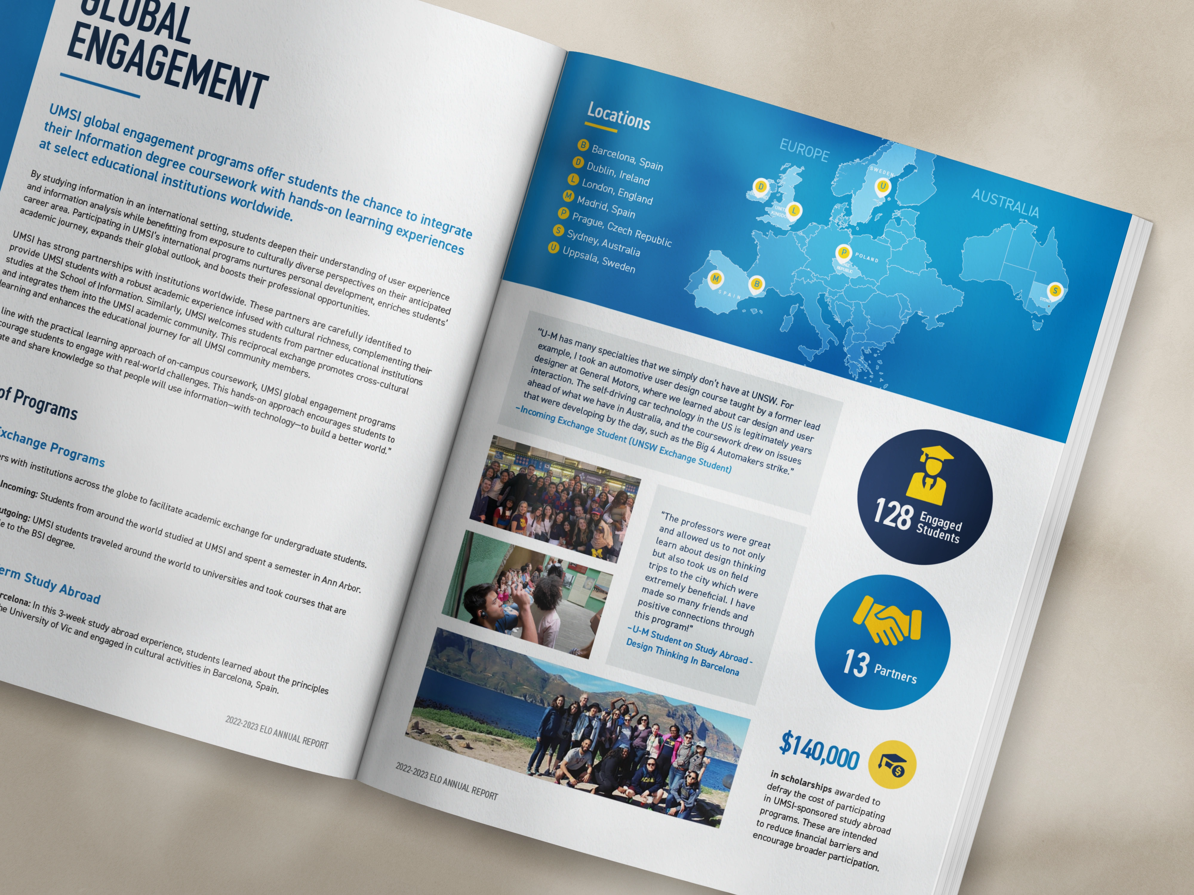
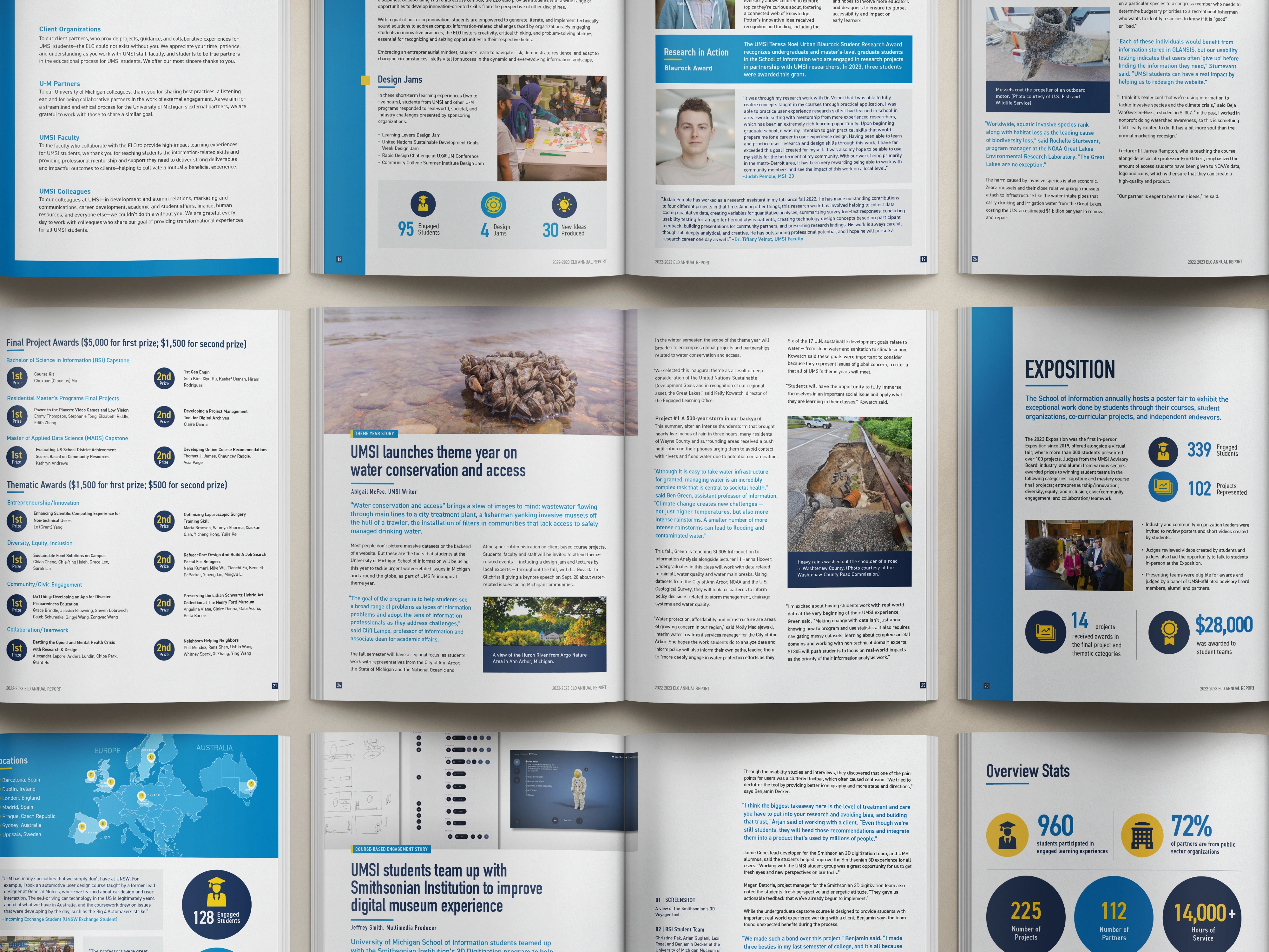
We designed the 29-page inaugural report from the ground up.
The cover pulls student and community photos into a collage that reads warm and energetic against the maize and navy palette. It sets the tone in the first three seconds: this is people-first work with real reach.
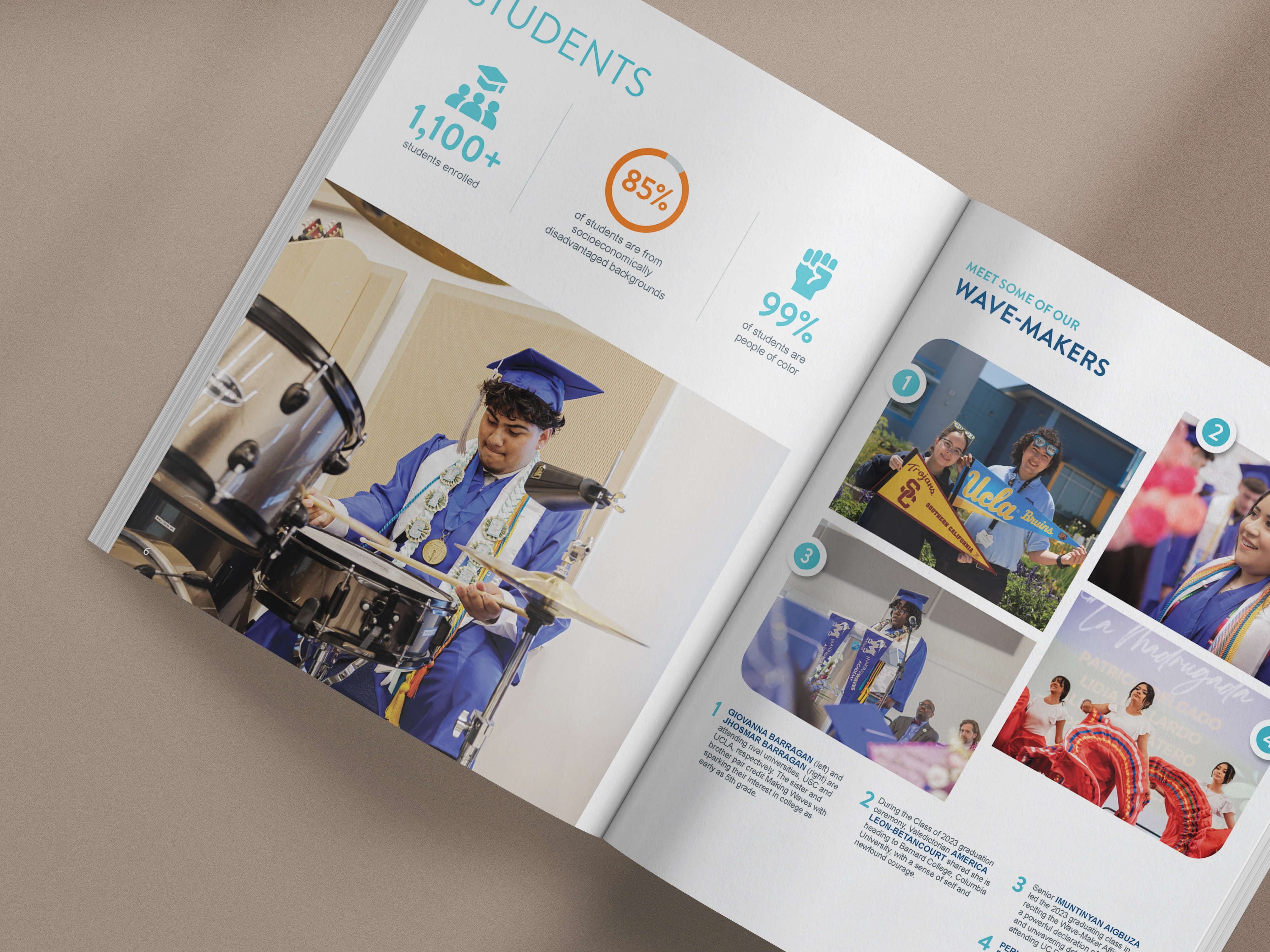
Inside, every engagement section follows the same format, so a reader moving from civic to course-based to global never has to relearn the page. Circular data visualizations make the numbers scannable at a glance. Bold color blocking keeps the U-M identity present without stepping on the stories underneath.
We crafted the layout for both kinds of readers: the one scanning for stats and the one reading every word. Pull quotes from community partners sit next to program outcomes. A director's letter opens with honesty about the year. Partner acknowledgments close it with gratitude.
Every decision came back to how the report would actually be used. Reviewed on a laptop. Passed around a meeting. Sent to a 17-year-old deciding where to apply.
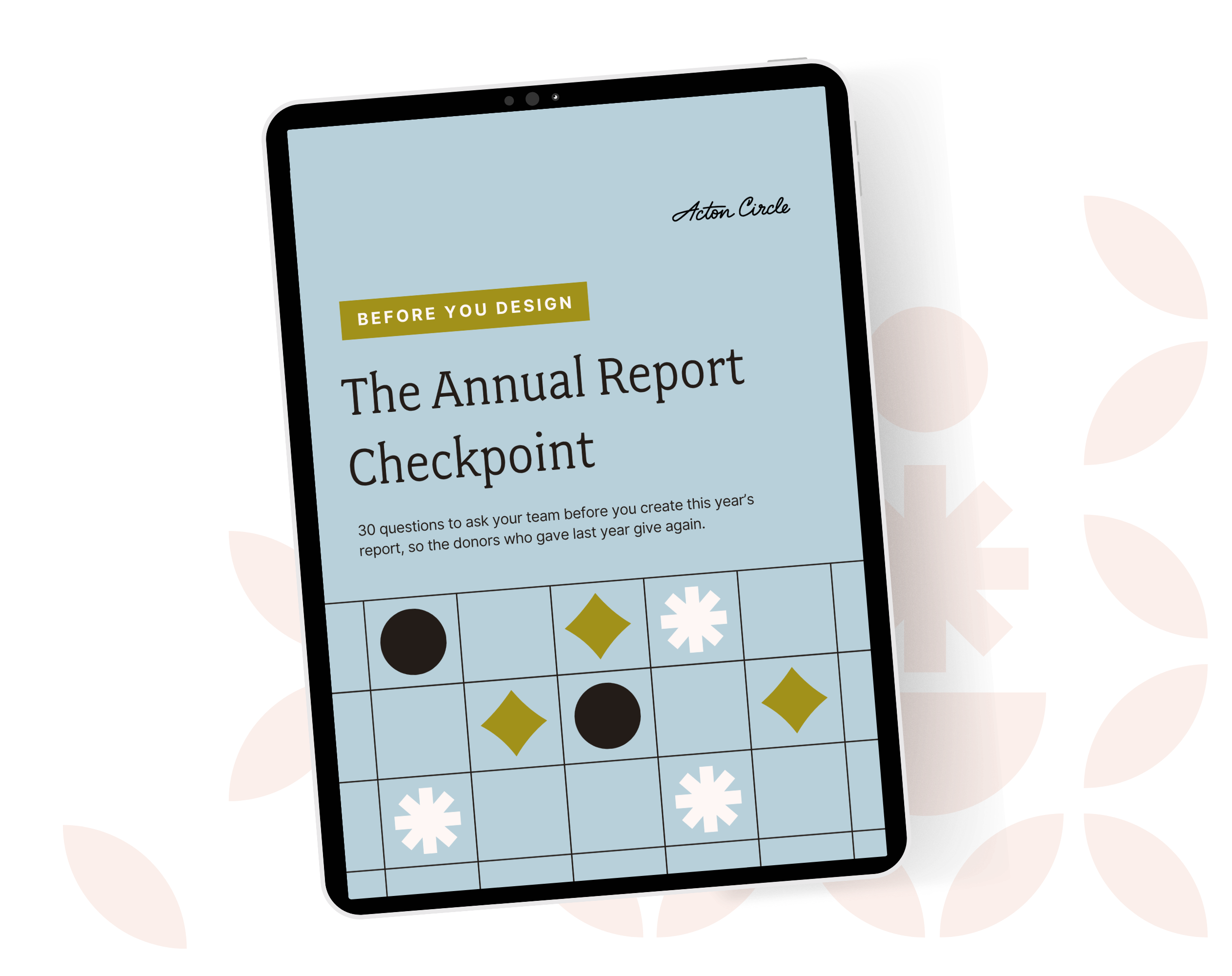
Get The Annual Report Checkpoint
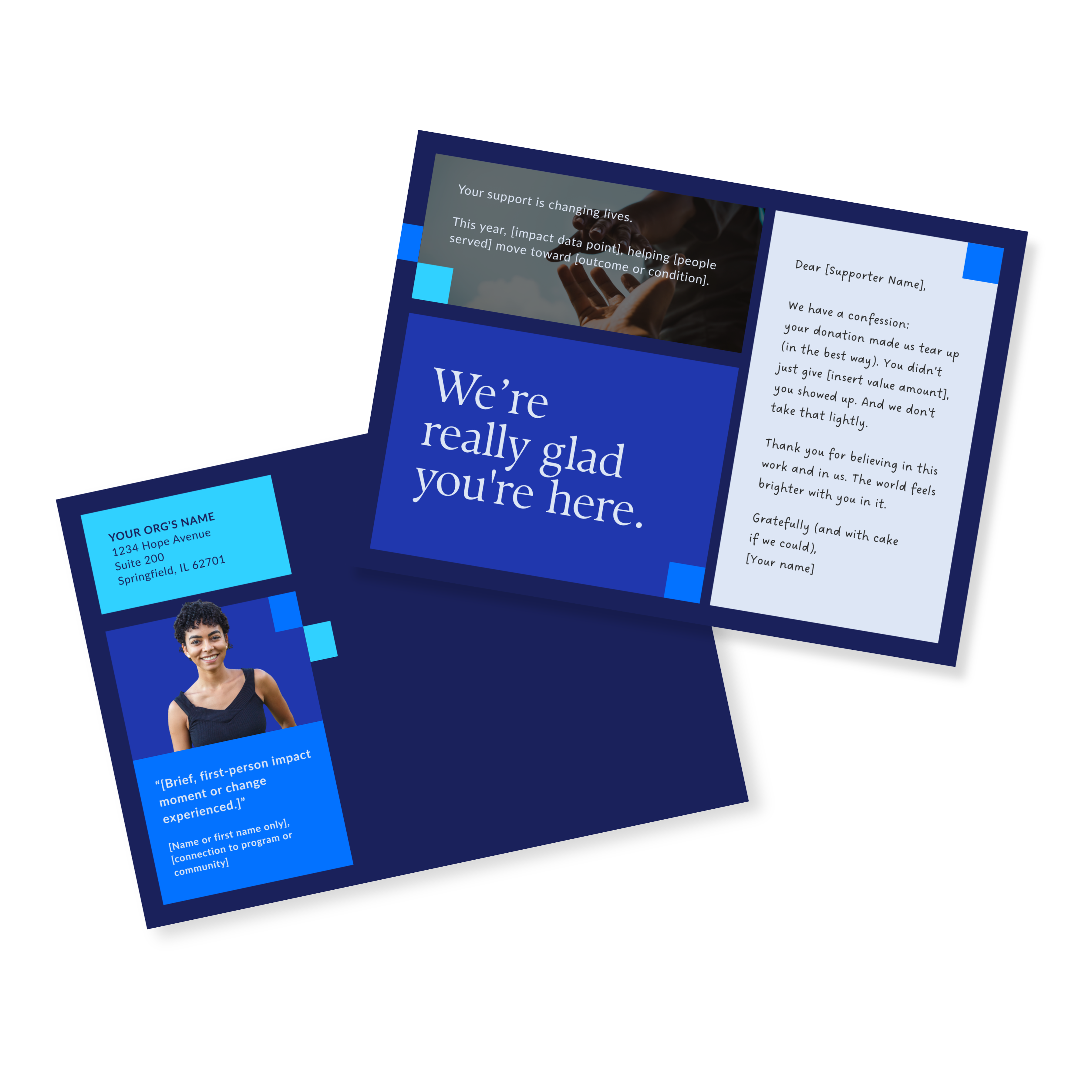
Donor Thank You Postcards Templates
Enter your info and we’ll send the postcards straight to your inbox:
What the Senior Associate Director Said
"Olivia was wonderful to work with and we were very pleased with the end-product. Highly recommend!"
- Alissa T., Senior Associate Director of Student Engagement, University of Michigan School of Information
The Work Was Real Before. Now the Document Is Too.
Campus leadership, donors, alumni, and prospective students can open this report and immediately understand what the ELO does, who it serves, and why it matters. The story isn't scattered across internal documents anymore.
And here's the part that pays off in year two: the design system carries forward. The layout logic, the visual hierarchy, the section structure. The inaugural report becomes the template.
That's the argument for investing in a first report instead of scraping one together. You are not buying 29 pages. You're buying the shape of every report after it.
Working inside a strict brand?
Tight brand standards and a report people want to read are not opposites. You just have to know where the flexibility lives.
If that's the position you're in, book a call and let's talk it through.
See the full project in our portfolio: University of Michigan School of Information.