Designing Research Into Policy-Ready Nonprofit Materials

Written by

Olivia Wheeler

/

Updated

September 19, 2026

Some nonprofit materials only have to be read. Others have to travel.

They get presented at a legislative meeting. Printed at a community event on a copier that's seen better days. Emailed to a donor who will skim it on a phone. Handed to someone who speaks Spanish or Tagalog at home.

Research that can't survive that trip doesn't influence anything. It just exists.

Breast Cancer Prevention Partners (BCPP) had the research and the policy expertise. What they didn't have was a set of materials built for the road.

One Marketing Director, Three Very Different Audiences

Communications sat with a solo marketing director balancing strategy, production, and day-to-day outreach. (Hi, it's you.) There was no spare capacity to turn dense science into public-facing tools.

So the gaps showed up where you'd expect. Reports were dense. Community resources needed to be clearer and easier to print. Donor materials didn't carry the scale or urgency of what BCPP was actually proving.

The materials needed to:

  • Make risk-factor content clear, printable, and community-ready
  • Give donors something that inspires action and trust
  • Polish technical reports enough to hold up in policy conversations
  • Work across multilingual audiences
  • Match the urgency of the science underneath

The work was strong. The translation layer was missing.
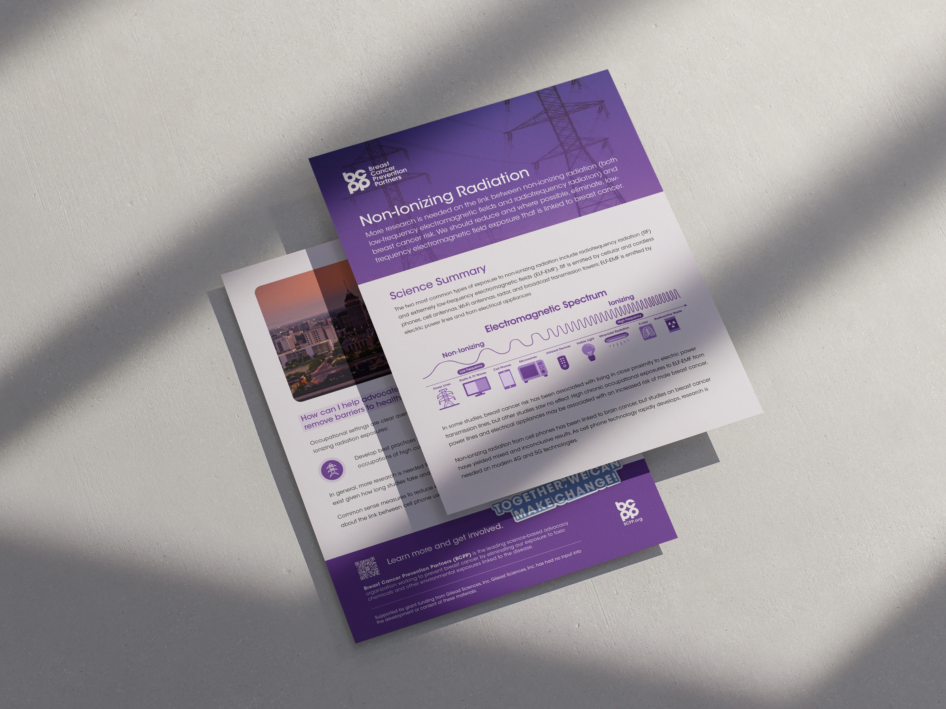
Three Pieces, One Visual System

We built a cohesive system across advocacy, community, and fundraising materials, so a policymaker and a community member are clearly looking at the same organization.

The IFRA Report. A policy-ready document on fragrance toxicity, designed so the evidence reads as credible at a glance and stays navigable under time pressure.

The Donor Case Statement. A story-driven PDF that balances data, impact, and a clear ask. Emotional without leaving the research behind.

Community One-Pagers. Bilingual, print-friendly, built for a folding table at an event and not just a screen.

Each piece was designed to move through a different room and still sound like BCPP.
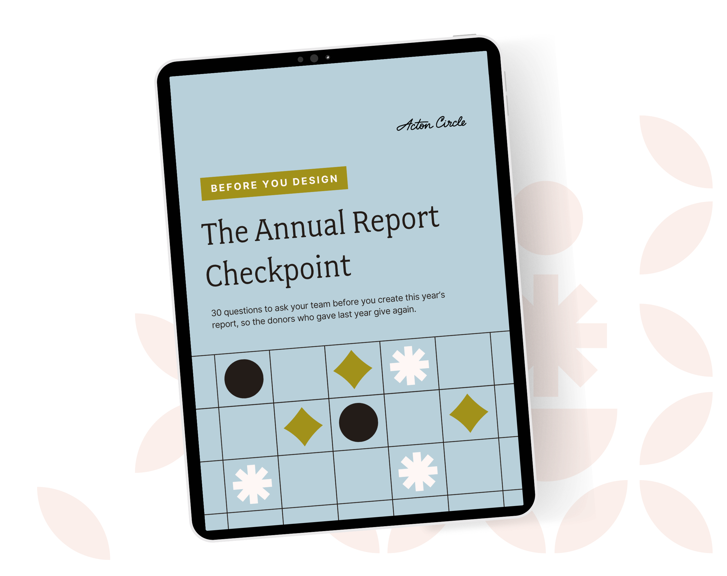
Ipad on a green floral background displaying an image of a blue, patterned PDF

Get The Annual Report Checkpoint

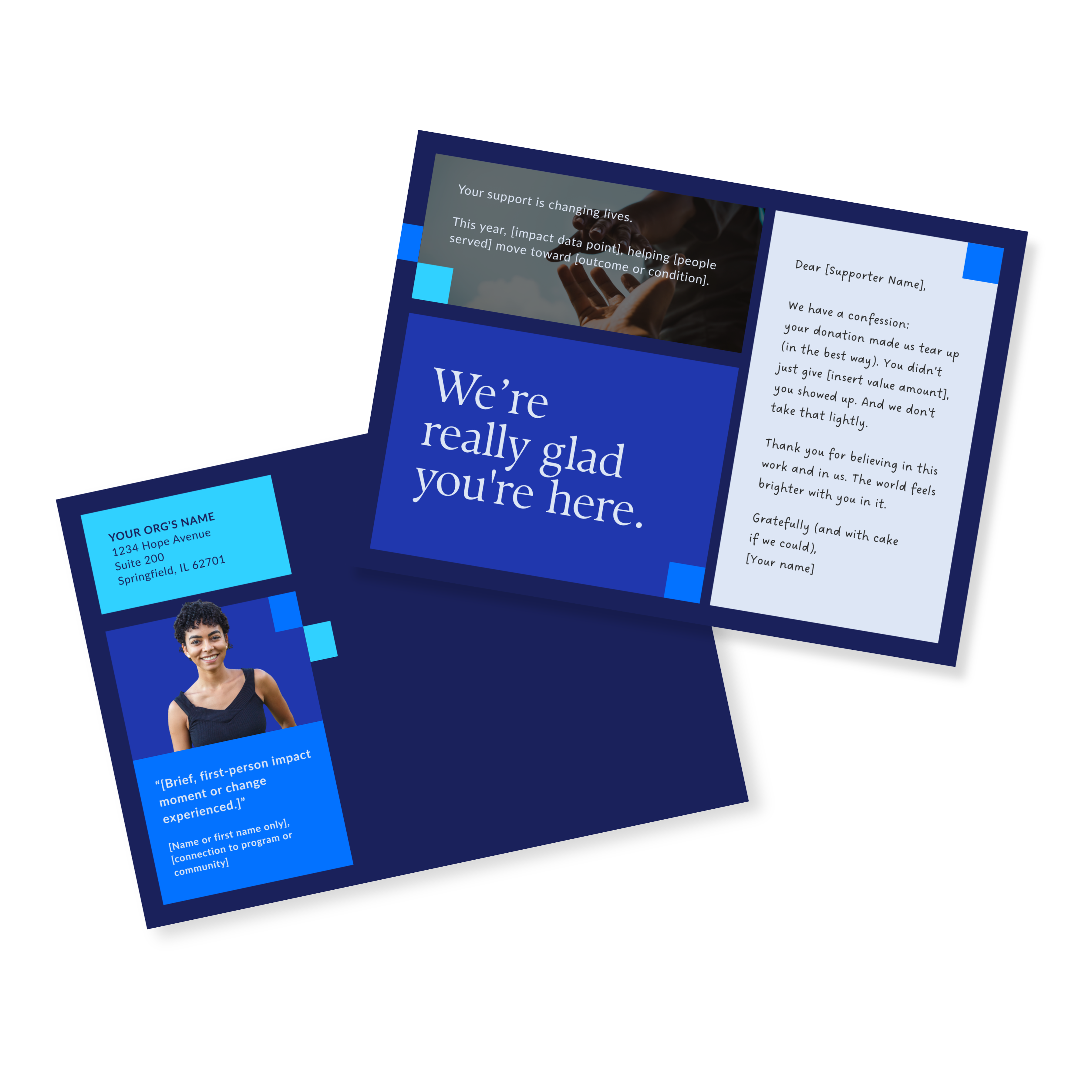
Donor Thank You Postcards Templates

Enter your info and we’ll send the postcards straight to your inbox:

Four Bills and 1.9 Million People
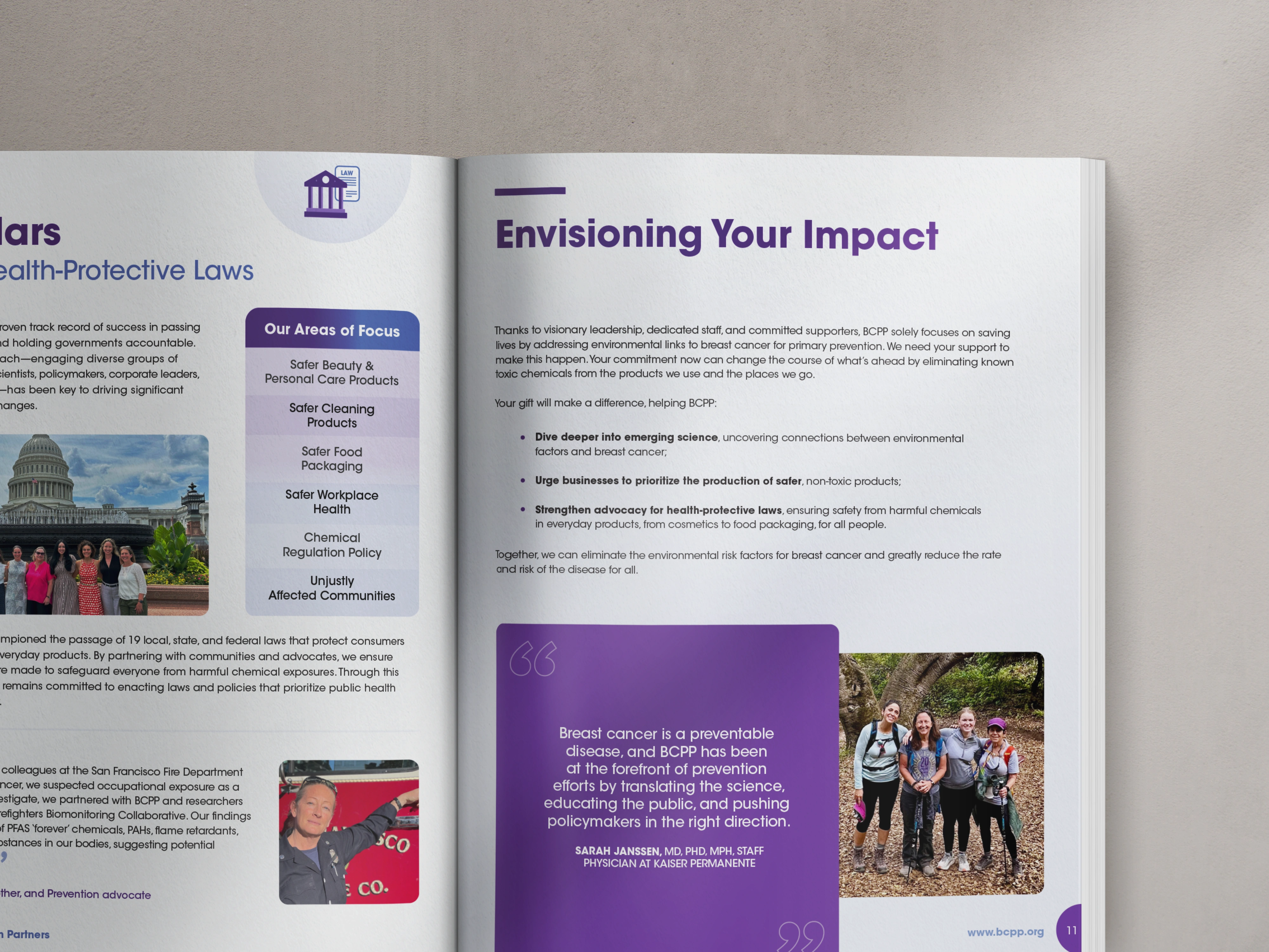
You know what's wild?! The clearest proof here isn't a design award. It's reach and legislation.

  • The Risk Factor Hub, which features our work together, reached 1,934,797 people in its 2025 launch and generated 220,683 page engagements and counting
  • The IFRA report helped support four health-protective bills introduced in Congress
  • Community audiences got multilingual resources they can actually use
  • Board members now feel confident presenting and sharing the work

None of that happened because the science got better. The science was already there. The materials just stopped getting in its way.

That's the part people underestimate. Design isn't the bow on top of the research. It's the distribution system.

If Your Research Deserves a Bigger Room

Dense findings, a tiny comms team, and audiences who need very different versions of the same truth. That's a design problem with a known shape.

If that sounds like your org, book a call and let's talk about it.

See the full project in our portfolio: Breast Cancer Prevention Partners.

👋🏽 Hi, I'm Krista Reyes

I'm a writer and editor with almost a decade of professional experience. I spent most of my formative years working with local and international nonprofits, channeling my passion for worthy causes into written works with depth, value, and intention.

If I'm not working, you'll find me reading books, watching movies, playing chess, or bonding with my four dogs.

👋🏽 Hi, I'm Olivia Wheeler

I'm a creative leader with high standards for nonprofit storytelling. I work between homeschooling and gym sessions, obsess over typography, and believe your annual report should make supporters feel your mission in their bones.

I help nonprofits connect with new audiences and look like the org they're becoming, not the ones they were five years ago.

The stuff you’re wondering, answered straight

Why only 1 in 4 donor ever gives again

Your annual report is a stewardship and retention tool waiting to be used.

Most orgs treat it like a formality. Design it, ship it, forget it. Then wonder why the same donors don't show up again next year.

Donors leave because nobody showed them their gift mattered after they gave it.

First-time donors are THE MOST fragile group you have. One good report = a second gift.

We wrote about exactly how to use your annual report as a stewardship tool, not just a recap: Your Annual Report Is a Stewardship Tool. Here's How to Actually Use It That Way.

Why only 1 in 4 donor ever gives again

Great work along does not raise money

Programs don't fund themselves. Understood value does.

You can run the best program in your sector and still lose funding, because funders and donors don't fund what you did. They fund what they understood.

Most impact sections list activities. Meals served, kids reached, hours logged. None of that tells anyone what changed.

The gap isn't your work. It's the translation between your work and what the reader actually feels reading about it.

I broke this down here: How to Measure Your Nonprofit's Impact (And Make Sure It's Felt)

Great work along does not raise money

Where donors stop reading

Donors give you a few seconds before they decide if your report is worth their time.

Dense pages, no hierarchy, and nothing to pull the eye to what matters don't help.

I wrote about what actually earns attention in that window here: Annual Report Layout: Tips for a Report Donors Will Read

Where donors stop reading

A faster way to build your report

So you're doing your annual report solo again this year, huh? Same deal as last time: last year's PDF open in one tab so you can copy the bones, and a blank Canva doc that doesn't carry a single thing over.

A template is the thing that should've existed the first time you did this solo.

Here's a better approach to your report if you're handling it in-house: The Faster Way to a Beautiful Annual Report

A faster way to build your report

What you're not pulling from your own report

Your annual report is the most content-rich thing your org makes all year. And then it just sits on your website.

Real stories, real numbers, real proof your mission works, all sitting in one PDF that gets opened once and forgotten.

That same content could be twelve LinkedIn posts, three newsletter sends, a case study, a slide for your next pitch deck. Every one of those keeps your mission in front of donors between asks, not just during them.

More on how to make your report work past launch day: Simple and Flexible Annual Report Ideas for Busy Nonprofits

What you're not pulling from your own report

Explore more articles

Client Case Studies
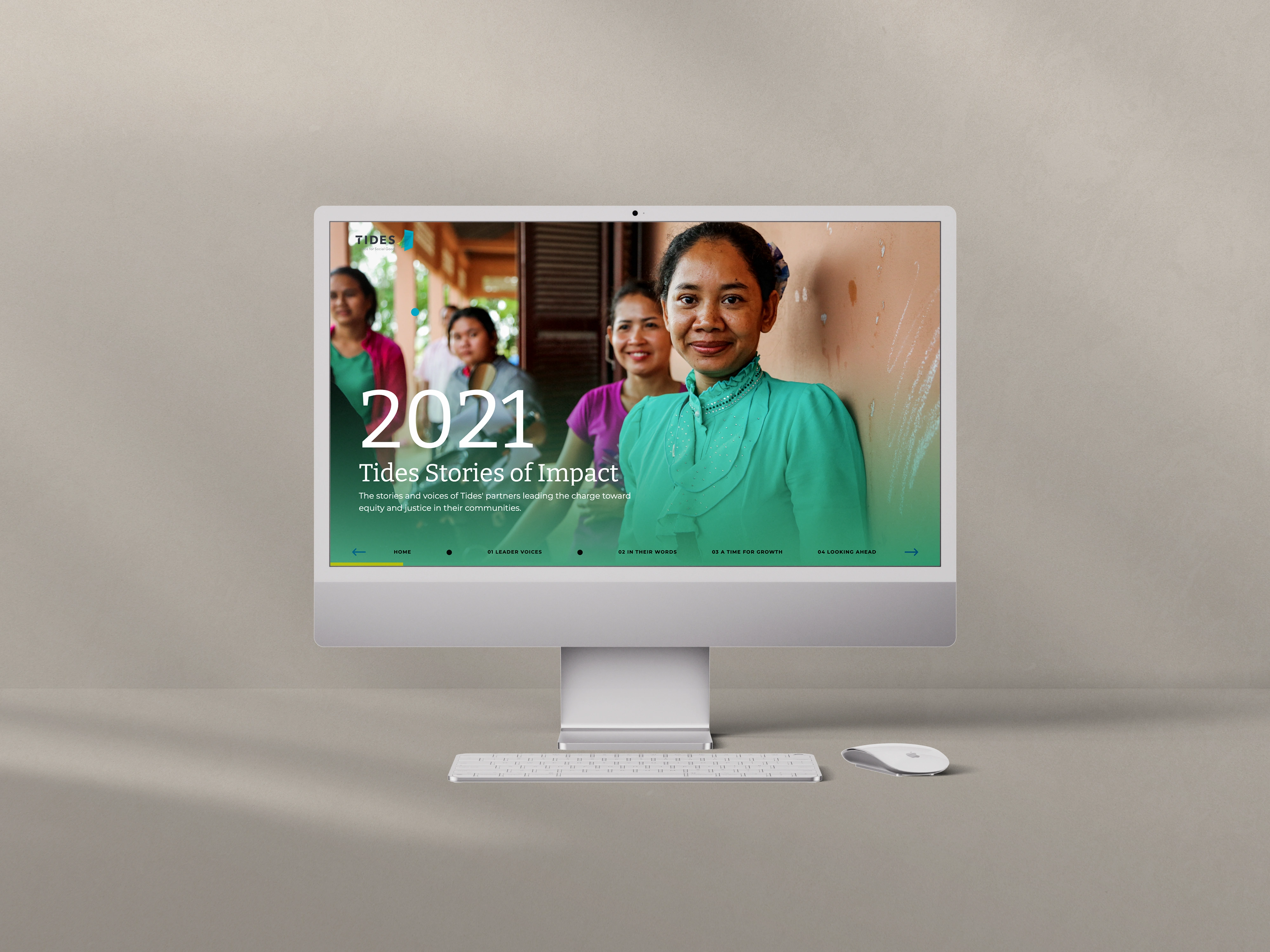
Tides wanted annual impact storytelling that lived online as an experience, not a PDF. Three microsites later, they have a digital language of their own.
Client Case Studies
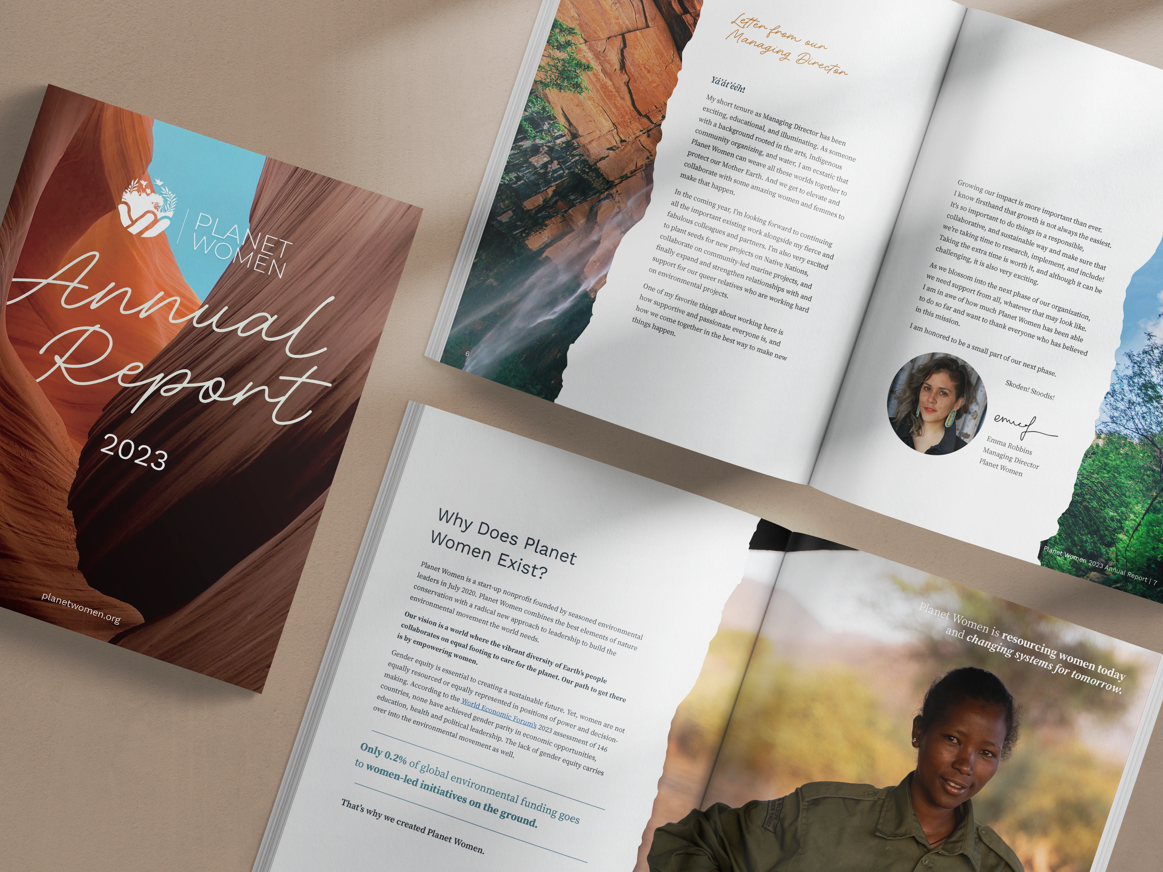
Planet Women needed a year-three report that matched their values and kept earning after launch week. Here is how it became a year-round asset.
Client Case Studies
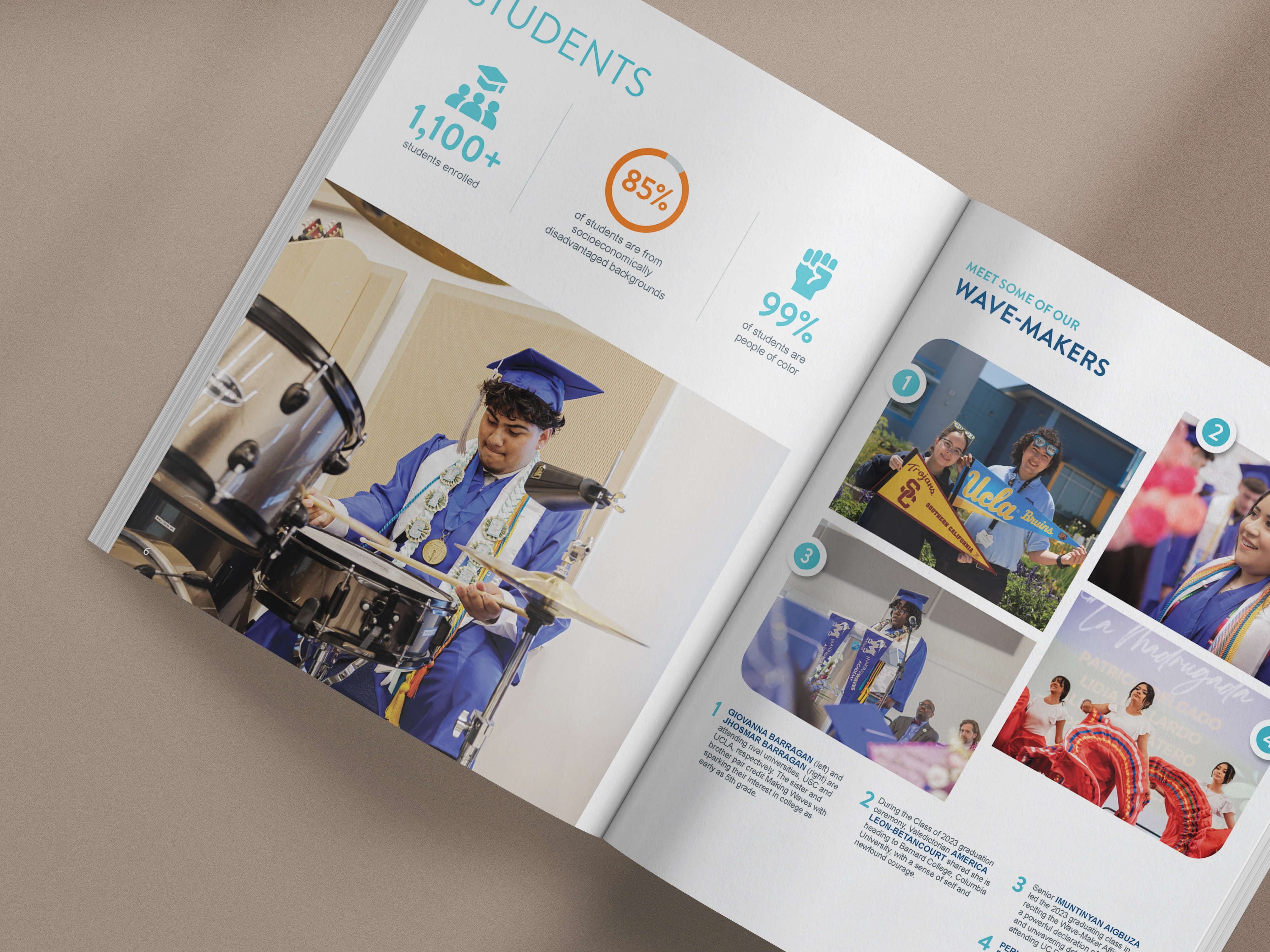
Making Waves needed separate reports for its Foundation and Academy that still felt like one mission. Four reports later, here is what worked.