An Annual Report Built to Be Used All Year

Written by

Olivia Wheeler

/

Updated

September 19, 2026

Most annual reports have a shelf life of about nine days (IYKYK).

Launch email. A couple of social posts. A board meeting. Maybe a postcard with a QR code linking to your report. Then it goes to the website and becomes an archive item, while the team starts over from zero on the next campaign.

Which is a strange outcome for the single most researched, most reviewed, most expensive thing you make all year.

Planet Women decided their year-three report wasn't going to work that way.

A Young Organization Growing Faster Than Its Materials

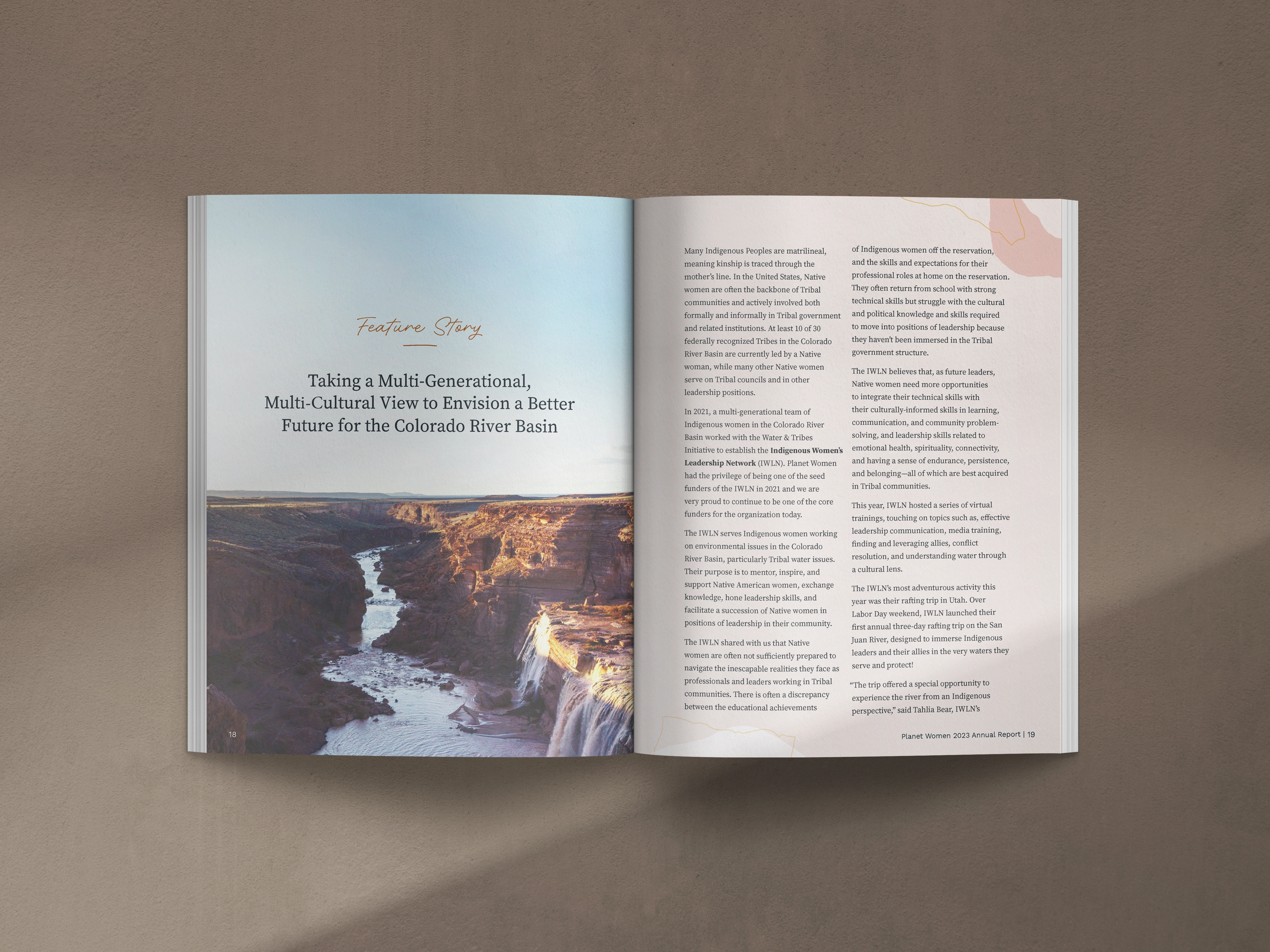
Planet Women advances environmental solutions by uplifting women and cultural knowledge. Approaching year three, they needed a report that reflected real growth while staying true to an organic, community-centered brand.

Summarizing numbers wasn't enough. The report had to educate donors, show grassroots impact, and amplify the voices of women leading environmental change around the world.

Communications sat with a two-person team led by a Director of Marketing juggling strategy, campaigns, and donor engagement. Building a publication that works as a fundraising piece AND a long-term storytelling asset was never going to fit in that calendar.

They also needed a specific balance: authentic enough to feel like them, polished enough to build donor confidence. Get that wrong in either direction and the report undercuts the very thing it's trying to prove.
Designed for Longevity, Not Just Launch

We reimagined the report as an immersive storytelling piece for print and digital interaction.

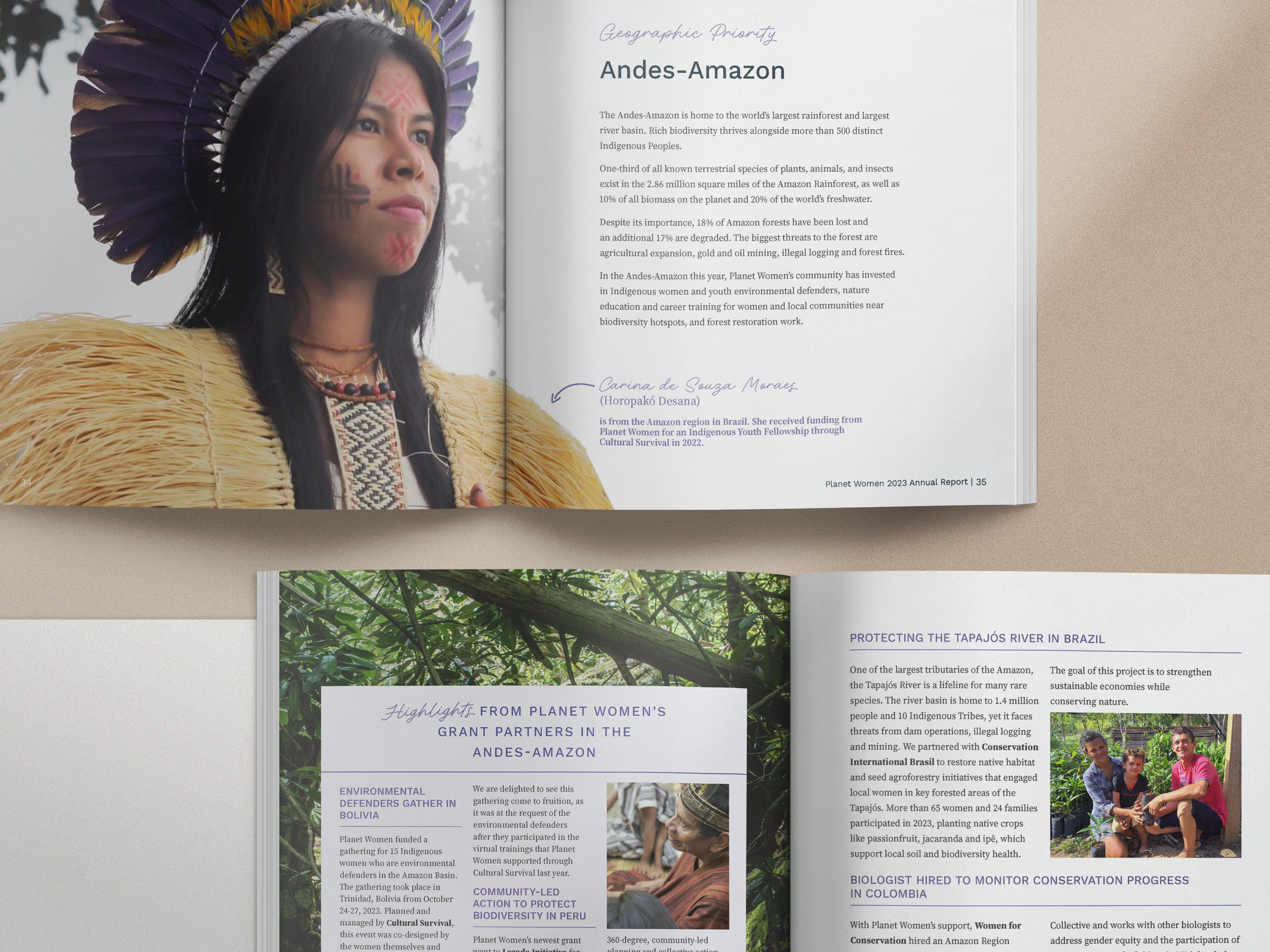
The final publication is a flipbook-style experience with embedded video, organic textures, and warm typography drawn from nature and cultural connection. Authentic imagery and narrative pacing keep real voices at the center instead of in a quote box.

Deliverables included:

  • An interactive flipbook report with embedded video
  • A visual system inspired by nature and cultural storytelling
  • Community narratives paired with imagery
  • Typography and textures aligned with their brand ethos

The design brief wasn't only "make this beautiful for launch." It was "make this still useful in June."
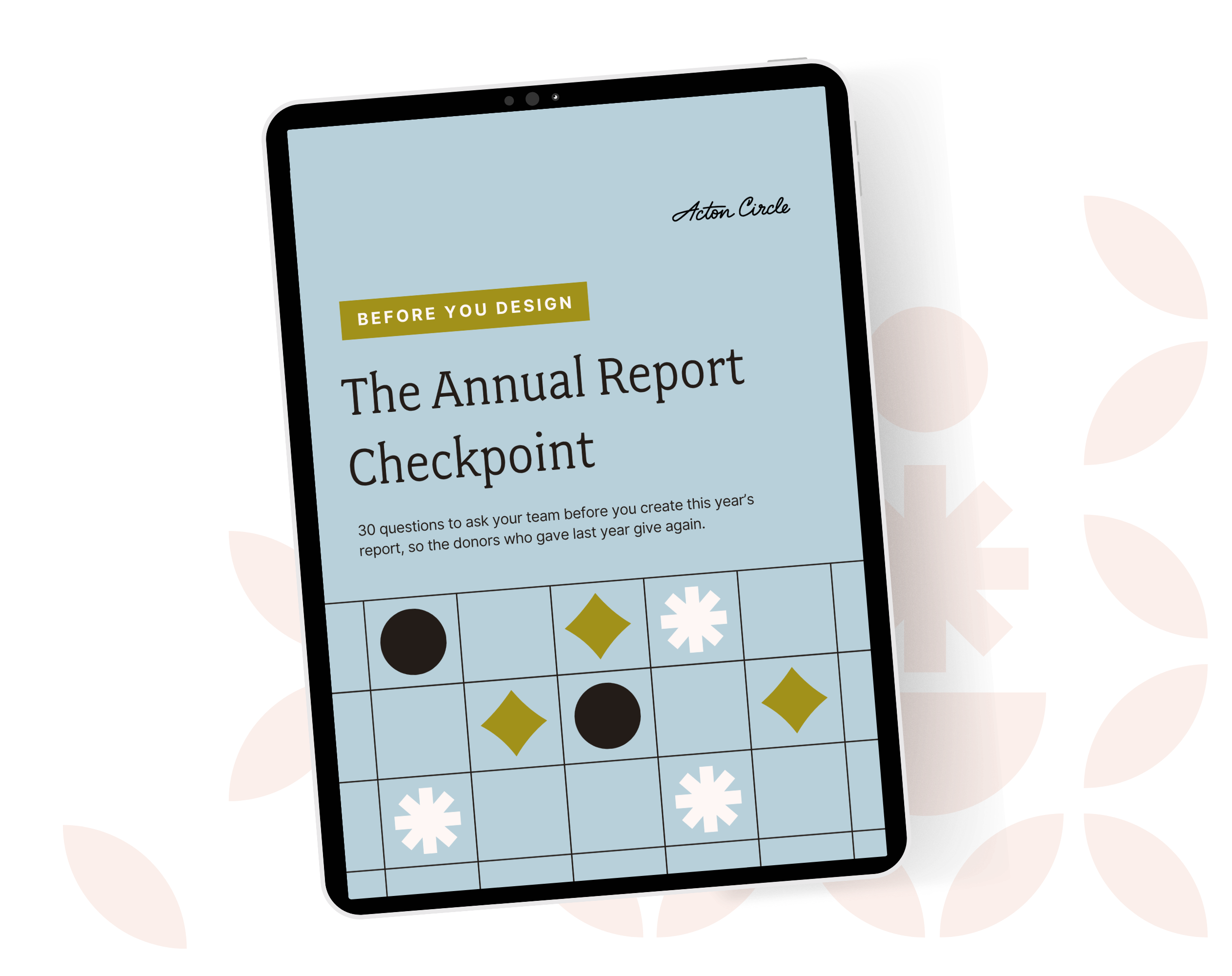
Get The Annual Report Checkpoint
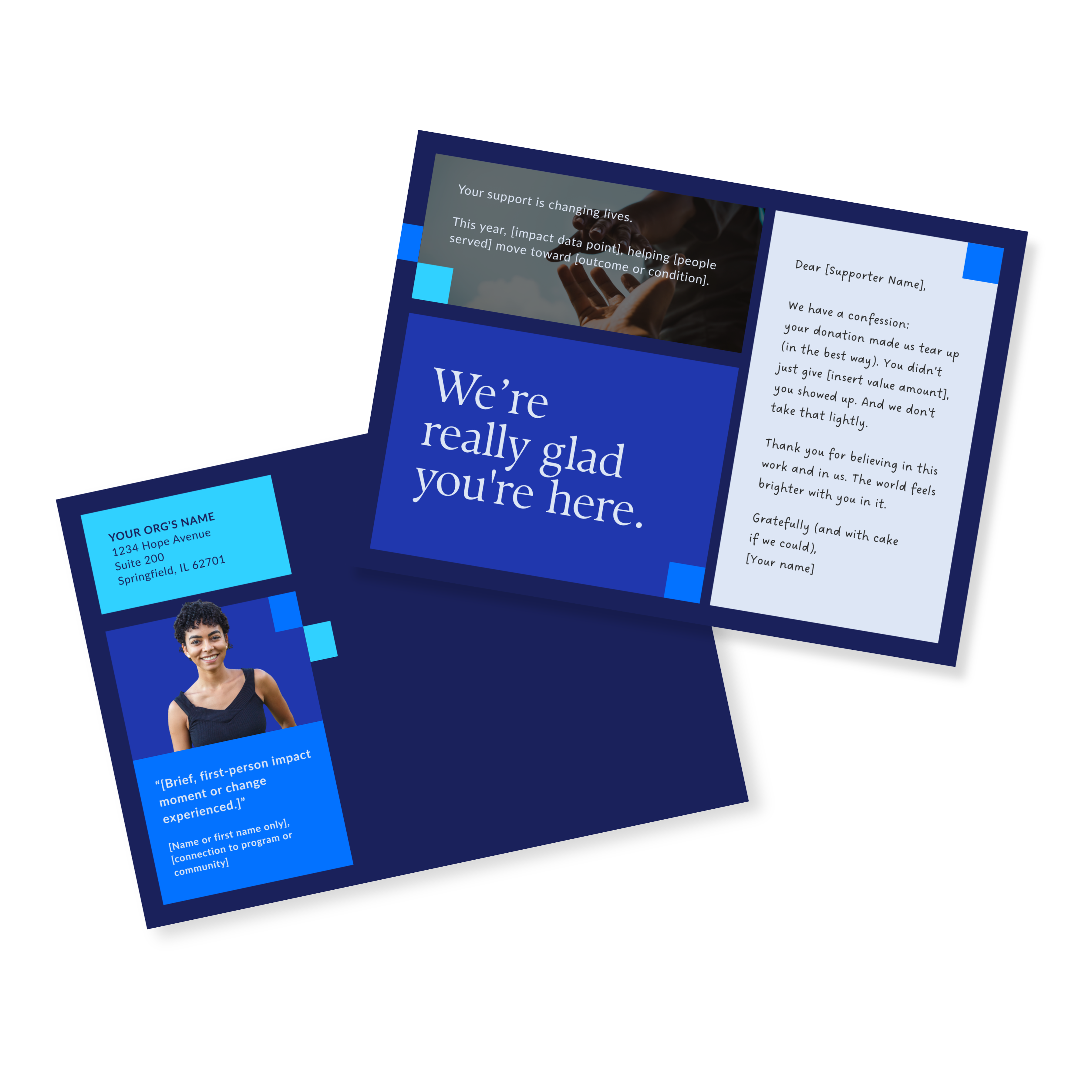
Donor Thank You Postcards Templates

Enter your info and we’ll send the postcards straight to your inbox:

What the Director of Development and Marketing Said

"We really loved the Annual Report that Acton Circle created for our small environmental nonprofit this year. They followed our direction really well and made a beautiful and fun report that highlighted our programs perfectly. We highly recommend them!"

- Joanna M., Director of Development & Marketing, Planet Women
__wf_reserved_inherit

What an Evergreen Report Gives You

The report became a year-round communication asset instead of a one-time publication.

Planet Women now has a library of stories, visuals, and key messages that keep serving fundraising, donor education, and advocacy across multiple campaigns. The report anchors the communications strategy and gives every later piece a starting point.

So the question isn't how do we get through report season? It's: what does this report let us stop rebuilding for the next twelve months?

What began as an annual recap became a storytelling platform.

Before You Build This Year's Report, Score Last Year's

You can have great photos, solid numbers, a clean layout, a mission worth funding... and still watch it stall two weeks after launch.

If you want more than a one-time report, book a call and let's map it.

See the full project in our portfolio: Planet Women.
Ipad on a green floral background displaying an image of a blue, patterned PDF

Monthly Design Workshop

If you’re the one who usually handles design at your org, this is meant for you. You’ll leave with useful design tips you can start using right away.

see upcoming sessions
👋🏽 Hi, I'm Krista Reyes

I'm a writer and editor with almost a decade of professional experience. I spent most of my formative years working with local and international nonprofits, channeling my passion for worthy causes into written works with depth, value, and intention.

If I'm not working, you'll find me reading books, watching movies, playing chess, or bonding with my four dogs.

👋🏽 Hi, I'm Olivia Wheeler

I'm a creative leader with high standards for nonprofit storytelling. I work between homeschooling and gym sessions, obsess over typography, and believe your annual report should make supporters feel your mission in their bones.

I help nonprofits connect with new audiences and look like the org they're becoming, not the ones they were five years ago.

The stuff you’re wondering, answered straight

Why only 1 in 4 donor ever gives again

Your annual report is a stewardship and retention tool waiting to be used.

Most orgs treat it like a formality. Design it, ship it, forget it. Then wonder why the same donors don't show up again next year.

Donors leave because nobody showed them their gift mattered after they gave it.

First-time donors are THE MOST fragile group you have. One good report = a second gift.

We wrote about exactly how to use your annual report as a stewardship tool, not just a recap: Your Annual Report Is a Stewardship Tool. Here's How to Actually Use It That Way.

Why only 1 in 4 donor ever gives again

Great work along does not raise money

Programs don't fund themselves. Understood value does.

You can run the best program in your sector and still lose funding, because funders and donors don't fund what you did. They fund what they understood.

Most impact sections list activities. Meals served, kids reached, hours logged. None of that tells anyone what changed.

The gap isn't your work. It's the translation between your work and what the reader actually feels reading about it.

I broke this down here: How to Measure Your Nonprofit's Impact (And Make Sure It's Felt)

Great work along does not raise money

Where donors stop reading

Donors give you a few seconds before they decide if your report is worth their time.

Dense pages, no hierarchy, and nothing to pull the eye to what matters don't help.

I wrote about what actually earns attention in that window here: Annual Report Layout: Tips for a Report Donors Will Read

Where donors stop reading

A faster way to build your report

So you're doing your annual report solo again this year, huh? Same deal as last time: last year's PDF open in one tab so you can copy the bones, and a blank Canva doc that doesn't carry a single thing over.

A template is the thing that should've existed the first time you did this solo.

Here's a better approach to your report if you're handling it in-house: The Faster Way to a Beautiful Annual Report

A faster way to build your report

What you're not pulling from your own report

Your annual report is the most content-rich thing your org makes all year. And then it just sits on your website.

Real stories, real numbers, real proof your mission works, all sitting in one PDF that gets opened once and forgotten.

That same content could be twelve LinkedIn posts, three newsletter sends, a case study, a slide for your next pitch deck. Every one of those keeps your mission in front of donors between asks, not just during them.

More on how to make your report work past launch day: Simple and Flexible Annual Report Ideas for Busy Nonprofits

What you're not pulling from your own report

Explore more articles

Client Case Studies
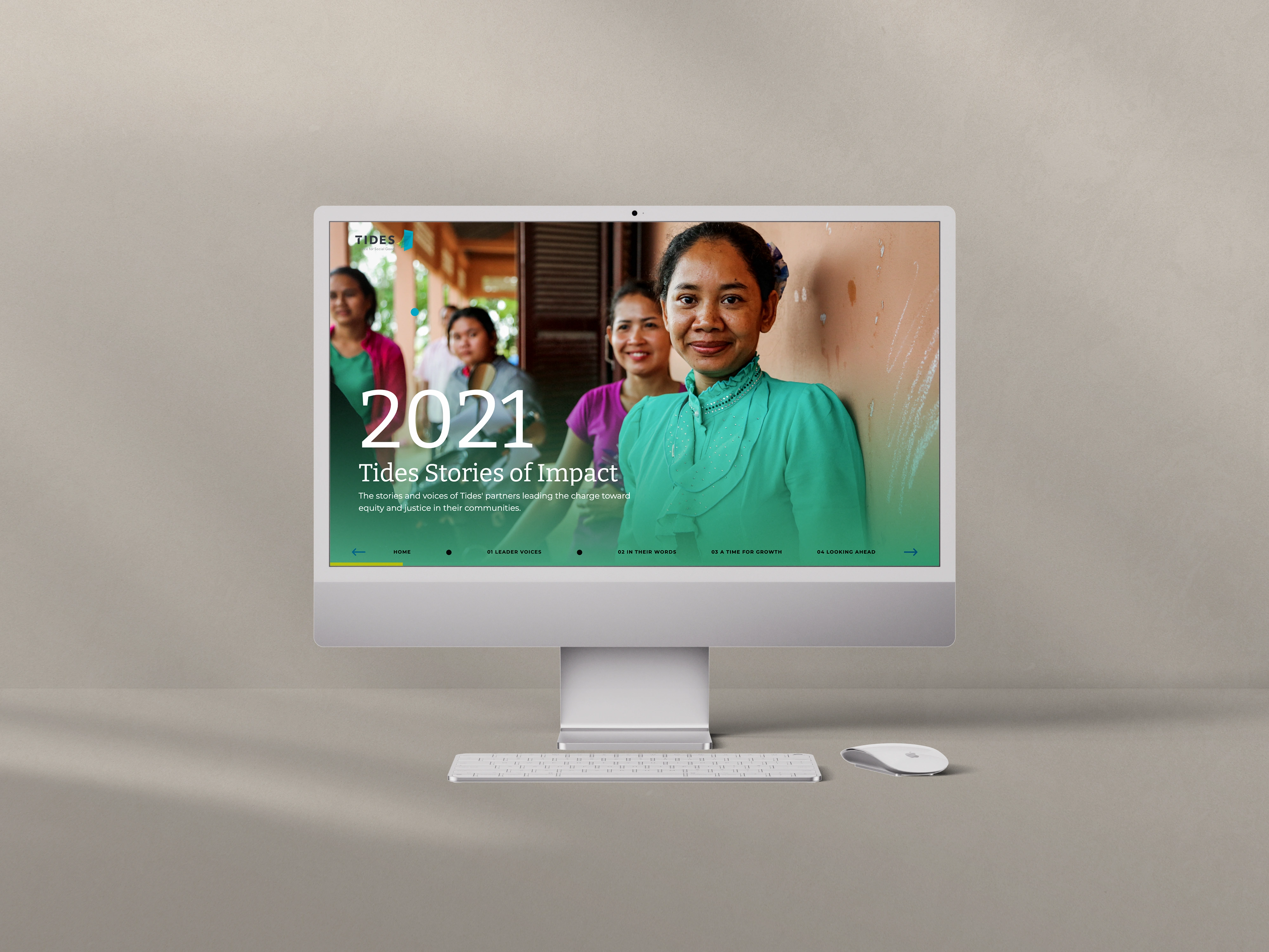
Tides wanted annual impact storytelling that lived online as an experience, not a PDF. Three microsites later, they have a digital language of their own.
Client Case Studies
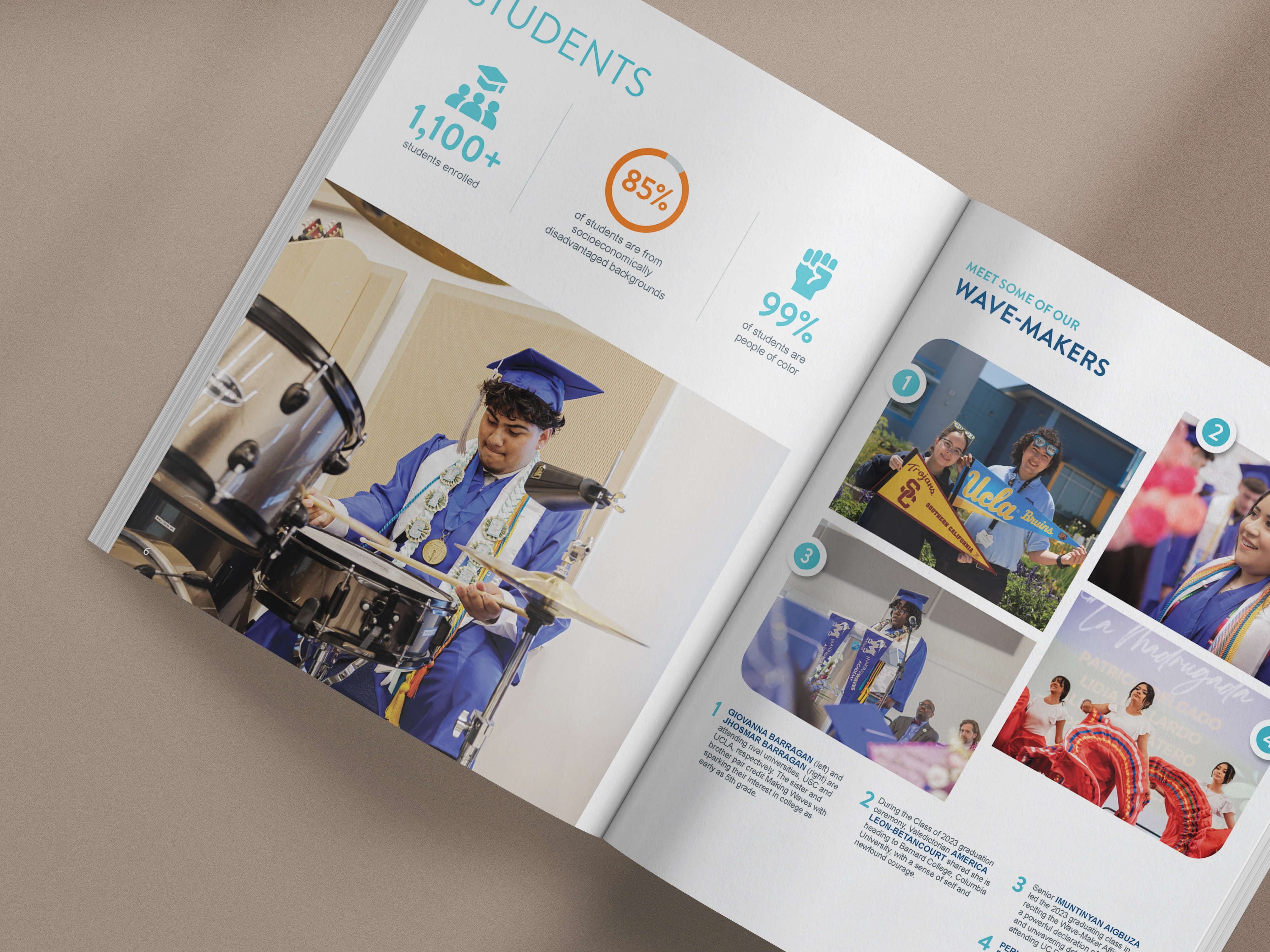
Making Waves needed separate reports for its Foundation and Academy that still felt like one mission. Four reports later, here is what worked.
Client Case Studies
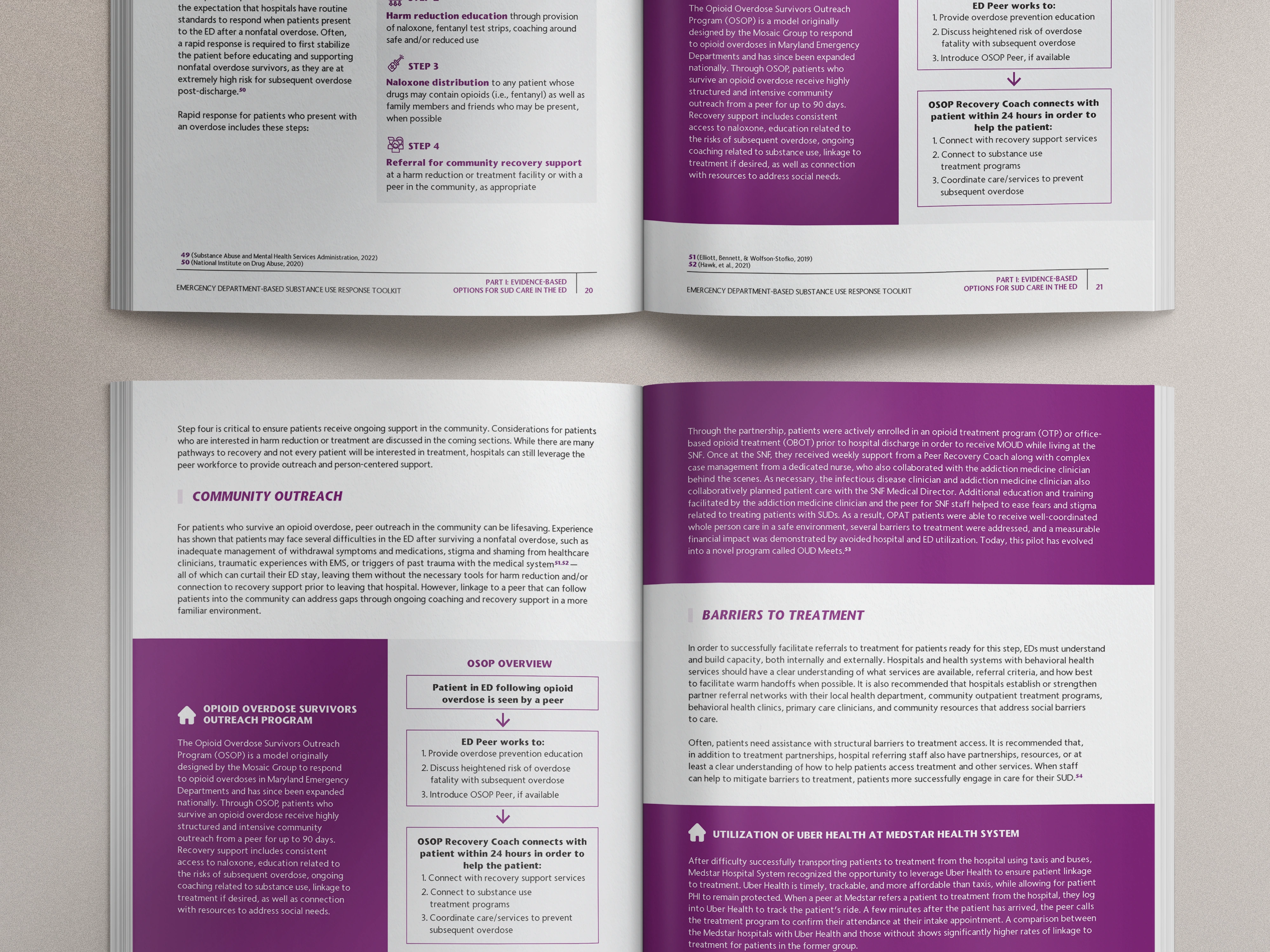
NACCHO had an overdose-response toolkit full of careful research and a format that slowed readers down. Here is how it became a field resource.