Most annual reports are not built under ideal conditions.
Content arrives late. Photos are all over the place. Numbers aren’t final. Somebody wants to add a new section two weeks before print. And somewhere in the middle of all of it, you’re supposed to produce something that feels elevated, cohesive, and credible.
That’s what annual report season looks like for most nonprofit teams.
The goal was never to create perfection from perfect ingredients. It’s to create something clear and credible despite real-world constraints. And that takes judgment, not just execution.
Here’s how you get through all of it without losing your report... or your mind.
Your Content Is Late. Start Designing Anyway.
Late content is probably the most universal annual report headache. Someone’s traveling, someone else needs one more week, another team member hasn’t even started their section yet... and the report is due in three weeks.
The gaps aren’t going anywhere. But your design can work anyway. Start with what you have and build placeholder sections for what’s coming.
Real talk: showing stakeholders a draft, even an incomplete one, usually gets content moving faster than any follow-up email will. People respond to something tangible.
A blank doc doesn’t create urgency. A designed page with “[PROGRAM SUMMARY GOES HERE]” does.
It also helps to decide early which sections are load-bearing and which aren’t. If the leadership letter is late, that’s a real problem. It sets the tone and framing for everything that follows. If one program summary hasn’t come in yet, placeholder it and keep going.
Knowing the difference keeps the whole project from grinding to a halt over one missing piece.
Inconsistent Photos Don’t Have to Tank Your Report
You’re not the first team to have one gorgeous hero shot and a folder labeled “good photos” that is... not that.
One of the fastest fixes is converting inconsistent photos to black and white. It equalizes them visually and makes a report feel editorial instead of patched together. It reads like a creative decision rather than working with whatever you had.
Remember, you don’t have to fill every spread with an image.
For sections where photography is genuinely weak, lean on design instead. A well-treated pull quote or a strong data visual will do more than a blurry 2019 event photo ever will.
And for future cycles, start the photo conversation early. A one-page brief to program teams before report season, asking for specific shots, good light, horizontal framing, no logos in the background? It goes further than you’d think. Most teams just don’t know what you need until you tell them.
Designing Around Unfinished Financials
Financials are almost always the last thing to arrive. Audits take time, leadership wants to review, the board hasn’t signed off yet. It’s just the reality of the timeline.
The practical move is to design the financial section with placeholder numbers in the exact format the real data will take. When the finals come in, it’s a swap, not a redesign. That distinction matters a lot in the final week when everyone is already stretched thin.
If your report is designed to build belief rather than satisfy compliance, you often have more flexibility on timing than you think. Lock in what you can, design around what you can’t, and swap the real numbers in at the end.
Honest take: most donors are not reading your financials the way an auditor would. “We served more than 4,000 families” generally means the same as “we served 4,217 families” for the reader whose trust you’re trying to build.
Conflicting Stakeholder Feedback Is Not a Design Problem
This is the one that turns a good report into a committee document.
Everyone means well. But every stakeholder walks in with a different version of what this report is supposed to do. And by the time they’ve all weighed in? The report is trying to be everything at once and succeeding at none of it.
Earlier alignment is the fix.
Before the first draft goes out, get the room to agree on two simple things: who is this report primarily for, and what do we need them to believe when they close it? That single question becomes the filter for every piece of feedback that follows.
When a stakeholder suggests a change, the question stops being “is this reasonable?” and becomes “does this make the report more effective for that reader?” Sometimes the answer is “yes.” Often it’s “no.”
Having that conversation early gives you something to stand on. You’re not defending your taste, you’re defending a shared decision.
.avif)
Get The Annual Report Checkpoint

Donor Thank You Postcards Templates
Enter your info and we’ll send the postcards straight to your inbox:
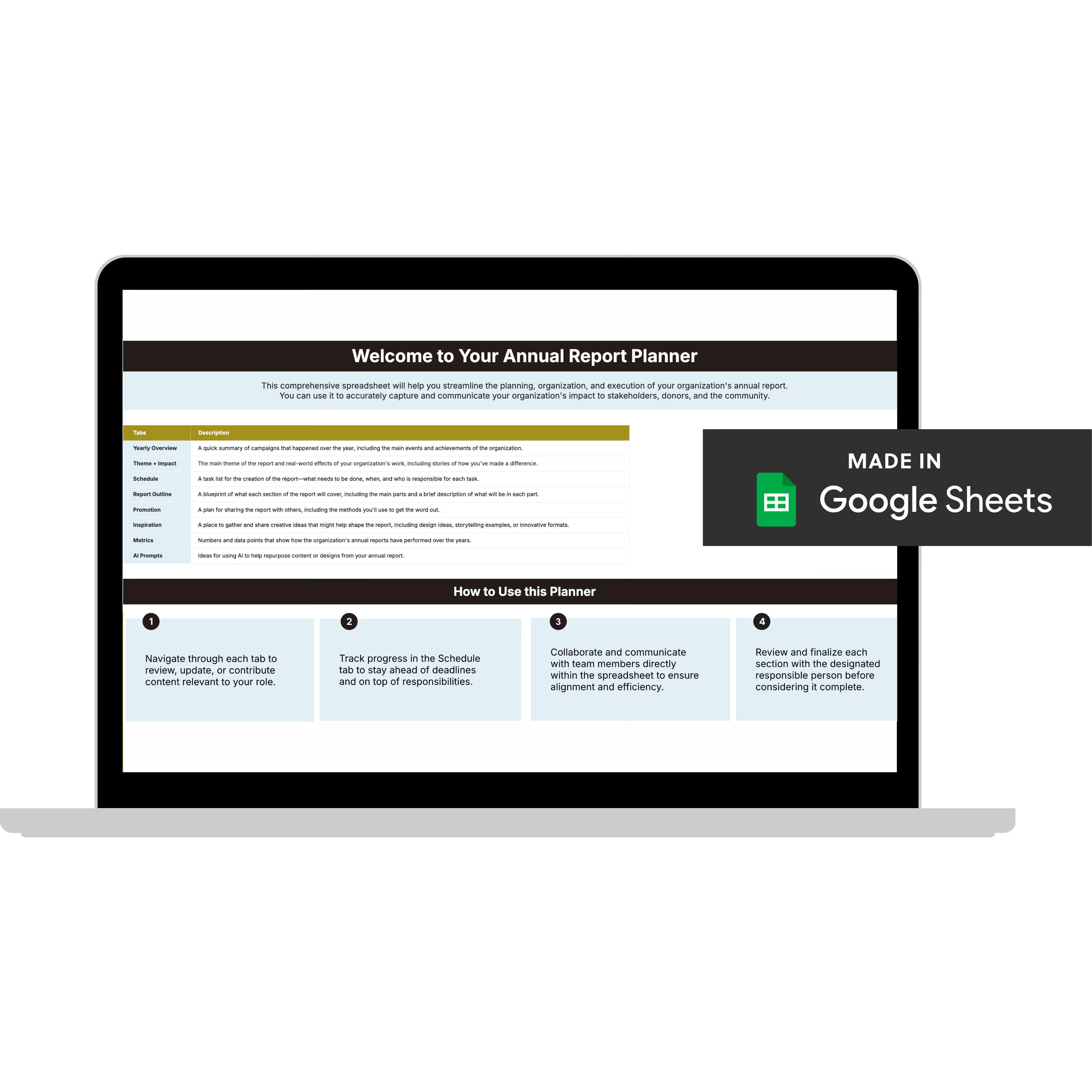
Annual Report Planner
Get a clear content roadmap so your annual report builds belief, earns trust, and actually gets used after launch—plus the same planning approach we use with our 1:1 clients, built in.
Producing a Report in the Middle of a Brand Transition
The org knows it needs to evolve visually. Maybe there’s a rebrand in conversation, a new strategic plan that’s shifting the messaging, or leadership that came in with a different vision for how the org should show up. Nothing is finalized yet. But the report is due.
The trap is trying to split the difference, keeping enough of the old brand to not upset anyone while gesturing toward something newer. The result usually feels like neither. It reads as inconsistent rather than intentional.
The stronger move is to make a deliberate choice. Either lean into the existing brand with full commitment and save the evolution for when it’s ready, or use the report as a controlled first expression of where you’re headed. Both are valid.
The annual report can be one of the best places to preview a brand direction before a full rebrand is complete. Just make sure it’s a decision, not a default.
What doesn’t work is doing both at once.
“Make It Like Last Year but Better” Is Not a Creative Brief
This is the creative direction that sounds reasonable and is very hard to work with. There’s nothing wrong with building on last year. The problem is when last year’s report is doing the thinking for you.
Last year’s report was built for last year. Different content, different pressures, different priorities. Pointing to it as the brief means you’re inheriting all of its choices, including the ones that weren’t quite right, without always knowing why they happened.
“Better” also means different things to different people. More visual? Cleaner? More emotional? More data-forward? Without a shared definition, you’ll spend the whole project chasing a moving target.
The fix is to get specific before design starts. What did last year’s report do well that you want to carry forward? What didn’t work? Who is reading this year’s report and what do you need them to feel?
Even a 30-minute conversation with the right people answering those questions gives you more to work with than last year’s PDF ever will.
If You’re Still the One Building It
Sometimes the answer isn’t a new process or better stakeholder alignment. Sometimes it’s just: this landed on your plate, you don’t have design support, and it has to get done.
That’s real. And it’s more common than anyone admits.
You can’t out-design a professional with bandwidth constraints and a deadline. But you can make deliberate decisions instead of scattered ones. That’s the actual difference between “fine (ish)” and credible.
Pick one visual element and commit to it. A color, a font treatment, a layout structure. Whatever it is, repeat it on every page. You’re not trying to make each page interesting on its own. You’re trying to make the whole thing feel like one person made it on purpose. Repetition reads as intention.
Then start taking things away. Two fonts max. Three colors max. One or two page layouts you rotate through the whole report. The reports that look amateur almost always have too much going on, not too little. Restraint is a design decision.
Finally, pick your battles. Not every page needs to carry equal weight. The leadership letter, the impact numbers, one good story with a real person in it—those are the pages donors read. Pour your energy there and let the supporting pages be clean and simple.
None of this replaces having the right support. But it closes the gap between “I did what I could” and “I’m proud of this.”
The One Decision That Makes Report Season Manageable
Every scenario in this article comes back to the same thing: knowing what you’re building before the pressure hits. And it will hit.
Late content, inconsistent photos, too many opinions, a brand mid-transition, a creative brief that’s really just “same as last year.” That’s annual report season. Not a sign that something went wrong.
Having clarity before you’re in it changes everything. When you know who the report is for, what they need to believe, and what it needs to do after it goes out, every hard call gets easier.
You stop reacting and start deciding.
That’s it. That’s the whole thing. And it’s a lot easier to build that clarity before the season starts than in the middle of it.
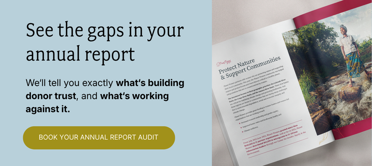
Ready to build that foundation?
The Annual Report Audit is where we start. Bring your current report to a 45-minute call, and I'll score it against our BELIEF by Design™ framework, developed through 7 years and 65+ nonprofit partnerships. What's working, what's working against you, and which problem to fix first.
You'll walk away with:
✅ Every gap in your report, named
✅ What each one is costing you in donor response
✅ Your #1 fix, prioritized and ready to act on
✅ The scores, yours to keep (with us or without us)
Everything else (the design, the templates, the full-service work) flows from here. But this is where we start.