Repurposing nonprofit content is one of the best things a small comms team can do with limited time. You already gathered the stories, pulled the stats, and found the photos that show what your work looks like. Your annual report is proof of all that effort. So why let it live as a single PDF that gets emailed once and then kind of disappears?
One solid annual report can become months of content for donors. You just need to know which formats are worth building.
This guide covers five Canva designs you can build from content you already have.
Why Repurposing Your Nonprofit's Content Saves Your Team Real Time
One of the most consistent things we notice when working with small nonprofit comms teams is that the content is already there. What's usually missing is a way to get it into multiple formats without rebuilding everything from nothing every single time.
Repurposing allows you to get more mileage out of content that took real effort to create. When you start from one strong message instead of starting fresh for every platform, a few things get easier:
- Your message stays consistent, which builds donor trust over time.
- Your team spends less time designing and more time on work in their zone of genius.
- Your annual report investment goes further. One document becomes a whole content system.
- You show up more consistently, even with a small team and a tight budget.
The goal is more of the right content, in the right places.
Start With a Message Worth Repeating
Before you open Canva, you need one clear message to build everything else from. This is the line that each design will reference, adapt, or expand on depending on where it's going.
A good core message tells someone what you do and gives them a reason to care. Short enough to be remembered, specific enough to mean something.
Try this formula: [Amount or action] + [who it helps] + [impact or timeframe].
- "$25 provides clean water to a family for a month."
- "Your volunteer hours give seniors the companionship they deserve."
- "Every signature brings us closer to changing this harmful policy."
In a lot of the projects we review, the strongest core messages didn't come from a copywriter. They came from donor feedback, community stories, or something a program lead said in a meeting that nobody wrote down. Pull from what already resonated.
The language your community uses is almost always better than what gets polished for a brochure.
Turn Your Message Into 5 Canva Designs
Once you have a core message, the goal isn't to copy-paste it five times. It's to adapt it so it fits each platform and the people using it. Same idea, different entry point.
Instagram post
Social media moves fast. Your post has a few seconds before someone scrolls past. Lead with the shortest, most emotional version of your message upfront.
- What to show: The distilled version. "$25 = clean water for a family."
- What to add in the caption: A micro-story that makes it real. "Maria's family used to walk 3 miles for water. Your gift changed that."
- Format worth trying: A carousel where each slide features a different real story, all pointing back to the same message.
Quick test: Look at your design on your phone from arm's length. Can you read the message in under two seconds? If not, simplify.
Email banner
Your email banner is the first thing a reader sees. It should create enough pull to keep them reading, not summarize everything in the email.
- Lead with a hook: "$25 = Clean Water for a Month"
- Let the body do the depth: Stats, stories, and context live below the banner, not inside it.
- Template move: Build one master header template and swap colors, photos, and text per campaign. Design time drops from 30 minutes to five.
Donor quotes and mission framing work well here. Give readers a reason to stay.
Event banner or website header
This format works 24/7 in the background. It should drive momentum and communicate urgency without being loud about it.
- Core message plus a pull toward action: "$25 = Clean Water. Join the Wave."
- Add subtext for timeline or goal: "Help us raise $25,000 by World Water Day. That's 1,000 families."
- Worth trying: A weekly "progress version" of your banner during campaigns showing how close you are to your goal. Visual momentum drives engagement.
Print mailer
Print reaches people who aren't on your email list or scrolling your feed. It's slower and more personal, which means it can go deeper.
- Front: Emotional hook. "$25 = clean water for a family."
- Back: A story that feels tangible. Real name, real detail, real outcome.
- CTA: Make it frictionless. Give online, mail a check, scan a QR code. One clear option per audience.
A short note from someone inside the org adds warmth and makes it feel less like a mailer and more like a letter.
Presentation slides
Board presentations, funder pitches, volunteer trainings. Your slides need to reinforce the core message while looking like your org has it together.
- Slide title: The hook. "$25 = clean water for a family."
- Body: The bigger picture. "Last year, your donations helped build wells for 200 families. This year, we're doubling that goal."
- One stat or story per slide: Each one rooted in the same message but expanding a different dimension of it.
.avif)
Get The Annual Report Checkpoint

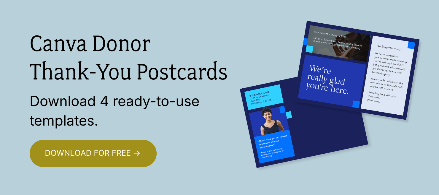
Donor Thank You Postcards Templates
Enter your info and we’ll send the postcards straight to your inbox:
How to Keep Repurposed Content From Feeling Stale
When organizations come to us having already used their annual report content across different formats, the ones that do it well share one thing: they changed the framing, not just the layout. The same story connects differently depending on where someone encounters it.
One message per design
When you try to say too many things in one design, nothing gets through. Pick one idea per format.
It's tempting to cram everything in, especially when you don't have time to make multiple versions. But one clear message will always outperform three competing ones.
Adjust your voice by platform
Social works well when it's direct and emotional. Email has room to be more conversational. Print can go deeper with a real story. Slides need to sound confident and credible. It's the same org and the same mission on every platform, just adapted for who's reading and why.
Make it accessible
Plain language, descriptive alt text, accurate captions, and mobile-friendly layouts aren't extras. They're what makes your content reach people. If your main message gets lost in a hard-to-read graphic, a chunk of your audience is already gone.
Build templates, not one-offs
Going back to square one every time takes way longer and tends to look less cohesive. Build templates for the formats you use most: Instagram carousels, email banners, LinkedIn posts. Once they exist, you're just swapping in new content instead of rebuilding the wheel.
Repurpose With Your Mission in Mind
In our experience working with nonprofit comms teams, the annual report is the richest content an org produces all year. The stories, the data, the photos, the mission-deep messaging. It's all in there. What most teams are missing is a way to let that content keep doing something after the report goes out.
A good starting point is your donor thank you. You already have the impact story from the report. The Donor Thank You Postcard templates give you a FREE, Canva-ready format to put that story directly in your donors' hands without building a design from nothing.