Your nonprofit website is one of the most important visibility tools you have. It contains most of the foundational, evergreen information that a lot of your assets won’t always be able to communicate.
Social media posts, one-pagers, and even impact reports are often context-specific and time-bound. While these are great ways to find and engage new supporters, they’ll likely head to your website to learn about your work in depth.
This is exactly why it’s important to have a website that puts your organization’s best foot forward. In this article, we’ll share some of our favorite examples of nonprofit websites and the role of branding and design in creating them.
How a Great Website Helps Your Mission (and How a Bad One Brings It Down)
Most people will probably find your nonprofit through social media. But that doesn’t always translate to consistent support. For people to form a true emotional connection with your mission, they have to understand your purpose, see your impact, and know the path forward.
Your website is typically where they’ll go for all this information. It’s the digital embodiment of your mission and where all your stories, results, and plans live.
A website that’s slow, confusing to navigate, and visually uninteresting can very easily put off potential new supporters. If they arrive at your website and don’t immediately feel what your message is, chances are that they’ll leave without taking action.
On the other hand, the best nonprofit websites usually showcase the organization’s mission through great branding and design. There’s a clear narrative flow, strong visual hierarchy, complete design cohesion, and smooth user experience.
New supporters visiting such a website are more likely to relate to your mission. More practically, a strategically designed website makes it easier for potential donors to learn how they can get involved with your nonprofit.
.avif)
Get The Annual Report Checkpoint

Donor Thank You Postcards Templates
Enter your info and we’ll send the postcards straight to your inbox:
12 Nonprofit Website Examples We’re Excited About
Your website should reflect the soul of your organization and be designed to convert. Below, we list 12 nonprofit website examples with standout elements, strategic layouts, and impactful digital experiences:
1. Community Mindfulness Project
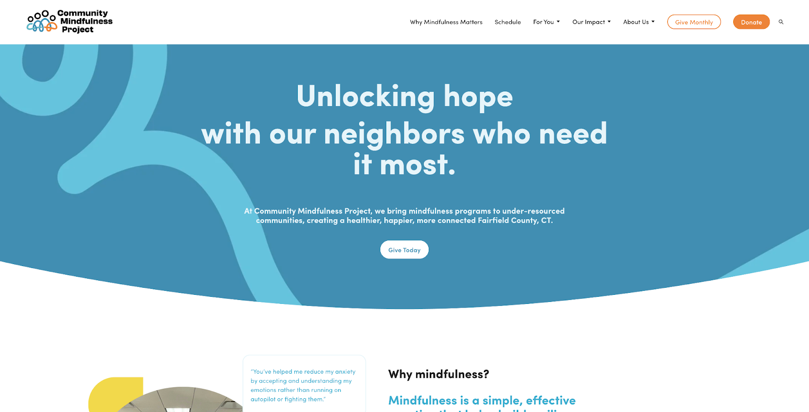
The Community Mindfulness Project promotes the importance of mindfulness training for improving the quality of life of under-resourced communities. Their website was designed by our founder Olivia’s friend Lauren from HeartSpark Design.
Dynamic Foundations: We love the infinite carousels of text, bouncing elements, and shifting messages that communicate the nonprofit’s message while keeping the audience visually hooked.
Soft Graphics: Wave effects, well-placed shapes, and doodle-like designs create a lightness that reflects the organization’s values.
2. EarlySpark Institute (by Acton Circle)
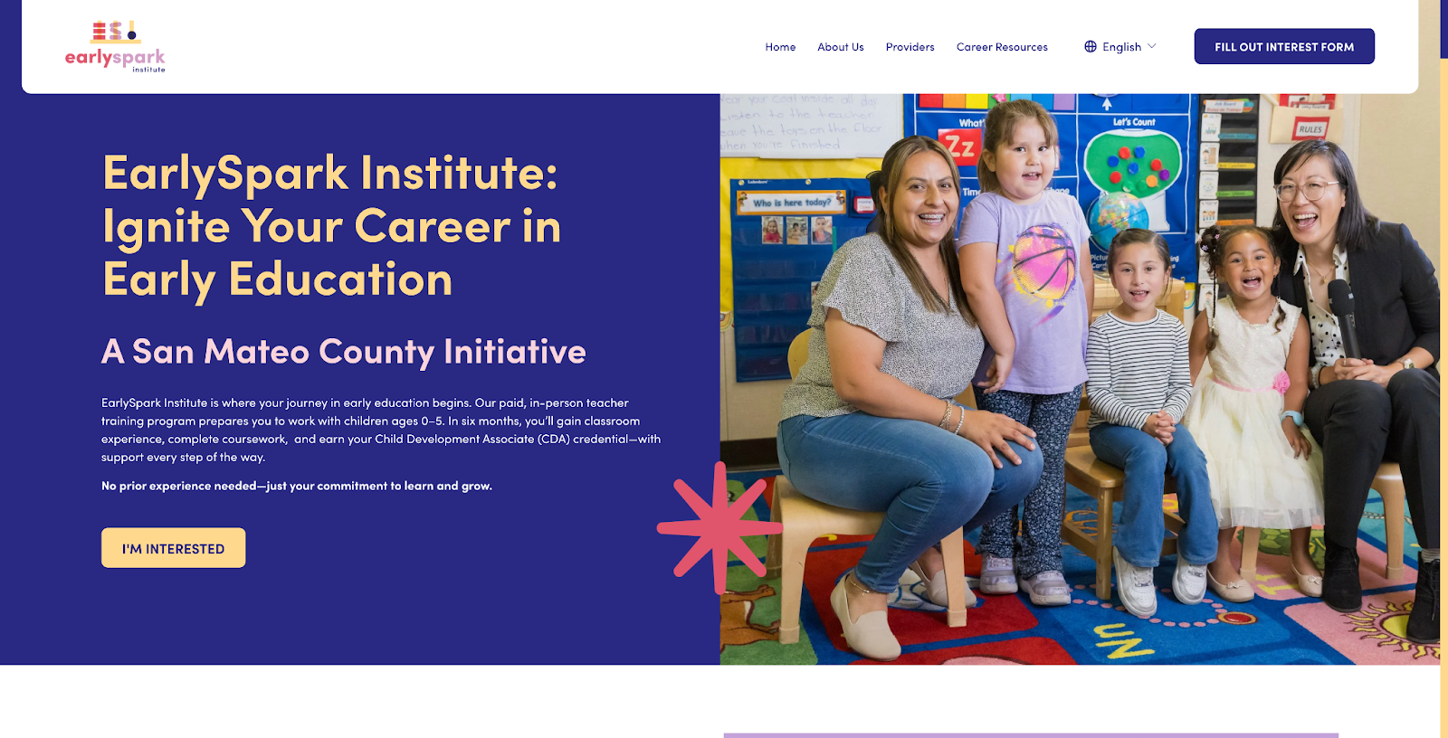
EarlySpark Institute is an early education program that seeks to build a diverse pipeline of educators by offering a supported pathway into these careers. Acton Circle partnered with Maevnco to deliver a brand that’s bold, professional, and designed to drive action.
Bold + Playful Elements: The colors, shapes, and accents all reflect the community that the program serves to inspire trust from page one.
Intuitive Flow of Information: The entire website is built around the goal of mobilizing, so it effectively highlights crucial details and ways to get involved.
3. Blue Heart
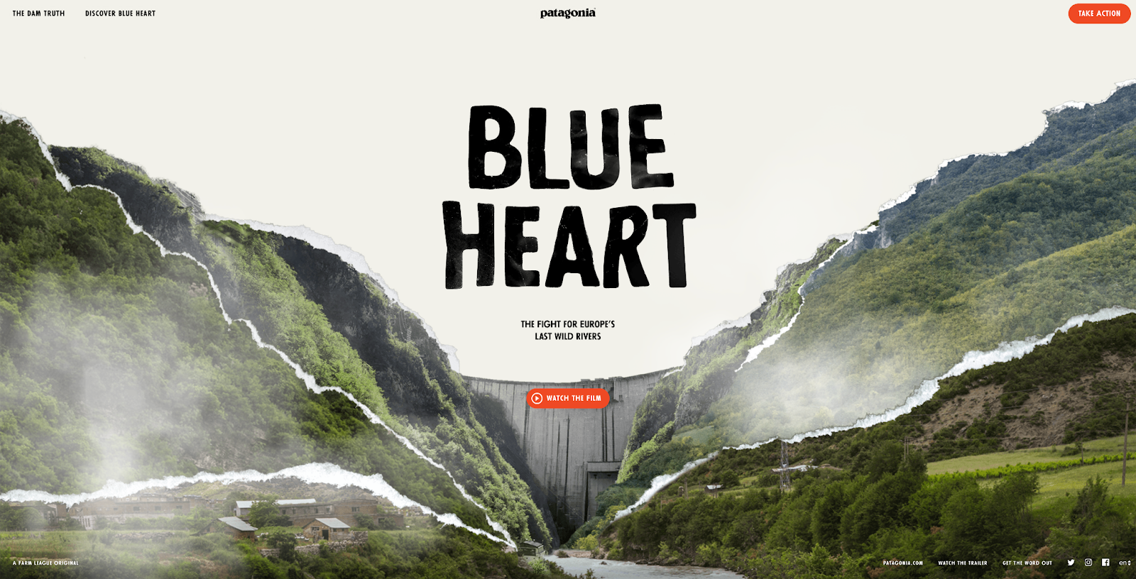
The Blue Heart campaign of Patagonia advocates for the protection of Europe’s last wild rivers.
Distinctive Elements: Being part of a multimedia campaign, the website uses unique fonts and graphics that help it stand out to potential supporters.
Dynamic Background + Imagery: It centers images and visualizations of the mission’s focus, immersing visitors and increasing the likelihood of creating an emotional connection.
4. Radiating Hope
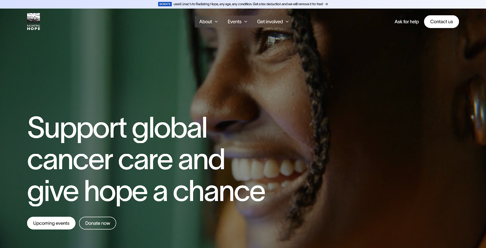
Radiating Hope champions cancer patients by working to improve cancer care worldwide.
Bold Text + Imagery: The website uses full-frame images with striking quality and large fonts, which immediately draw readers’ attention.
Clear Visual Focus: Their layout leaves no room for confusion, as eyes are pulled directly to the central messages and images.
5. Stamford Senior Center
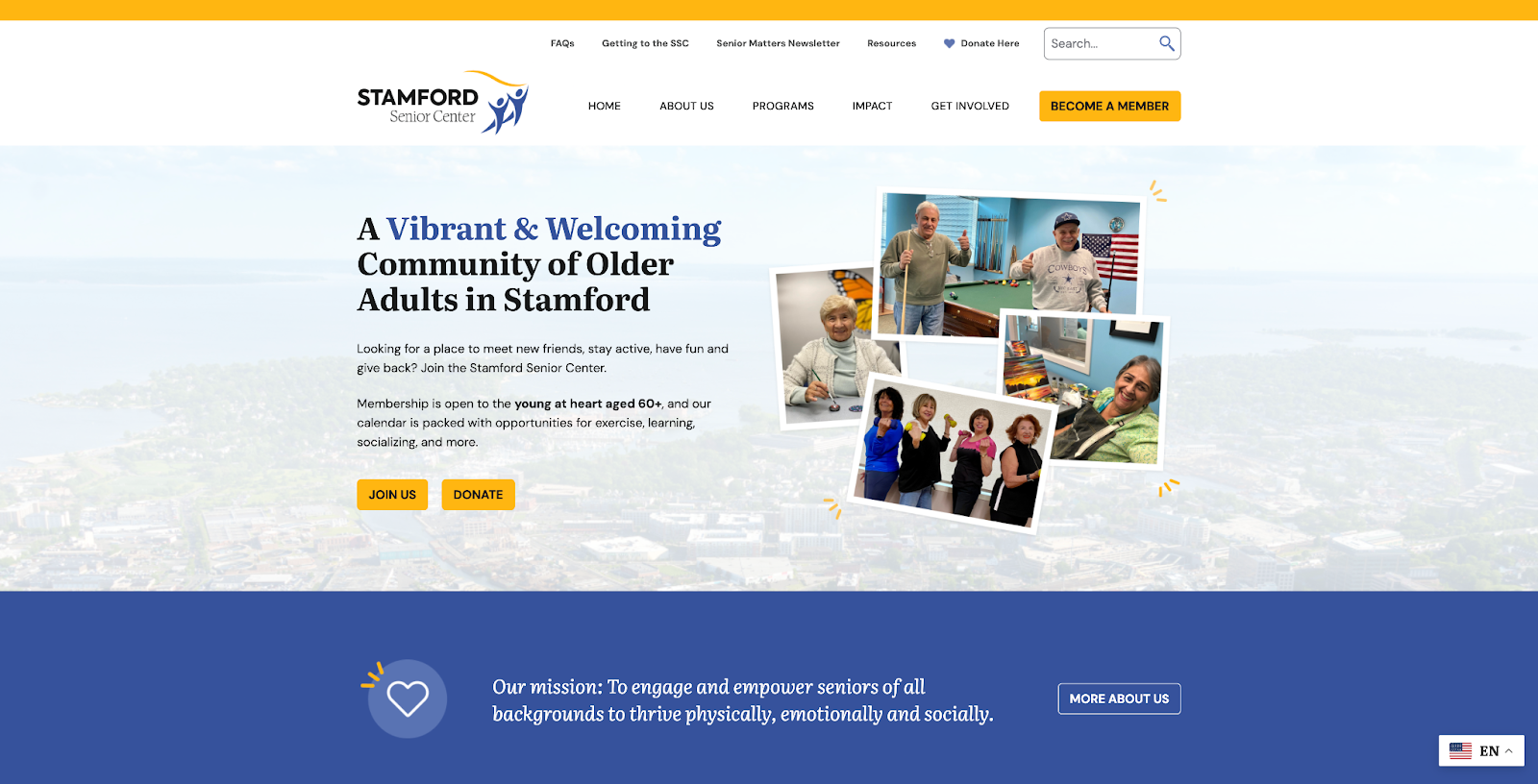
The Stamford Senior Center creates a community that enriches older adults’ physical, emotional, and social well-being. Their website was designed by Olivia’s friends at Pixel Lighthouse.
Spotlight on Community Members: The website is filled with well-placed photos of the people they serve, showing the SSC’s dedication to its community.
Accessible + Digestible Information: Each page is rich in information that’s both very instructive and easy to understand.
6. No-fishing.net by Sea Shepherd
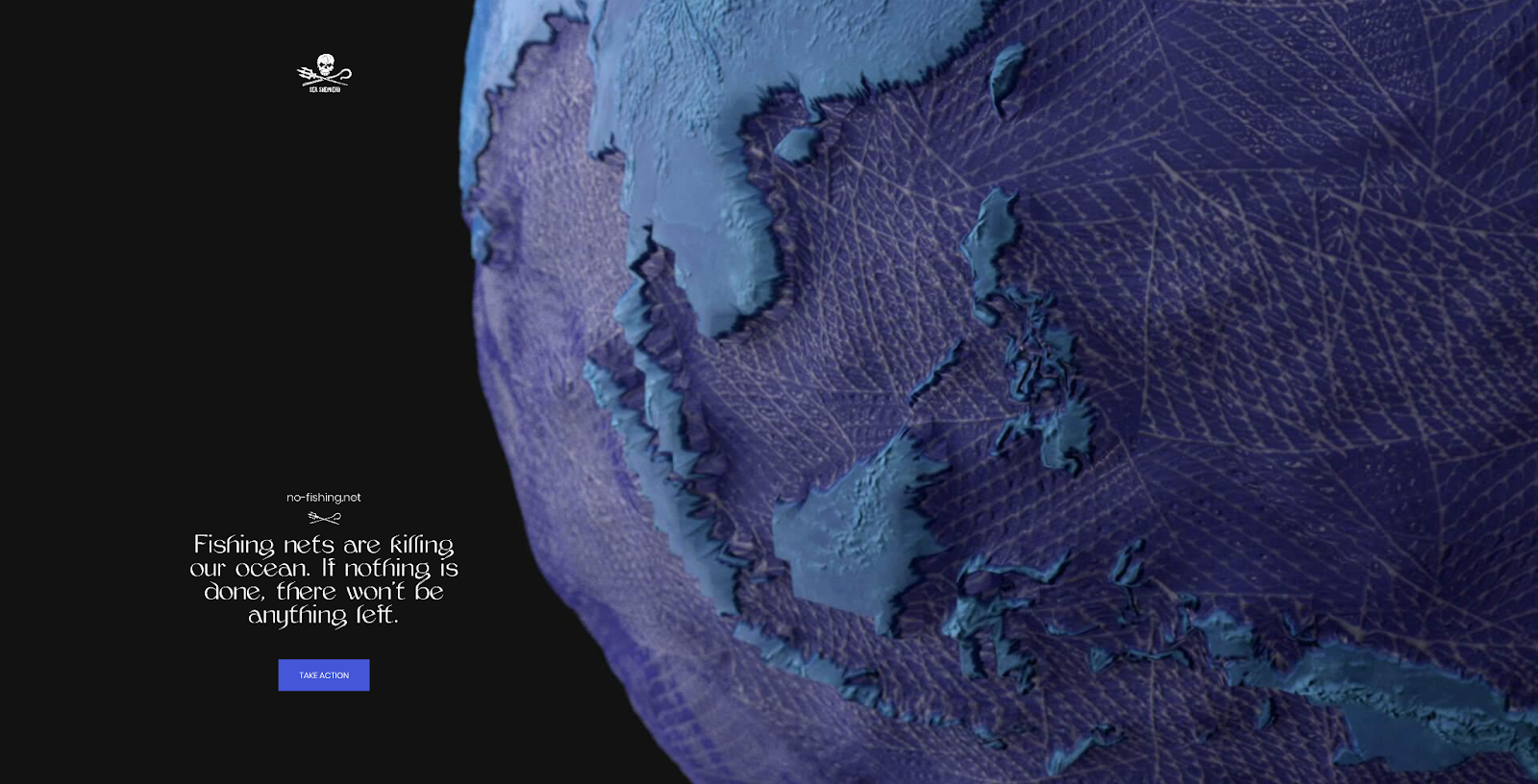
No-fishing.net is a campaign by the Sea Shepherd Conservation Society that aims to raise awareness about how discarded fishing nets threaten ocean life.
Interactive Interface: The website creates an immersive experience, where supporters are able to easily visualize the campaign’s mission and the impact of support.
Clear Visitor Pipeline: It does a great job of directing where visitors go and what they focus on by centering singular CTAs, multimedia inserts, and a guided dynamic experience.
7. Marin Community Foundation
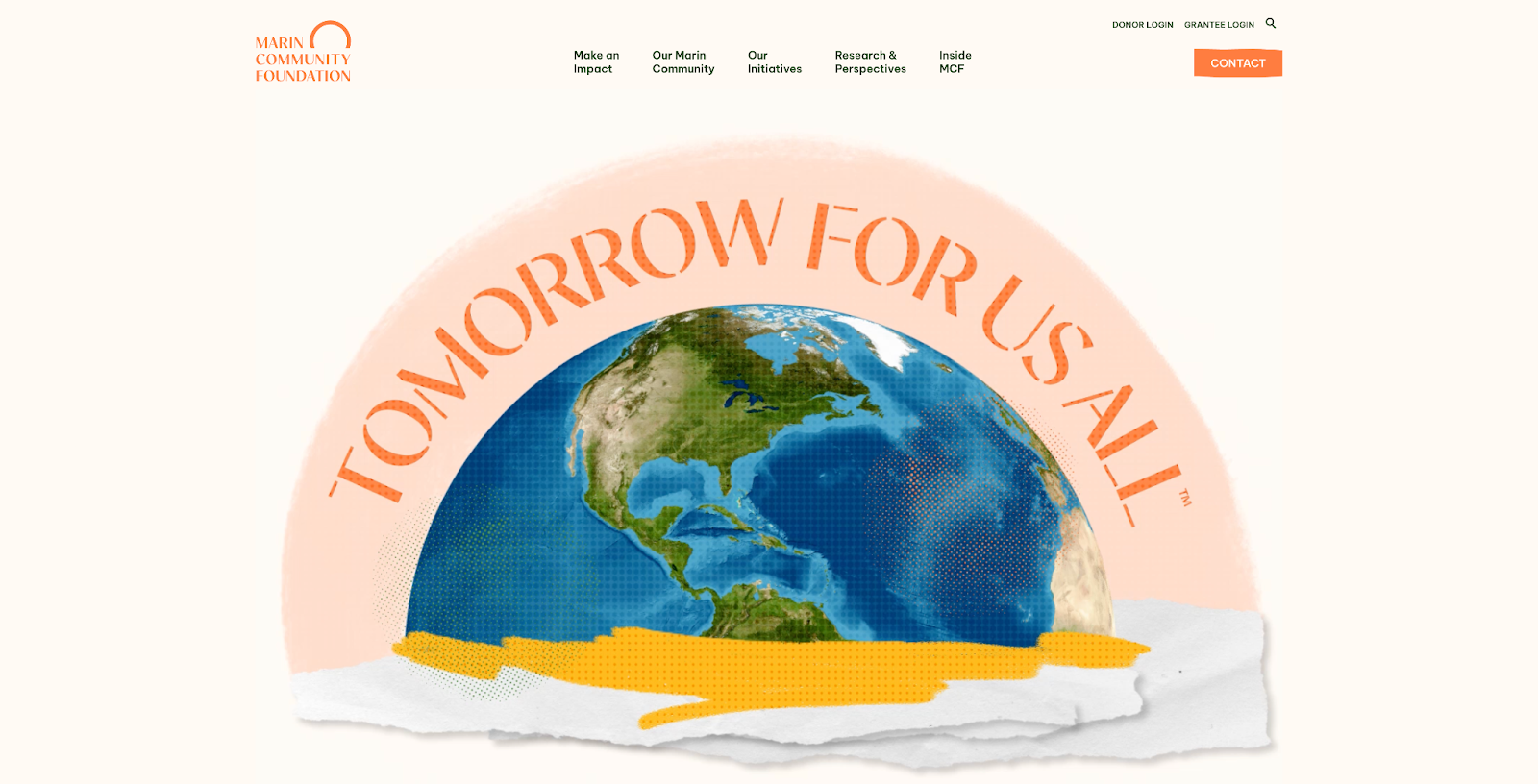
The Marin Community Foundation mobilizes and unites community members to resolve social issues and create positive change.
Visually Striking Graphics: The website uses graphics that blend real-life images with artistic renderings to create visual excitement for visitors.
Dynamic Elements: It also leverages moving banner visuals that grab the eye and spark curiosity.
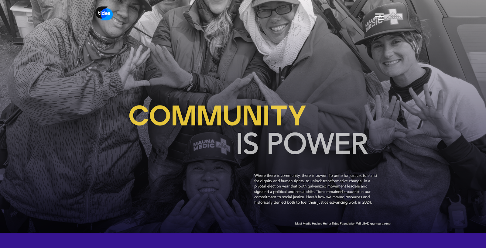
8. Tides’ 2022 Annual Report (by Acton Circle)
Tides Foundation empowers marginalized communities to advance social justice and equity. In 2022, Acton Circle helped them create an interactive microsite to turn their annual report into an immersive digital experience for their donors and supporters.
Movement-First Horizontal Scroll: The unique scrolling mechanism made all visuals and information accessible at a glance, offering a unique and skim-friendly experience.
Bold Layout + Palette: Color blocking with bold hues and modern grids created a visually pleasing effect that not only draws the eye but also guides readers’ attention throughout the site.
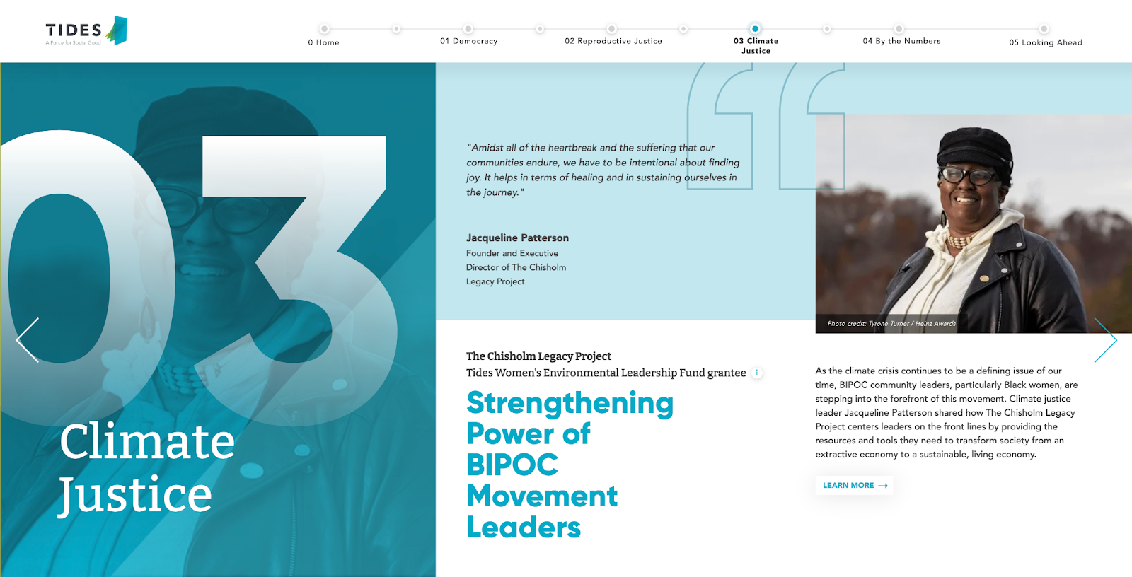
9. Tides’ 2024 Annual Report (by Acton Circle)
In 2024, we again worked with Tides to deliver their latest annual report microsite that highlighted a year of bold wins with clarity and energy.
Large-Format Photography: Striking colors complement large-layout photos that spotlight community members, events, and stories of impact.
Clear Thematic Sections: The website is built with distinct areas that make it easy for readers to navigate and absorb the various facets of the nonprofit’s efforts.
10. Every Mother Counts
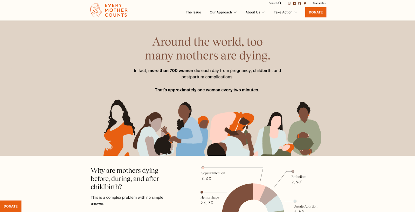
Every Mother Counts seeks to make pregnancy, childbirth, and the postpartum period a safe and equitable experience everywhere.
Grounded Palette + Elements: Warm, soothing neutrals and grounded elements communicate the organization’s character of compassion and care.
Dynamic + Digestible Flow of Information: Multimedia assets, responsive elements, and dynamic text present information in a calm yet engaging way.
11. Moms Demand Action
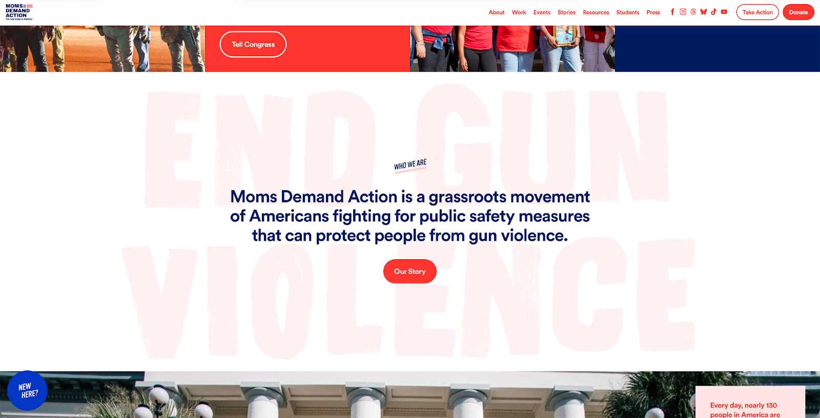
Moms Demand Action advocates for the implementation of public safety legislation and measures to protect communities from gun violence.
Bold + Provocative Colors: The website uses a striking two-color palette to communicate urgency and bold grids to highlight key messages.
CTA-Focused Pipeline: Buttons are strategically spread throughout the website, and the flow of information emphasizes the primary goal of taking action.
12. Wildlife Conservation Society
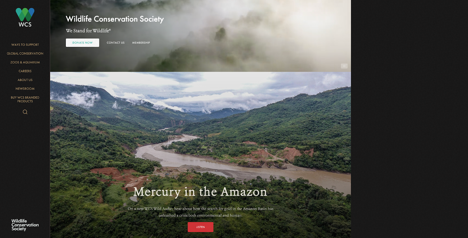
The Wildlife Conservation Society champions wildlife preservation and leads conservation programs around the globe.
Powerful Imagery: The website centers images of the wildlife and areas they’re advocating for, giving supporters an immediate glimpse into the value of the mission.
Simple Yet Intuitive Layout: It follows a simple grid that allows visitors to easily skim and absorb the information presented.
How to Make Your Website Pull Supporters (Instead of Having to Chase Them)
Think of your website as the one-stop shop for everything there is to learn about your nonprofit. If you want to improve donor engagement or reach new audiences, your website needs to reflect your community’s interests and cater to their behavior. And that’s hard to do when your website is poorly designed, outdated, or lacking in accessibility features.
If you’re looking for nonprofit website ideas to give your organization a fresh new digital identity, there are 3 paths you can choose from:
Find a Nonprofit Website Inspiration and Let It Guide Your Team
If you have a full design team on staff, the first thing you might consider is creating or rebranding your website from the ground up. You can take inspiration from any of the nonprofit website examples we shared above or even find your own favorites.
This path will give you the most freedom and flexibility, as you can control how much of your resources you invest and more closely oversee the process.
Use a Template That Resonates and Make It Yours
In many cases, having a designer on staff doesn’t automatically mean you’re ready to take on the task of (re)building a website from scratch.
Web development requires technical skills that not all graphic designers have—and even if they do, they’re likely swamped with program brochures, campaign materials, and social media assets.
You don’t have to do it all by yourself. There are plenty of nonprofit website templates that allow you to simply plug in your content and basic brand elements. All you have to do is find one that feels the most like your mission, make sure the template is compatible with your hosting platform, and run with it.
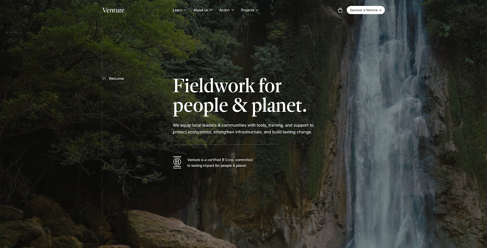
We really like Venture by Studio Mesa. It’s made specifically for nonprofits and centers powerful imagery alongside compelling text. It’s great for environmental or community-based organizations that want to highlight their impact stories.
Work with a Design Partner That Actually Breathes Nonprofit
The reality is that many nonprofit teams don’t have the time, energy, or staff to spare for a full website project. The result? You keep putting off the task and never actually get to do it, or you settle for something that doesn’t quite meet your vision.
If you’ve been wanting to create a unique digital experience for your annual report but don’t have the resources to pull it off on your own, your best option is to work with a design team that understands your goals and specializes in helping you see them through.
… hey, that’s us! Acton Circle partners exclusively with purpose-driven teams like yours to create assets that build belief and make you stand out.
We specialize in turning annual reports from a once-a-year asset to a year-round tool for visibility and engagement. Whether you need a 20-page report or a full digital experience—complete with a landing page or microsite and repurposed assets—we know how to create something that communicates your message clearly and thoughtfully.
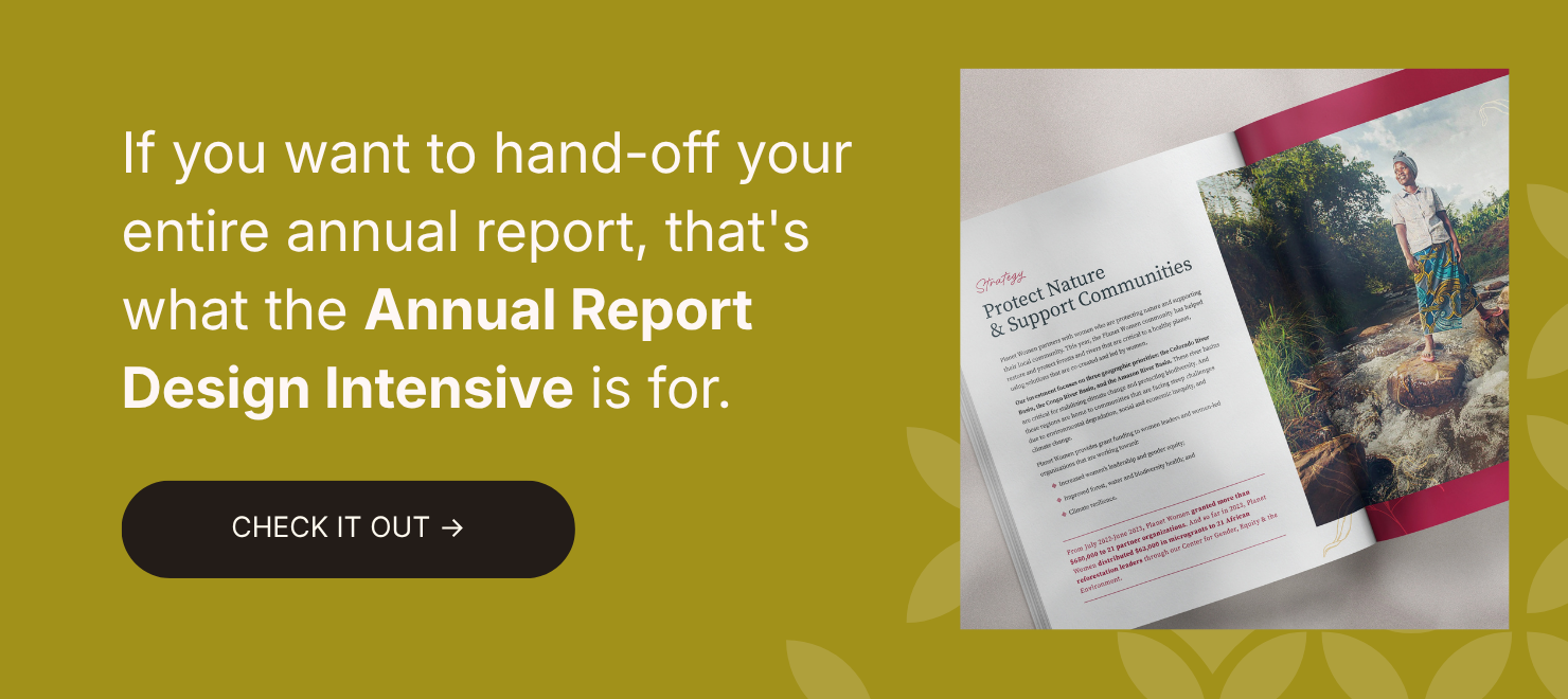
Check out our Annual Report Design Intensive to learn more about how we can help you.