Snapshot
Audience: Ministry leaders, youth pastors, and faith-based educators
Challenge: Turn an abstract conference theme into a tangible, versatile identity
Solution: Multi-direction logo exploration + event-ready visual system
Result: A cohesive conference brand that energized promotion across platforms
Where They Started
Before stepping into a new name and expanded mission as Ministry Leadership Center, Center for Youth Ministry Training (CYMT) was preparing for its annual Children & Youth Ministry Conference. The 2024 theme, Building Transformational Ministries, was about more than programming—it centered on cultivating meaningful, faith-filled spaces where youth could grow.
The theme was conceptually strong, but it needed a visual identity that would make it feel immediate and inviting. The design had to resonate with ministry leaders while remaining consistent with CYMT’s established brand.
What Was Getting in the Way
The team had clarity around the message but not yet a defined visual direction.
They needed design that could:
- Capture the idea of building faith-centered programs in a clear visual metaphor
- Maintain a warm, professional tone that would resonate with ministry leaders
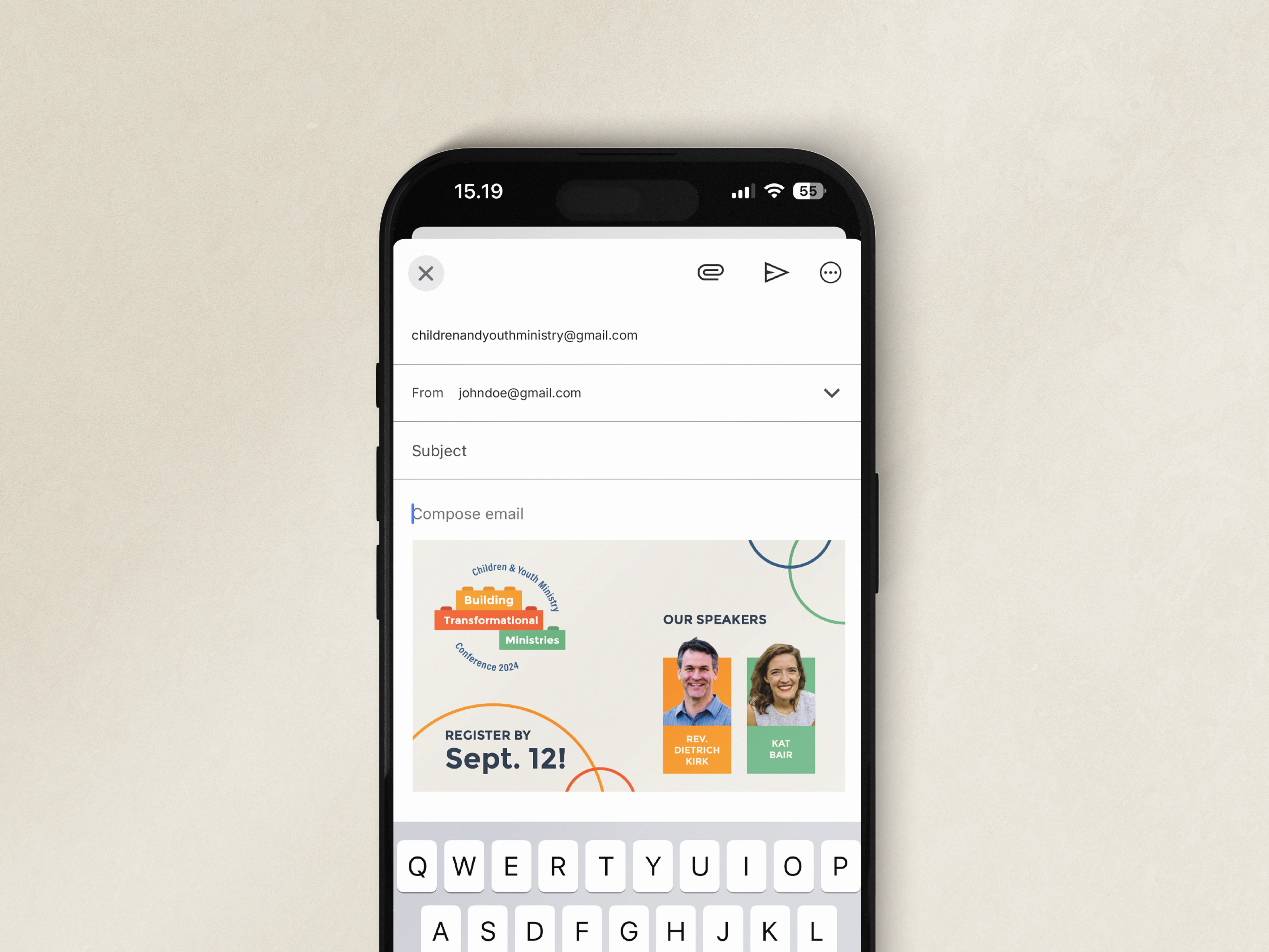
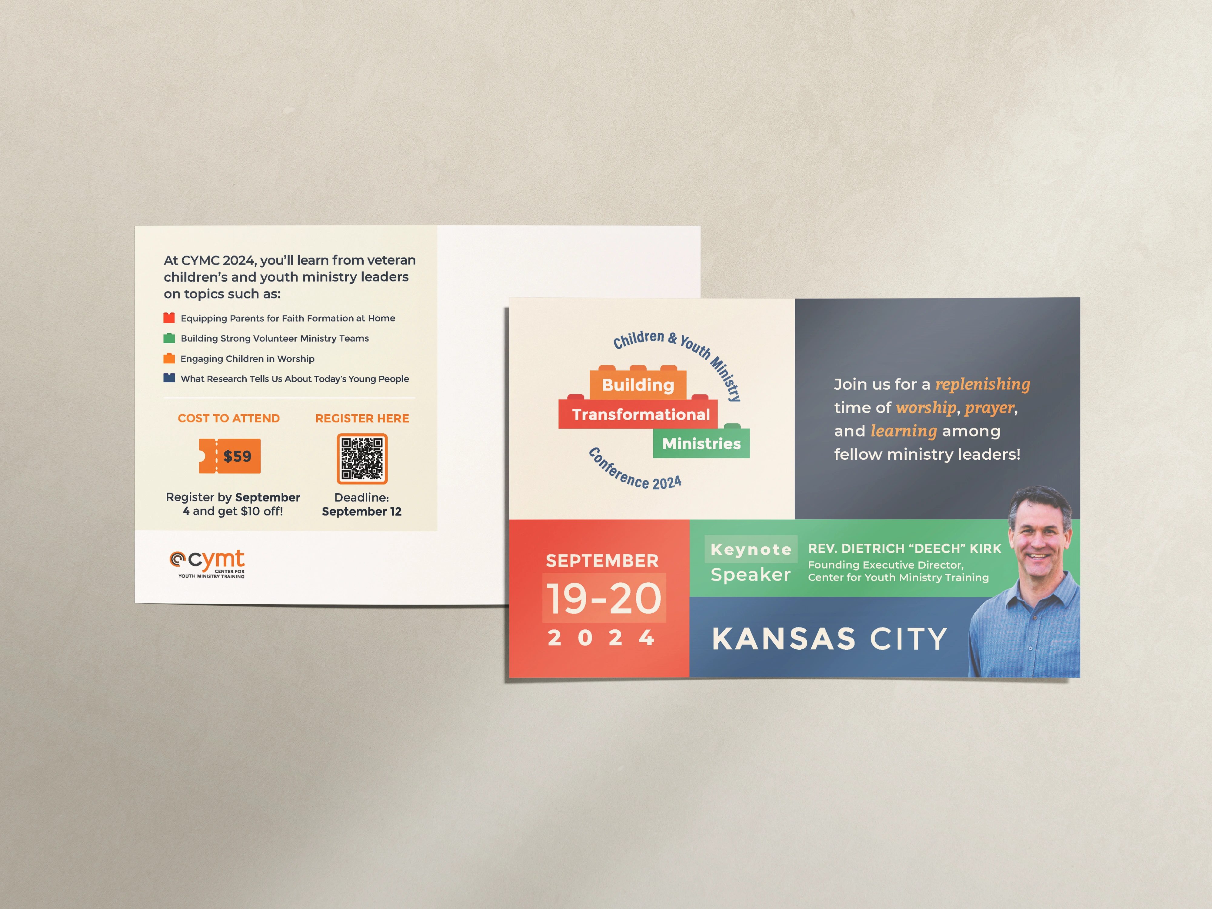
- Adapt seamlessly across email, flyers, and digital promotions
- Translate the theme into something tangible and recognizable
The challenge was giving form to an idea in a way that felt inspiring.
What We Built
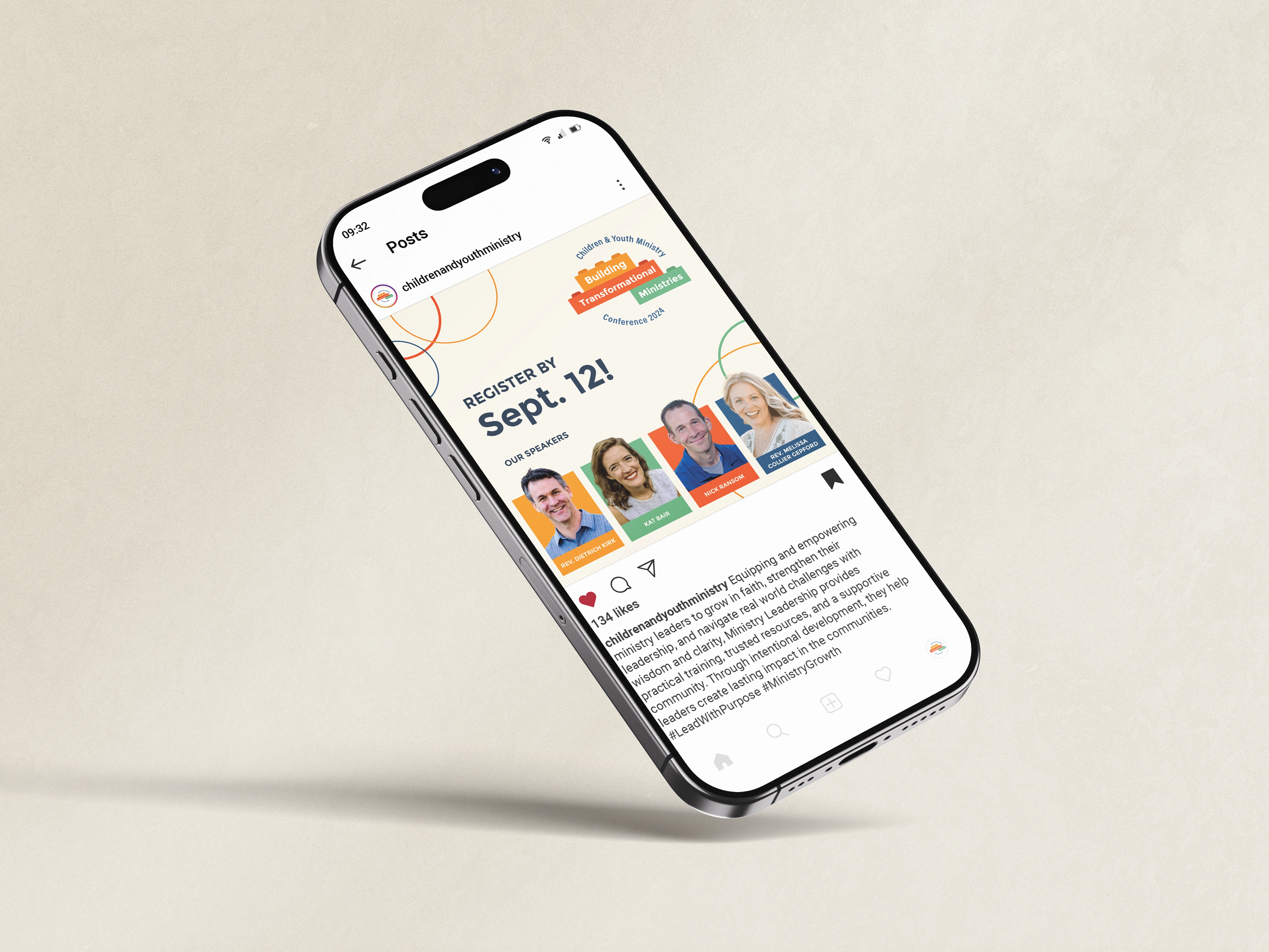
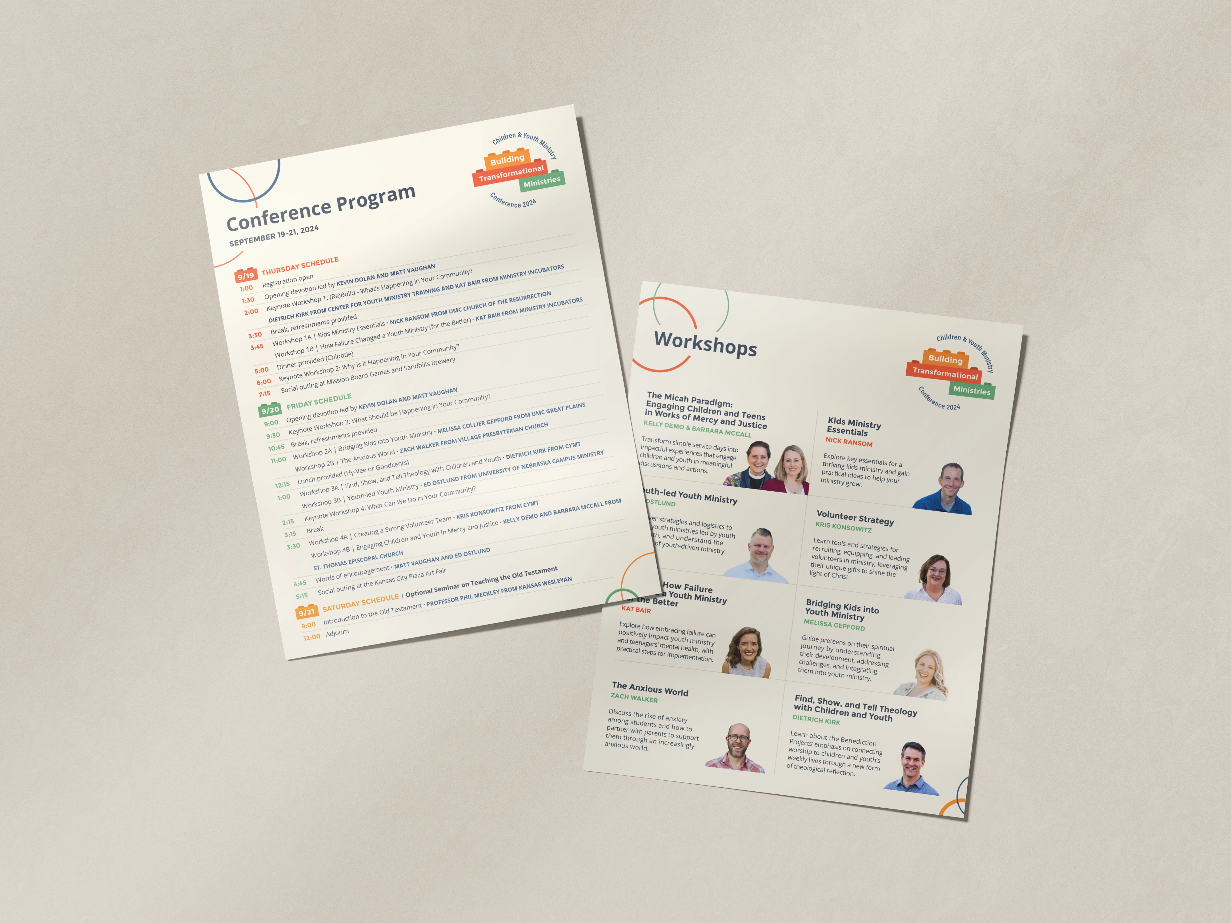
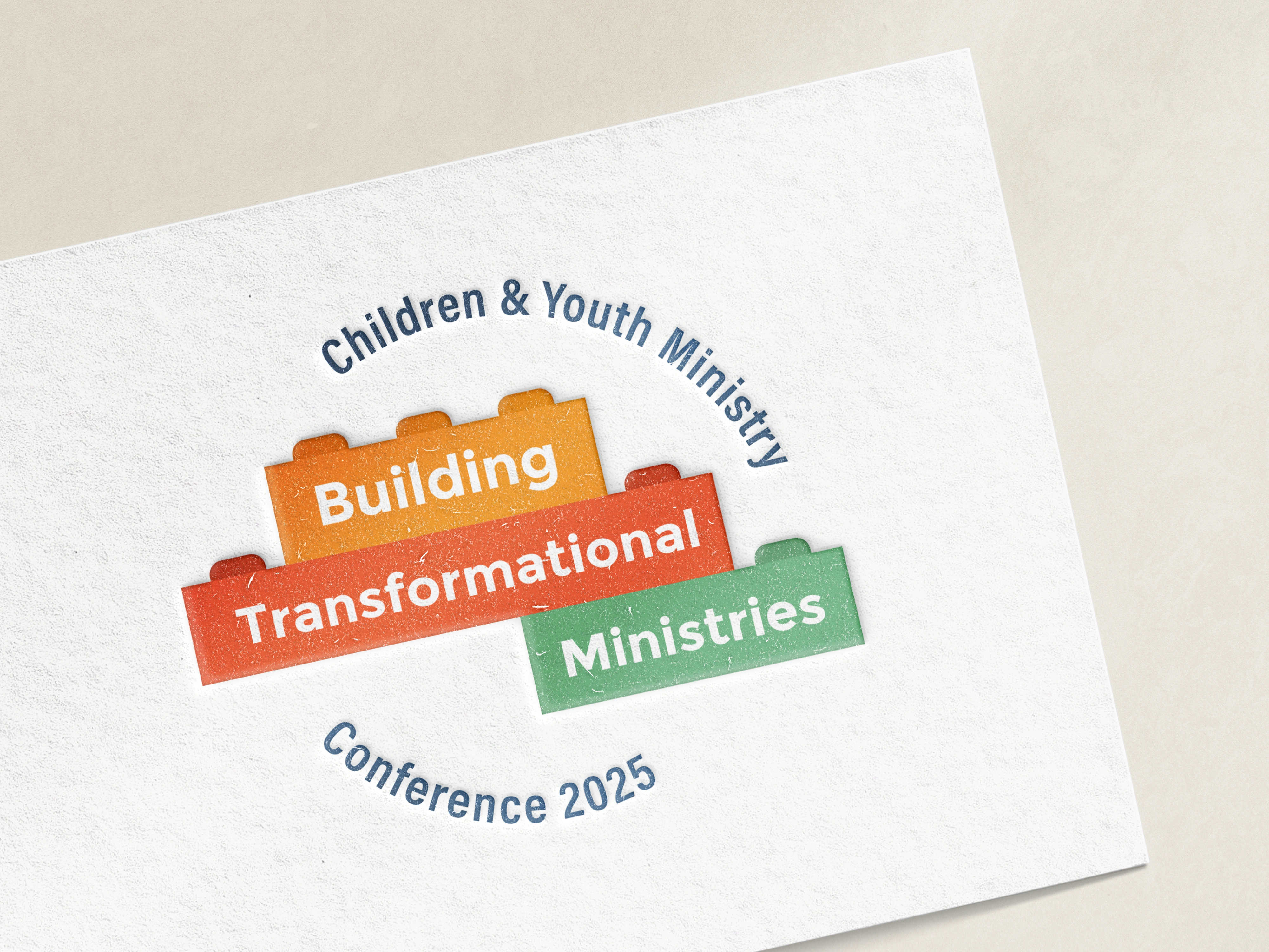
Acton Circle developed three distinct logo concepts, each interpreting the “building” theme through structure, collaboration, and symbolic growth. Every direction balanced approachability with creativity, ensuring the identity could work across both print and digital applications.
The final concept selected by CYMT leaned more literal, playful, and energetic, introducing movement and a sense of invitation while staying aligned with their broader visual identity.
Deliverables included:
- Three logo directions exploring structure, collaboration, and growth
- Concepts featuring building blocks, warm color palettes, and soft typography
- Versions optimized for digital and print use
- A final logo system designed for flexible event promotion
What Changed
The conference branding gave the event a welcoming presence across all touchpoints.
Promotional materials felt aligned and purposeful, helping the theme of transformation resonate more clearly with attendees. The final identity energized communications while maintaining the warmth and integrity central to CYMT’s work.