Most annual reports end with a donate button, and usually that's the right call. For Greater Schools, we took it out.
Greater Schools is the education initiative of The Connor Group Kids & Community Partners. Their first campus, The Greater Dayton School (GDS), opened in 2022 as Ohio's first private, non-religious school serving only under-resourced students. They're now raising $135 million to build a second campus in Cincinnati and fund its first ten years of operation, with doors opening in 2029.
This meant that what they needed, more than anything, was for funders to see the impact they've made so far and what else is possible. And they needed to see it for themselves.
Building Around the Ask
Ryan Ernst, Kids & Community Director for The Connor Group, led the project on their side. At kickoff, he explained that donors at the $1M level almost always visit before they commit. They sit down for a family-style lunch with students and walk through the on-site wellness center. That's usually where the decision gets made.
Existing donors also don't get a hard ask at all. To them, the report's purpose is to keep them informed and make sure they understand the importance and impact of their support.
So, we built every page of the report and microsite around the clear first step for donors: scheduling a campus visit. The gift comes after.
That's also why the donate button came out. A donor who's moved by page six might give a few hundred dollars and feel like they've done their part. That gift matters, but it can replace the visit that would have led to a much larger one.
Get The Annual Report Checkpoint
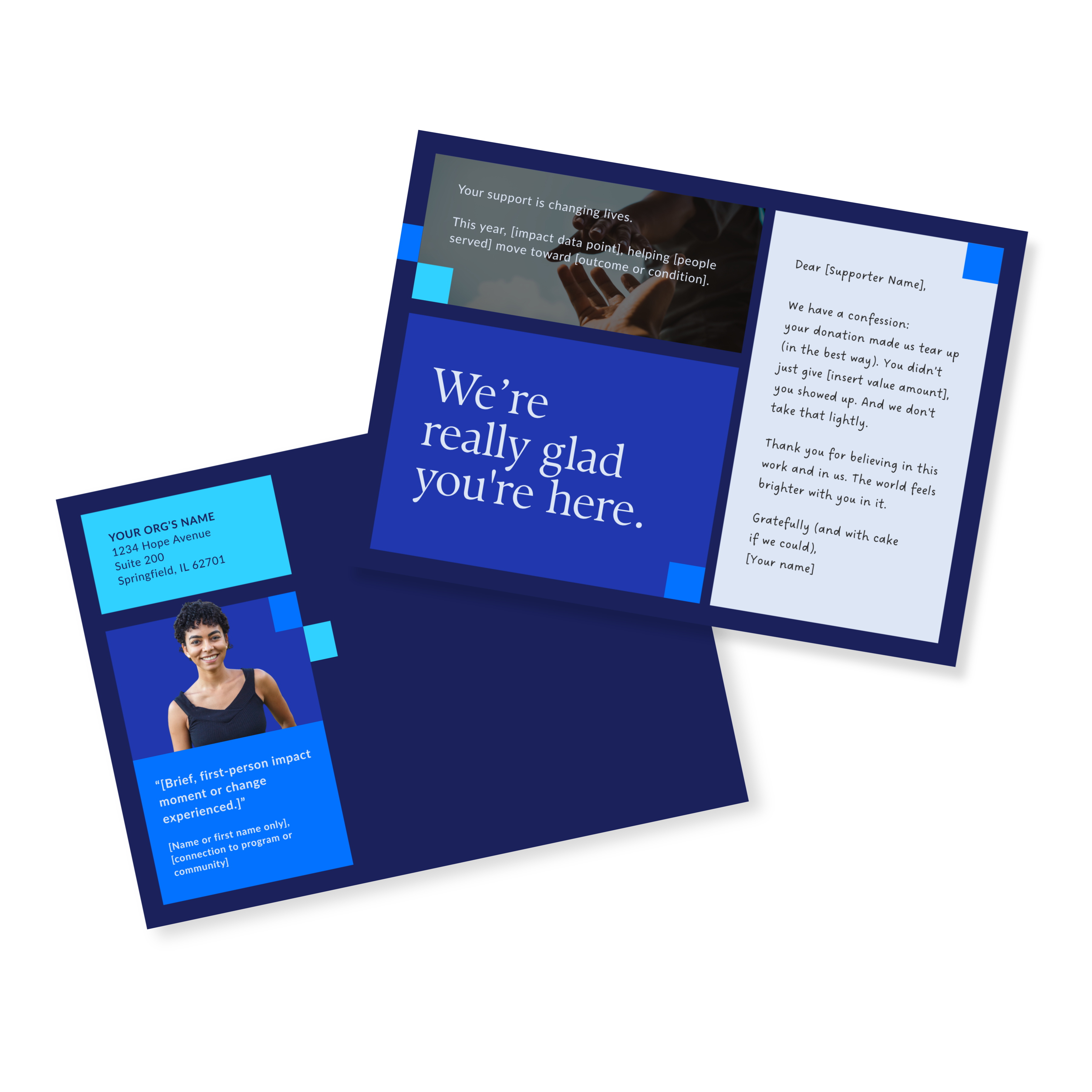
Donor Thank You Postcards Templates
Enter your info and we’ll send the postcards straight to your inbox:
Strong Results and an Even Stronger Presentation
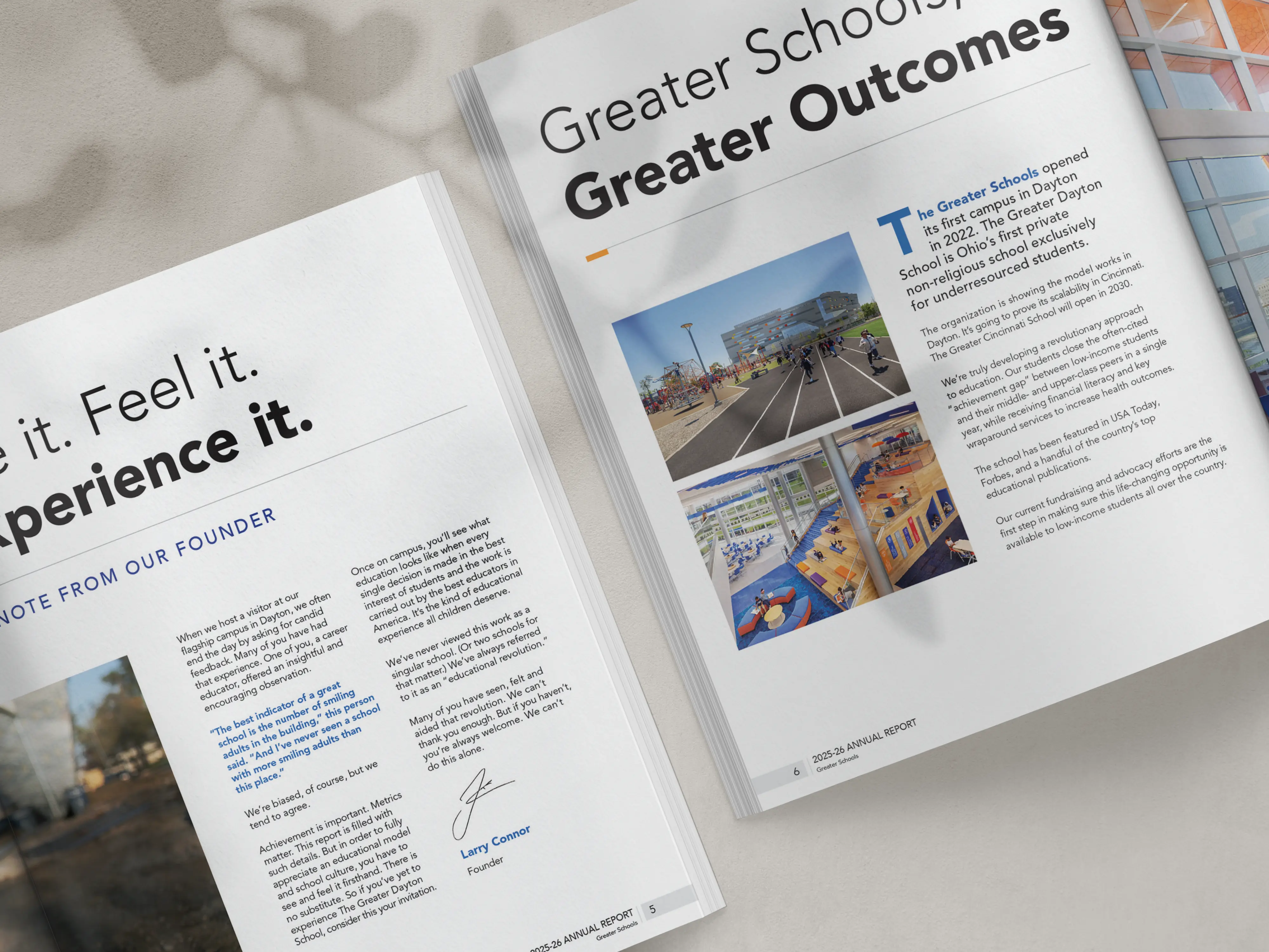
During our first call, Ryan said he wanted something that would make readers stop. He also wanted less text (which we were very happy to hear, as so many nonprofits fall into the trap of thinking that more text = better communication!).
Their results were already very strong. All the data show that GDS students outperform their peers in Dayton Public Schools and exceed national grade-level benchmarks. The proof was there, but they needed someone capable of a major gift to act on those numbers. A page of stats rarely does that on its own, especially if funders don't even bother to read it.
Since the report was going to high-net-worth donors, small business owners, foundations, and more than a thousand investors, we knew we needed to design something that stands out. Those readers get a lot of annual reports, and most of them get skimmed.
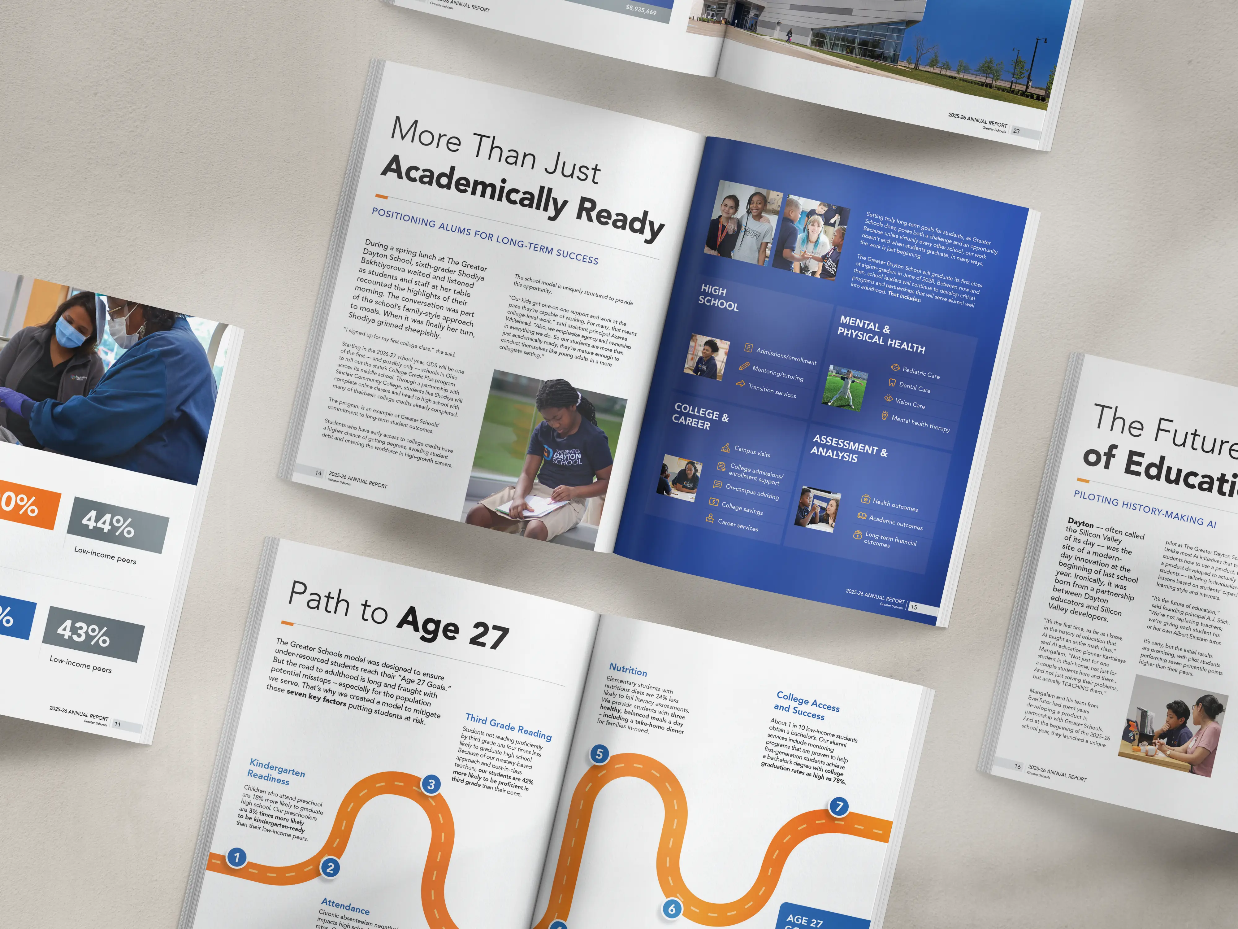
So, for Greater Schools, we designed with:
- Strong numbers that jumped out meaningfully at readers
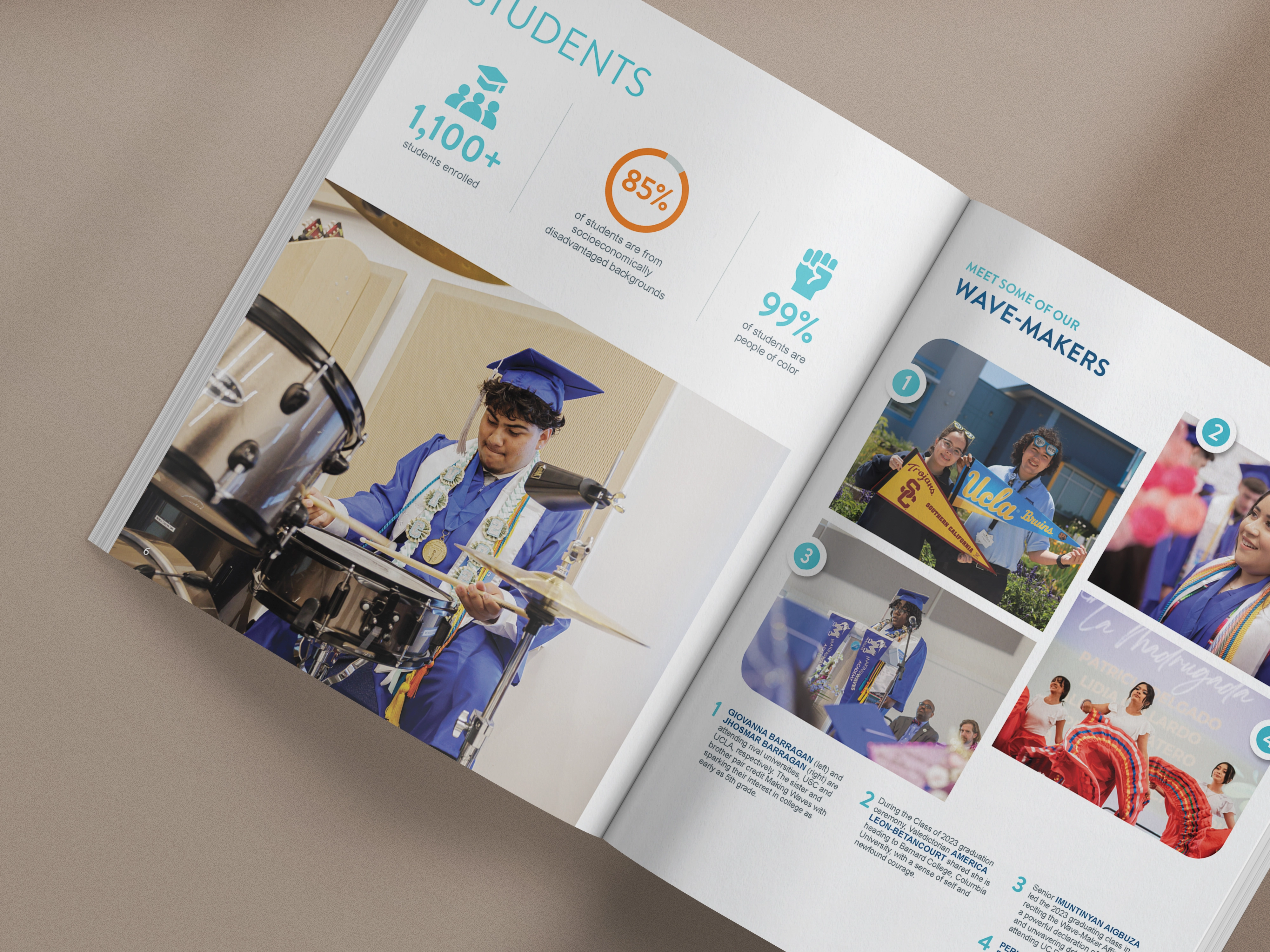
- Large, high-quality photos that gave a clear glimpse into the work
- Polished copy that says a lot without saying too much
- A layout that ties everything together, so every page has a narrative
Pieces Worthy of a $135-Million Campaign
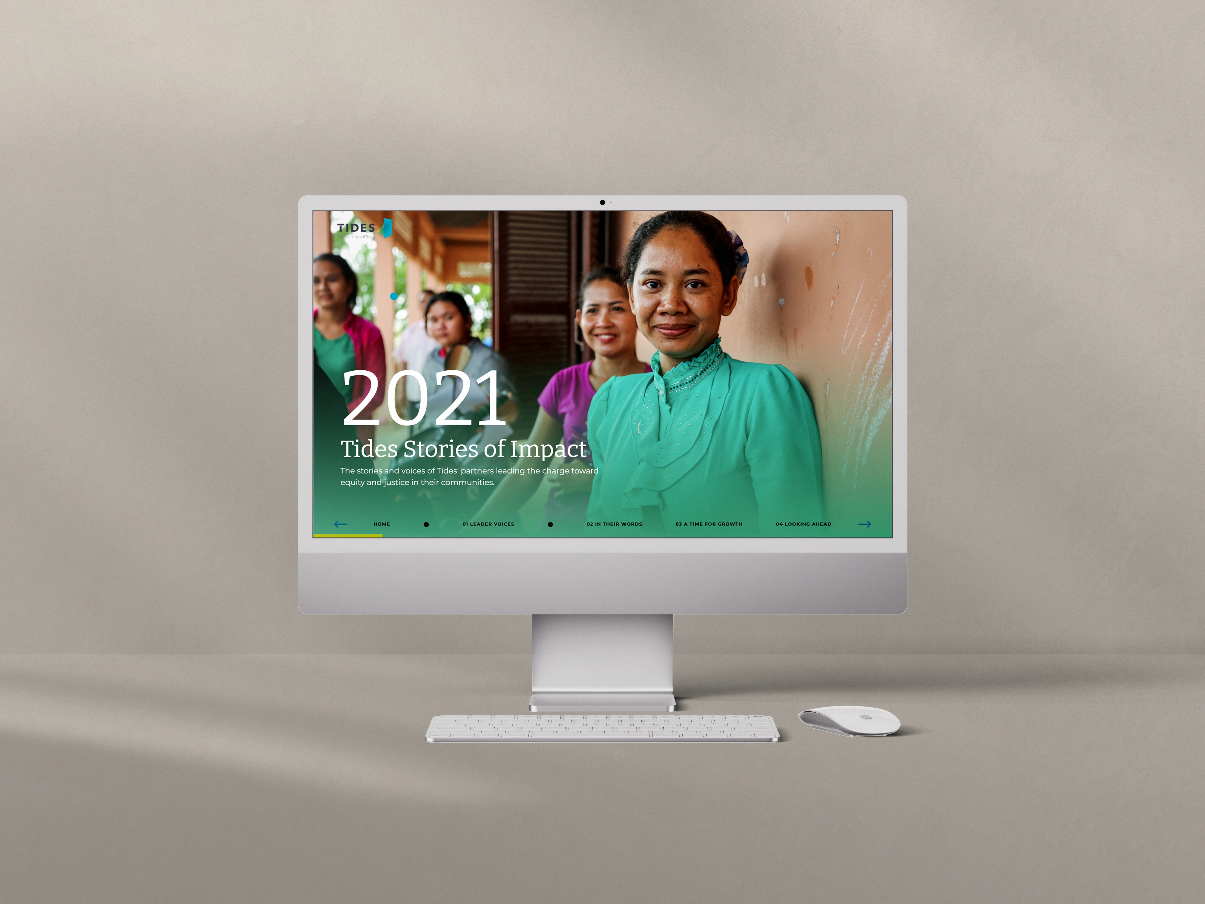
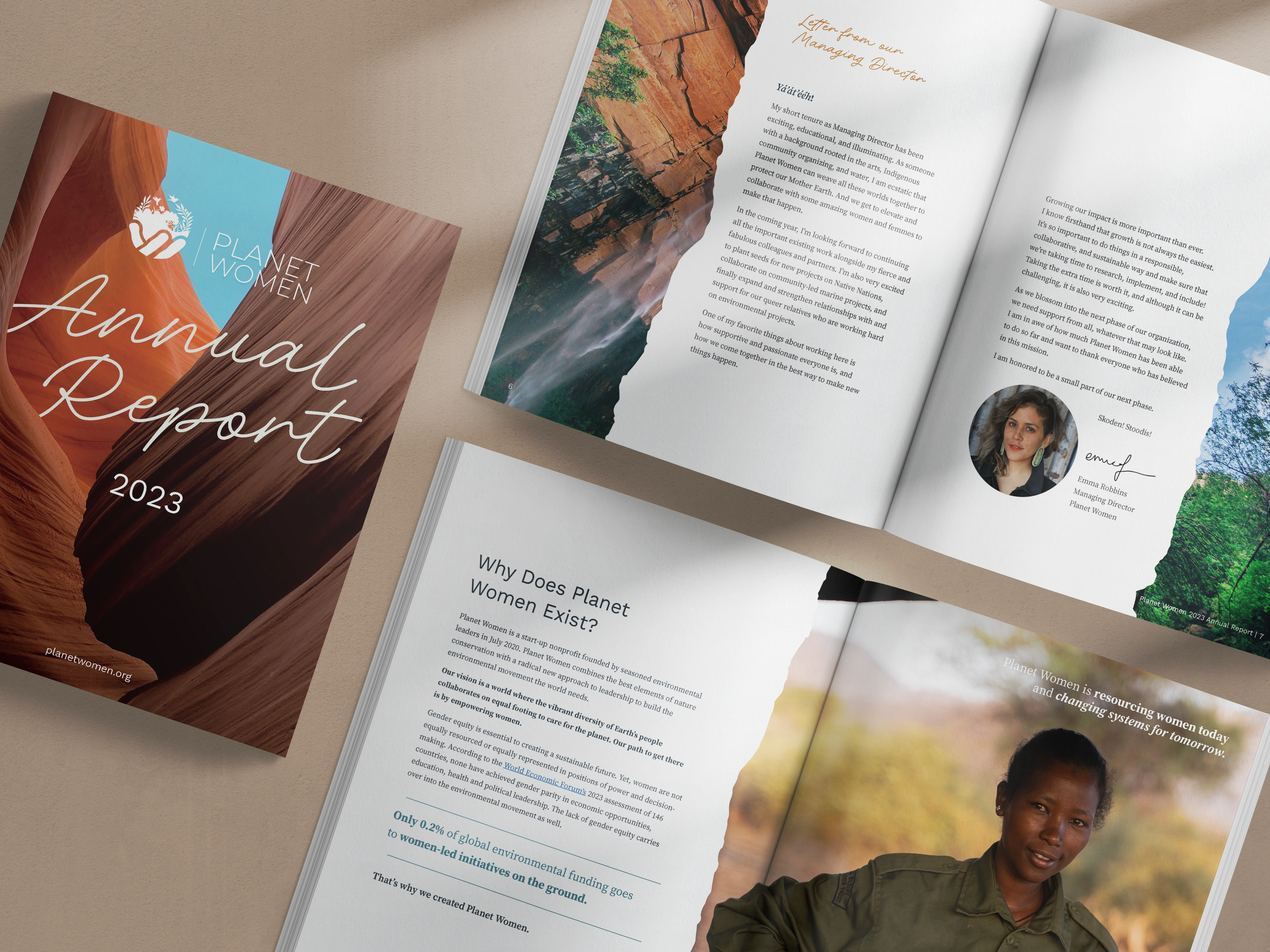
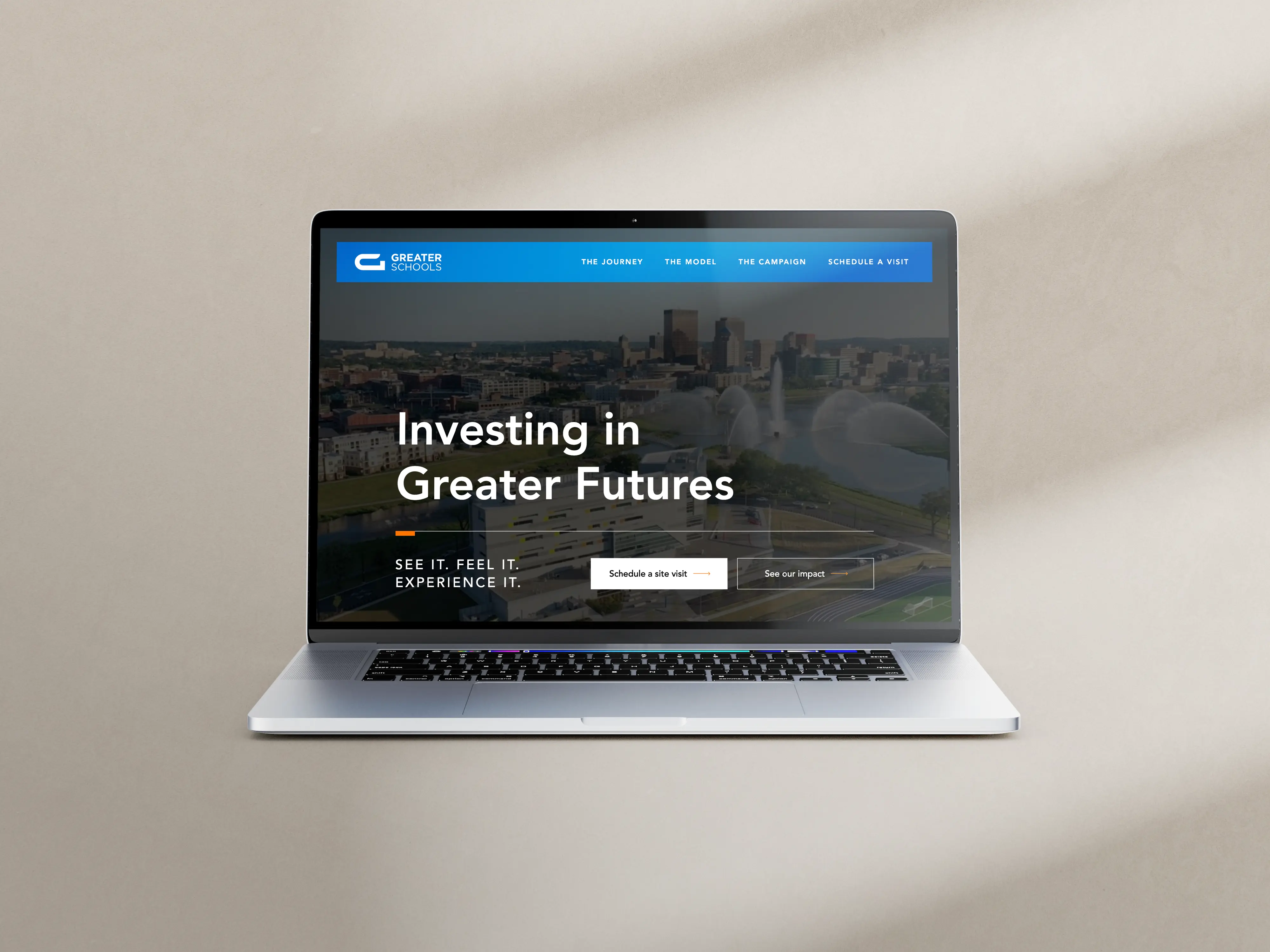
The core piece that we delivered is a story-led annual report, Investing in Greater Futures, in digital and print-ready versions. From there, we built a five-page Webflow microsite that trims the report for the web and adds motion.
Their 12-minute documentary sits at the top of the homepage with a clear prompt to play, since a small thumbnail tends to get ignored.
We also set up Google Analytics tracking on button clicks, scroll depth, video plays, and form activity, so the team can see how people move through the site.
Ryan, who's a former journalist, wrote all of the copy and sent it over to us in one batch, which made wireframing much smoother. He also had a habit we loved: when he wasn't sure how long a headline should be, he'd type "HEAD" as a placeholder, let the layout set the space, and write to fit afterward.
Thanks to Ryan's diligence and eagerness to be involved, all we had to do on the content side was basic copy editing and proofing for grammar and brand consistency.
Their photo library was also better than most we see. Shots of teachers with their students, various educational activities, wide building views, and portraits of smiling faces. These all came together to paint a clear picture of a school that truly cares for and empowers its students.
The microsite even follows the same structure as the report, with short pages and a shared navigation. When the Cincinnati campus has its own year to report on, the team can start from this system instead of a blank page.
Advance Your Campaign with a Report That "Gets It"
A capital campaign calls for an annual report and supporting assets that go beyond what most people think annual reports should be.
If your funding depends on donors seeing your work in person, you need a piece that gets them to your doorstep. If your timeline is limited and you need supporters to give now, you'll want something that balances urgency and grace.
Whichever situation you find yourself in, Acton Circle has the experience and nonprofit-savvy to help. Just book a call, and we'll talk it through.
See the full project in our portfolio: Greater Schools.