Same scene, every year. Report season hits (whenever that is for you), somebody opens last year's file, changes the year on the cover, and starts dropping in new numbers.
I get it. That file worked. The board liked it. Why start over?
Here's the thing though: the report you needed last year and the report you need this year are usually not the same report. Same 10 to 16 weeks. Same deadline. Different assignment.
And when nobody calls out the assignment, the report does exactly what it did last year. It gets sent. It gets filed. A month later it's just sittin' on your website.
After working with 65+ nonprofit teams, I keep seeing the same thing: annual reports fall into four buckets. Sometimes orgs make one of them without realizing it. Figuring out which one you're making changes everything downstream. Who you write for. What gets cut. What the cover has to do in the first three seconds.
So let's name them.
1. The Campaign Centerpiece
You're in a capital campaign. A new building, a new campus, an endowment. $10M, $20M, more. (If you're a school, you know this one well.) This report is the piece every major-donor meeting ends with. Your campaign director leaves it on someone's desk after coffee and hopes it keeps talking after she's gone.
That's a very different job than "here's what we did this year."
A campaign centerpiece has to make one specific ask feel obvious. The reader gets to the last page thinking, of course this is the next step. So the whole thing gets built backward from the campaign case. Every milestone you report is proof that the bigger thing is possible, not a recap.
What changes: fewer program summaries, more "here's where we are on the road to there." The financials still show up. They just stop being the point.
What most orgs do instead: make the regular report, then staple the campaign to the back. Nobody reads the back.
2. The Milestone Report
25 years. The first graduating class. The founder stepping down. A building finally open.
This one has to tell the whole story, not just the fiscal year. And there's a trap in it. Milestone reports LOVE to look backward. Timelines, archival photos, "how it all started." Lovely. But the donor reading it isn't asking what happened? They're asking what am I part of, and what's next?
When we worked with Peninsula Family Service on their 75th anniversary report, the move was to honor the past AND point at the future in the same spread. Nostalgia became momentum instead of a museum.
What changes: the past gets a chapter, not the whole book. The forward-looking section gets the best design real estate.
What most orgs do instead: a 40-page scrapbook the board loves and nobody outside the board finishes.
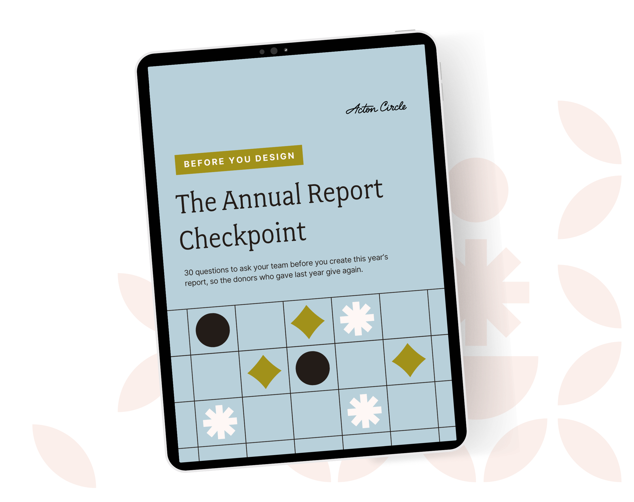
Get The Annual Report Checkpoint
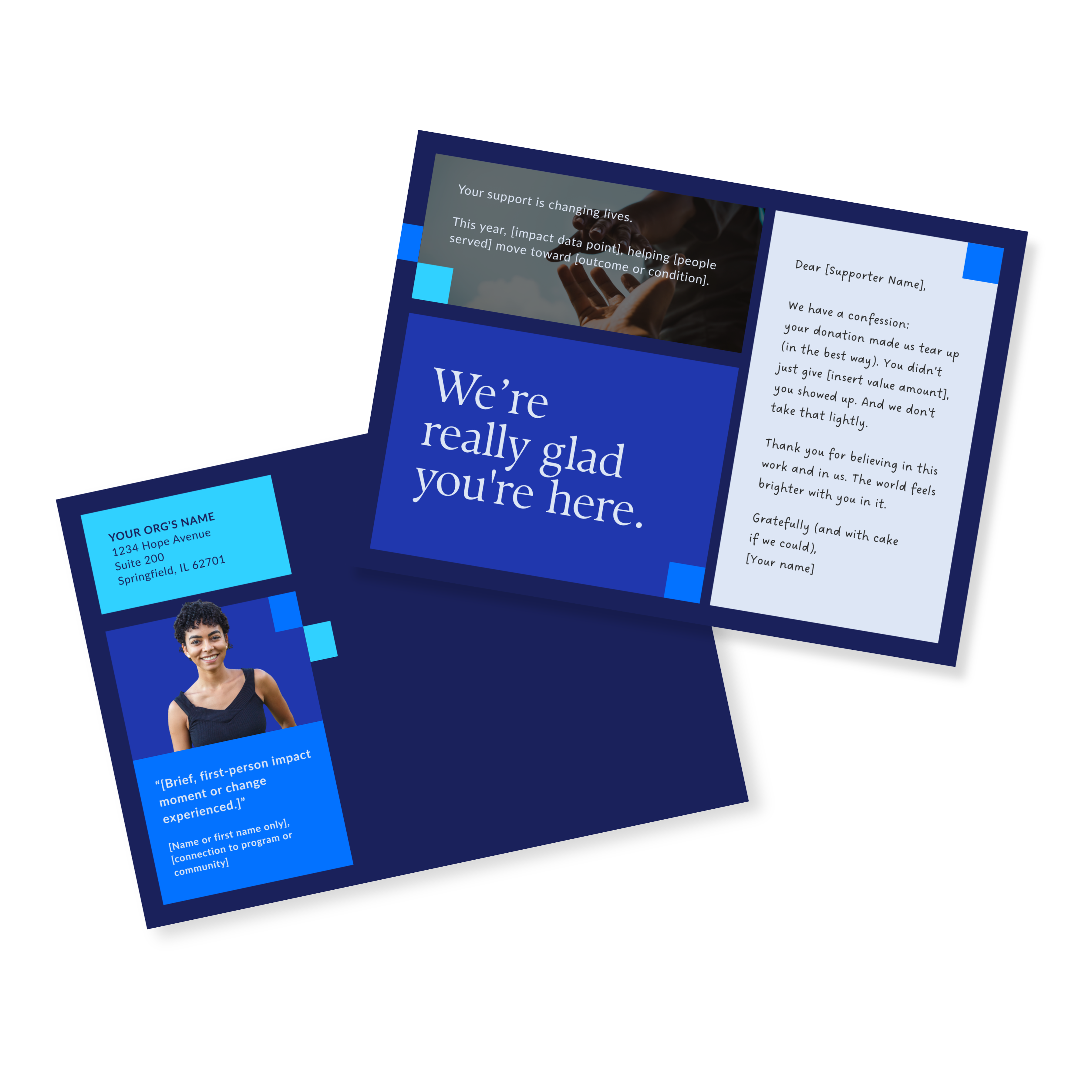
Donor Thank You Postcards Templates
Enter your info and we’ll send the postcards straight to your inbox:
3. Your First-Ever Annual Report
The board finally said yes. There's no template, no "last year's version," and everyone's watching to see if it was worth it.
Real talk: first reports matter more than any other kind. It's the first time a lot of your supporters will see your work organized in one place. It sets the bar for what "put together" looks like at your org. It also gets the biggest reach, because nobody can say "oh, I saw last year's."
The University of Michigan School of Information had three engagement areas that had never been told as one story. Their first report was less about the year and more about answering who are we, all together? That's the real job of a first report.
What changes: you're building the messaging system, not just the document. Everything you decide here (how you describe the mission, which numbers matter, what a story looks like) becomes the foundation every future piece pulls from.
What most orgs do instead: copy the format of the biggest org in their sector and wonder why it feels borrowed.
4. A New Approach to the One You've Always Made
No anniversary. No campaign. You've done this for years and it's... fine.
This is the one most orgs are actually making, and it's the one that gets the least thought, because nothing forces the question. The report goes out because it's supposed to go out.
But if your report has been the same shape for five years, your donors have stopped reading it. Not out of disrespect. They already know what's in it. So "fine" is costing you the one moment a year when everyone's paying attention at once.
A new-approach report is a decision. You're changing what the report is FOR. Usually that means moving from a recap (what we did) to a case (why this matters and what you make possible). Same content, new job.
Sometimes it also means changing what the report IS. A lot of schools and larger orgs put out an annual magazine: features, profiles, a letter from the head, the year's numbers tucked inside instead of leading. It reads like something you'd keep on a coffee table, and that's the point. People pick it up more than once. If your report is stuck at "fine," the magazine format is one of the fastest ways to make people open it again.
What changes: the structure. Programs stop being the chapters. The donor's path through the story becomes the chapters. (Or the features do, if you go the magazine route.)
What most orgs do instead: a redesign. New colors, new fonts, same shape. It looks better. It doesn't work better.
So which one is yours?
If you can't answer that before opening the file, that's the first thing to fix. Not the layout. Not the photos. Not the printer.
Decide what it's for. Then build the report that does it.
Not sure which one you're making? That's what the Annual Report Strategy Call is for. We'll talk through your vision for this year and you'll leave with a plan for what your report can look like.
Already know what you want? Skip ahead and book a Report Planning Call. We'll get straight into scope, timeline, and what it'll take.