Your whole annual report took 11 weeks. The cover design took 11 minutes.
I say that with zero judgment. Trust me… I've seen it happen at almost every org I've worked with.
The interviews get done. The photos are gathered. Somebody finally wrestles the finance numbers out of the CFO. And then, two days before it goes to print, someone drops the logo in the corner, types "2026 Annual Report" across the middle, and calls it.
But hear this: that cover is the only page that 100% of your audience will see.
Not the program spread you fought over. Not the impact data that went through 6 rounds. The cover.
It's the handshake, the first impression, and the thing that decides whether anyone opens the file at all. So let's give it the 11 weeks' worth of thinking it deserves.
Keep reading for all the do’s and don’ts of annual report cover design that we’ve mastered over the years! Bonus: we share some covers we found out in the wild (and some we created) that we think you should see.
What Goes on an Annual Report Cover
Every good annual report cover has 4 essential elements:
- Your organization's name or logo
- The report title and year (or reporting period)
- A theme line (don't skip this! It's the one sentence that tells a donor what this year was about)
- One primary image or graphic
- Optionally, a single headline number
Notice what's not on it: just the words "annual report", a logo on a colored background with an image of buildings (and no people), or a tagline that repeats the title.
A cover fails by addition, almost never by subtraction.
The AARP Foundation's 2025 Annual Report cover is a great example of stripping down to the essentials.
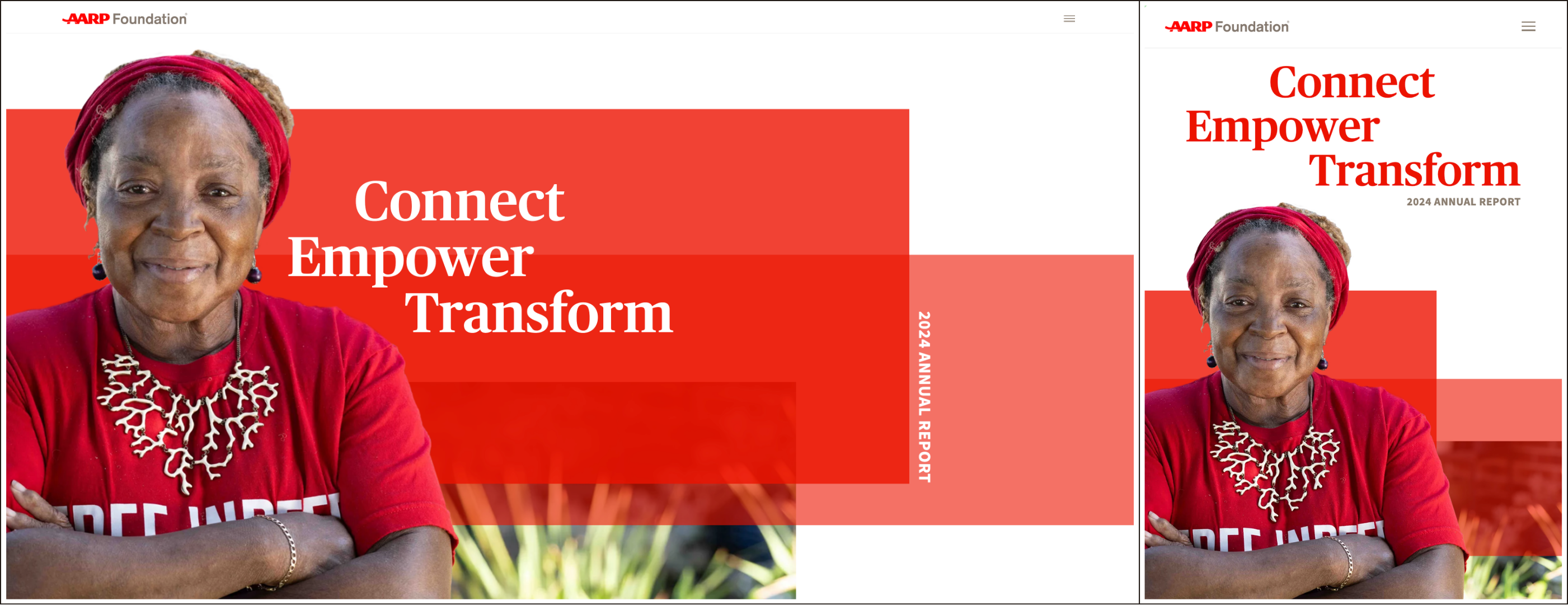
Their web-based annual report is dynamic, accessible, complete, and (most importantly) it establishes an emotional connection at first glance.
The presence of a face immediately shows donors the real people their support is helping. The theme line goes deeper into what the year focused on, rather than just providing a surface-level recap of the mission donors already understand.
Simple, clear, on-brand, and totally effective.
The Three-Layer Rule for Annual Report Cover Design
I talk a lot about design hierarchy… and for good reason.
More than just a style choice, hierarchy deals with what readers see and feel the moment their eyes hit your cover. You're deciding, on purpose, what someone thinks about your org in the first two seconds.
- Layer one: what they read from 5 feet away. One thing. Usually the theme line, sometimes a face, occasionally a single enormous number.
- Layer two: the essentials. Your name and the year. Plus whatever isn't layer one but is absolutely essential. Typically limited to 2-3 elements.
- Layer three: everything else. This could be highlighting impact numbers or story articles like magazines typically do.
The most common annual report cover mistake I see is two things fighting for layer one. A big theme line and a big logo. A full-bleed photo and a headline over it at the same visual weight.
When two elements compete, the eye picks neither, and the reader flips past.
Try this: shrink your cover to the size of a postage stamp. What's still clearly visible? That's your layer one. If nothing is, you don't have a hierarchy yet… you have a collage.
Take this 10,000 Degrees Impact Report we designed.

Layer one is the photo. Focusing on a single face, but communicating the org's impact as clearly as a 1-paragraph mission statement could. Layer two includes the logo and theme line. Layer three has the report type and year.
Each element has its own lane. The reader first sees the photo and understands what the mission is about and how their support is changing lives. Then, they see the org that's helping make it happen and what they accomplished during the year. All essential, and none competing for attention.
Annual Report Cover Ideas That Aren't Just a Stock Photo
Very cold take: the stock photo of 4 volunteers high-fiving has never once made a donor feel anything. And your donors have seen it. Probably on 3 other reports this year.
That last part isn't a joke. When I push teams toward their own photography, it's about authenticity and uniqueness.
Stock libraries are shared, so your own photo, even an imperfect one, is the only image on earth that's definitely yours.
A few directions that actually work:
One person, looking straight at the camera
No caption explaining who they are. Let the theme line do that work. Eye contact is the cheapest emotional shortcut in visual design, and it's always effective because it's unique to your community.
Save the Children has embraced this technique, and it works for them every time. And I mean every time.
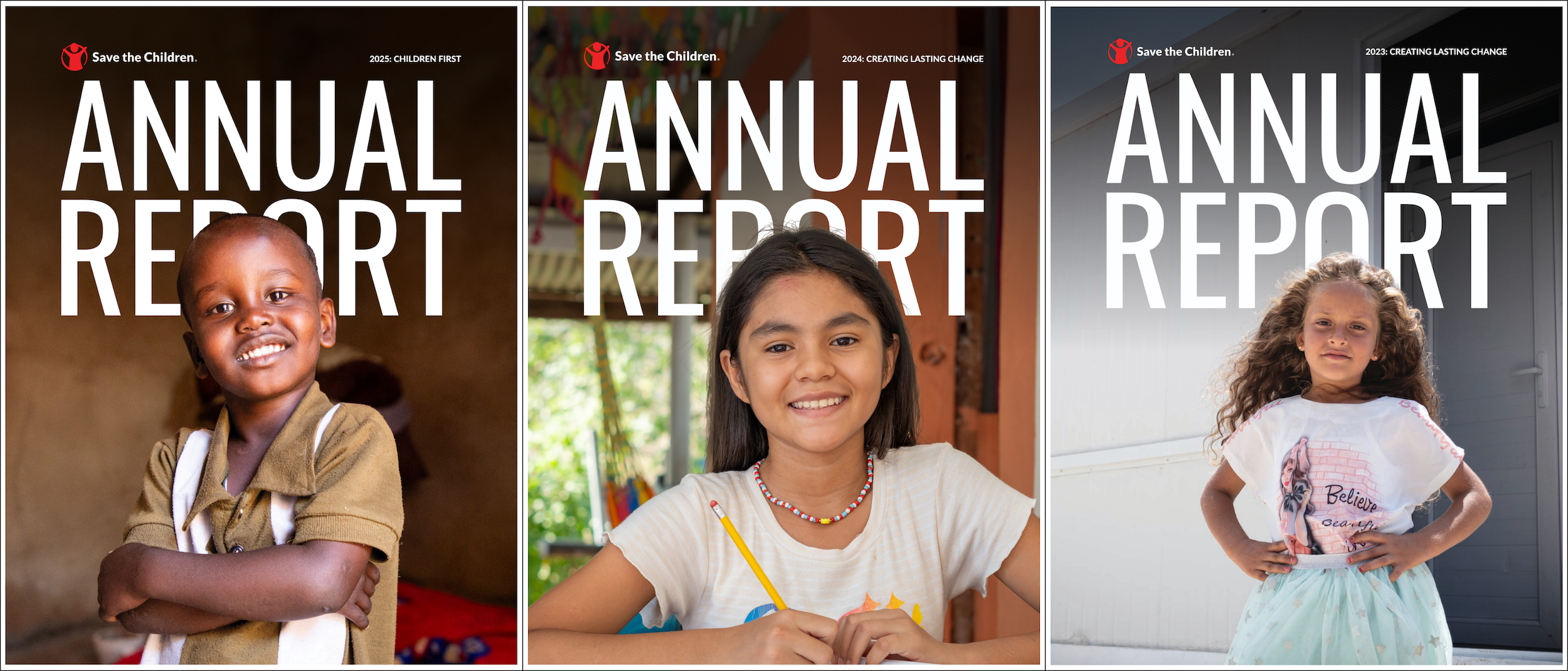
They've followed the same simple formula since 2023, and it never gets boring. The faces in each cover tell a different story each time, and it's enough to get donors in the door.
(I would say the big Annual Report text is a little redundant and missed opportunity, but as a national org, they are likely intentional about this for some reason.)
A single number, set enormous
This works when the number is genuinely surprising, and you have the guts to let it stand alone.
"1 in 4." "Zero." "847." No sub-headline. The inside pages explain it. Or, if you decide to add a sub-headline, it should drive an emotional connection or appeal for support.
HealthWell Foundation's 2024 Annual Report is a pretty good example of this.
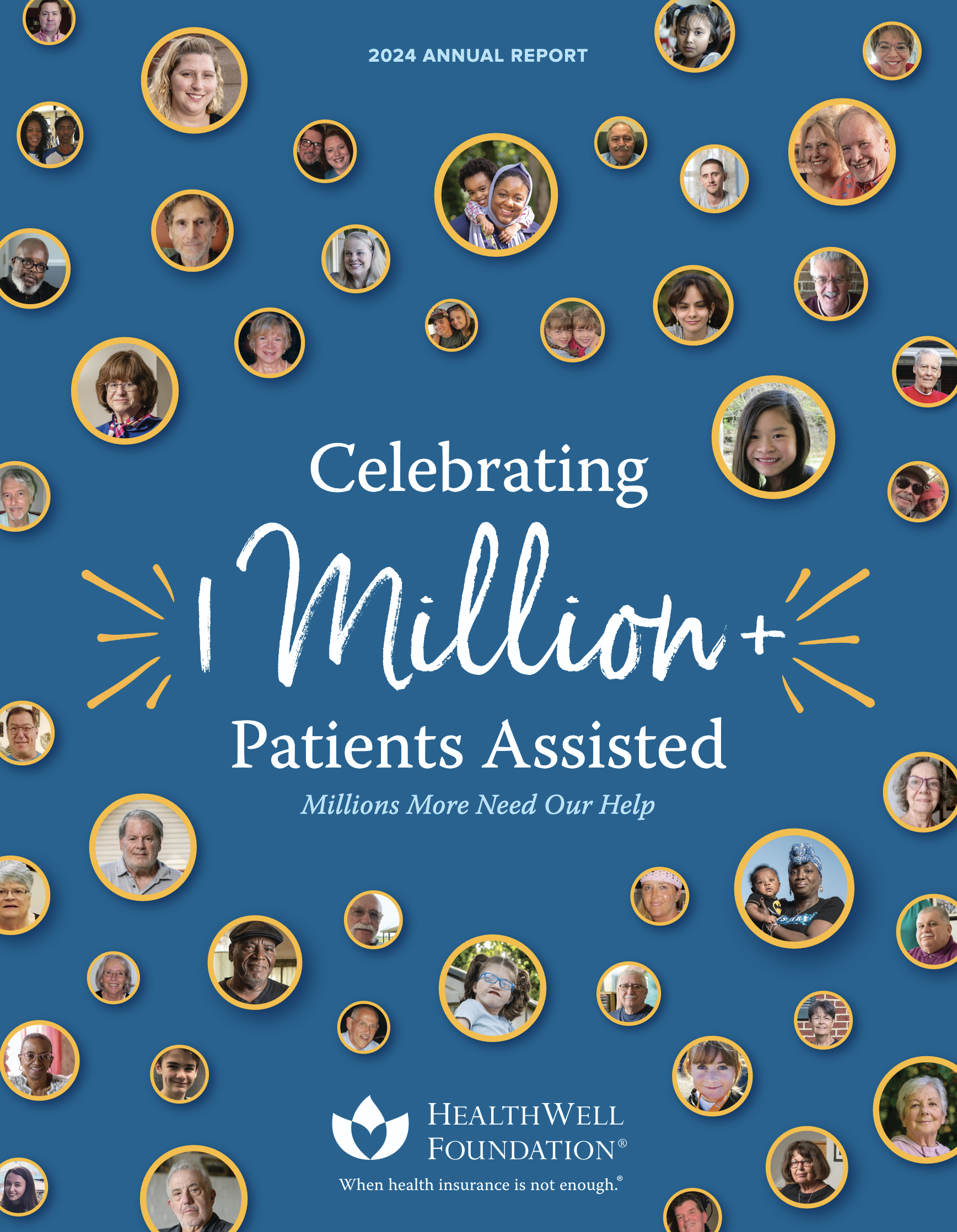
The number is clearly the first design layer. The faces around it calmly add to this focal point instead of competing with it.
And the sub-headline ("Millions More Need Our Help") directly speaks to the reader's place in the mission and calls on them to continue reading. It answers an unspoken question in the reader's mind.
"You've already achieved this much. What else can I do?” Well, here's what.
Type-only, with real conviction
If your photo library this year is genuinely bad (it happens, especially if your programs are confidential or your work is policy), stop apologizing for it and set a beautiful theme line at 96pt.
A confident type cover reads as intentional. A mediocre photo reads as "well, we needed a photo, so here you go."
Take a look at this 2024 Annual Report from Blood Cancer United (formerly the Leukemia & Lymphoma Society).

Direct, certain, bold, and active. Enough said.
A detail, not a scene
Hands. A doorway. A stack of files. There's more than one way to tell a story without a face.
Close crops and focused shots can carry more feeling than wide shots. Plus, they photograph better on a phone camera (which is what you probably have most of the time).
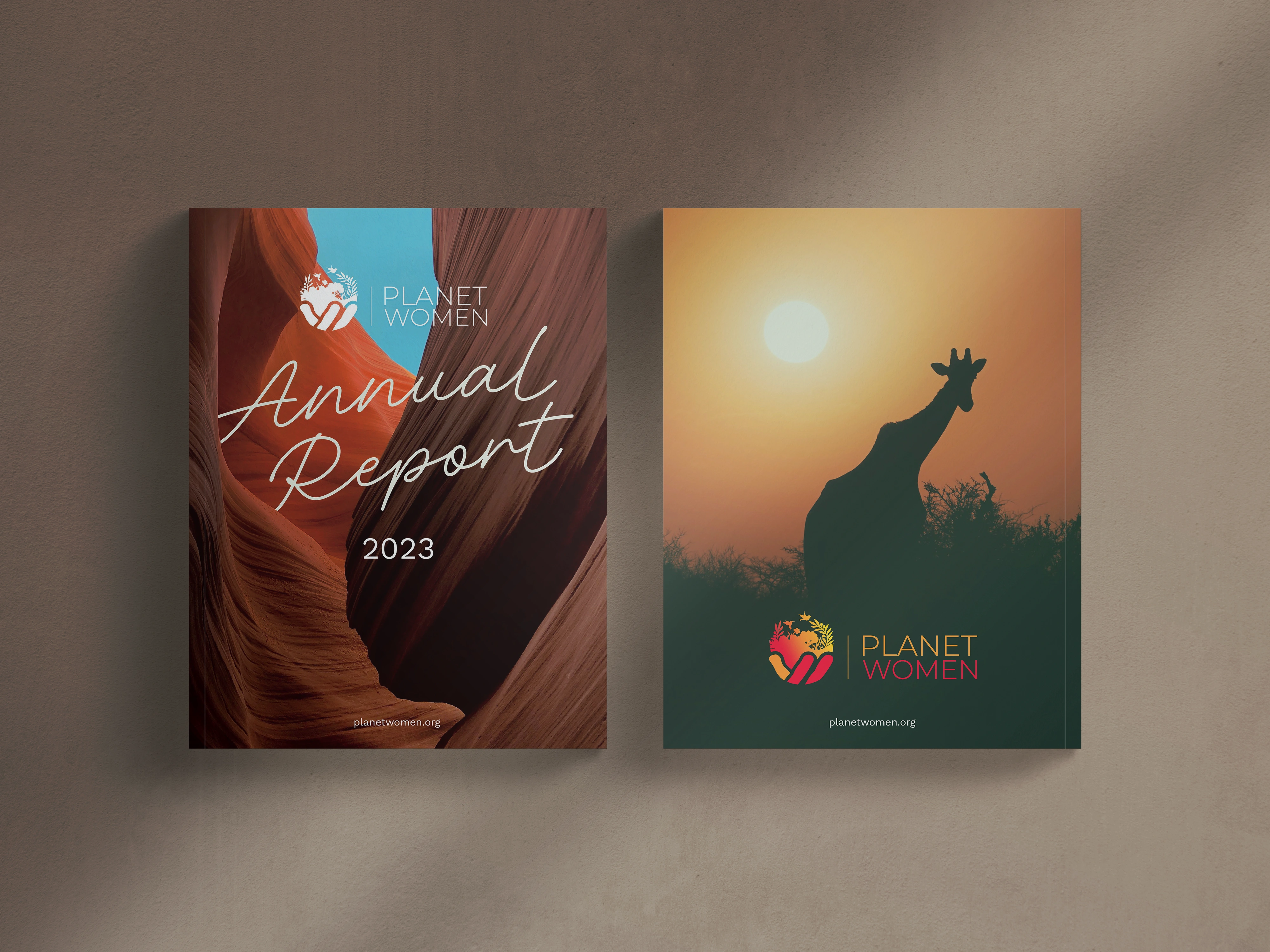
We worked with Planet Women to create their 2023 Annual Report. The cover didn’t have a person or a face, but it clearly reflected the environmental focus of their work.
The story and theme are fully there. And it didn’t need a forced image to say it.
The same structure, new content, every year
An annual report design cover template isn't necessarily boring. If done right, it builds recognition and reinforces your org's branding.
And a cover that's recognizably yours year over year? That does compounding work that a one-off never will.
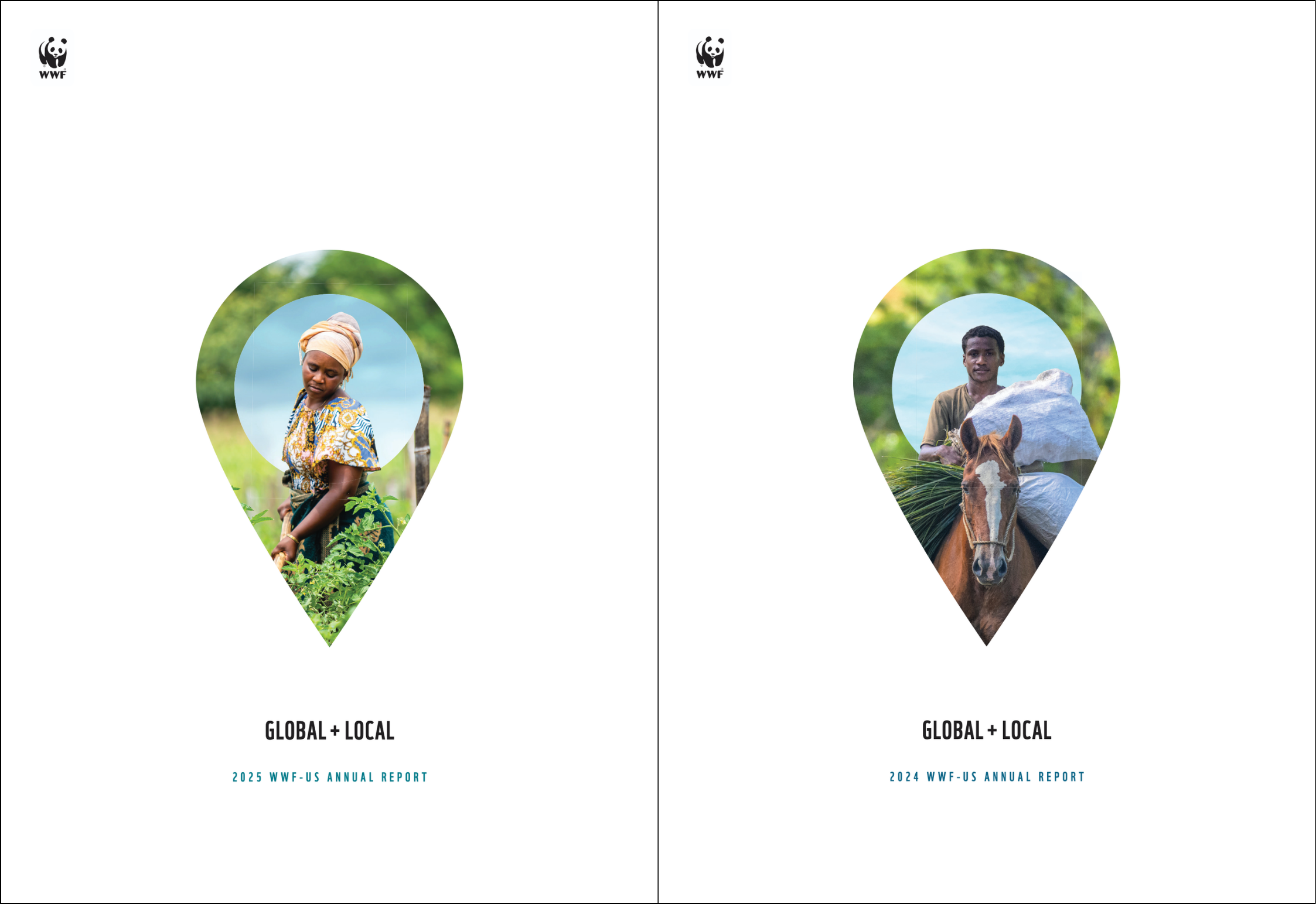
The World Wildlife Fund (WWF) does this exceptionally well. They understand the power of a recognizable brand and lean into it. Small logo, small type, lots of white space, and all the attention on the stylized cover image.
(More on how to achieve this below!)
Underrated (and Often Overlooked) Annual Report Design Cover Tips
The annual report cover ideas above will give you the framework and overall strategy. But the “small" decisions that come after that can still make or break your design. So… let's walk through them together.
Get The Annual Report Checkpoint
Donor Thank You Postcards Templates
Enter your info and we’ll send the postcards straight to your inbox:
Annual Report Template Kits
Turn a folder of half-finished docs into a donor-ready annual report, without hiring a designer or pulling another all-nighter.
1. Put the year's biggest thing on the cover
A community development director I talked with this month is finishing a restored historic theater block. $28 million, a decade of work, ribbon-cutting last week. When we got to the cover conversation, it took about 5 seconds. The theater leads.
Everything else her organization did is real, and it's in the body of the report. But the cover is for the one thing a stranger would repeat to somebody else.
That's the filter. Not "what represents all our programs." What would somebody tell their friend about?
Most covers fail this test because they're trying to be fair to every department. Fair is a good instinct for a budget and a bad one for a cover.
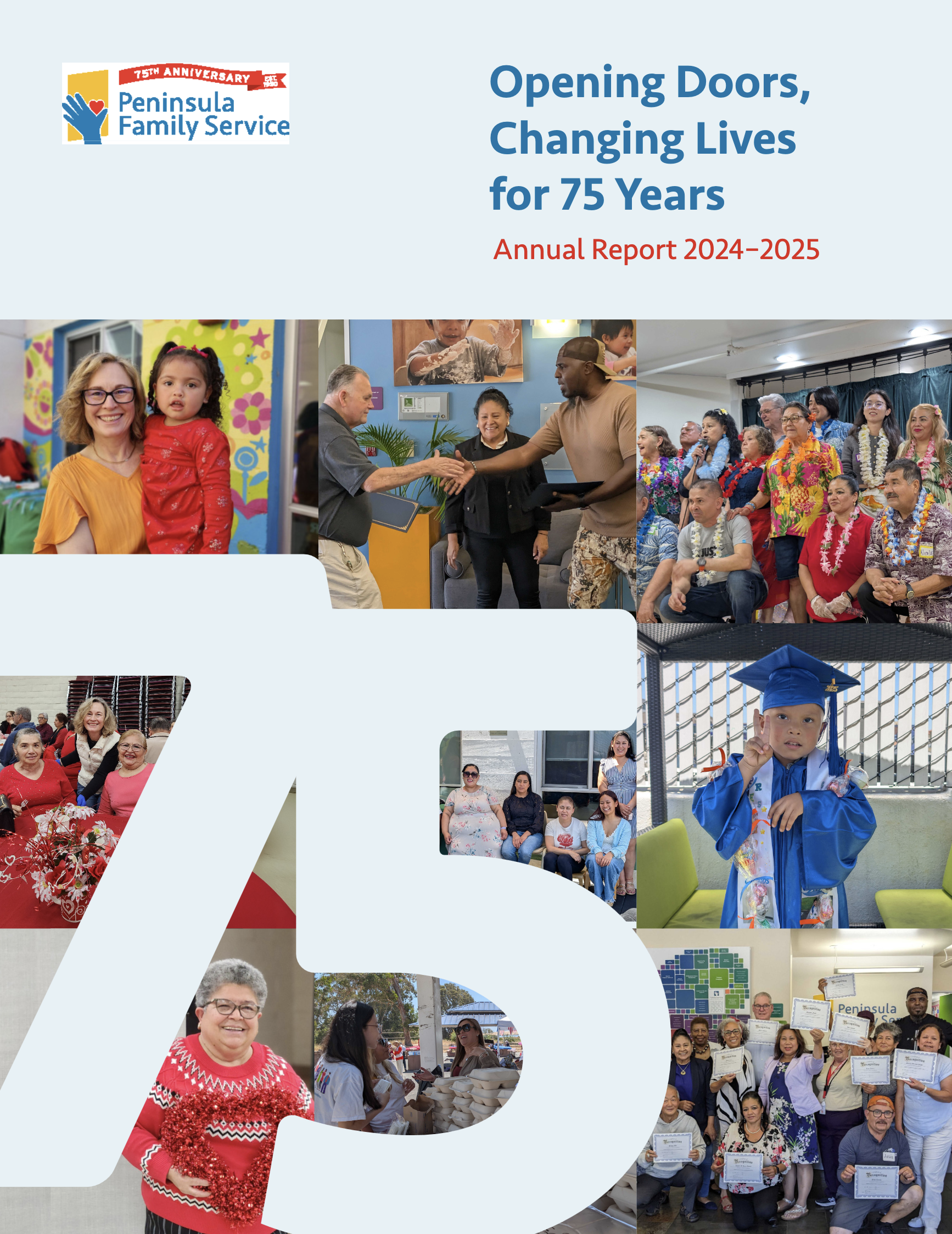
Peep Peninsula Family Service’s 2024-2025 Annual Report cover below (we designed it).
The organization was celebrating a major milestone: its 75th year. That was the inspiration for the entire report.
So, you've got the number as the first point of attention (layer one). And the theme line and accompanying images at layer two give an effective summary of what that milestone means.
2. Run the thumbnail test
I already mentioned this earlier, but it really bears repeating.
Roughly half your audience is opening your report on a phone, and a good chunk of them are seeing it first as a thumbnail in an email, a tile on your website, or a link preview in a text message.
So run the thumbnail test. Shrink your cover to about 150 pixels wide.
Can you still read the theme line? Can you tell what the image is? If not, your type is too small, and your photo is probably too busy. It doesn't matter how good it looks at full size because most people will never see it at full size.
While you're there, design the cropped versions at the same time you design the cover. Your cover is going to live a second life as an email header, a LinkedIn image, an IG story, and a mailer teaser. Build it once with those sizes in mind instead of chopping it up in a panic in November.
3. Accessibility belongs on the cover, too
This one is skipped by literally every article I read while researching this piece, which is wild for a sector that cares as much as ours does…
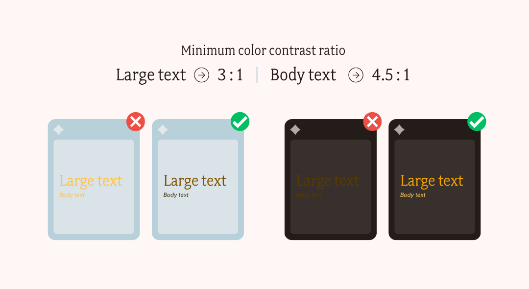
Your title over a photo needs a contrast ratio of at least 4.5:1 for body-size text and 3:1 for large display type. Run it through a free contrast checker if you must.
If your brand color fails against white (a lot of oranges and yellows do), don't abandon the color. Instead, create a darkened variant that's reserved for text and write that into your brand guide.
Trust… your funders are increasingly asking about this, and (more importantly) some of your donors need it.
4. Stop thinking it’s “simple" when it's really “trustworthy”
Corporate design blogs will tell you to go bold, go glossy, add a foil stamp. Well, that advice doesn't survive contact with a nonprofit board.
You're designing under a constraint no corporate report has: your cover has to look intentional enough to earn trust, and grounded enough that a donor doesn't think you spent their gift on it. That's a real tension, and pretending it isn't there is how orgs end up with covers that don’t resonate with their community.
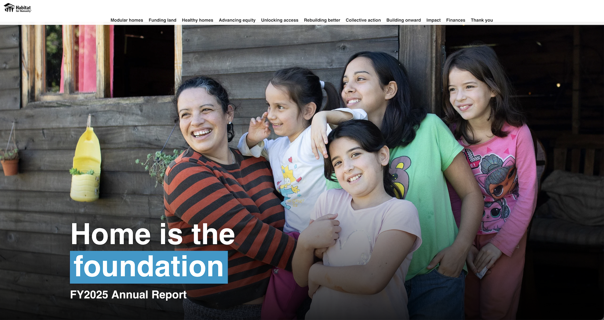
This 2025 Annual Report from Habitat for Humanity shows a great example of a digital cover that's grounded but impactful. It’s intentional, and it respects the hierarchy that makes an annual report cover look like it means and represents something.
Print Specs Your Designer Needs to Know
Every article about covers says "don't ignore print specifications" and then never names one. Well, here they are.
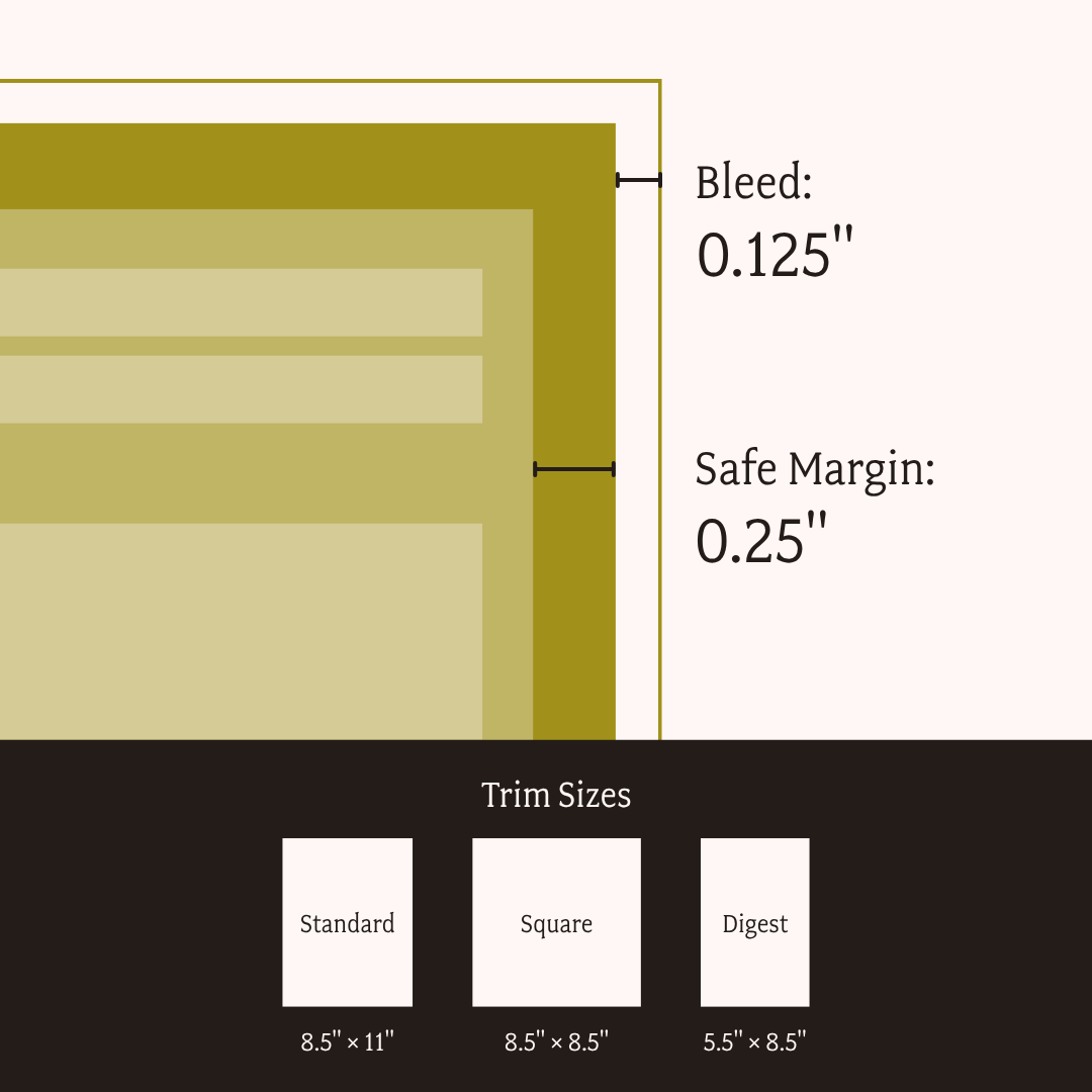
- Trim size: 8.5 x 11 is standard and cheapest. A square (8.5 x 8.5) reads as more designed and costs slightly more. Digest (5.5 x 8.5) is great for mailing and forces you to edit.
- Bleed: 0.125" on all sides if any color or image runs to the edge.
- Safe margin: keep type at least 0.25" inside the trim. Cutting is not perfectly accurate.
- Resolution: 300 DPI at final size. A 72 DPI web photo blown up to a full cover will look exactly as bad as you fear.
- Color: CMYK for print, RGB for screen. Your brand blue will shift when it converts. Ask your printer for a proof if the color matters to you.
- Export: PDF/X-1a or PDF/X-4, fonts embedded, not "Smallest File Size."
If you're handing this off to a printer, ask for a physical proof on the actual paper. Screens lie about paper.
Common Annual Report Cover Mistakes
And lastly, let's make sure you skip the issues I see happen time and time again.
Basic design mishaps (because it happens all the time)
Elementary for some. Absolutely necessary reminders for those who usually work alone with Canva and a dream (and if you're reading this piece, chances are that's you).
- Treating it as a title page.
"2026 Annual Report" is a file name, not a cover. - Two elements competing for attention.
Pick one thing to be biggest. - A theme line too long to set large.
Cut it to nine words. It'll mean more. - Stock photography.
Your real photos, even imperfect ones, beat a purchased smile. - Type that dies at thumbnail size.
Run the 150px test. - A cover that doesn't match the inside.
If the cover promises warm and human and page 3 is a wall of Calibri, you've broken the promise on the first turn. - Ignoring bleed and safe margins.
Then wondering why the title got trimmed. - Starting from scratch every year.
You're throwing away recognition you already paid for.
Picking the cover image (the “how” and “why")
Before you pick the cover image, ask whether the person in it knows it's going on the cover. Remember… your first ethical responsibility is to your community.
Consent for a program photo is not consent for a cover. A cover gets printed, mailed, posted, screenshotted, and lives on your site for a decade. Get specific, written, cover-level permission, and give people a real option to say no without any consequence to their benefits.
Next, make sure the image you're choosing follows these 2 rules I bring to every project:
- The cover image should be about the community, not the organization. A photo of your staff at a training is a photo of your ops, and it belongs on the team page.
- The cover is the one page with no room to explain itself. If an image needs a caption to make sense to someone who doesn't know your work, it isn't a cover image.
And if you're shooting anything new this year, shoot for the cover on purpose: horizontal, with open space at the top where a headline can sit, at the highest resolution your camera does, and a mix of tight and wide so you have options in October.
Giving that instruction before the event (instead of after) is the whole difference between a cover you chose and a cover you settled for.
Writing the theme line
This is the craft problem hiding inside the design problem, and almost no one treats it as one.
Your theme line is not your report title, and it's not your mission statement. It's the sentence that says what this year was. Short enough to set large, specific enough to mean something.
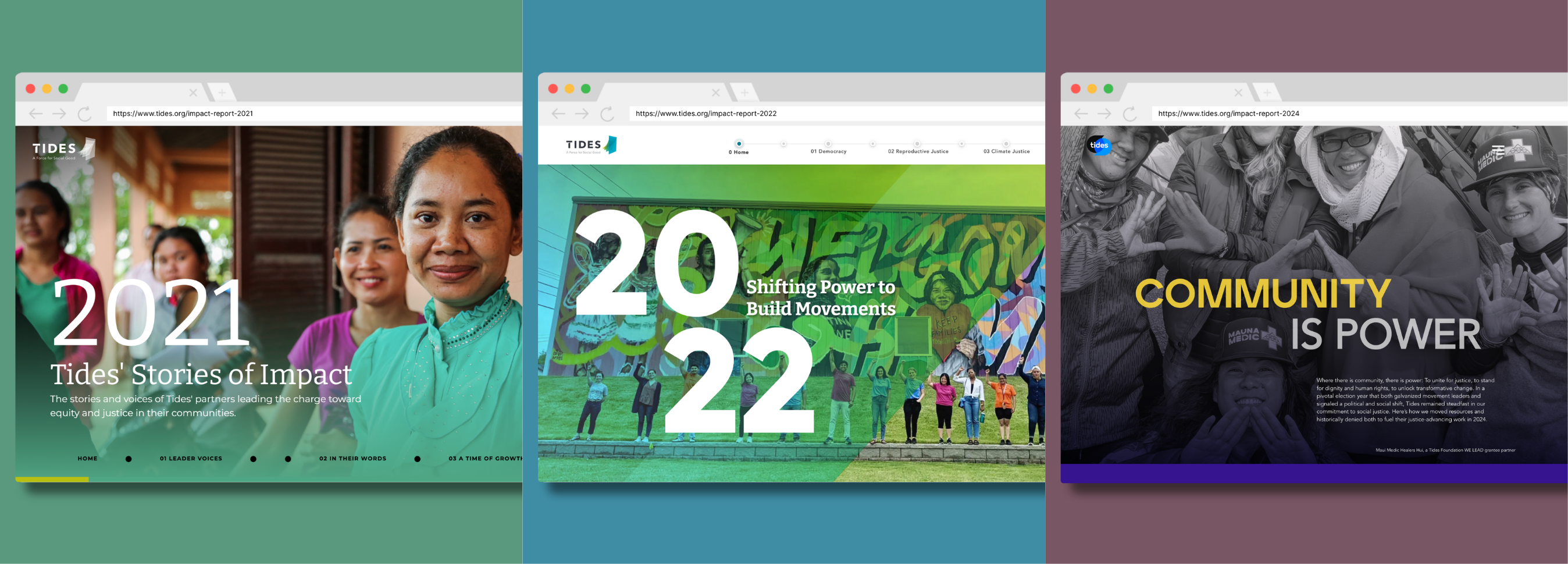
The theme line became the springboard for the annual report microsites we created for Tides Foundation.
Every cover design choice came from one question: what's the one thing your team wants supporters to immediately understand about your work this year?
Once we had that, we knew how to structure the cover and interior pages to reflect the org's mission, progress, goals, and impact.
So, two rules. First, keep it under about 9 words. Past that, you can't set it big enough to be layer one.
And author your own line breaks. Where a line breaks changes how it's read, and letting the text box decide is how you end up with an orphaned "the" sitting alone at the bottom.
FAQs: Annual Report Design Cover
What should be on the cover of an annual report?
Your organization's name or logo, the report title, the year or reporting period, a theme line, and one primary image. Optionally, a single headline number. Leave financials, board lists, and partner logos for the inside.
What size should an annual report be?
8.5 x 11 inches is the standard and the most cost-effective to print and mail. Square (8.5 x 8.5) and digest (5.5 x 8.5) are both good alternatives if you want the report to feel more designed or more mailable.
Should the cover match the rest of the report?
Yes, and more than most people mean by "match." The cover sets the expectation for typeface, color, photo treatment, and tone. If the interior doesn't deliver on it, the reader feels the drop immediately, even if they can't name why.
Should we put an impact number on the cover?
Only if it's genuinely surprising and can stand without explanation. A number that needs a subtitle might be better off on page 2.
Can we design the cover in Canva?
Absolutely, as long as you set up bleed correctly, work at 300 DPI, and export a print-ready PDF. Canva can make it very easy to skip the print setup entirely.
Build an Annual Report Design Cover Template You Can Reuse
You're going to do this again next year. And the year after that.
So decide now what stays fixed and what changes. Most likely…
- Fixed: the grid, the type scale, where the logo sits, where the year sits, the margins.
- Changing: the image, one accent color, the theme line.
If your team is building in Canva, lock this into a Brand Kit so that the wrong colors aren't even clickable. If you're in InDesign, build it as a parent page. Either way, write the rules down somewhere that survives staff turnover.
Do all this today, and the payoff is recognition.
A donor who's gotten 4 of your reports and can identify yours across the room before reading a word has a relationship with your organization that no beautiful, one-off cover can manufacture. Consistency is what makes you look your actual size.
And if you need help getting started, our Annual Report Template Kits include a full report and matching launch suite, designed with donor psychology baked in and ready for your story in Canva.