Donors don’t give to be celebrated. But recognizing them well? That’s how you build connection, earn trust, and inspire future support.
Thoughtful design turns appreciation into something people can see and feel—not just skim past in their inbox. And yes, it makes a real difference in donor loyalty.
Here’s how to do it right.
Start with Brand Alignment
Donor recognition should feel like an extension of your mission. If the visuals look like a totally different organization made them, you’re missing a chance to deepen trust.
Stay true to your brand style. If your work centers on education, your design should feel bright and energetic. If you focus on healing, lean into calm colors and grounded imagery. Your visuals should feel like part of the story, not a side note.
Why Design Matters in Recognition
Design isn’t just decoration. It shapes how your message is received.
When your thank-yous are visually thoughtful, donors are more likely to remember the moment. That feeling is what keeps them connected not just to the cause, but to your organization specifically.
This doesn’t mean overproduced or overly polished. Just intentional. Clean layouts. Real photos. Clear hierarchy. Small details, well-executed.
How do donors like to be recognized?
Most people don’t want fanfare. But they do want to know their gift mattered.
This could be as simple as a well-designed social graphic with their name and the impact they made. A spotlight in your newsletter. A short email that says, “Thanks to your gift, 40 students started the year with new supplies.”
And yes, it should look like you took time on it.
The more personal and specific, the better.
How do you make donors feel appreciated?
Be clear. Be visual. Be sincere.
Show the outcome of their gift in a way that feels human. That might mean a collage from a recent event, a quote from someone their donation supported, or a brief video with your team saying thanks.
If you’re sending physical mail, keep it short and beautiful. A branded card, a small art print, or a simple handwritten note—whatever fits your voice and feels intentional.
What is a good gift for donors?
You don’t need to send a gift to show appreciation. But if you do, make it meaningful.
Skip the generic swag. Send something with purpose: a mission-themed art print, a mini photo book, a short story zine from your community, or a calendar filled with donor quotes and program milestones.
If it looks like something they’d proudly keep on their desk or wall, you’re on the right track.
Creative Donor Recognition Ideas
When you’re ready to try something new, start here:
- Illustrated thank-you cards that connect to your mission
- Infographics showing impact in your donor emails
- Donor portraits or stories featured in a designed spotlight
- An interactive digital timeline for recurring supporters
- Art prints mailed after major gifts—designed, not just branded
These ideas don’t require a huge team, just some thoughtful planning (and strong templates don’t hurt either).
How to creatively ask for donations?
Visuals help your ask land faster and stick longer.
Instead of a dense letter, try a graphic that shows what different gift levels support. Design a small comic strip that walks through a real success story. Use imagery that connects emotionally, and a message that’s direct and human.
You’re not just asking for money—you’re asking someone to join in on real, visible impact.
Design Tips for Donor Recognition
Want your visuals to land well every time? A few musts:
- Use your brand colors and fonts consistently
- Keep text minimal—let the visuals carry weight
- Always highlight results, not just actions
- Make sure everything’s mobile-friendly
- Refresh key templates yearly so they don’t feel stale
No need for overdesign. Just clarity, warmth, and a little attention to detail.
Why Storytelling Through Design Builds Loyalty
Impact is emotional. So is giving.
Use visuals to make that connection real. A bar graph with smiling faces. A quote overlaid on a photo of someone helped. A handwritten message paired with a clean layout and calming imagery.
People remember how your message made them feel. That’s the moment you’re designing for.
How can your annual report support recognition?
Your annual report is a reflection of your values, your wins, and your community. Don’t waste the chance to celebrate your donors inside it.
Highlight top supporters. Include name clouds, program-specific shoutouts, or clickable donor notes in a digital version. Show how gifts translated into impact, visually and clearly.
Keep it readable, visual, and warm. Your report should feel like a celebration, not a checklist.
Make Every Thank-You Count
Donor recognition doesn’t have to be complicated, but it should be intentional.
With the right design, even a simple thank-you can deepen trust, spark emotion, and keep your mission top of mind. These small touches add up. They help donors feel seen, not just thanked.
If you’re ready to take that first step, we’ve got you.
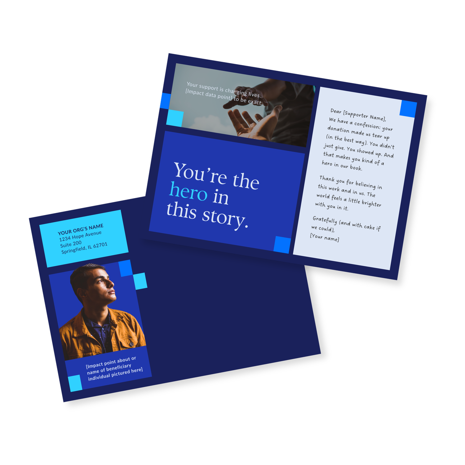
Download our free thank-you card templates below designed to feel personal, polished, and aligned with your mission.
.avif)
Get The Annual Report Checkpoint

The Belief-Building Annual Report Playbook
Enter your info and we’ll send the postcards straight to your inbox:

Donor Thank You Postcards Templates
Enter your info and we’ll send the postcards straight to your inbox:

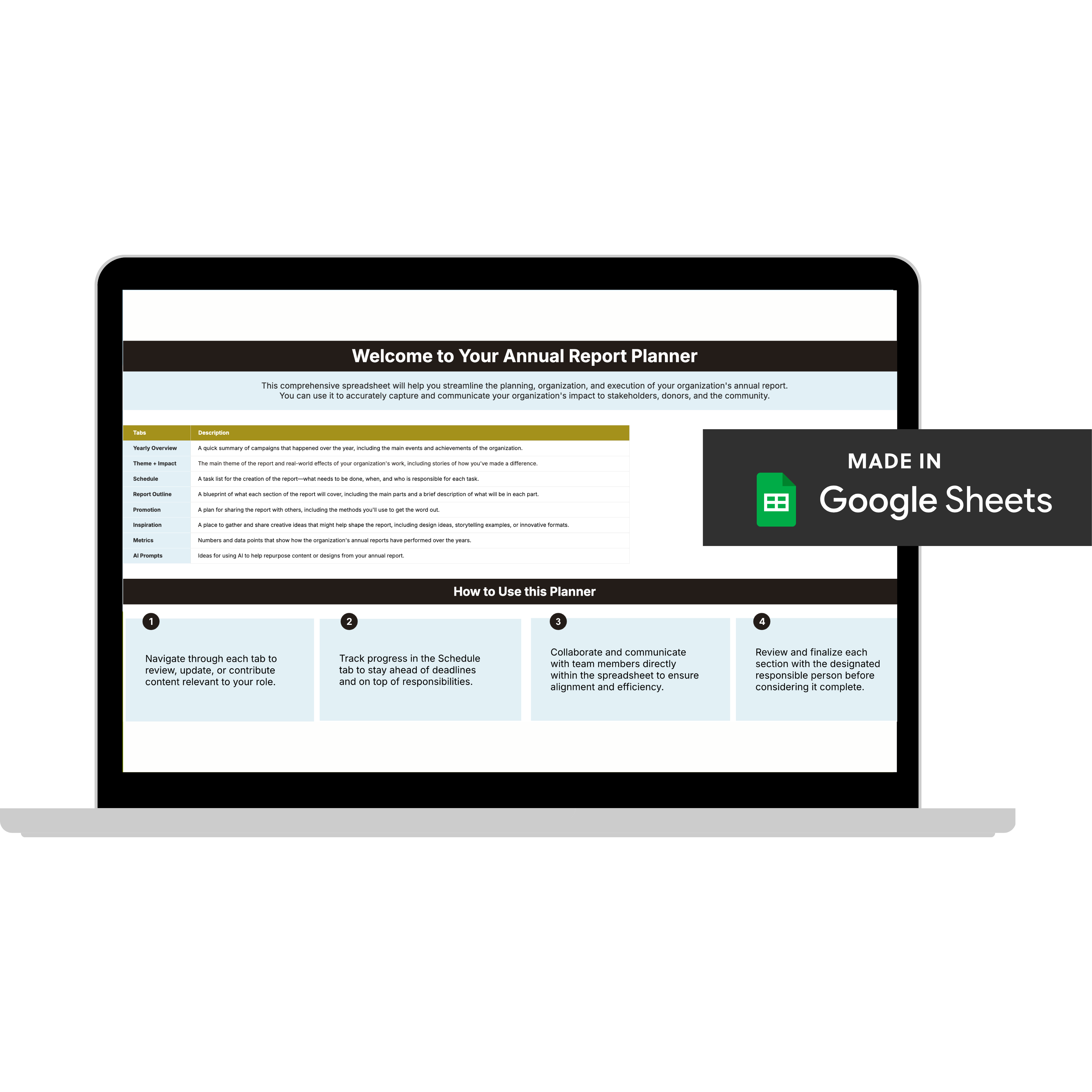
Annual Report Planner
Get a clear content roadmap so your annual report builds belief, earns trust, and actually gets used after launch—plus the same planning approach we use with our 1:1 clients, built in.


