Ask a nonprofit comms lead what needs to change about last year's annual report and you'll hear some version of the same answer: the design. More visual. More modern. More polished.
And look, design DOES talk first. But polishing the wrong thing is how you end up with a very expensive (and pretty) report that still doesn't move donors to action.
So what's the problem? Usually one of four things. And honestly, knowing which one changes everything.
Four Problems That Look Like Bad Design But Aren't
I see these constantly. And they almost always get blamed on design.
Your story isn't clear enough.
Not unclear like confusing. Unclear like uncommitted.
The report tries to honor every program, acknowledge every partner, celebrate every milestone. Which is understandable. But supporters don't need the full picture. They need a CLEAR one.
When a report doesn't have a through line, readers absorb facts without the pieces connecting. They finish knowing THINGS about your organization without believing ANYTHING about it. That's the gap. And it's a content decision, not design.
You can't design your way to a through line that isn't there.
Your opening doesn't grab confidence fast.
Most leadership letters open with gratitude and bury the point around paragraph three. Donors aren't waiting.
The opening has ONE job: make them feel like this org knows what it's doing.
A strong opening doesn't need to be dramatic. It needs to be specific.
"We served more families this year" is forgettable. "This year, we crossed a threshold we've been building toward for a decade" makes someone turn the page.
Specificity wins. Every time.
.avif)
Get The Annual Report Checkpoint

Donor Thank You Postcards Templates
Enter your info and we’ll send the postcards straight to your inbox:
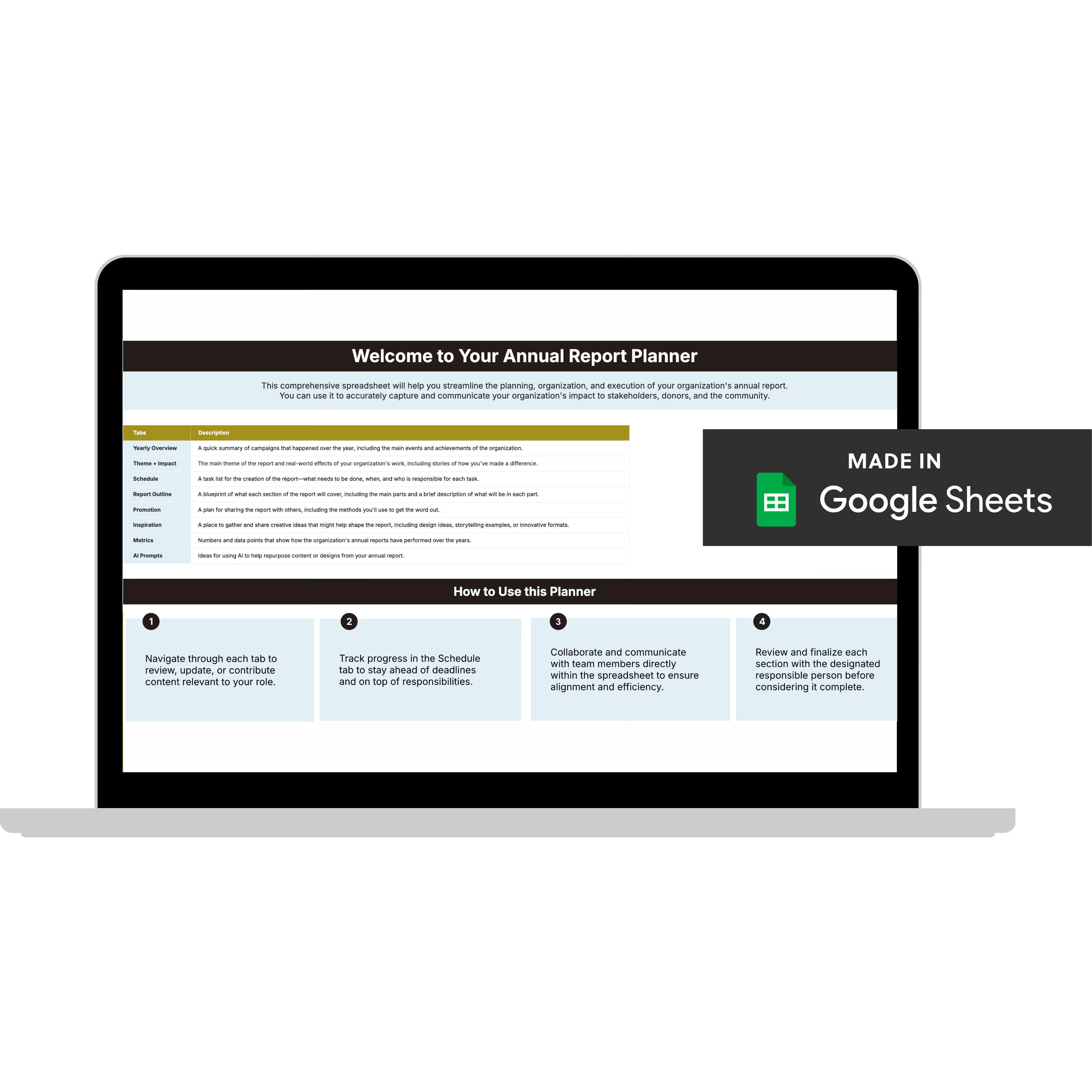
Annual Report Planner
Get a clear content roadmap so your annual report builds belief, earns trust, and actually gets used after launch—plus the same planning approach we use with our 1:1 clients, built in.
Your strongest proof is on page nine.
This one's so consistent it might as well be sector tradition. The stat that would stop a donor cold. The story that makes the work real. The outcome that justifies every dollar. Buried in the back.
It happens because most teams organize reports the way they organize work: by program, by quarter, by department. That makes internal sense, but it's not how supporters read.
Supporters are looking for evidence that their investment is going somewhere meaningful.
Lead with your strongest proof and build trust early. Then go deeper.
Your format doesn't guide anyone anywhere.
A report without a reader journey is just organized information. Pretty, maybe. But aimless.
Every section should answer two questions:
What does this tell supporters?
And where does it lead them next?
You don't need more CTAs or an aggressive layout. Design a sequence that builds on itself. Each section points forward.
By the end, supporters don't just know more, they feel something. That's the difference between a report that gets glossed over and one that gets SHARED.
Why Teams Keep Solving the Wrong Problem
When something feels off, the most visible fix is how it looks. Design is tangible. You can mark it up, present changes, get sign-offs on color palettes.
Unclear strategy is harder to name and harder to fix.
So teams polish. The report looks better, but underneath, the problem is still there just wearing a nicer layout.
Here's what I see from working with 60+ nonprofits: the ones with the strongest donor response figured out their story BEFORE anything got designed. That's what changes the outcome.
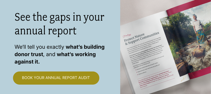
The Annual Report Audit
Before you spend money on a redesign, figure out which of these four problems is yours.
The Annual Report Audit is where we start. Bring your current report to a 45-minute call, and I'll score it against our BELIEF by Design™ framework, developed through 7 years and 65+ nonprofit partnerships. What's working, what's working against you, and which problem to fix first.
You'll walk away with:
✅ Every gap in your report, named
✅ What each one is costing you in donor response
✅ Your #1 fix, prioritized and ready to act on
✅ The scores, yours to keep (with us or without us)
Everything else (the design, the templates, the full-service work) flows from here. But this is where we start.