The best interactive digital annual report examples have one thing in common: they don't feel like reports at all.
More nonprofits are ditching the static PDF for interactive digital annual reports, and the difference is aesthetic AND strategic.
A well-built digital report makes donors feel like they're inside the mission, not reading about it from the outside.
I pulled together 12 interactive digital annual report examples from nonprofits doing this well, including a few we had the privilege of building at Acton Circle.
If you're thinking about what your next report could look like, these are worth sitting with.
What is an interactive annual report?
Not every "digital" report is interactive. A PDF uploaded to your website is digital. It is not interactive.
An interactive annual report is a web-based experience, one where design and content work together to pull donors through the story rather than hand them a doc and hope for the best.
Think smooth scrolling that reveals content as you move through the page. Animated data visualizations that make numbers feel like something. Clickable sections, embedded video or audio, maps that move.
Done right, your report becomes the thing that keeps your org top of mind between campaigns.
If you're still weighing whether digital is right for your organization, I wrote a full breakdown on digital vs. print annual reports that might help you decide.
12 Interactive Digital Annual Report Design Examples Worth Studying
Here are 12 nonprofits doing this well, and the specific choices that make their reports work.
1. YLabs: Vibrant Storytelling That Earns Attention
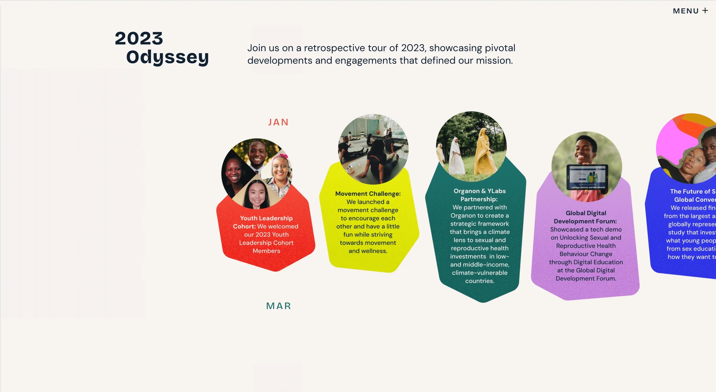
YLabs creates tech that amplifies youth power, agency, and opportunity. Their report moves the way their mission does, with ENERGY.
Content fades in and slides into place as you scroll, giving the page a sense of momentum rather than density.
Bold colors, clean sans-serif type, and geometric shapes (triangles, hexagons) reinforce the tech-forward brand without overwhelming the story underneath.
The design looks good AND it feels unique to the org.
The takeaway: Your report's energy should match your mission's energy. If your work is dynamic, your design should be too.
2. Feeding America: Big Numbers, Bigger Impact
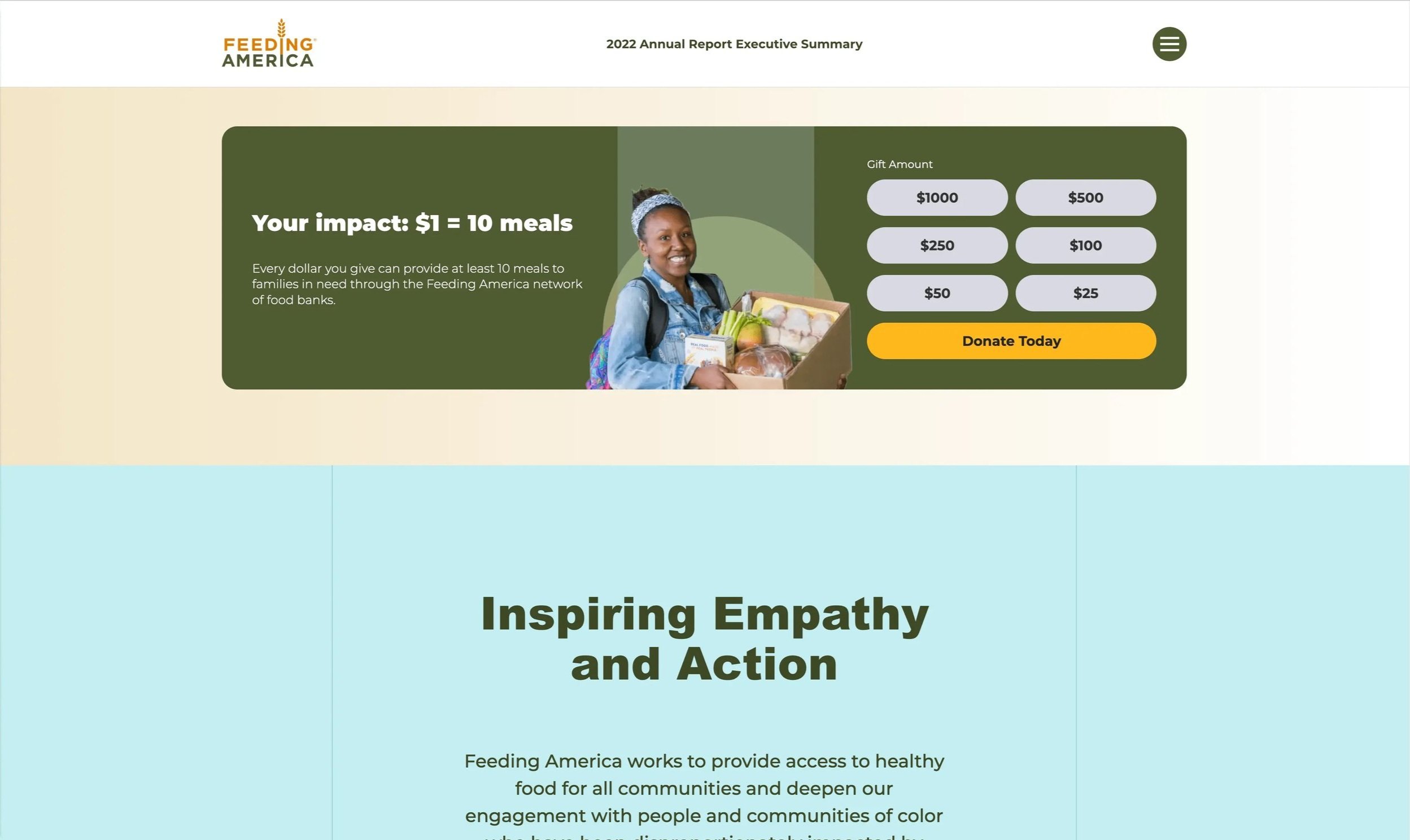
Feeding America provided 5.3 billion meals to people facing hunger in 2022. That number alone is a HUGE deal, and their report makes sure readers grasp the significance.
Large, bold statistics are presented visually so donors understand the scale immediately, without having to hunt for it. CTAs are woven throughout the page in a way that feels natural, not pushy. They invite action without interrupting the story.
The takeaway: Most orgs underestimate what their data could do with the right design behind it.
3. Girls Who Code: Making Supporters Feel Seen
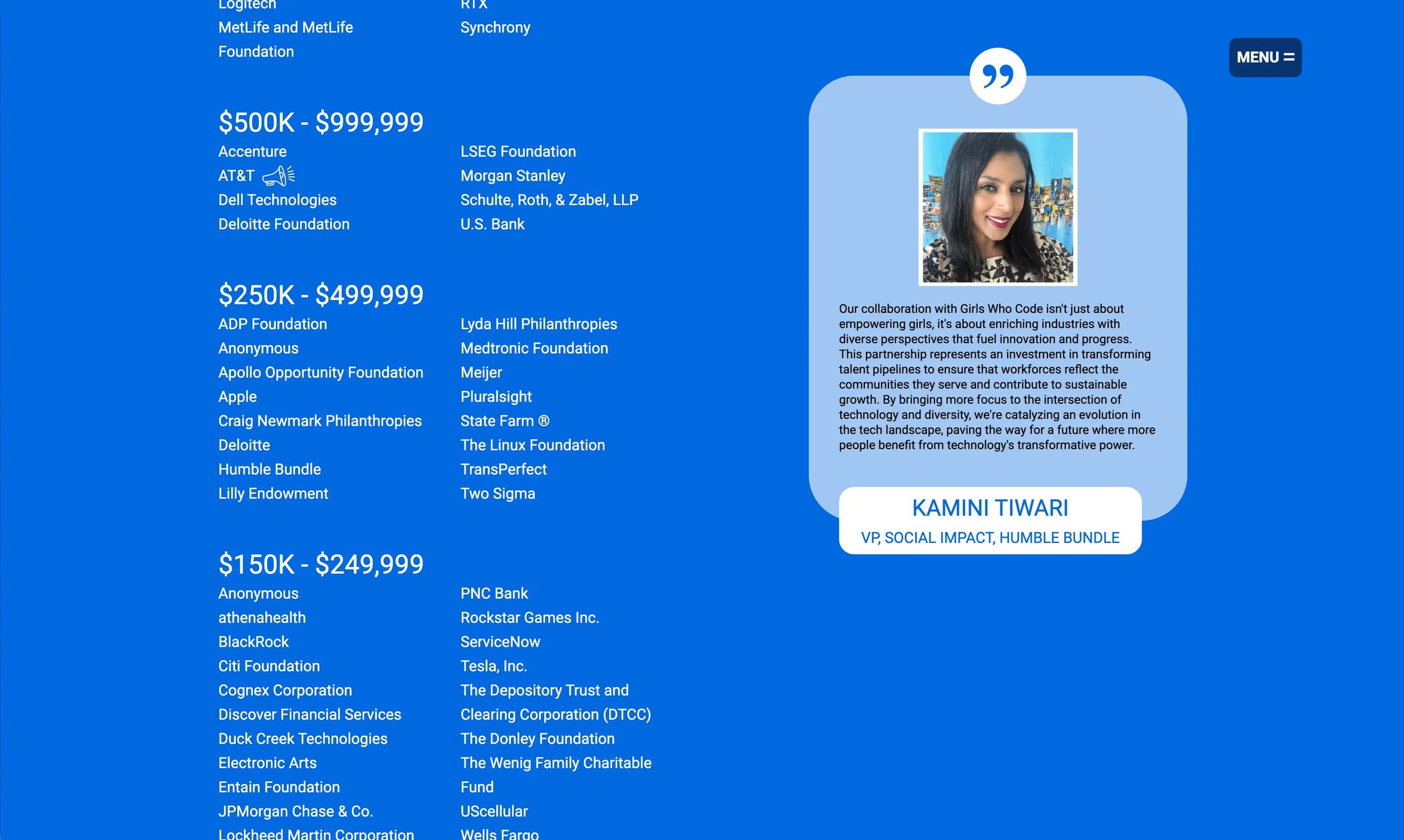
Girls Who Code works to close the gender gap in tech. Their report does something smart with the partner section. Instead of a static list of logos, individual partner images scale up and cycle through as you scroll, making each supporter feel highlighted rather than catalogued.
They also embed social media posts and video directly in the report, which adds texture and reminds donors this is a living, breathing org and not a once-a-year doc.
The takeaway: The way you feature your partners and supporters in your report tells them how much they matter to you. Make it feel like more than a credits roll.
Need more ideas for how to make your donors feel seen in your report? This article's for you →
4. San Diego Foundation: Clean, Responsive, Everywhere
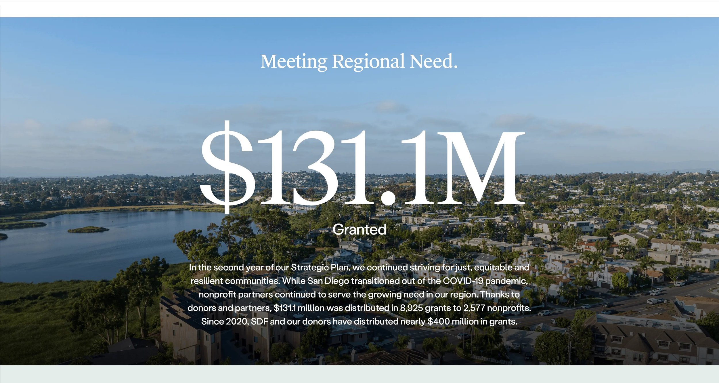
The San Diego Foundation's report does something a lot of orgs overlook: it looks just as good on a phone as it does on a desktop.
Color-coded sections make navigation intuitive. The minimalist layout keeps the focus on the content, not the design. It's not the flashiest report on this list, but it's one of the most accessible, and that is essential when your donors are reading on the go.
The takeaway: A report your donors can't read on their phone is a report half your donors won't read.
5. Tides: Bold Imagery, Clear Story (Acton Circle)
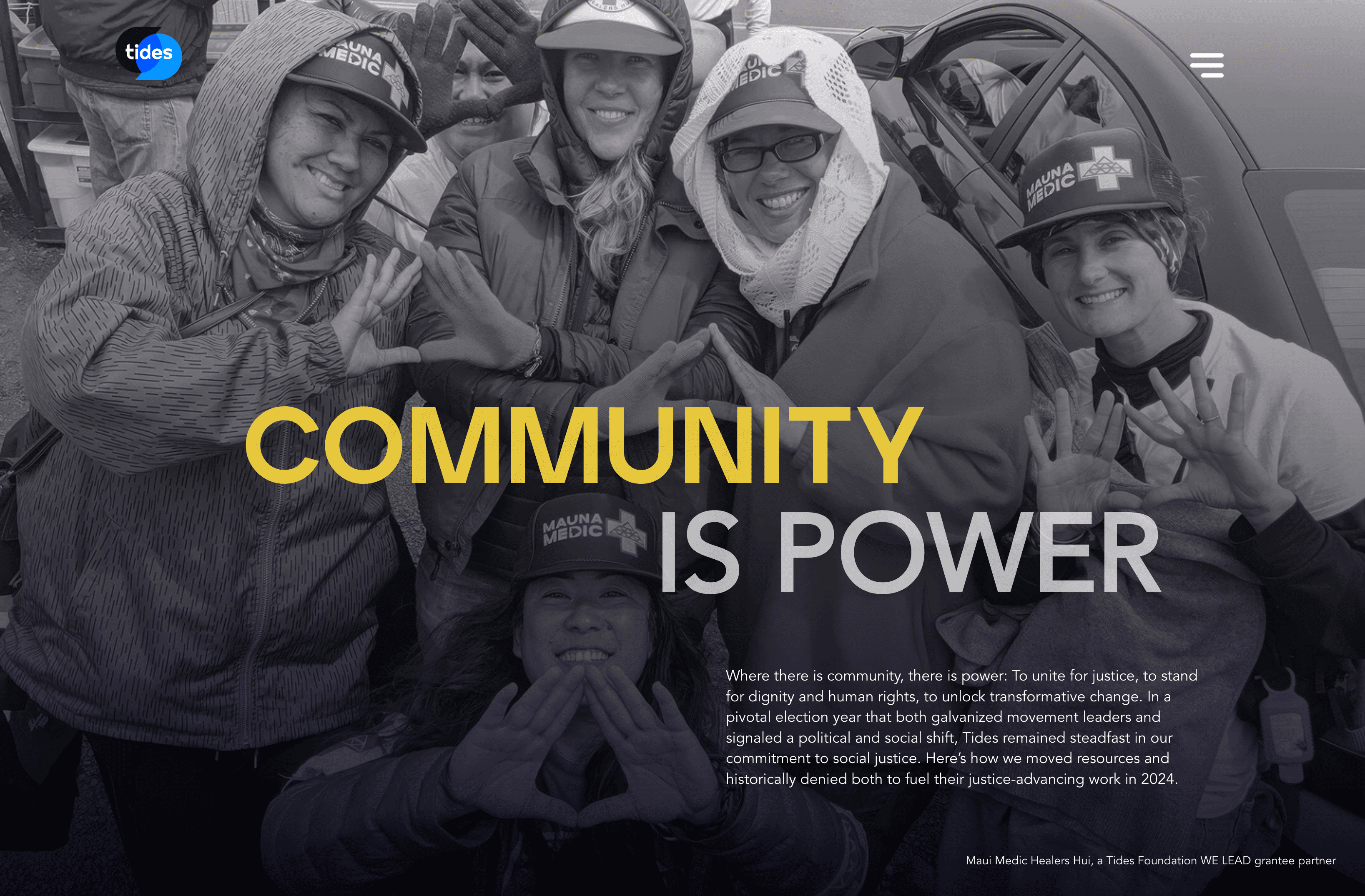
This one is close to my heart because we built it (1 of 3 interactive reports to be exact).
Tides advances social justice and equity, and their report needed to feel as expansive as their work.
Striking full-layout photography greets visitors as they scroll, with color choices that complement rather than compete with the imagery.
Each section focuses on a distinct aspect of Tides' work, so donors move through the report with a clear sense of where they are and what they're learning.
Bold visuals can carry a lot of narrative power when they're chosen with intention. This report does that well.
The takeaway: Photography is the fastest way to make a donor FEEL something before they've read a word.
6. 10,000 Degrees: Data That Moves (Acton Circle)
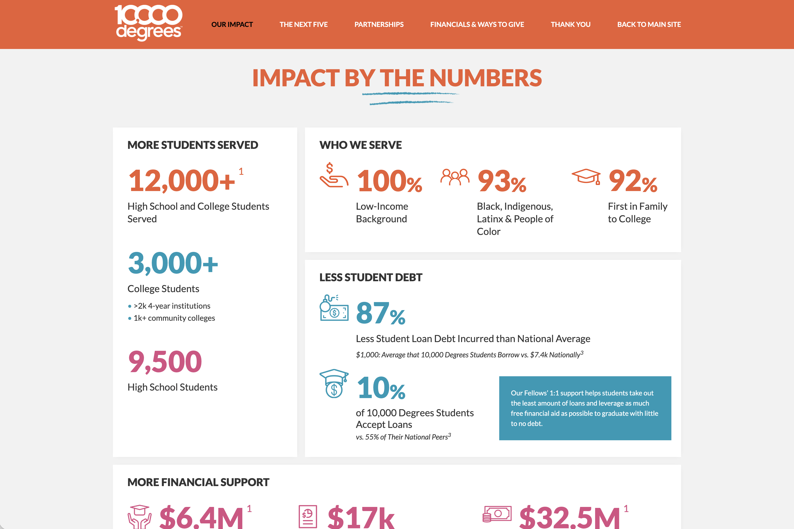
10,000 Degrees helps low-income students earn college degrees, and the data behind that work is genuinely compelling. The challenge is making it feel that way on the page.
Their report uses animated charts and graphs that come to life as you scroll, drawing attention to the right numbers at the right moment. Content is revealed progressively so donors aren't confronted with a wall of info, they're guided through it.
We loved building this one. The story was strong and we made sure the layout was too.
The takeaway: Motion draws the eye. That's it. Use it where your most important numbers live.
.avif)
Get The Annual Report Checkpoint

Donor Thank You Postcards Templates
Enter your info and we’ll send the postcards straight to your inbox:
7. National Geographic Society: When a Photo Says What a Paragraph Can't
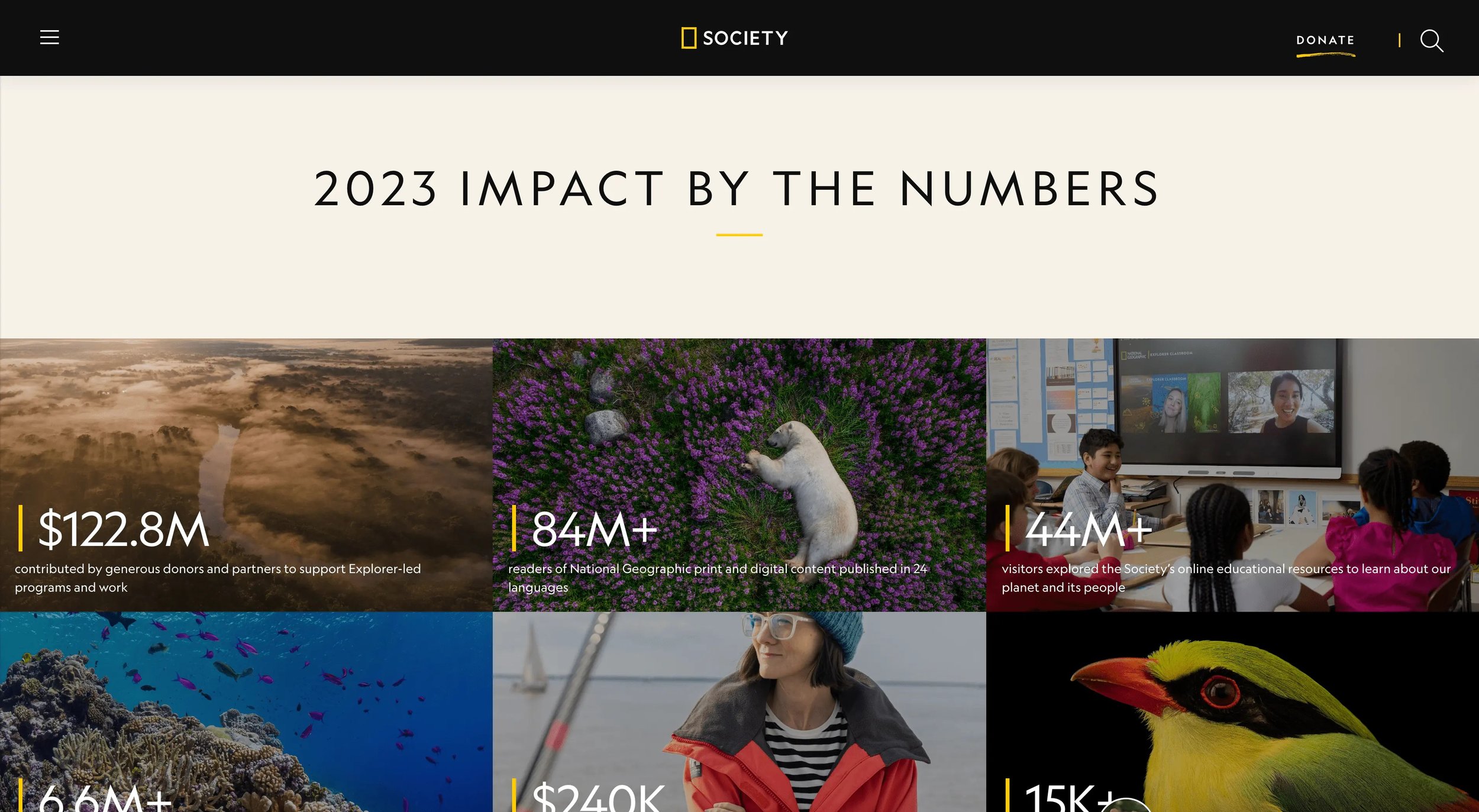
National Geographic has a visual legacy to uphold, and their annual report doesn't let that slip.
High-quality photography of wildlife, landscapes, and fieldwork communicates global reach instantly.
A "Year in Review" video pulls together expeditions, interviews, and key moments into something donors can watch in minutes and feel like they've been somewhere.
The takeaway: If your work happens in the field (with people, in communities, in the world) show it. Not stock photos. REAL glimpses.
8. Mellon Foundation: Report as Editorial Experience
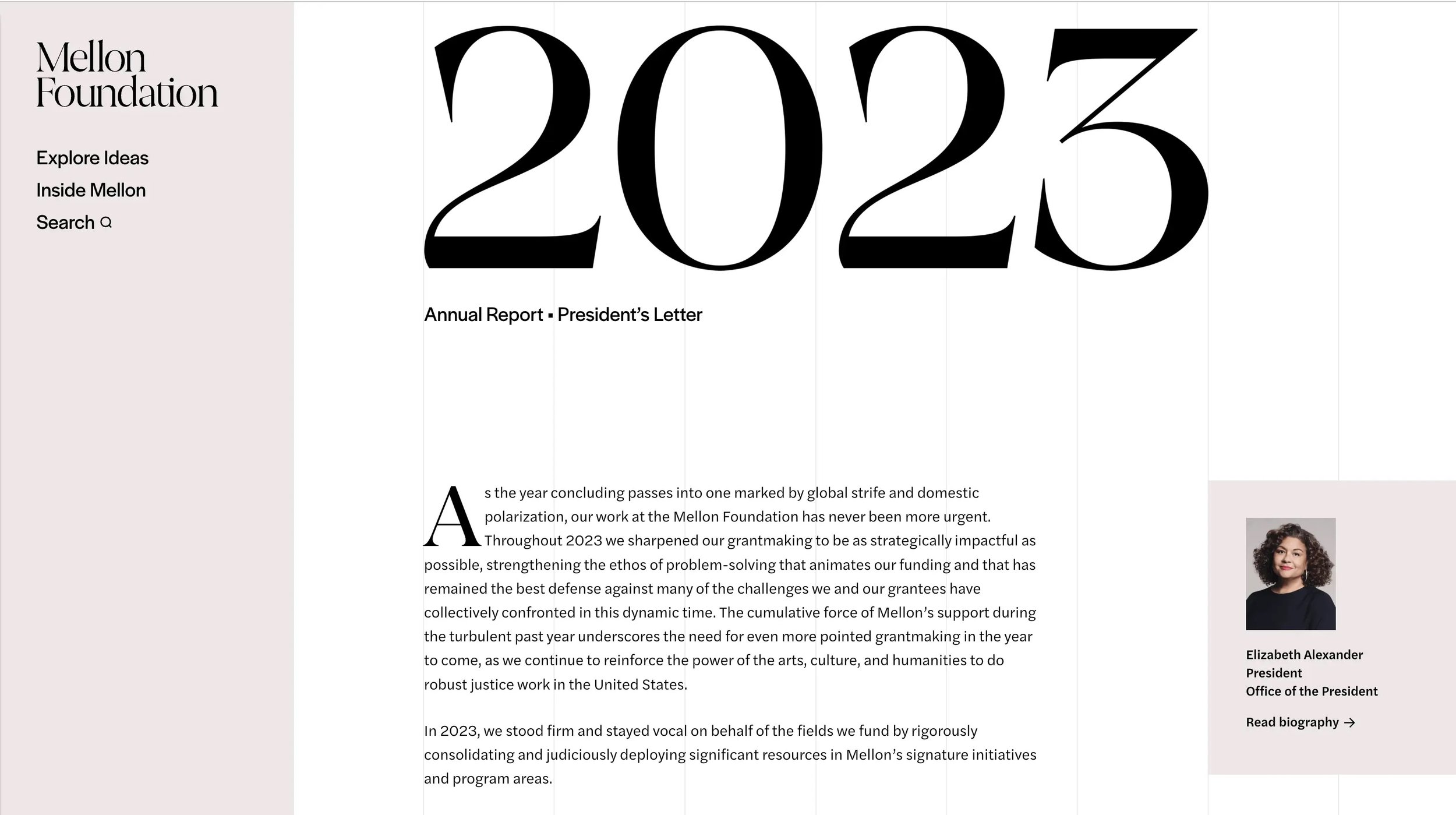
Mellon Foundation supports arts and humanities communities. Their report reads more like a magazine, which is exactly the point.
The design matches the rest of their website, so moving from the report into other areas of the site feels seamless.
Large images and headlines make the work accessible. It doesn't feel like a report you have to get through, but something worth reading.
The takeaway: The best reports don't feel like reports, but an extension of who you are.
9. Jacobs Foundation: Built for Different Kinds of Readers
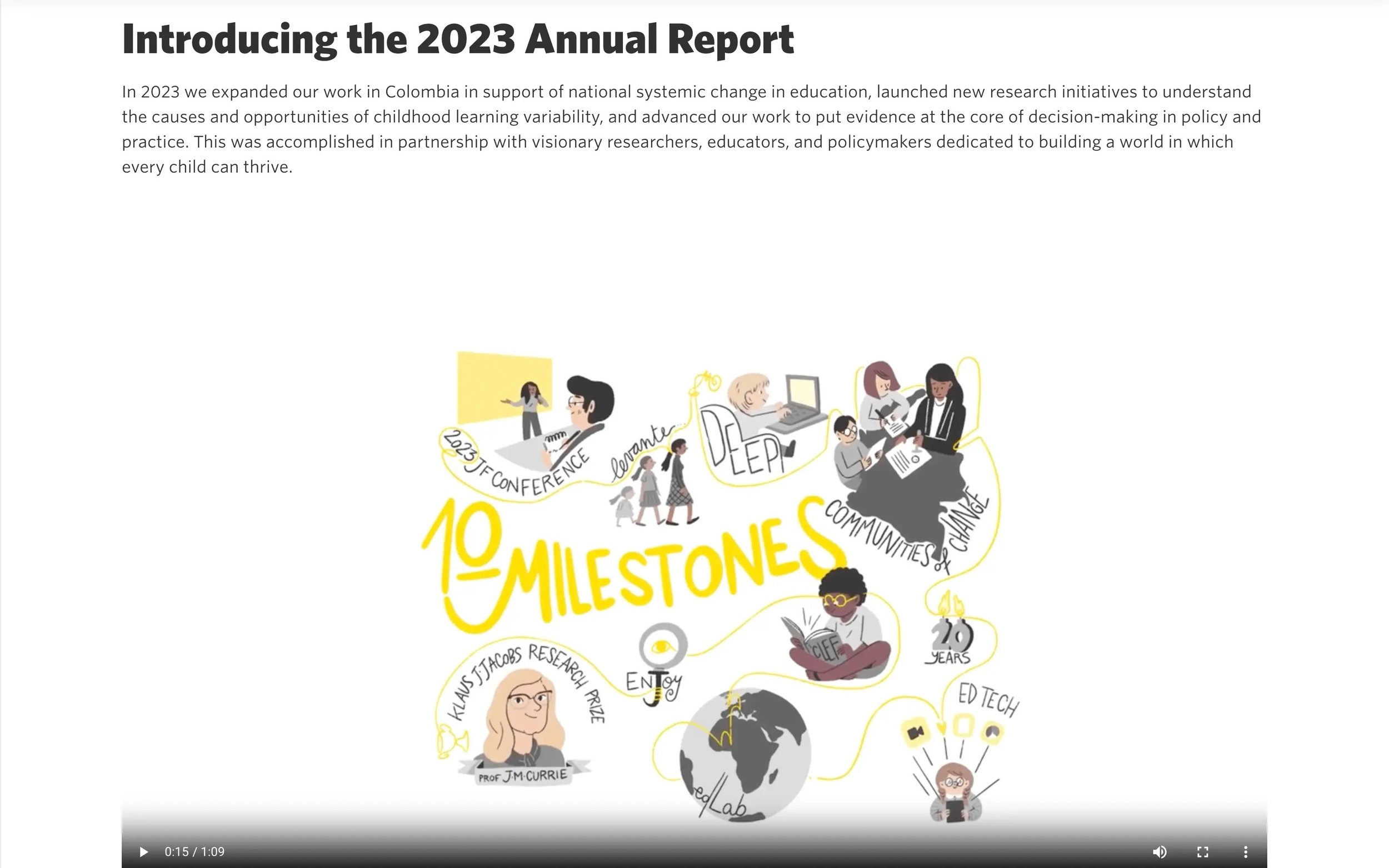
Not every donor engages the same way. Jacobs Foundation, which focuses on learning and education for children and youth, built their report with that in mind.
There's an interactive flip-style PDF for people who want to browse like a book. A video overview for people who'd rather watch. Dynamic charts for data people. Short video clips from partners for people who need to hear it from someone in the work.
Multiple entry points, one story.
The takeaway: You don't have to pick one format. Meeting donors where they are means offering more than one door in.
10. Alzheimer's Drug Discovery Foundation: Smart Navigation, Happier Donors
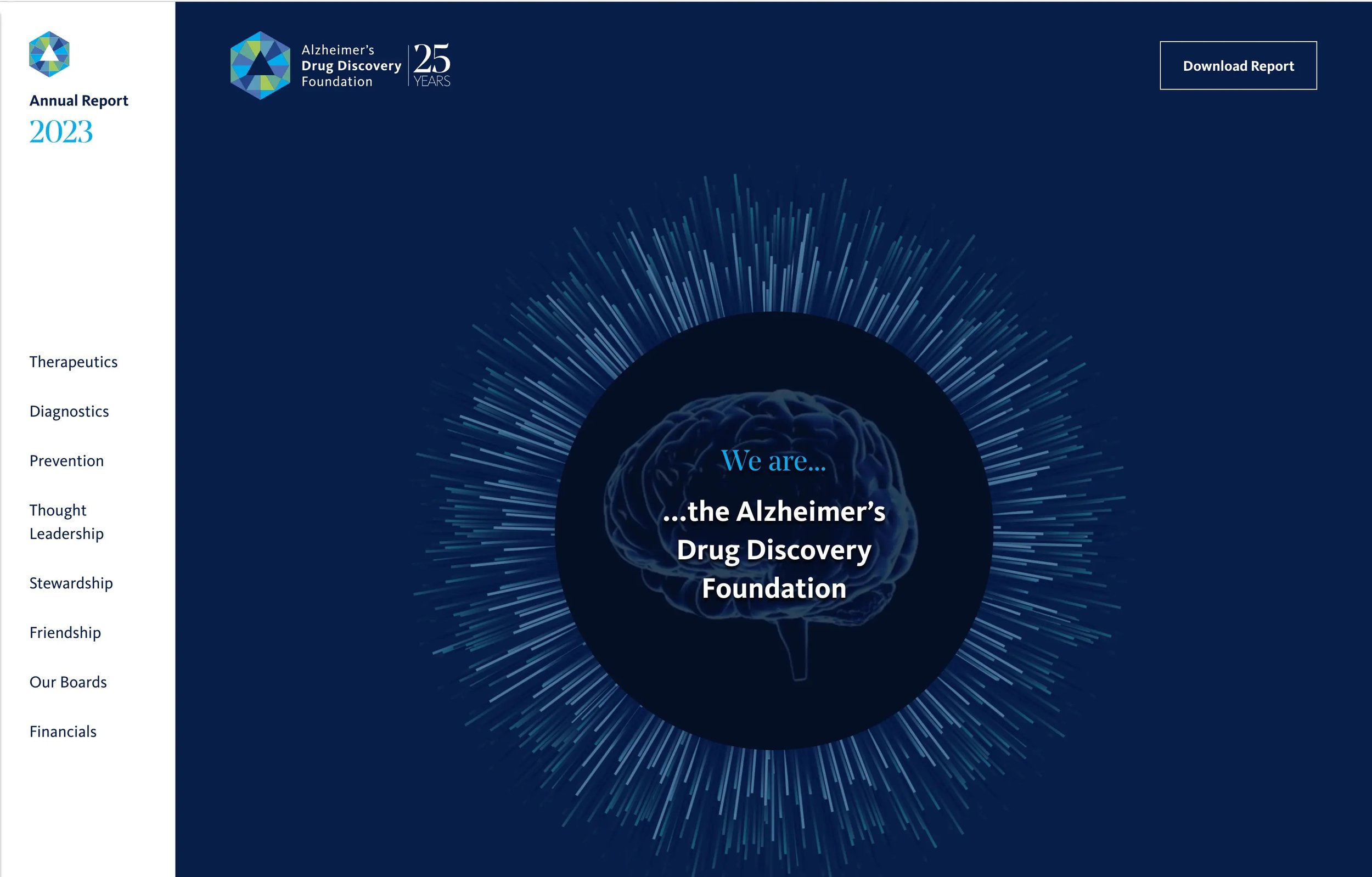
Alzheimer's Drug Discovery Foundation (ADDF) accelerates drug discovery for Alzheimer's prevention. Their report is dense with info, and it handles that well.
A sidebar navigation stays visible as you scroll, so donors always know where they are and can jump to what matters to them.
Bold colors organize content visually without cluttering it. Key stats are highlighted so the most important things are impossible to miss.
The takeaway: If your report has a lot to cover, don't make donors work to find what they need. Smart navigation is a form of respect.
11. Public Rights Project: Minimalism With Depth
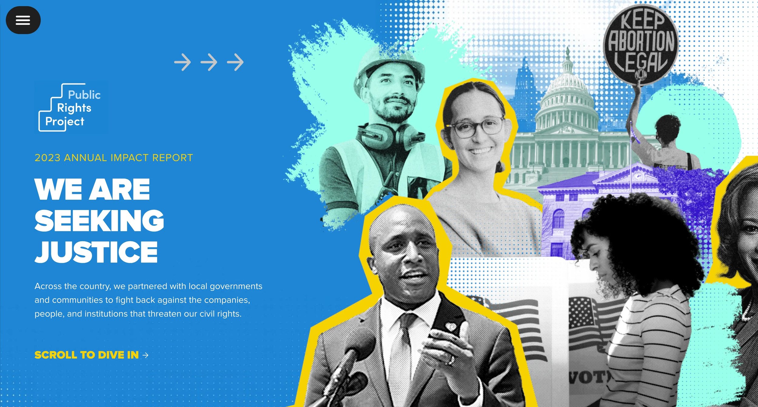
Public Rights Project works to protect civil rights through state and local government. Their report takes a layered but restrained approach, and it works.
At first glance the branded imagery, colors, and texture give it visual character, but scroll through and you'll notice how little is actually on the page.
Minimal content, intentional placement, nothing fighting for attention.
The takeaway: Minimalist design doesn't mean black and white or boring. Every element on the page has a reason to be there.
12. Peninsula Family Service: Real People, Real Stories (Acton Circle)
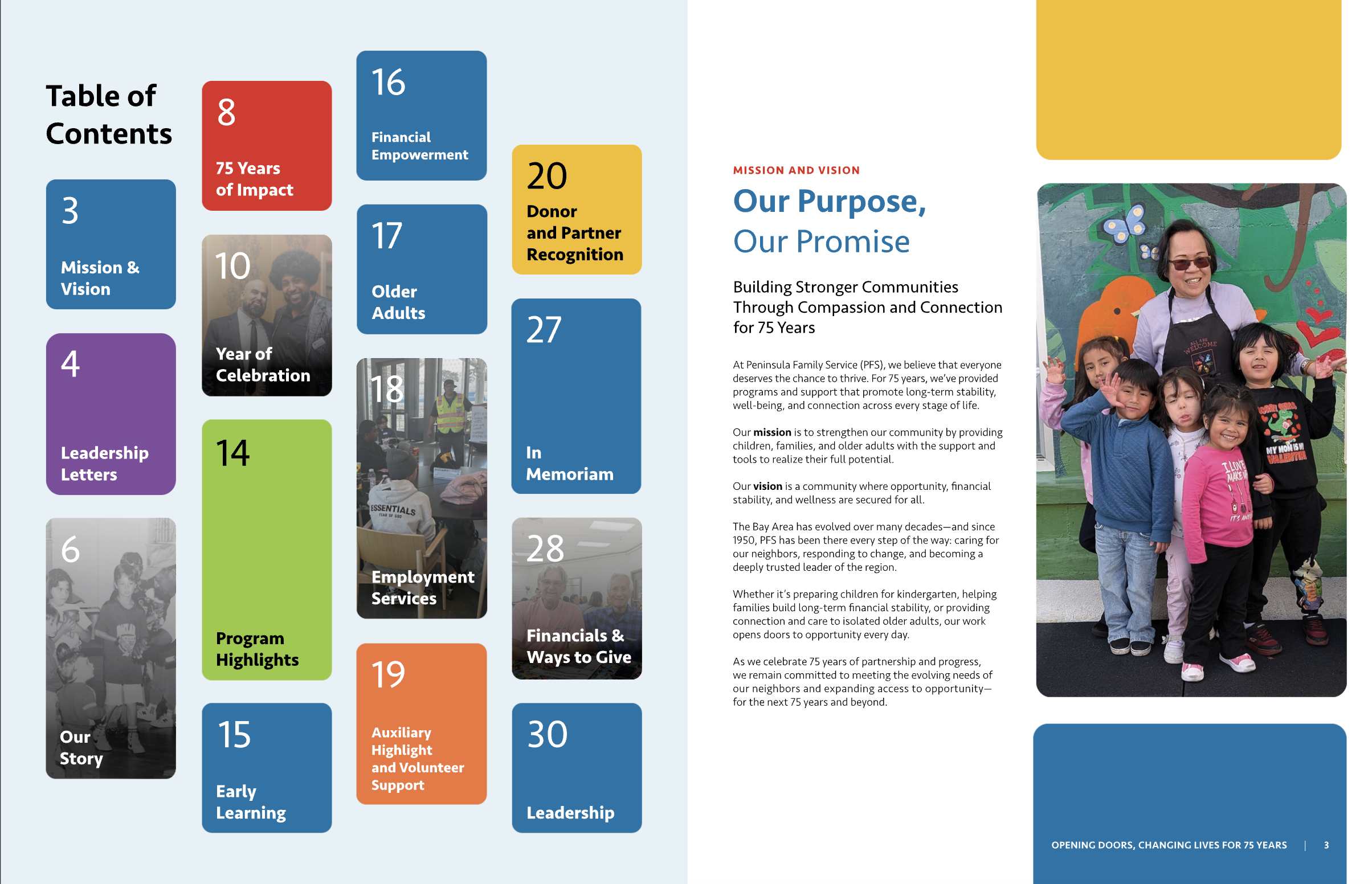
Peninsula Family Service supports economic stability, early learning, and older adult services across the Bay Area. Their report is built around the people they serve and not just the programs.
Warm, real-life photography puts faces to the mission immediately.
Light motion and interactive elements add polish without distraction. Animations guide attention and enhance transitions rather than compete with the content.
The result is a report that feels human from the first scroll to the last.
We loved working on this project. When the photography is right and the story is centered on real people, everything else falls into place.
The takeaway: Impact data is essential. But it's the human story behind the data that moves donors to give again.
What These Interactive Digital Annual Report Examples Have in Common
After working through these, a few things stand out.
These interactive reports are presenting info AND engineering belief. What does a donor feel at each section? What do they walk away convinced of? That's the design brief.
They also all make a choice: to treat the annual report as a donor communication tool... one that keeps your organization top of mind, increases funding, and positions you as the obvious choice to do this work.
That shift in framing changes everything like what gets included, how it's designed, what the call to action is at the end.
A few things worth carrying into your own planning:
→ Let the experience match the mission. YLabs, Tides, and Public Rights Project show how much the feel of a report contributes to tone and trust. Purposeful details, movement, and visual rhythm aren't afterthoughts.
→ Make your data do more work. Feeding America and 10,000 Degrees show what happens when numbers are brought to life, not just listed. Data becomes emotion when the design isn't accidental.
→ Design for the phone. San Diego Foundation gets this right. Your donors are reading on their phones. Meet them there.
→ Center the humans. Peninsula Family Service is the reminder that a real face, a real story, and a real snapshot is what a donor remembers.
Ready to build yours?
If you're looking at these and thinking I want that for our org, that's exactly what we do at Acton Circle.
We've built interactive digital annual reports for organizations like Tides, 10,000 Degrees, and Peninsula Family Service. Every project starts with the story and works backward to the design, because a report that looks good but doesn't move people isn't doing its job.
Let's talk about your project.