You’ve done the work. Lives changed, goals met, mission in motion. Now let’s show people what happened.
A nonprofit impact report gives your supporters a clear look at the results. It turns data into something people feel, with stories, photos, and wins worth celebrating. When done well, an impact report becomes one of your strongest engagement tools.
Not every report makes an impression. Some get skimmed. Others get shared.
Let’s make yours the second kind.
One thing I notice when reviewing reports that didn't resonate the way a team hoped: the design got all the attention, but the foundation didn't.
The reports below look good. But I promise that's not the only reason why they work. Every single one of them started with a clear sense of who was reading, what they needed to feel, and what the org wanted them to do next. The design just made that possible.
What is an impact report?
A nonprofit impact report is a focused look at what your work achieved. Unlike an annual report (which can feel like a larger mix of updates and details), an impact report zooms in on results from a specific campaign, program, or moment.
It’s simple: what changed, who was affected, and why it was significant.
Bring the lived experiences, the key outcomes, and the design that makes it feel real, and donors don't just see proof their gift worked. They feel it.
If you’re researching nonprofit impact reports or looking for inspiration for your next report, this guide has you covered.
→ Click here to get the free Annual Report Checkpoint
Why Your Nonprofit Needs a Strong Impact Report
People want to know they’re making a difference and your impact report is proof that they are.
Nonprofit impact reports keep donors engaged, give funders confidence, and help your team (and yes, your board too) see the mission in motion.
And if it’s easy to understand, genuinely meaningful, and enjoyable to read? People don’t just finish it, they remember it, share it, reference it later. That’s how your story spreads beyond your list and into living rooms, board meetings, and group chats.
What Should Be Included in an Impact Report
However you design it (print, PDF, microsite), include the good stuff:
- Your mission. Front and center. Everything should point back to it.
- Key wins. Be specific. Who did you help? What changed?
- Where the money went. Charts, visuals, infographics, just make them stupid clear.
- Shoutouts. Donors, partners, volunteers; give credit where it’s due.
- Visual design. Branded, tidy, and true-to-you.
Use this list whether you’re creating your first impact report, revamping your existing design process, or exploring nonprofit impact report templates for inspo.
8 Nonprofit Annual Impact Report Examples That Got It Right
These are all Acton Circle projects. Some lean annual, some lean impact, but each one shows the org's work and impact in a way that feels both honest and inspiring.
Planet Women
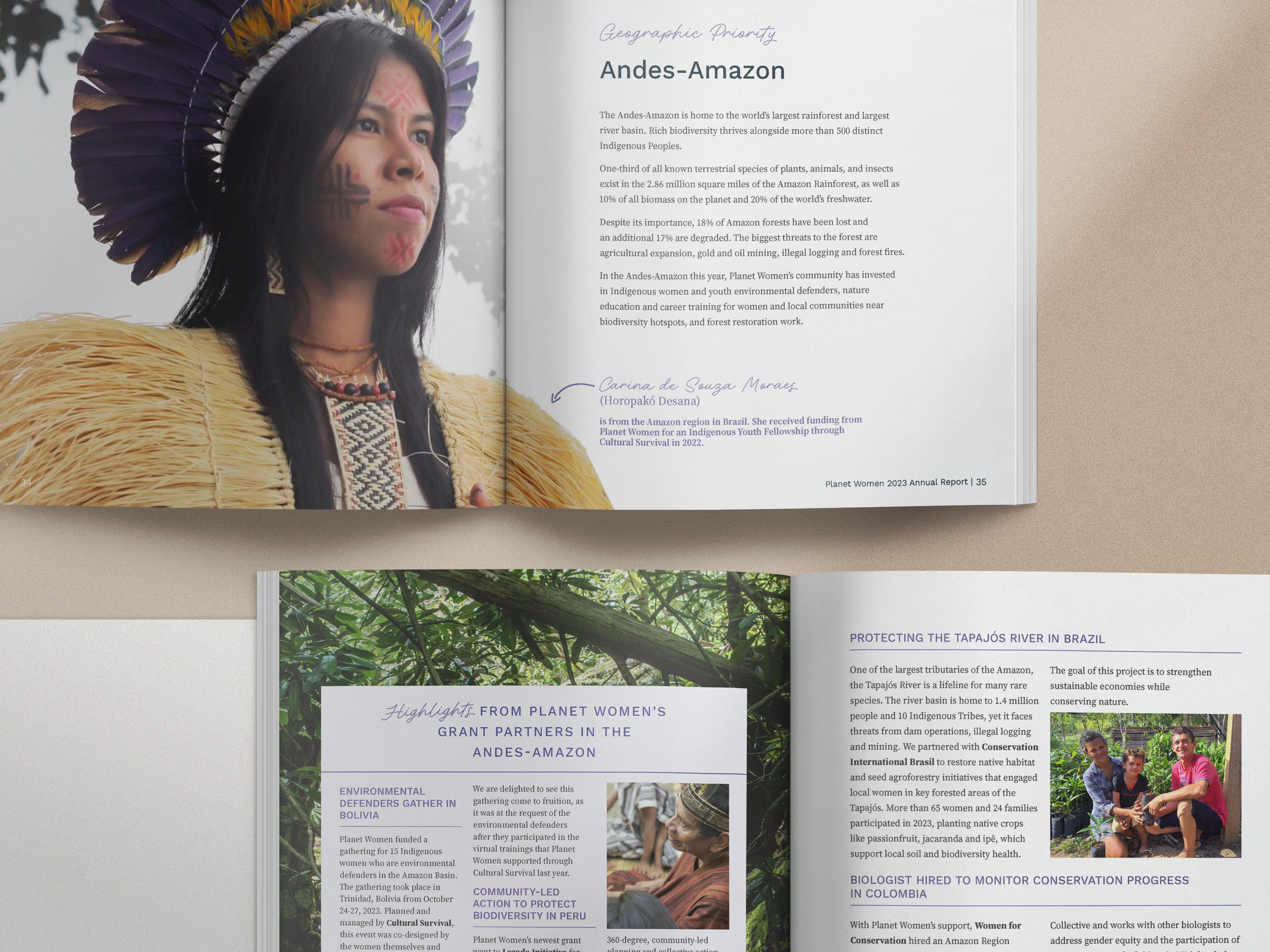
Planet Women empowers women in conservation around the world. Their report feels like a coffee-table magazine full of bold imagery, nature-inspired textures, and confident typography. It’s not just pretty, either: it’s built to inspire today’s donors and lay the groundwork for future partners.
Takeaways:
- Use full-bleed photography to evoke emotion and transport readers into the work.
- Let textures and colors echo your mission (nature, community, local culture, etc.).
- Personality-infused typography can make a smaller org feel warm and welcoming.
Learn more about Planet Women's nonprofit report
Making Waves Education Foundation
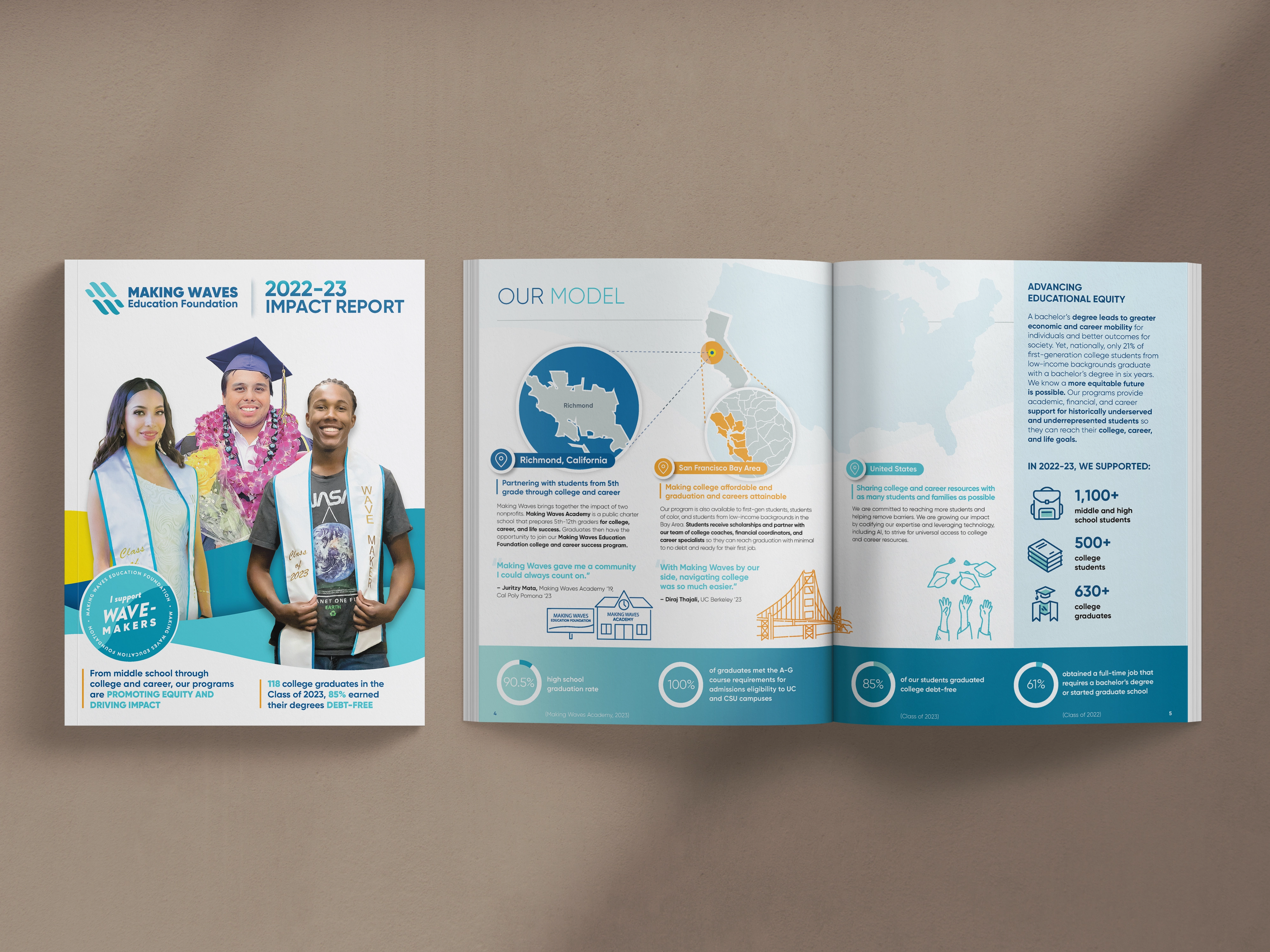
Making Waves Education Foundation supports students through college coaching and financial literacy. Their report puts students in the spotlight, blending personal stories with data that makes sense. From color-coded sections to branded illustrations, it’s easy to read, and even easier to understand.
Takeaways:
- Combine clearly labeled sections with icons or color code info to guide the reader.
- Pair every key metric with a real student story to make the data human.
- Use branded illustrations to reinforce identity.
Learn more about Making Waves Education Foundation's report
This is what a multi-year design relationship looks like in practice. The VP leading marketing and storytelling at Making Waves Education Foundation has worked with us across four consecutive reports, and what makes that possible is that the work goes deeper than aesthetics each time. As she put it:
"Olivia takes the time to really understand our nonprofit organization's mission as well as the goal, audience, and style for each project."
That consistency shows up in the work.
Making Waves Academy
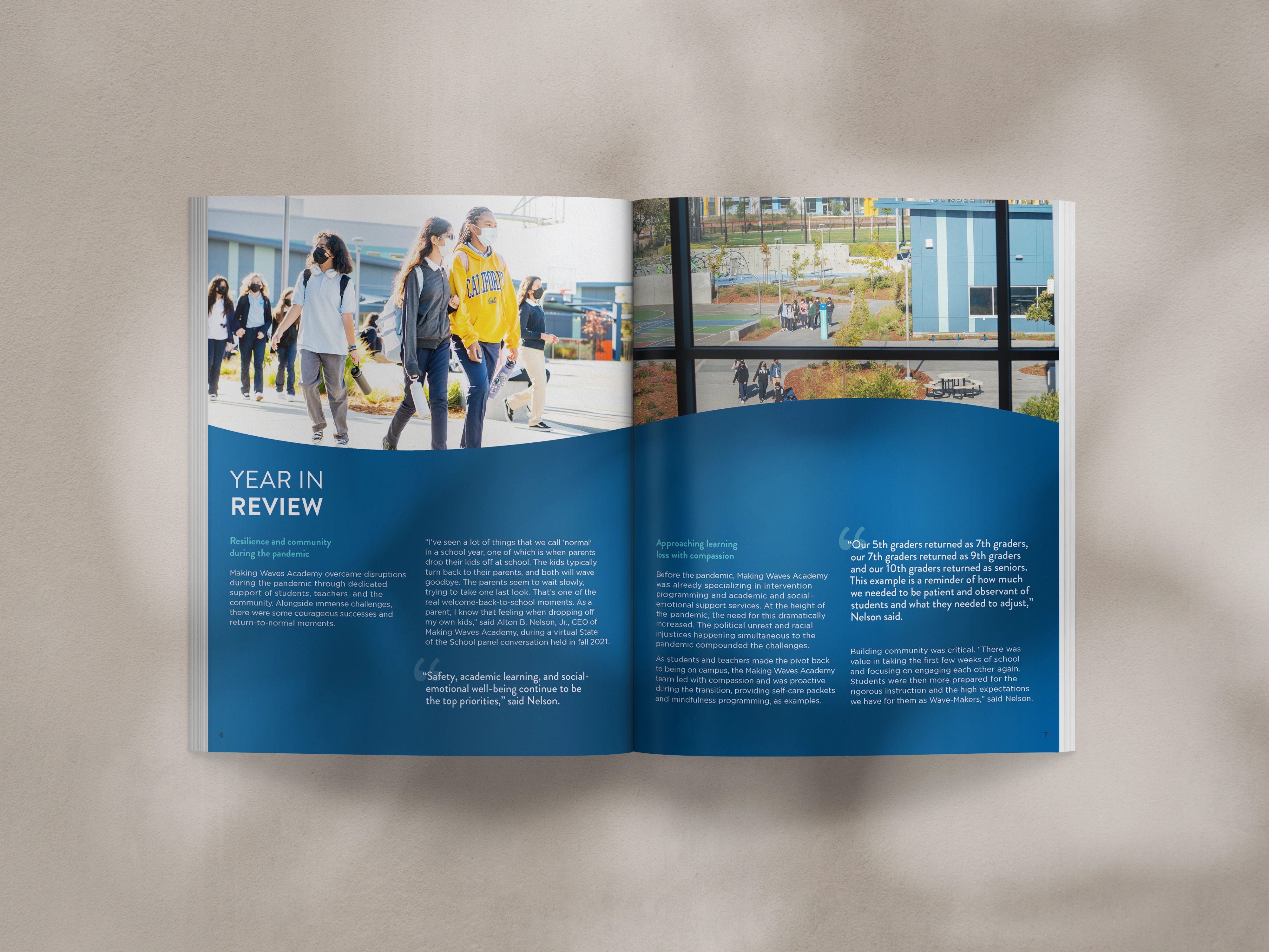
Making Waves Academy's report is a great companion to the foundation’s, clean, bold, and full of energy. With real photos, bright colors, and open layouts, it captures the spirit of the school while keeping everything polished and mission-deep.
Takeaways:
- Open layouts give breathing room and make long content feel approachable.
- Use energetic brand colors strategically to highlight key info.
- Let authentic photography communicate the story on their own.
Learn more about Making Waves Academy's report
10,000 Degrees

10,000 Degrees’ report is a great example of cross-platform storytelling. Supporters can dive into their impact through an interactive microsite or a vibrant, easy-to-share PDF. Each version features hand-drawn illustrations, bold colors, and donation links right where you need them. A built-in QR code smartly bridges print and digital making it easy to move from inspired to involved.
Takeaways:
- Offer multiple formats (PDF + microsite) to meet donors where they are.
- Add CTAs or donor links inside the report, not just at the end.
- QR codes are your friend when you want to turn reading into action.
Learn more about 10,000 Degrees' report
When the strategy is right, the praise follows. After completing 10K Degrees' report, a communications leader at the organization shared that it was some of the best-designed materials they'd had to date, with board-level recognition to match.
That kind of response didn't happen by accident, but was tied to our goals from the start.
Wu Yee Children’s Services
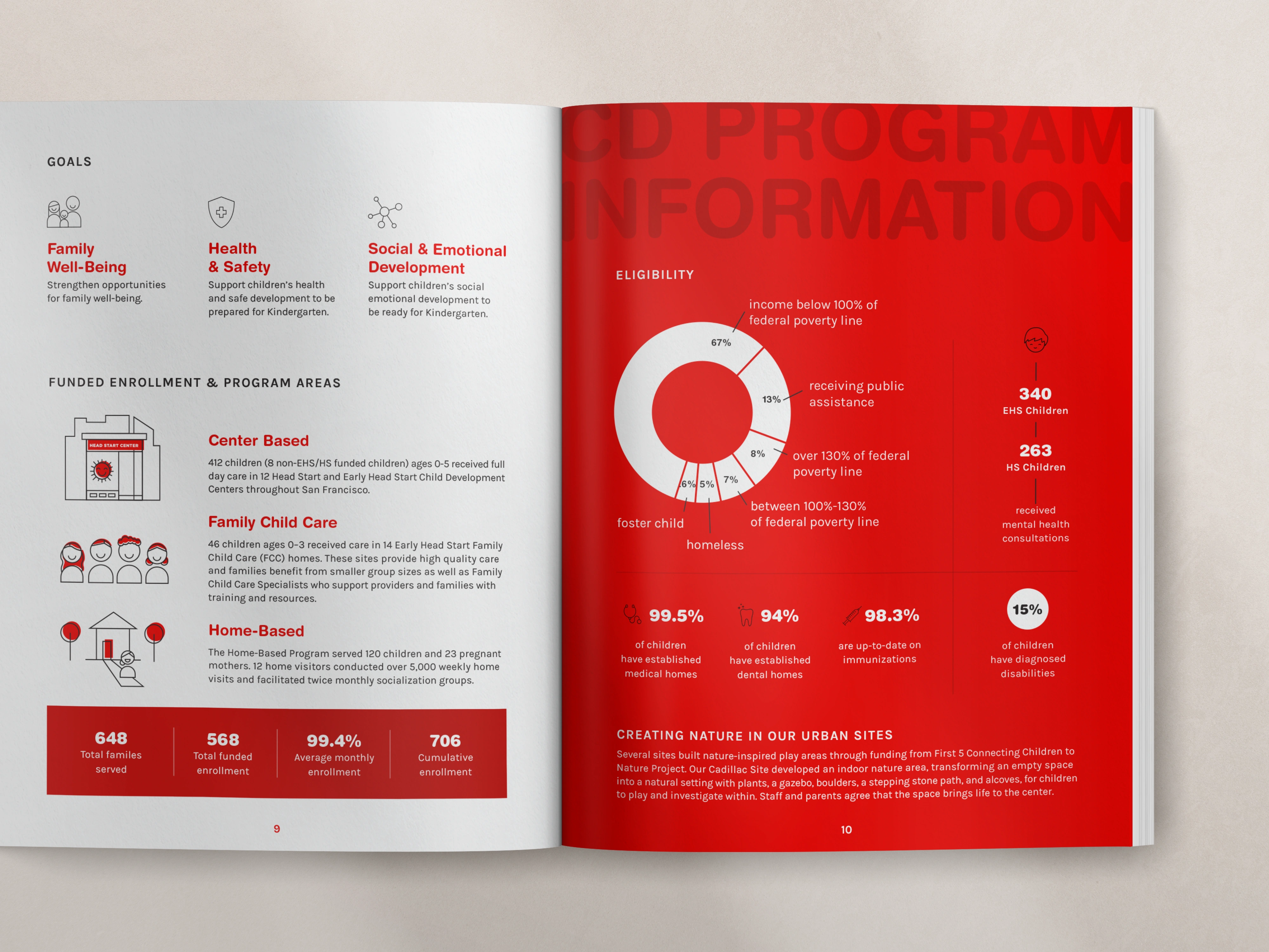
Wu Yee Children's Services' report incorporates bold visual moments that instantly stand out. Red overlays pull photos together, and bold graphics highlight data in eye-catching ways. Everything feels on-brand, from custom icons to clean illustrations.
Takeaways:
- A single accent color used consistently can unify your entire report.
- Strong, simple data visuals beat complicated charts every time.
- Branded icon sets instantly elevate the personality of your design.
Partners in Development Foundation

Partners in Development Foundation went simple and smart: one bold, infographic-style summary with greens, yellows, and leaf patterns honoring Hawaiian roots.
Takeaways:
- One-page summaries work beautifully when you want quick engagement.
- Cultural motifs (colors, patterns, symbols) help connect impact to place.
- Focused storytelling can make a single page feel more powerful than 12.
Ministry Leadership Center (formerly CYMT)
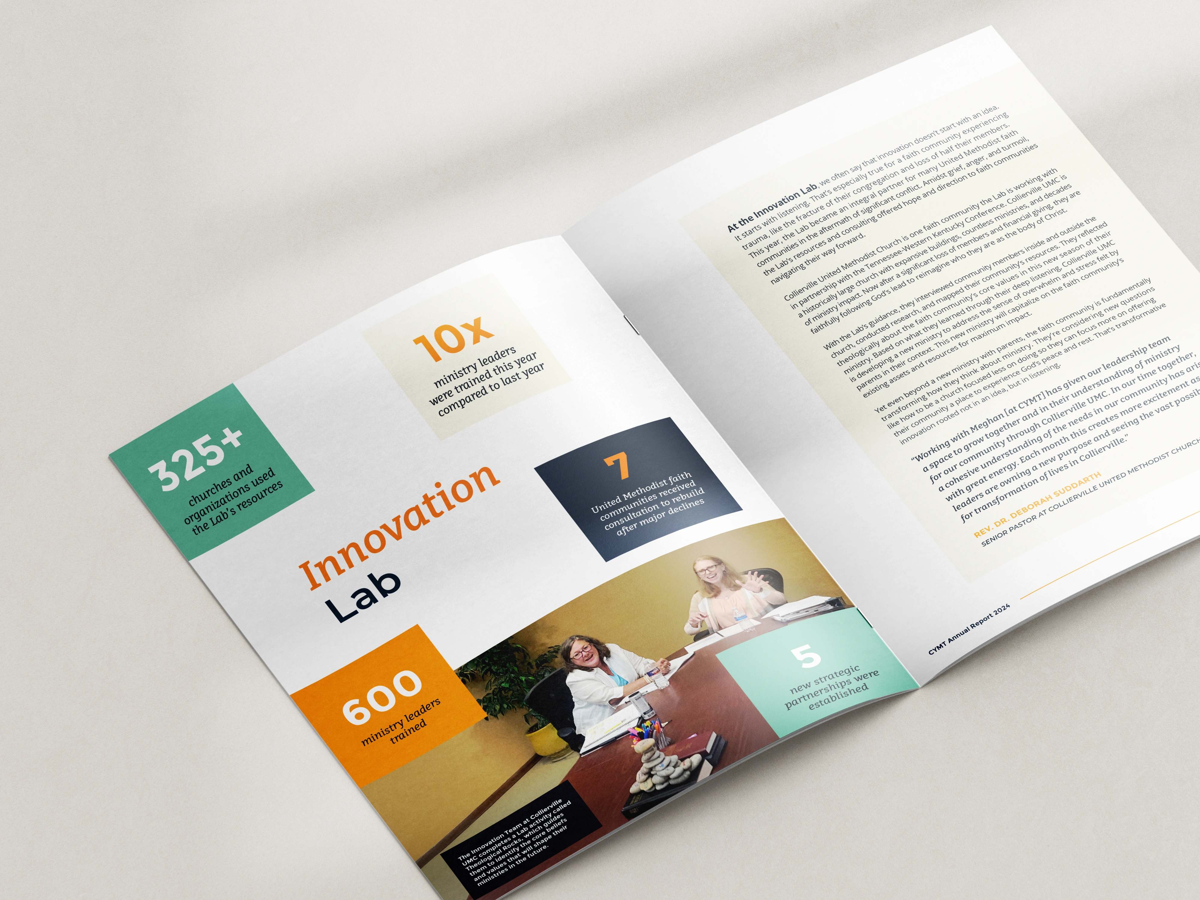
This report blends individual stories with community-wide impact, centering ministry leaders and their real-life challenges and growth. The design uses full-spread layouts, strong quotes, and warm, faith-centered photography. The report is honest, hopeful, and mission-aligned without being overly formal.
Takeaways:
- Use testimonial-style quotes to make intangible work (leadership, formation, ministry) feel tangible.
- Real program photography helps convey heart-centered missions.
- Reduce decorative elements and let strong stories sit in generous negative space.
University Department
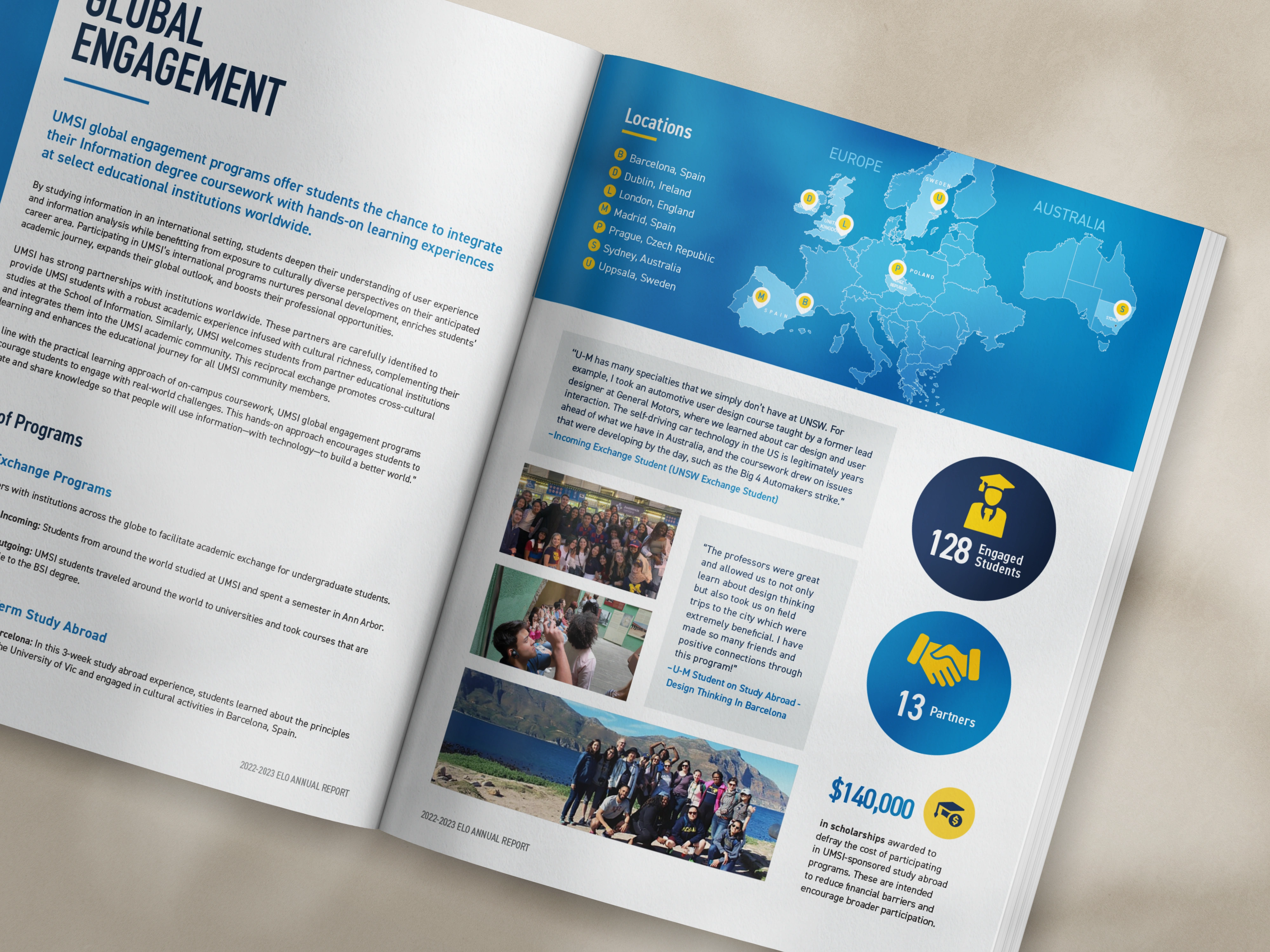
This university department’s report pulls together the year's program data, articles, and student voices into one unified layout. Designed to highlight global engagement, the spread shown above uses location-based infographics, bold stats, and vibrant student photos to keep readers engaged. It’s a polished blend of credibility and heart... academic meets accessible.
Takeaways:
- Location-based maps or infographics are perfect for global or multi-site programs.
- Blend articles and student stories to appeal to both academic and donor audiences.
- Use consistent stat styles (size, color, placement) to create rhythm and clarity.
Get The Annual Report Checkpoint
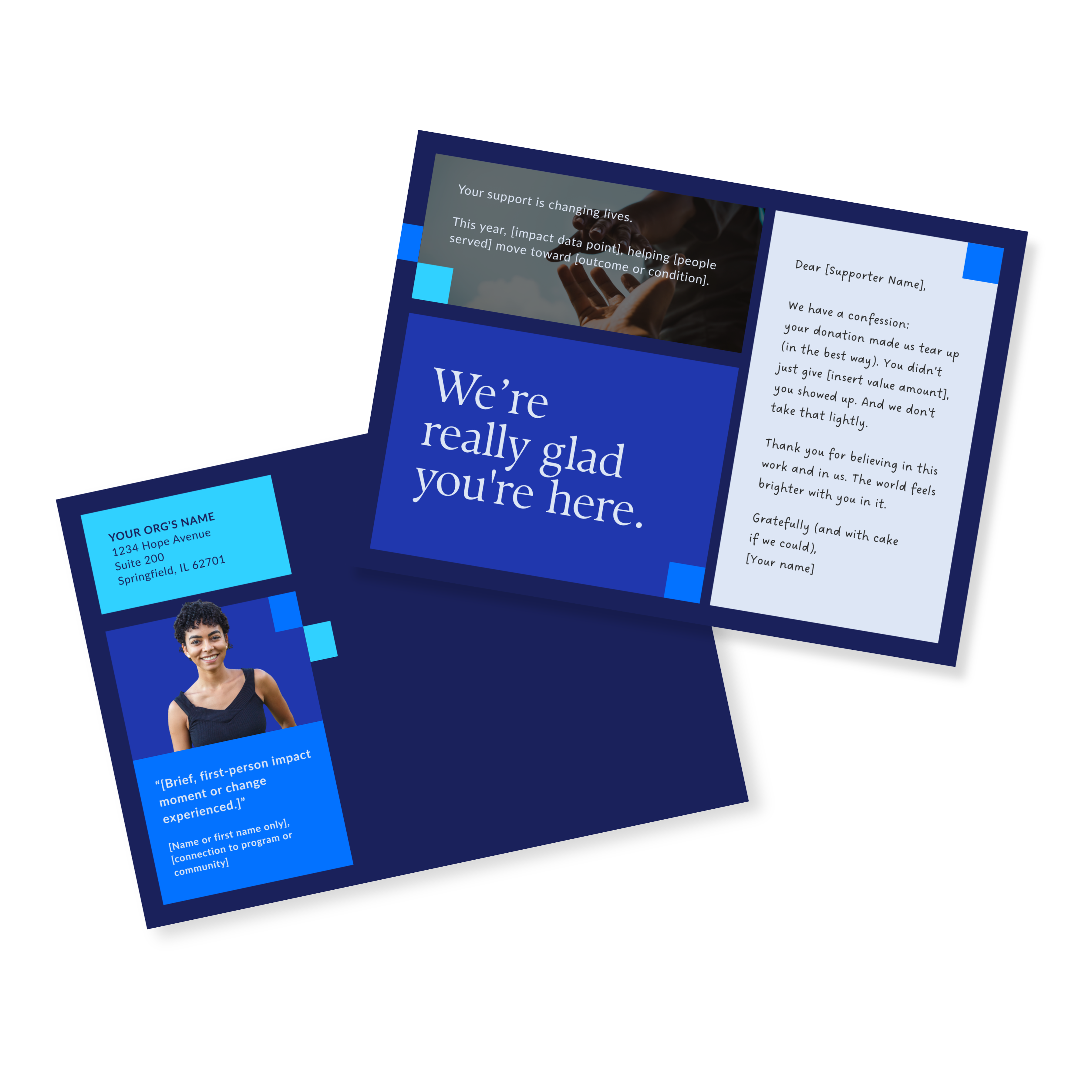
Donor Thank You Postcards Templates
Enter your info and we’ll send the postcards straight to your inbox:
How to Design an Impact Report That Works
Want a report that instantly connects with people? Here’s how to make it work, whether you’re creating a full annual report, a short impact summary, or a nonprofit impact report your donors will llo forward to reading:
- Start with your audience. Who are you writing this for: donors, partners, community members?
- Keep it timely. Share recent wins, bumps in the road, and relevant data.
- Make it human. Skip jargon and highlight real people and real results.
- Design it for real life. Easy to read, easy to scan, easy to follow.
- Stay true to your mission. Every section should reinforce your values.
Before any design begins, I work with teams to get clear on the strategic foundation: who the report is for, what it needs to accomplish, and how every section connects back to that goal.
That's exactly what the Annual Report Deep Dive is built around: a two-part working session that covers content, format, story, and supporter journey before a single layout gets touched. If you're looking at these examples and wondering whether your report could get there, that's the right place to start.
Common Mistakes to Avoid
Even the best nonprofit impact reports can miss the mark if you’re not careful. Here are a few common missteps and how to sidestep them:
- Trying to say too much. If your report feels overwhelming to you, it definitely will be to your readers. Stick to the most important content and cut everything that doesn't support your main goal and message.
- Burying the good stuff. Lead with your strongest stories and most meaningful wins and challenges. Don’t hide them behind too much background or filler.
- Writing for insiders only. Avoid acronyms, jargon, or assuming everyone knows your programs inside out. Clear, friendly language goes a long way in making your report feel welcoming.
- Publishing and disappearing. Your report isn’t a one-and-done situation. Share pieces of it across your channels (social, email, donor updates, and events) to get the most out of your effort. (Need tips on how to do this? Learn how to maximize your report).
Nonprofit Impact Report FAQs
What does a good impact report look like?
It’s focused, easy to navigate, and clearly tied to your mission. The strongest nonprofit impact report examples combine data, storytelling, and visuals that make your outcomes personal and memorable.
What is the difference between an impact report and an annual report?
An annual report covers an org's activities over a full year. An impact report zooms in on the results of a specific program or campaign, making it typically more focused and often easier to share.
What is the goal of an impact report?
The goal is simple: show people that their support made a difference. A strong impact report builds trust, strengthens relationships, and inspires continued support.
How long should an impact report be?
Most nonprofit impact reports fall between 4–16 pages. Keep it long enough to show value, but short enough to keep readers engaged. Here are other simple ideas for impact reporting.
What are the elements of an impact statement?
An impact statement is a short, powerful summary of the difference your org made. It usually includes who you helped, how you helped them, and what changed as a result. Keep it rooted in real outcomes, not org-speak.
Ready to get started on your annual report?
Seeing what's possible is one thing. Knowing how to get your report there is another.
If you've got a report coming up and you want to avoid the common mistakes and make sure it keeps paying off long after it's published, let's talk about what that looks like for your org.